Futuristic Ship Interior
Hello everyone! This is my first time posting on Polycount, so go easy on me!
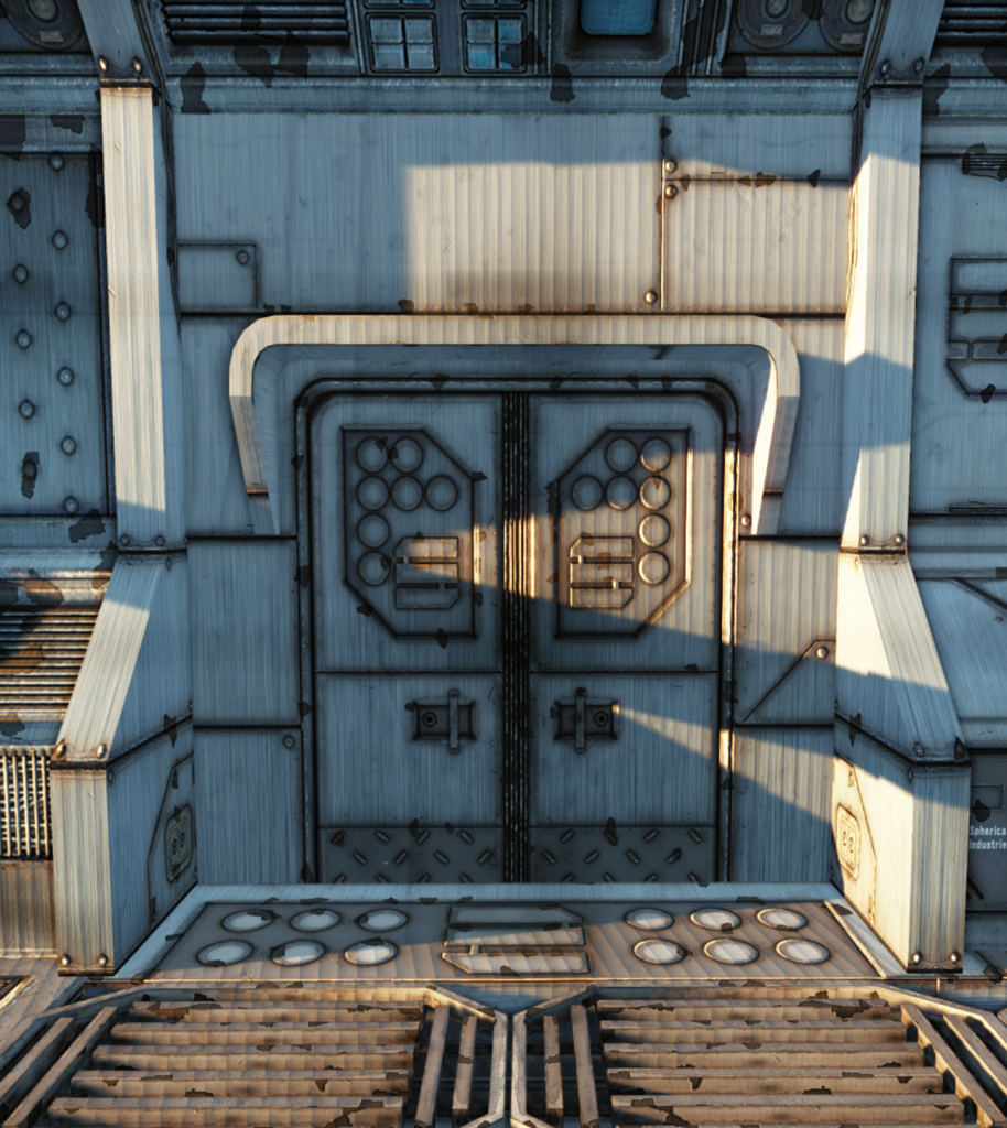
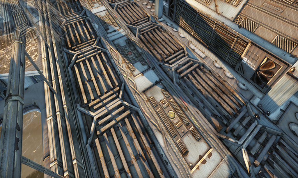
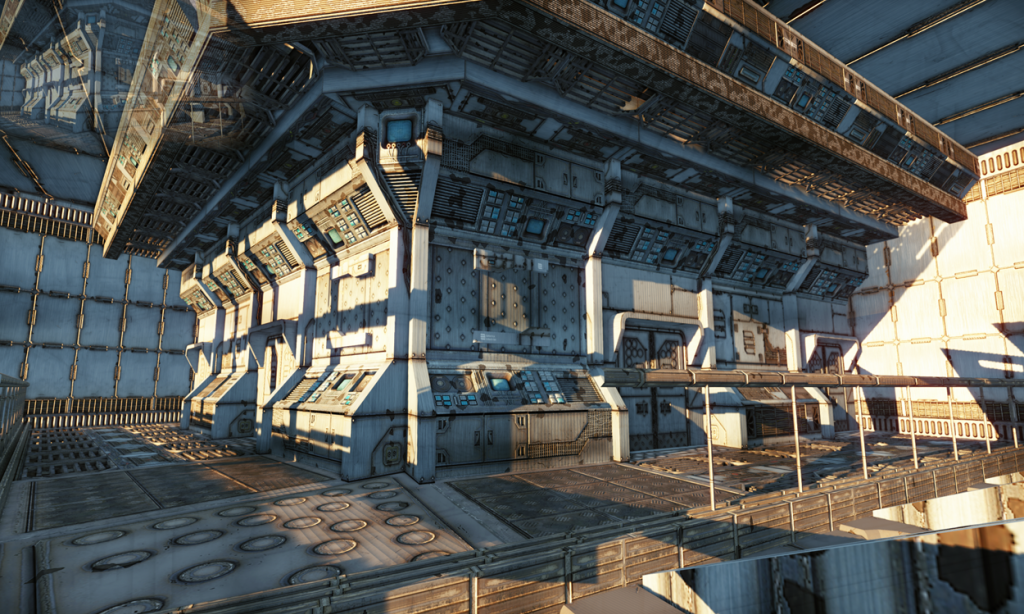
This scene I have been working on is un-kept space ship interior. I have taken quite a few renders in CryEngine so hopefully you can see it all and give me some pointers!
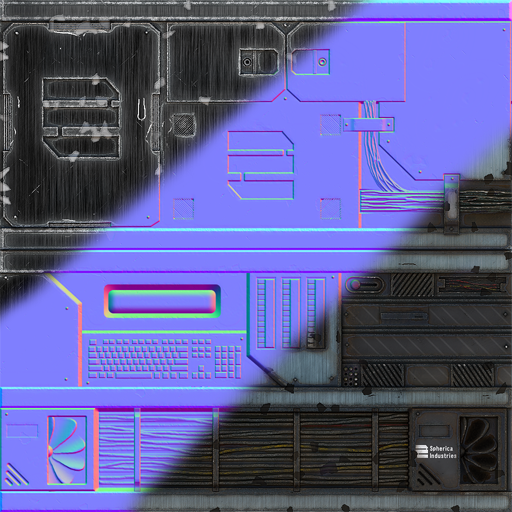
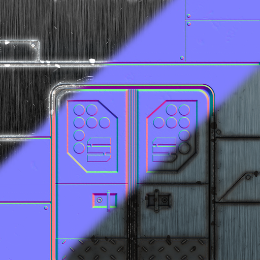
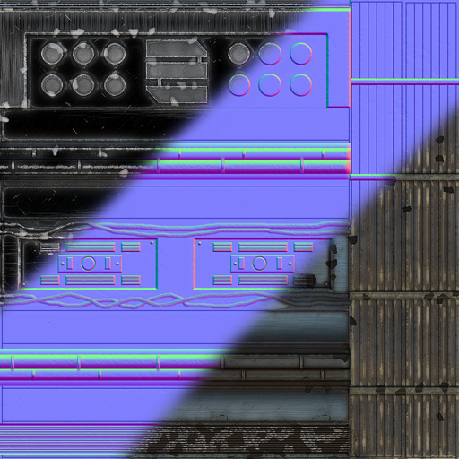
The entire scene is currently little under 40,000 tri's. I have included a couple of my textures as well which are 512x512 or 1024x1024 currently. There are also a fair few reused assets at the moment, which I will be replacing soon.
If you have any critique or ideas then please, let me know!
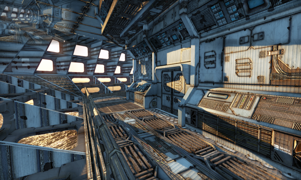
Please ignore the weird image at the top left of some renders, I don't know why but this happens when I take a screenshot in CryEngine 3 Sandbox, if you know why let me know.
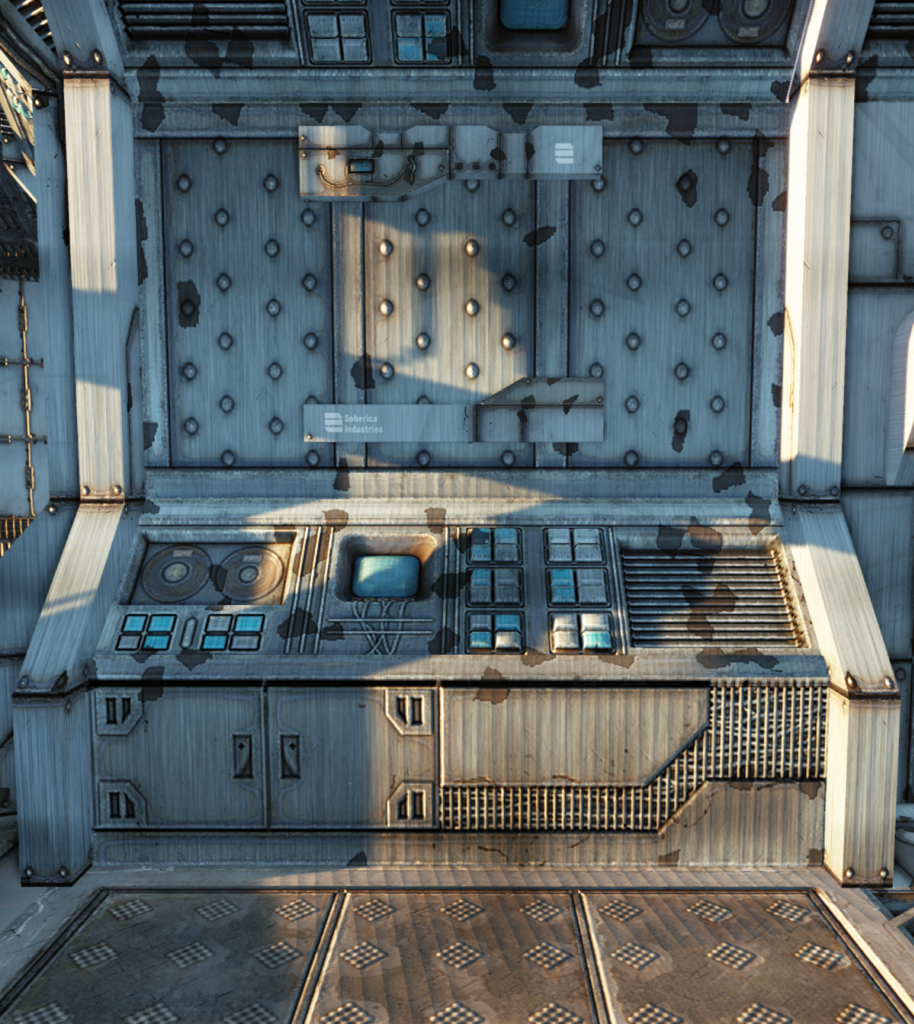
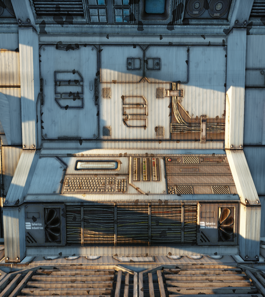
Going to add a hologram-type screen in the middle of this section.
Thanks for looking, I intend on updating this thread as often as I can. Any questions please ask away!
This scene I have been working on is un-kept space ship interior. I have taken quite a few renders in CryEngine so hopefully you can see it all and give me some pointers!
The entire scene is currently little under 40,000 tri's. I have included a couple of my textures as well which are 512x512 or 1024x1024 currently. There are also a fair few reused assets at the moment, which I will be replacing soon.
If you have any critique or ideas then please, let me know!
Please ignore the weird image at the top left of some renders, I don't know why but this happens when I take a screenshot in CryEngine 3 Sandbox, if you know why let me know.
Going to add a hologram-type screen in the middle of this section.
Thanks for looking, I intend on updating this thread as often as I can. Any questions please ask away!
Replies
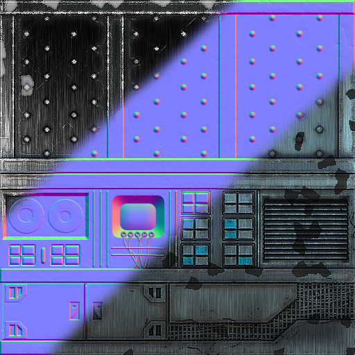
Honestly, my first impression when I saw this scene was that I thought the texture were AO's.
Looks like a interesting scene, still needs a lot of work, as of now it just seems like a black and white canvas.
As for the lighting, I only recently started using CryEngine and so I still have a lot to learn in that sense.