The BRAWL² Tournament Challenge has been announced!
It starts May 12, and ends Oct 17. Let's see what you got!
https://polycount.com/discussion/237047/the-brawl²-tournament
It starts May 12, and ends Oct 17. Let's see what you got!
https://polycount.com/discussion/237047/the-brawl²-tournament

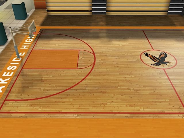
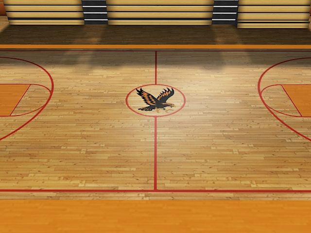
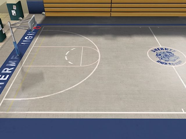
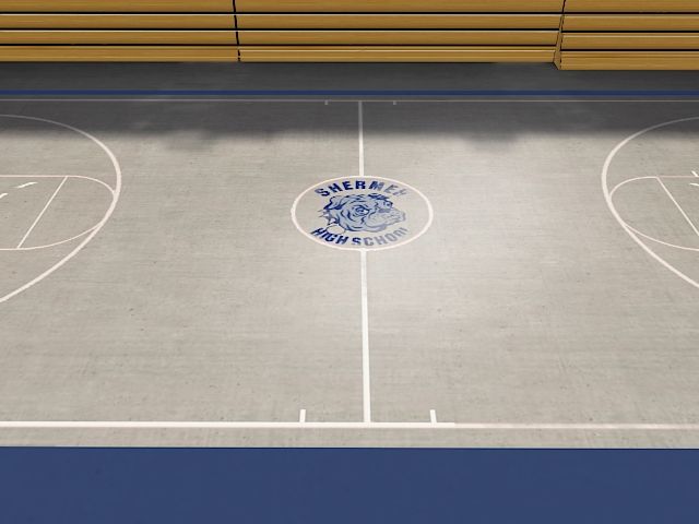
Replies
What engine are you guys using?
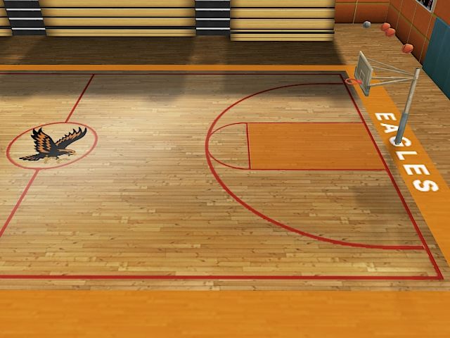
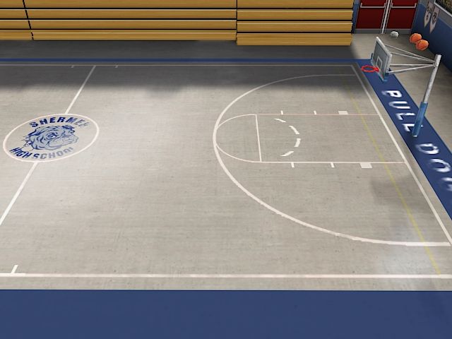
I don't have any massive crits, but the lighting on the last one i think could use some colour. it's looking pretty plain with the pure white lighting.
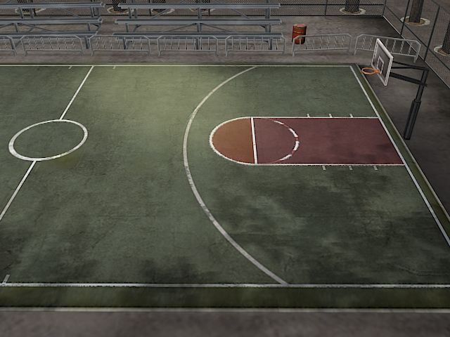
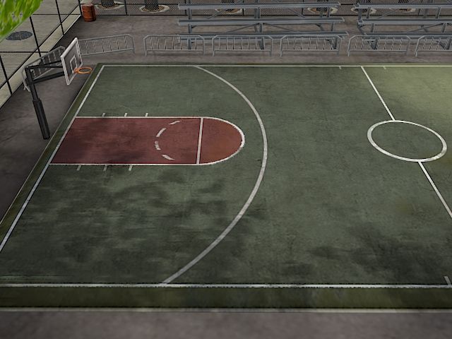
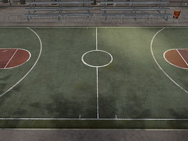
I think the first court is far to grey overall & fairly de-saturated in comparison to the others. Possibly because there is a dominant amount of metal, which is looking fairly dull / could use some spec highlights.
The ground in the first one could do with some slight wear & tear if its supposed to be an inner city ball court i'd expect it be more roughed up. The paint peeling / worn away etc.
If you have the budget, I'd recommend adding a net - it would be fairly visibly in the arenas you have.
The cylinders in the background in the first arena look like oil drums; I'd recommend changing them into recognizable trash cans. A few loose bits of trash would help as well. I also can't tell what that greenish rectangle on the left wall is supposed to be.
The doors in the final arena seem flat - perhaps baking some shadows in would help give an illusion of depth. The orange blobs on the right wall aren't recognizable.