Modeling Reel
polycounter lvl 5
This is a work in progress, any comments would be appreciated ")
[ame="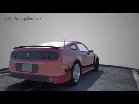 https://www.youtube.com/watch?v=0q55F0fDd6I"]2013 Modeling Reel - Tyler Green - YouTube[/ame]
[ame="
https://www.youtube.com/watch?v=0q55F0fDd6I"]2013 Modeling Reel - Tyler Green - YouTube[/ame]
Replies
Get some image based lighting with more boom and set multiple lights and maybe better shaders for the cars, they are just not right. Not reflective enough and just play with them until it looks fine.
Thanks for your comment.
The shading on your red car honestly doesn't look good and doesn't add any positive impression to your model. Not to mention the high light makes it extremely hard to see your wireframes. You'll be better of using flat shaded materials with probably an ambient occlusion.
The texture on the white car also doesn't look good, again a flat shaded with AO might serve you better.
You want to show your model and wireframes. Don't let bad shading or bad textures distract the viewer away from what's important.
Your kitchen has mostly simple shapes, nothing really complex that you need to show it in different camera angle. Give more time to your restroom instead, it has much more interesting shapes going on.
The kitchen looks cartoonish. I think you need some wood on the cabinets instead of the solid color.