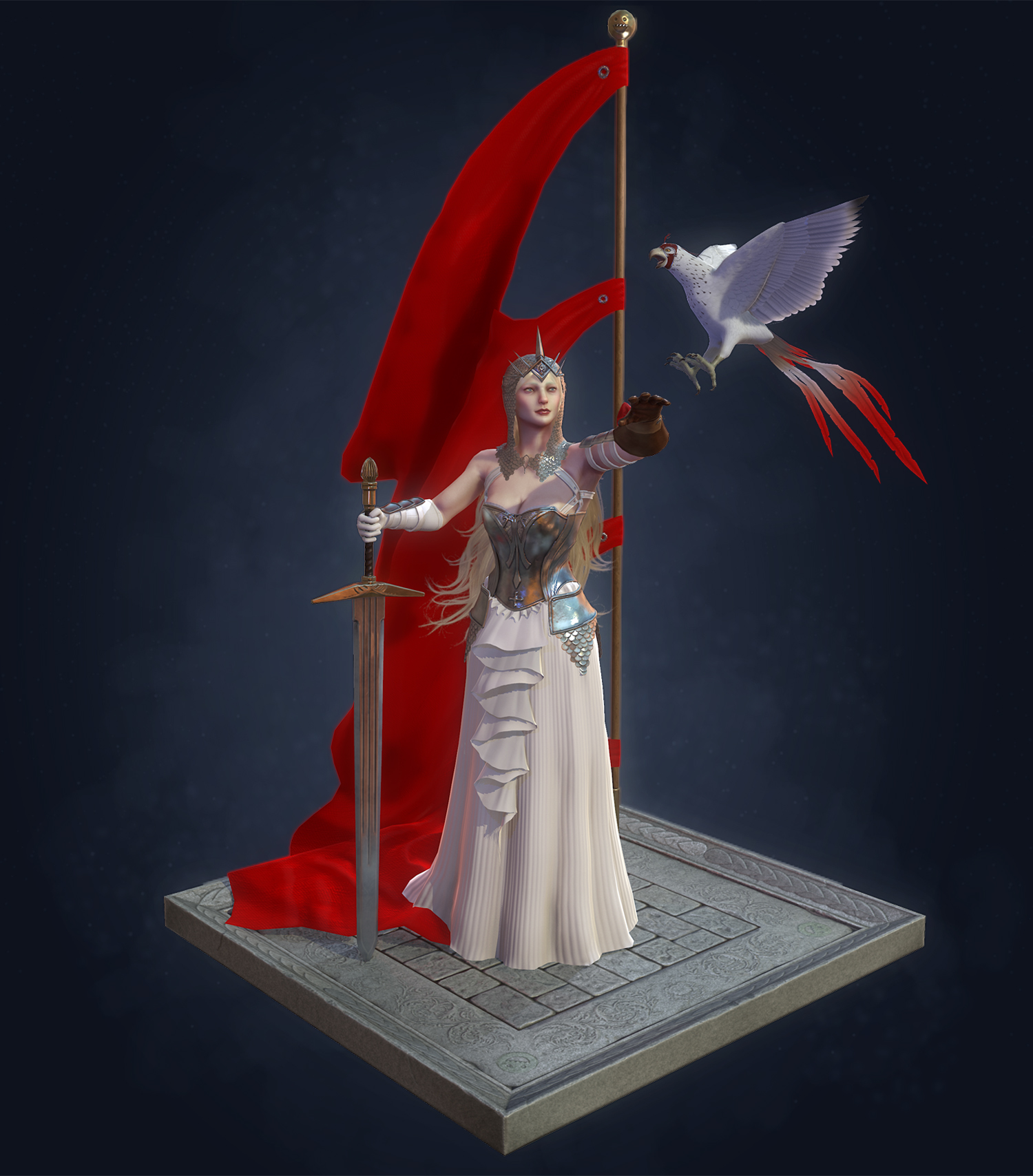
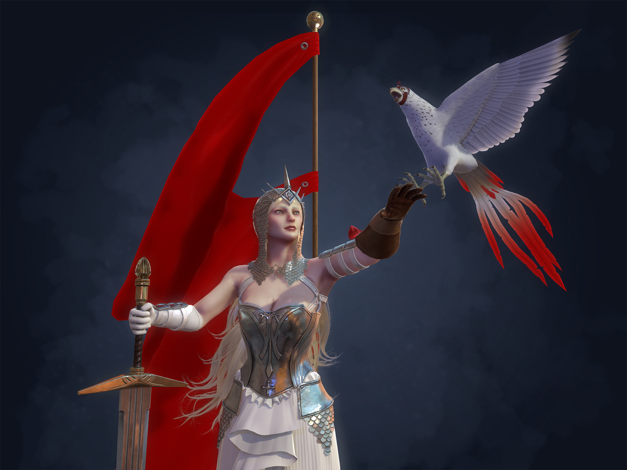
I think you're misinterpreting her figure from the concept. She's thin, if improbably endowed. Most of the size below her waist comes from the dress and the petticoats. Granted, some of her upper-body curves are probably imposed by the steel corset, but that shaping would still be present in the base mesh.
I agree with DWalker- I think the legs, arms, torso and stuff look great anatomically as standalones, but proportion-wise as a whole, this seems like the body of a more stylized character, which I don't think is what you're going for. Take the waist in a bit and lengthen the torso; for the face, her nose seems a little too long and bulbous at the end.
Looking forward to seeing how this progresses!
Thanks for the crits! Did some work on the face. I noticed alot of things I didn't like/ didn't match the concept. I also started blocking in some hair this is just an idea of the volume. I will be adding alot more hair later.
crits so far are good. great concept choice btw, sadly not the best angle for our purposes XD. but yea she is looking pretty good, few crits on her so far, the neck is a bit thick for a female, tends to be one of the areas that they are much softer/ less defined than males, and it tends to be more narrow at the base as a result of having less defined neck muscles (sternomastoids which dont really tend to show up on females in a very pronounced way. the muscle mass in her shoulders feels a bit out of proportion as well atm, she has some serious shoulders for someone who is fairly soft. she could also use a little more brow, her face is super flat in profile from the nose up, and while she does have very flat brows in the concept and females typically have a bit less of a brow ridge than males do, i think you could give it a little bit more space between the brow and the eye, and a little bit more definition on the inner edge of the eyebrow. her nose could stand to be a bit wider to match the concept as well it is a thin nose but still appears about equal to the space between the eyes at the nostril. Gl dude keep on it!
I'm sorry but that face still needs a lot of work. Look at your model from the same distance as the image. They do not match at all. I say keep working the forms of the face, the bone structure is really lacking/not correct. Sorry if I am being harsh or whathaveyou but likenesses are tough and you're gonna have to really work at it to get that likeness down pat.
You can always decap the head and work on the other parts of the costume then revisit the head. Good luck.
Did a pass on the likeness. I am not entirely concerned with 100% match to the concept as it doesn't give me a ton to go off of. I will be doing work on the head until the model is complete so this isn't final.
I agree with garriola83 you need to fix the face up somehow. The side view looks a little strange and mannish in my opinion. I did a paint over of how you might proceed to fix it.
Also i believe that looking at the concept art and comments made by someone that the reference for this character is indeed Kate Hudson. I would not try to make a realistic copy of her, but include her defining features.
I think her breasts should be pushed closer and up. That's a corset she's wearing. It's like the ultimate push-up bra.
And smaller waist for same reason.
Also i believe that looking at the concept art and comments made by someone that the reference for this character is indeed Kate Hudson. I would not try to make a realistic copy of her, but include her defining features.
you sure it's not Drew Barrymore? it really doesn't look like Kate Hudson, at all. speaking about that specific image btw.
it almost looks like different people are used for different compositions of this character.
This is what I think it looks like. I don't even know how to describe the damn thing. But I think the one draper-thingy should be in the middle lane, overlapping to the side. Not two of them from the side draping in.
Thanks PyrZern that helped. Small update here. Added some base meshes into the model and reworked the skirt detail. Decently happy with the skirt detail now. I think I will start sculpting it up now.
Thanks! For the scale mail I used a plugin called slideknit. Here is a link. For the ruffle I just model it in max mostly and then did some tweaking with the move brush in Zbrush.
its coming along, big improvement in the ruffle. the scales could still use a little love i think. try using the move topological brush in zbrush to jitter a few of the scales a bit more to break up the symmetry of it. also slideknit is awesome and all but when you make shapes like that head piece it does tend to make some seams like on the back of your head here. i would say definitely go in and manually place the scales, if there is a seam in the hp it will be really bad in the bakes.
also spend a bit more time on the face, its a good base at the moment but she dosnt have much personality or life. since her hair wont be visible in the final its even more important that she tells her story with her face.
Thanks Matt. Agreed on all counts the head piece has been bugging me. I just haven't had the patience to go in by hand yet. I am stuggling with the face atm, I will keep working on it.
That draper thing in the front really seems out of place O o'
Is it part of her skirt ? or part of her belt ? or part of her dress ? or corset ? or, just there O o?
It looks fine in 2d, but not so much in 3d IMO.
Update. Working on textures for the armor. Gonna bake out the rest of it tonight. Also did some polish on the low poly for the skin and some texture work for the skin.
Got all of the piece baked and started texturing. Here is some progress on it. Not the fur piece and hair I will be tackling later. Anyway here are some renders.
Oh wow, that's so clean baking.
I can't figure out why I can't bake stuff like that.
Last time I made a lowpoly torso that would cover hires body and armor, the intersection between the two would look so horrible and pixelated.
dazzerfong - Yeah I was considering adding a detail up front now that I am not doing the rufffle. I made sure to leave some UV space just in case I want to add stuff.
PyrZern - I broke alot of this in to separate objects to bake out. It makes it easier to process and I have to worry less about artifacts and seams.
PyrZern - Here is a tut by Adam Fisher on character creation for games. I linked the unwrap/ bake portion. The whole tutorial is awesome
.
Updates!
Been working on hair stuff. I made the fur piece and reworked the hair. I also added the ivory looking detail on the cuirass. I am not sold on the fur bit, think about replacing it with more armor.
So haven't done a lot since last post, but I did get the model into Marmoset 2.0 and its awesome. I also decided to scrap the fur piece. I am going to make some new stuff to attach to the model soon. I also started on the sword for her. After this I need to make the bird and a base. Here are some screens. Any feedback is appreciated!
Thanks! She is sort of a mish mash of a bunch of people, but that is one of the people I based her on yes. Also good call I will thin the arms out a bit.
Sorting out the front detail. I am pretty happy with it right now. Have to do a bit more detail in the normals. I might go and scuplt it a bit more. Now just have to decide what to do with the right shoulder. Here a screen:
Replies
Looking forward to seeing how this progresses!
crits so far are good. great concept choice btw, sadly not the best angle for our purposes XD. but yea she is looking pretty good, few crits on her so far, the neck is a bit thick for a female, tends to be one of the areas that they are much softer/ less defined than males, and it tends to be more narrow at the base as a result of having less defined neck muscles (sternomastoids which dont really tend to show up on females in a very pronounced way. the muscle mass in her shoulders feels a bit out of proportion as well atm, she has some serious shoulders for someone who is fairly soft. she could also use a little more brow, her face is super flat in profile from the nose up, and while she does have very flat brows in the concept and females typically have a bit less of a brow ridge than males do, i think you could give it a little bit more space between the brow and the eye, and a little bit more definition on the inner edge of the eyebrow. her nose could stand to be a bit wider to match the concept as well it is a thin nose but still appears about equal to the space between the eyes at the nostril. Gl dude keep on it!
-Woog
You can always decap the head and work on the other parts of the costume then revisit the head. Good luck.
Also i believe that looking at the concept art and comments made by someone that the reference for this character is indeed Kate Hudson. I would not try to make a realistic copy of her, but include her defining features.
And smaller waist for same reason.
Anyone have any thoughts on how to make the floral design on the front of the skirt? I am currently struggling with it. Its this piece for reference:
you sure it's not Drew Barrymore? it really doesn't look like Kate Hudson, at all. speaking about that specific image btw.
it almost looks like different people are used for different compositions of this character.
That ruffle bit might need a bit of tweaking, to me.. it just looks like a ladies.. uhmmm, intimate parts.
I'm gonna tell your girlfriend you said that :P
its coming along, big improvement in the ruffle. the scales could still use a little love i think. try using the move topological brush in zbrush to jitter a few of the scales a bit more to break up the symmetry of it. also slideknit is awesome and all but when you make shapes like that head piece it does tend to make some seams like on the back of your head here. i would say definitely go in and manually place the scales, if there is a seam in the hp it will be really bad in the bakes.
also spend a bit more time on the face, its a good base at the moment but she dosnt have much personality or life. since her hair wont be visible in the final its even more important that she tells her story with her face.
gl with updates
-Woog
The crease which her breast fold looks to pinched towards the d
Is it part of her skirt ? or part of her belt ? or part of her dress ? or corset ? or, just there O o?
It looks fine in 2d, but not so much in 3d IMO.
I can't figure out why I can't bake stuff like that.
Last time I made a lowpoly torso that would cover hires body and armor, the intersection between the two would look so horrible and pixelated.
PyrZern - I broke alot of this in to separate objects to bake out. It makes it easier to process and I have to worry less about artifacts and seams.
I can go study it after.
.
Updates!
Been working on hair stuff. I made the fur piece and reworked the hair. I also added the ivory looking detail on the cuirass. I am not sold on the fur bit, think about replacing it with more armor.
It's the same actress who plays Galadriel right ?
Love the update.