Student - FYP 70's Gentlemens Club.
polycounter lvl 6
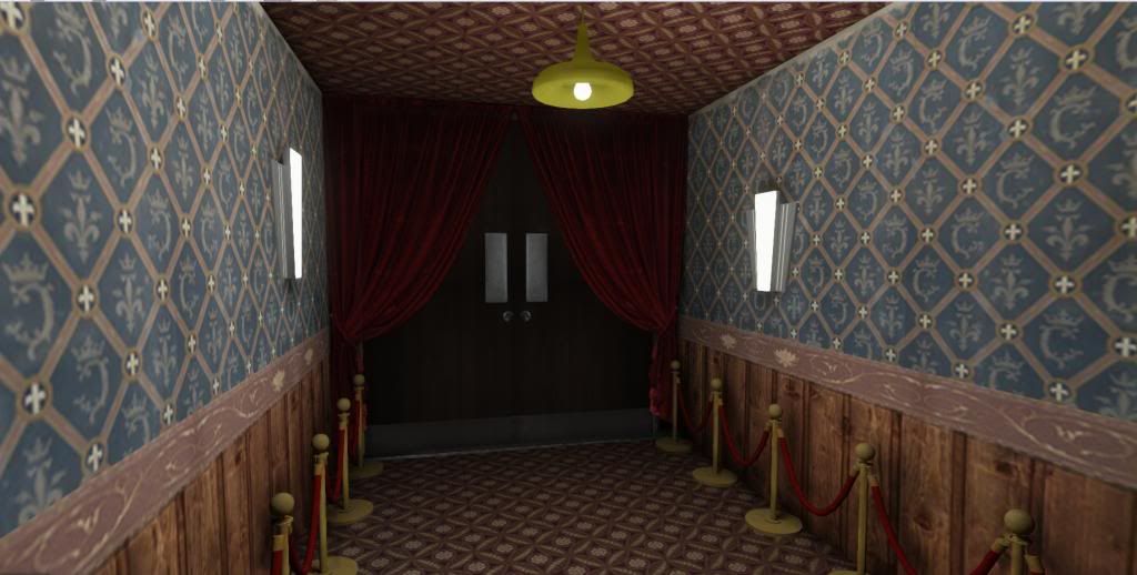
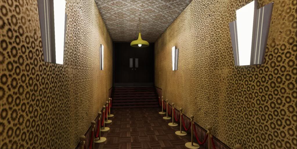
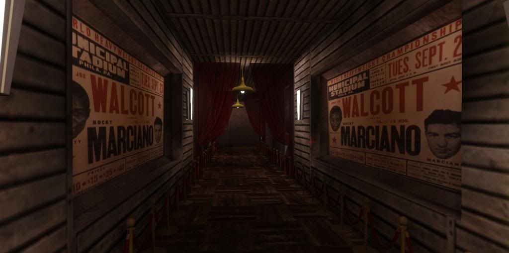
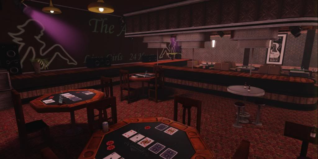
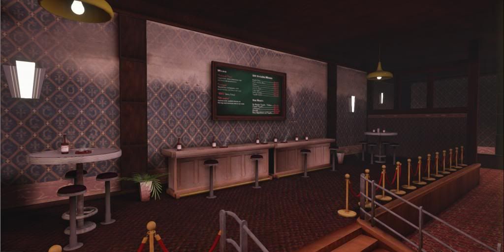
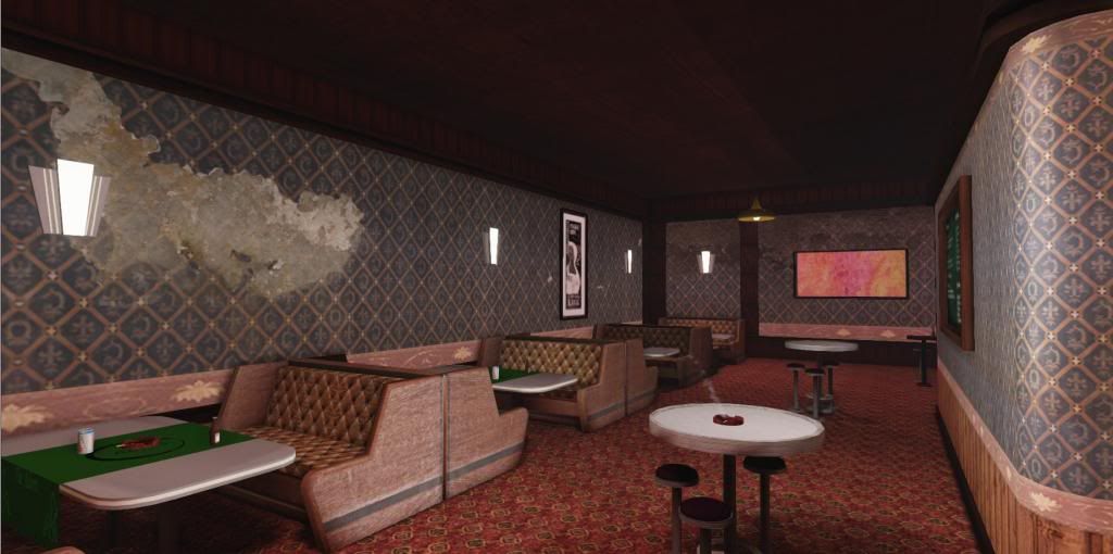
Hey everyone, This is my Final Year Project I have been working on this year for my dissertation. I would love some feedback on any errors you can see or anything that could improve my environment.
Thank you.
Thank you.
Replies
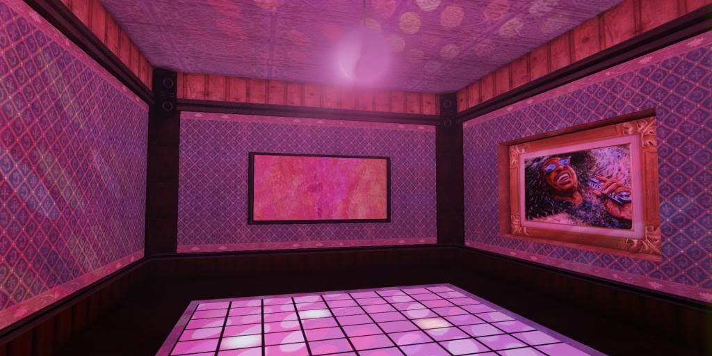
A lot of the text on the fourth image seems to be covered and you can't read what it says. I don't know if that was done on purpose, but maybe change it so you can read what it says.
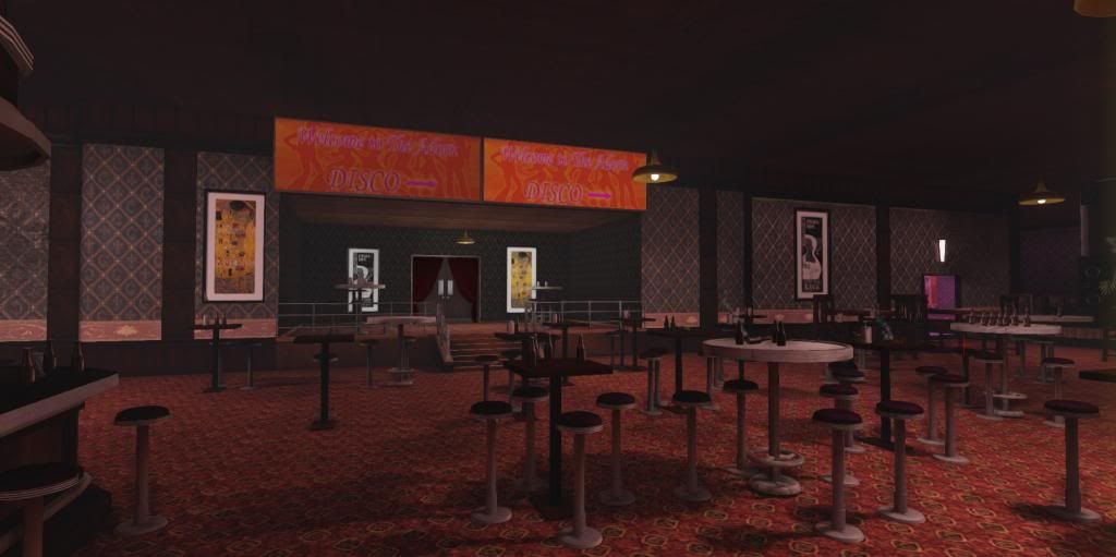
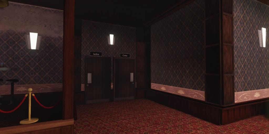
On the eighth image the two signs are really hard to read. Maybe change the color of the font or somehow outline the words to make it more readable.
Overall, very good job! I can tell you put a lot of work into this.