The BRAWL² Tournament Challenge has been announced!
It starts May 12, and ends Oct 17. Let's see what you got!
https://polycount.com/discussion/237047/the-brawl²-tournament
It starts May 12, and ends Oct 17. Let's see what you got!
https://polycount.com/discussion/237047/the-brawl²-tournament
FYP assignment
Hi everyone
I am currently attending university and I am currently working on my FYP an investigation into the aesthetic differences between survival horror and action based environments altering only lighting and texturing while keep the structure of the scene the same.
So far I am not massively pleased with everything but especially the lighting with the action scene any suggestions on how this can be improved would be great but any feedback would be greatly appreciated.
Action scene.
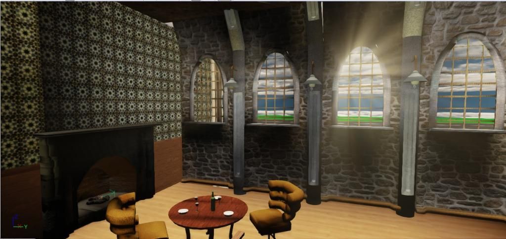
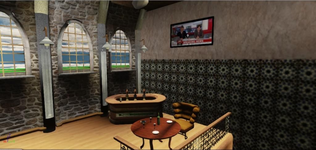
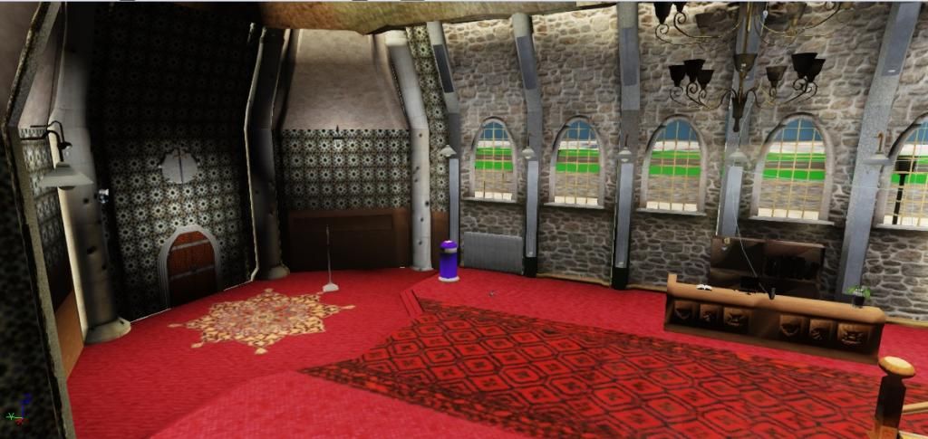
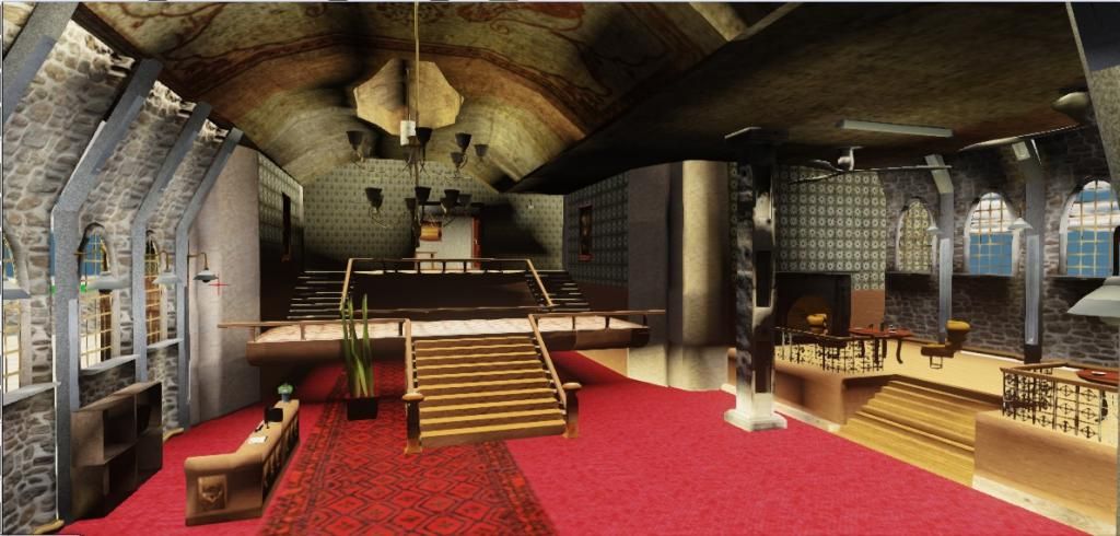
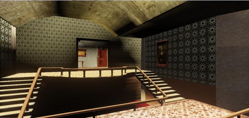
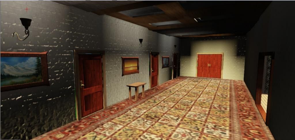
Horror scene
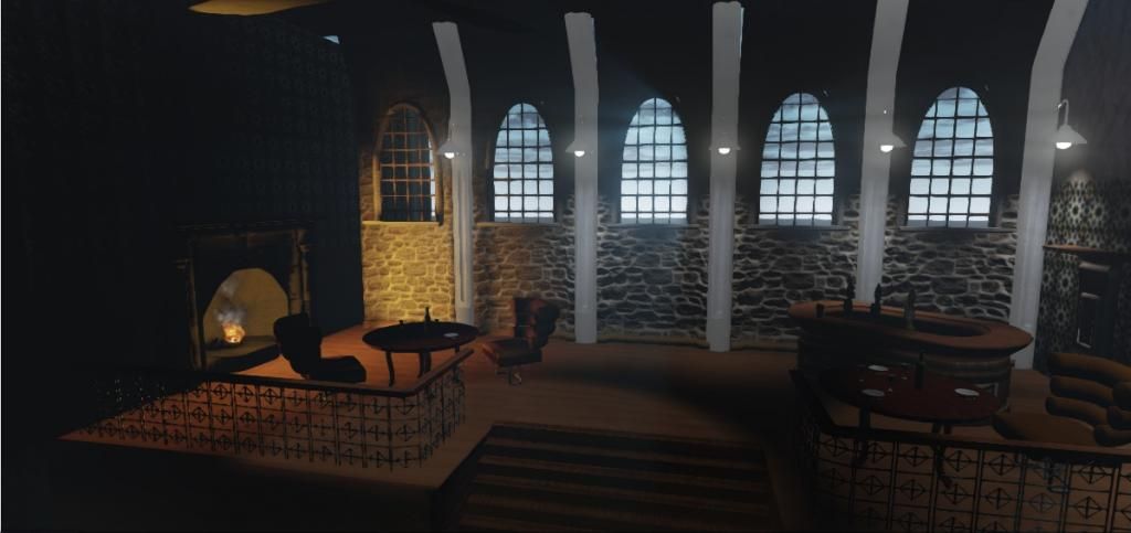
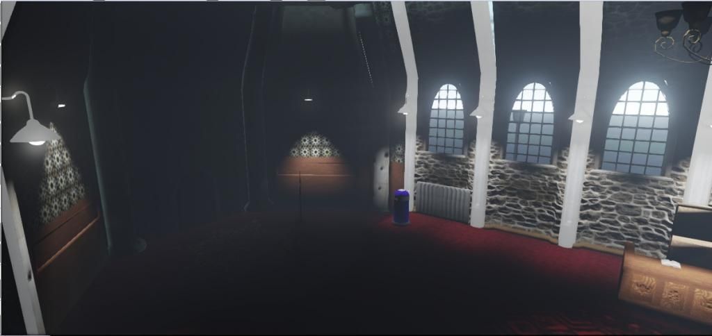
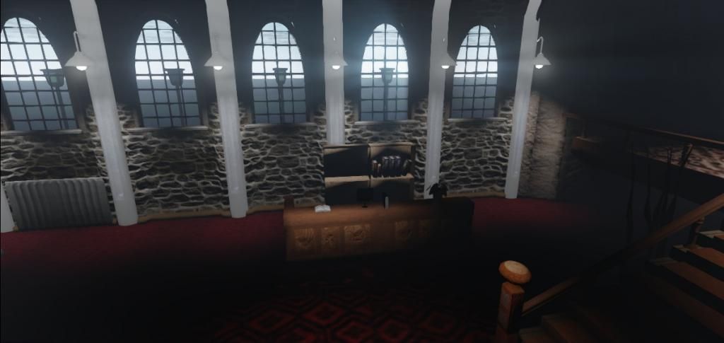
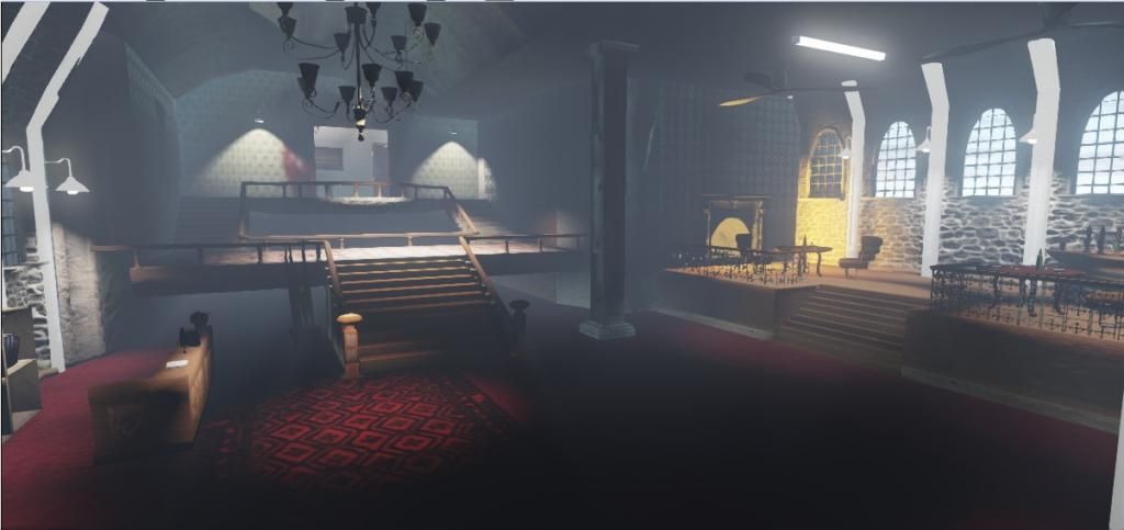
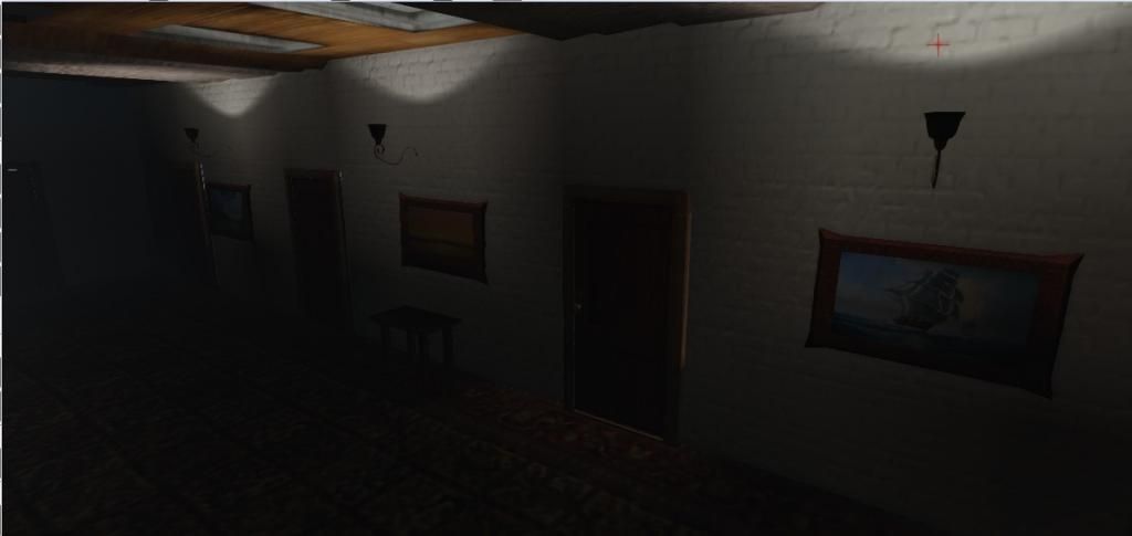
I am currently attending university and I am currently working on my FYP an investigation into the aesthetic differences between survival horror and action based environments altering only lighting and texturing while keep the structure of the scene the same.
So far I am not massively pleased with everything but especially the lighting with the action scene any suggestions on how this can be improved would be great but any feedback would be greatly appreciated.
Action scene.


Horror scene


Replies
I have made some progress since the last time the scenes were uploaded the lighting was improved and new particle systems and materials were added I have been having trouble with the lightning added into the horror scene I am trying to get a delay between the flashes and am not sure how to achieve this with a material any help or feedback would be appreciated thanks
action scene
horror scene
I'm using UDK the majority of the meshes have a sperate uv channel for the light maps though some of the smaller one's don't.
Since the last post I have created a bathroom to try and fill the scene out a bit. In response to the lighting problem I still have no idea what is wrong with it all the meshes have second uv channels on them so I have no idea why the lighting is behaving like this any help or ideas would be appreciated cheers.
Ambient occlusion will boost this a Lot. Still its very far from O.K. to be honest.
Also, your textures need alot of work. They don't feel linked at all in terms of style, and look like they were just made and thrown on without any regard to contrast and color.
I tried searching for a way to fix the lightmaps i came across a tutorial which said to sperate the sections of each island but when i applied it they made the light map worst i was wondering how i can fix the light maps?
I'm also lead to believe that the use of deferred shading in UDK doesn't require the use of light map, not sure how true this is, but worth trying, you will have to be running in DX11 if your not already.
http://udn.epicgames.com/Three/DeferredShadingDX11.html
I have checked all my meshes and all currently have 2 uv channels with no uv islands overlapping and at least one checker inbetween each island thats why i can't understand what seems to be happing to them i am currently running in directx 11 so i will look into deferred shading cheers .
I've just been tweaking it somewhat trying to get the lighting and textures looking a bit better.
horror scene
action
These are the latest updates of my scenes i have just been trying to improve the lighting as much as i can.
action scene
horror scene