The BRAWL² Tournament Challenge has been announced!
It starts May 12, and ends Oct 17. Let's see what you got!
https://polycount.com/discussion/237047/the-brawl²-tournament
It starts May 12, and ends Oct 17. Let's see what you got!
https://polycount.com/discussion/237047/the-brawl²-tournament
Portfolio Piece - Lumberjack's Cabin
Hey all,
So I'm working on a new portfolio right now (changed from the Mountain Castle) and I wanted to post some semi-regular progress in hopes to get some feedback as I keep working.
The idea is that eventually this will be made into a full scene of a Lumberjack/Hunter's cabin in a forest glen beside a stream. So far I've got the cabin built and textured and I'm going to start working on the interior now.
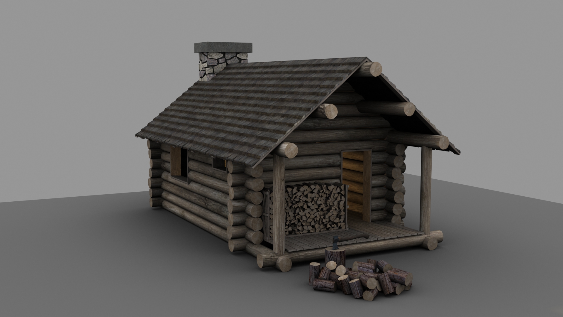
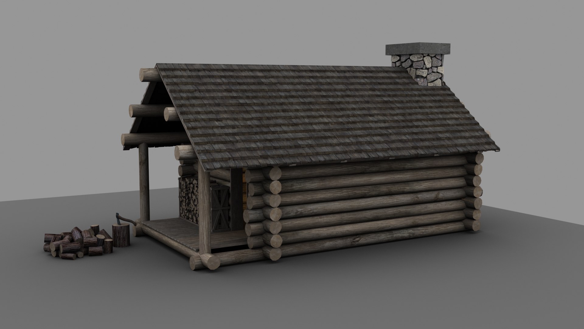
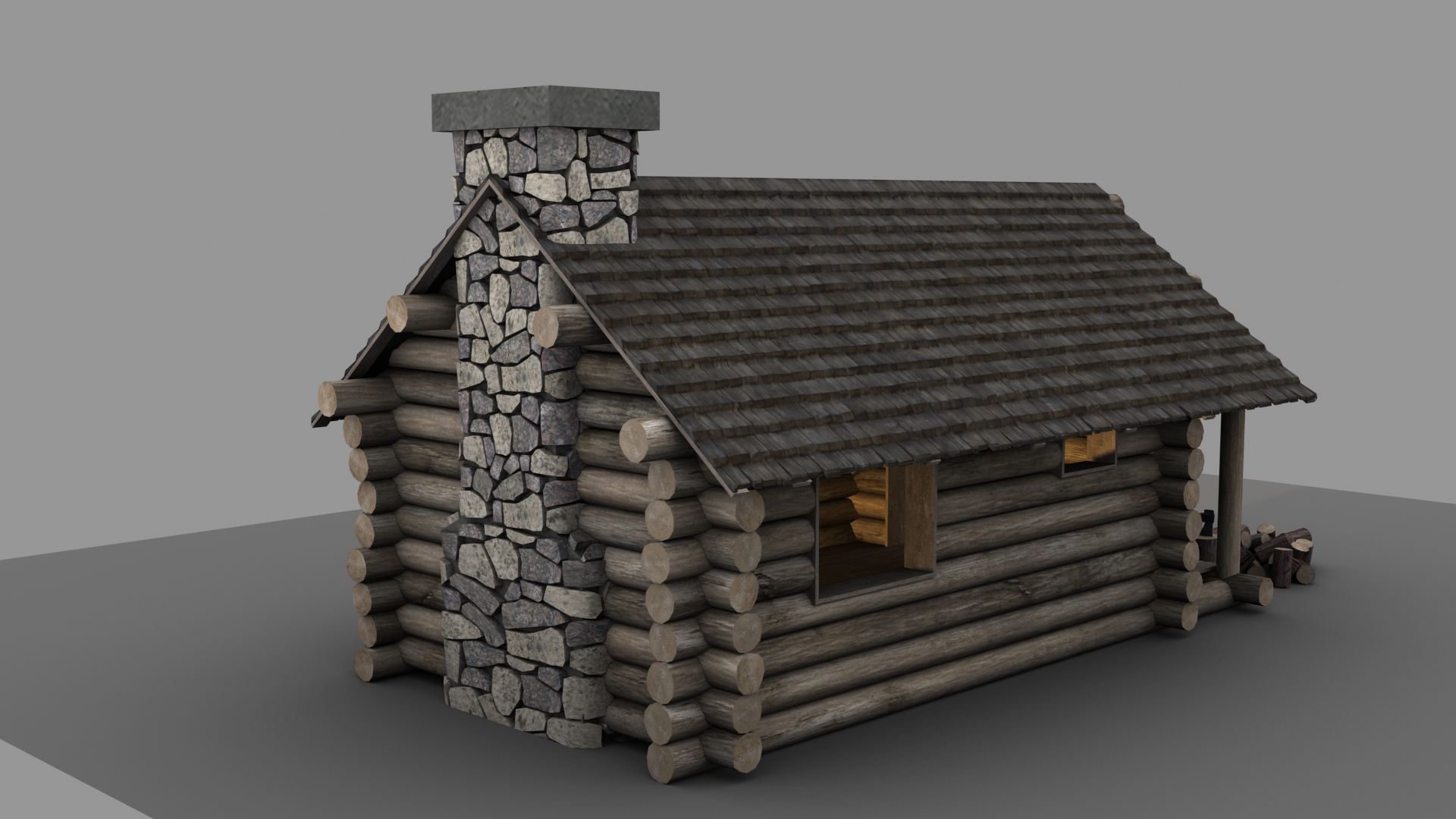
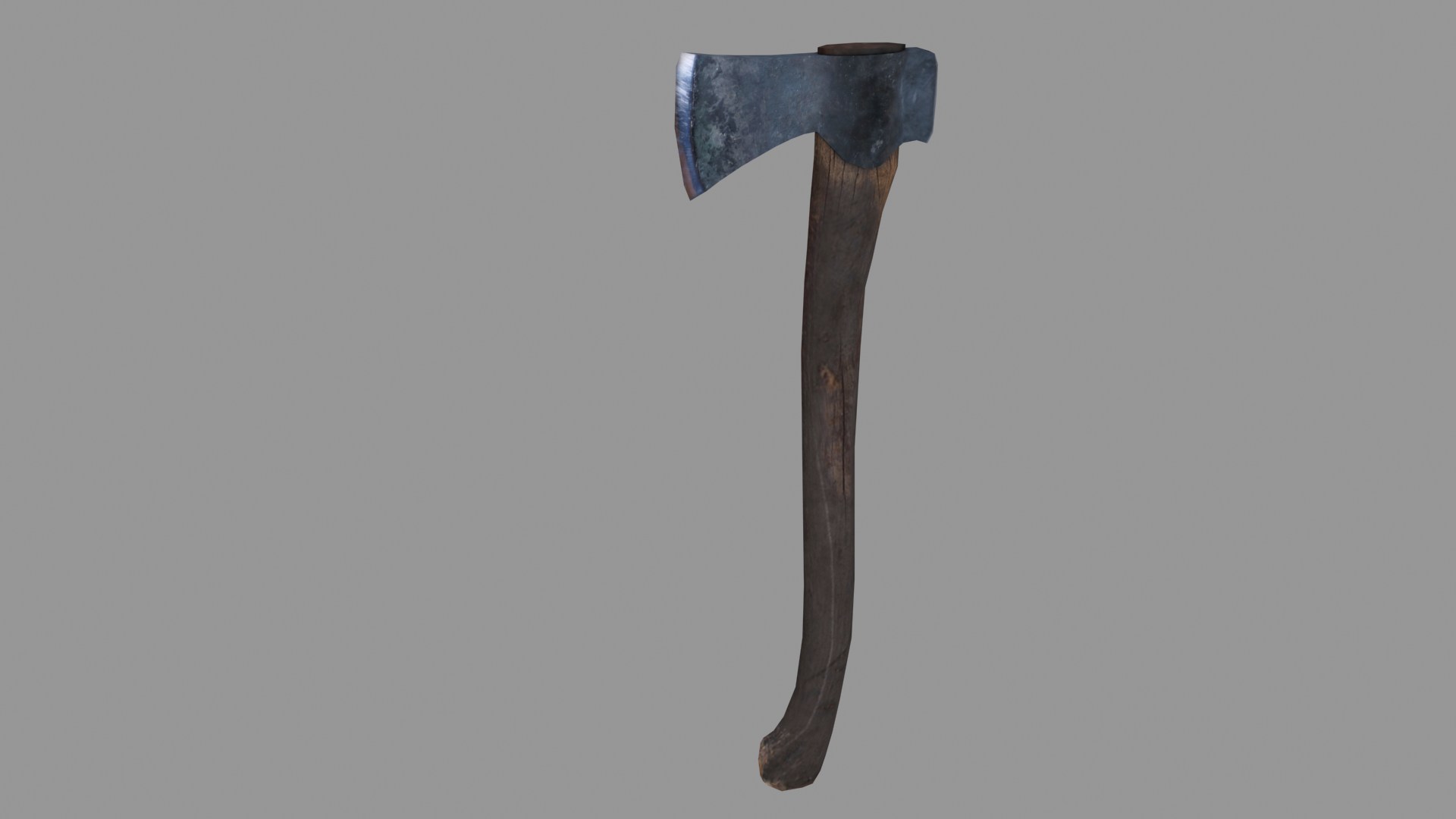
The idea is that I will build this out in multiple iterations meaning that at first I'm simply going to focus on the cabin itself, then the interior, then some props for building out the forest scene and then finally piece it all together inside UDK. This way if I run out of time, I'll still have some fairly good portfolio work at every stage.
Known Issues:
- There's no foundation. I plan to put place the cabin on some small rocks for a simple foundation but that will come later when I build out the scene geometry.
- The chimney rocks are all at the same depth. I'm going to work on varying the extrusion depth of each of the stones so it doesn't look so flat.
Would love some feedback.
So I'm working on a new portfolio right now (changed from the Mountain Castle) and I wanted to post some semi-regular progress in hopes to get some feedback as I keep working.
The idea is that eventually this will be made into a full scene of a Lumberjack/Hunter's cabin in a forest glen beside a stream. So far I've got the cabin built and textured and I'm going to start working on the interior now.


The idea is that I will build this out in multiple iterations meaning that at first I'm simply going to focus on the cabin itself, then the interior, then some props for building out the forest scene and then finally piece it all together inside UDK. This way if I run out of time, I'll still have some fairly good portfolio work at every stage.
Known Issues:
- There's no foundation. I plan to put place the cabin on some small rocks for a simple foundation but that will come later when I build out the scene geometry.
- The chimney rocks are all at the same depth. I'm going to work on varying the extrusion depth of each of the stones so it doesn't look so flat.
Would love some feedback.

Replies
Also, since it's a lumberjack's cabin in the woods, I feel like the place would be a little more roughed up. Here are some images I found that kind of represent what I was picturing as a lumberjack's cabin.
And here's an interior I thought was pretty cool, especially how almost everything is made of wood.
Subbing
Notice how large the shingles are, and how much they overlap. There's a great deal of variety, but a few large shingles were usually easier to make than many small ones.
The logs are of similar but different sizes, often with a slight taper towards one end; the actual size and amount of variance will depend on the type of trees used. You might also want to add an occasional stump or knot where branches were removed.
The chimney should be moved so that it is entirely outside the cabin. Enclosed and partially enclosed chimneys aren't seen in traditional log cabins.
Finally, notice the moss on the logs, similar to what you'd see on fallen logs.
Good luck with the model, look forward to seeing more
Yes the lighting is very flat. This is going to be in-game so I'm not going to waste time lighting it in max. I plan to rough the materials up a bit with some overlays for moss etc. Right now the entire cabin is built from one log material so if I paint moss etc. directly onto the material it will look terrible since every log shares the same UV space. Right now its purely diffuse. No normals yet so those should help greatly as well. I was trying to make it look like the cabin was just built recently and by a professional so that's why I didn't go for a really run down look but I'm trying to give it a feel of being hand built so that's why the ends don't line up perfectly. I'm also making sure to do this with the interior as well. Good idea with the knots. I'll probably make one or two modulars for that and scatter them around.
Loads of log cabins have straight cut ends. The 45 degree angles are from axe felled trees. This lumberjack uses a saw (though granted he would have needed help using it). I'm also thinking of adding a water powered saw mill to the site to help explain this and why the floor boards are so straight.
As for the chimney being partially inside the house, my reference image was
which is a newer house design so I might change it. My dad is an architect though so I'll ask him what he thinks. He didn't mention it when I showed him the pics though so I would assume its common.
Oh and as for the mud, I actually did quite a bit of research into this before starting and it really depends on the era the house was built in and the geographic location. In the wild west, they would often use mud or sticks to fill the gaps, but the Scandinavians used to simply notch the logs so that they fit into place perfectly and this design was later adopted by many different nations.
I didn't want to go as far as actually notching out the logs as it would create unnecessary polys, so I just intersected them to give the same look.
I also partially watched (my gf was watching) a show recently on netflix called "Happiness" which was about a Russian Woodsman who lived out in the wild in Siberia and built his own log home out there. Its what inspired me to want to work on this scene actually. I don't believe he used any mud in his cabin either, but I'll double check.
Very good point on the shingles being too small. I didn't even consider that in the design. To be honest, I just went with the best looking shingle texture I could find on cgtextures and tried to model it to look as if the shingles were extruded. If you look closely, I even made the last row of shingles individually and skewed them up or down and made them jut out or in ever so slightly to give the illusion that they are all individual pieces. Though now that you showed me that pic of larger tiles, I think I might go with this design. Not only will it save on UV space but I would also likely be able to model them all out without adding much to the total polys so thank you for the suggestion.
Thanks again everyone for the comments and feedback. I'll post an update as soon as its available.
Log Bed:
Log Bench: