ESCAPE - Fallen museum - JSargent
LATEST
[ame=" https://www.youtube.com/watch?v=IZLFPDXDqQY"]Jody Sargent- Natural History Museum - UDK - YouTube[/ame]


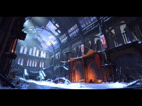
I want to do something quite architectural so I'm going to do a fallen version of the natural history museum. I've been there to get some reference and I'm blocking it out now I want it to seem like the knowledge that is there has escaped and been lost over time and it has all been destroyed. I'm going to do the central hall and try to give it an atmosphere of a kind of shrine. Also, a group of people have taken refuge there from the blizzard and have created a small stronghold. I'm looking forward to seeing what everyone comes up with!
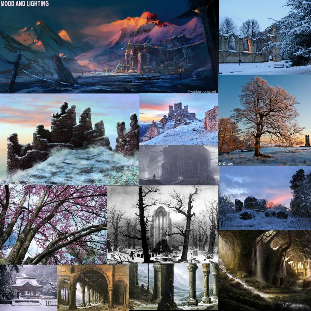
Here is a mood board for the lighting and atmosphere I want to go for....

[ame="
 https://www.youtube.com/watch?v=IZLFPDXDqQY"]Jody Sargent- Natural History Museum - UDK - YouTube[/ame]

I want to do something quite architectural so I'm going to do a fallen version of the natural history museum. I've been there to get some reference and I'm blocking it out now
Here is a mood board for the lighting and atmosphere I want to go for....

Replies
Oh and its all unlit in UDK
and still no lightmass
Also, I have some super basic lighting in now, my lightmass wont work so I have to transfer everything to another PC in order to light it
Looks really soft and balanced
Final little update for the evening
The only aspect which doesn't sit right with me is the hole in the roof... what caused the collapse? why aren't the adjoining parts of the roof affected and where is the rubble from the roof collapsing? If it was some kind of attack from the outside I would imagine some of the glass in the windows would be affected too...
Everything else is sweet! Keep it up guys.
Looking forward to seeing further development on this one!
I made a quick paint over to show you what I would suggest... just some changes to the roof destruction and the fire. As I said before, the barrel just seems out of place.
I also really like the idea you mentioned in the second post of a tree having crashed through the roof. You should definitely still add that as the reason why the roof is missing. Would look awesome seeing all the gnarled branches jutting into the building.
Fire also looks MUCH better, and as mentioned by
TorQue[MoD] that Trex skull does look awesome.
Keep it up!
YEY!
I would also like to say that not all structures have to seem "busy" there does not need to be too much "entities" to make it look good. What you have so far would work fine in a scene. I dont like when artists have big structures like this, they put so much fillers in it. It takes away from the beauty of the structure itself. If I were them, I'd rather spend my time in adding details in the structure :P
http://forums.cgsociety.org/showthread.php?f=185&t=691344
This is a very iconic building, so its not really surprising if it shows similarities to that CGTalk model.
http://gallicka.com/gallery/albums/tvshows/walking%20dead/Walking%20Dead%20S03/WD312HD/01/WD312HD_0404.jpg
http://media.salon.com/2012/04/booby-traps-hiking-trail.jpeg3.jpg
Scaffoliding to the roof would be nice, so that I can scout the area and perhaps snipe the intruders.
http://2.bp.blogspot.com/_bK55Vm5cvJA/SbXhfwkLx0I/AAAAAAAAAa4/GziiUaljxb4/s400/paintball+(8).jpg
Looks really cool.
As for the comments about it looking like the CGTalk model, you can tell by looking at his portfolio that he didn't download models to put this together.
The only minor thing I could say is to try to not let your atmosphere wash over the entire scene so that you can still have that full range of tones. I think it's gotten much better, but earlier it was a drying out some of the shot. I'd aim to have the foreground a little crisper/darker with a gradient that sweeps into the richer atmosphere and lighter values under the crashed window. If you could just get a little bit more darks into the first arch area (and less of the fog) you're going to end up with a really awesome range of values. But, that's terribly nit-picky because honestly, it's looking fantastic. I also wonder how those oranges would bounce up onto that second story, especially over those awnings. Is that happening naturally, or did you accentuate the bounce by adding additional lights?
Either way, great work!
-Jon
Thanks
I think I actually preferred everything in the last screen. The T-rex placement was much better, the banner hanging from the arch was a nice touch and the lighting at the end was more attractive too. The only thing I like better about this one is that you can see the moonlight coming through the window and the colors on the banners at the bottom left look much better. Oh and removing the flaming barrel on the steps was a good idea too.
Ooh and I added the new sky and added some blustery wind particles to the snow effects
Here is a little closep too...
Agreed!