Shipping Container Model - Looking for crits
polycounter lvl 8
Hi all ") , I've posted before, but I mainly lurk out of nervousness. Anyway, at the behest of my drive to improve my skills, I want to show you all this model I worked on for a few days in order to receive some feedback. I have been trying to get better at understanding normal mapping and texturing, so this was an exercise in that. Onto the art:
, I've posted before, but I mainly lurk out of nervousness. Anyway, at the behest of my drive to improve my skills, I want to show you all this model I worked on for a few days in order to receive some feedback. I have been trying to get better at understanding normal mapping and texturing, so this was an exercise in that. Onto the art:
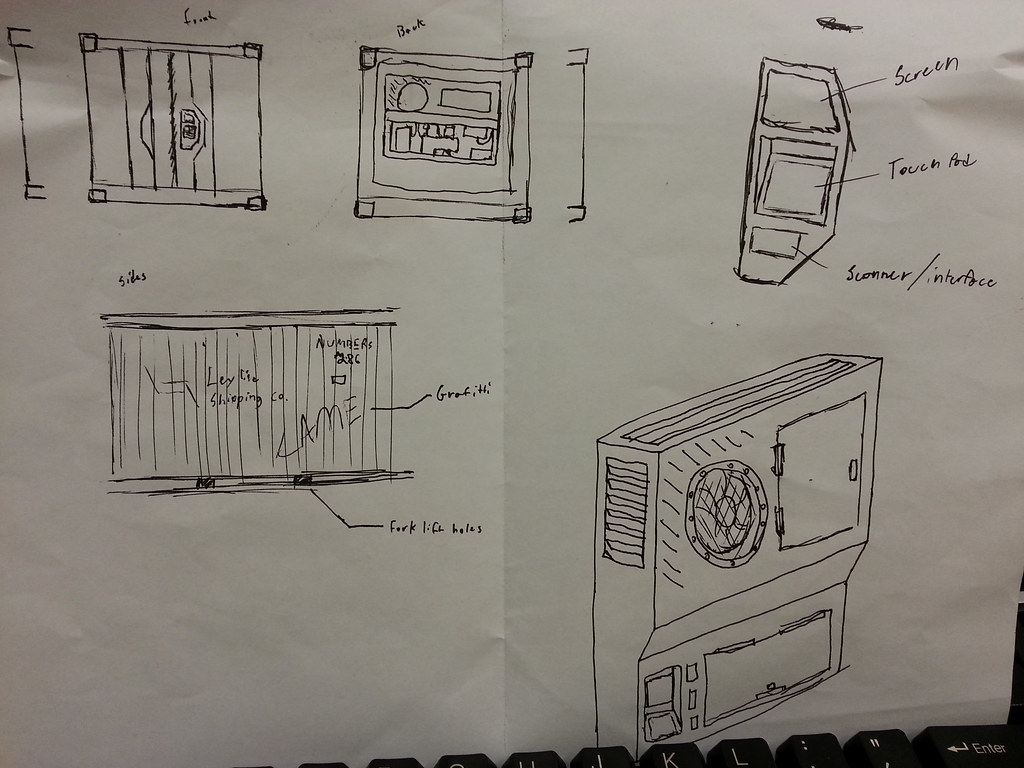
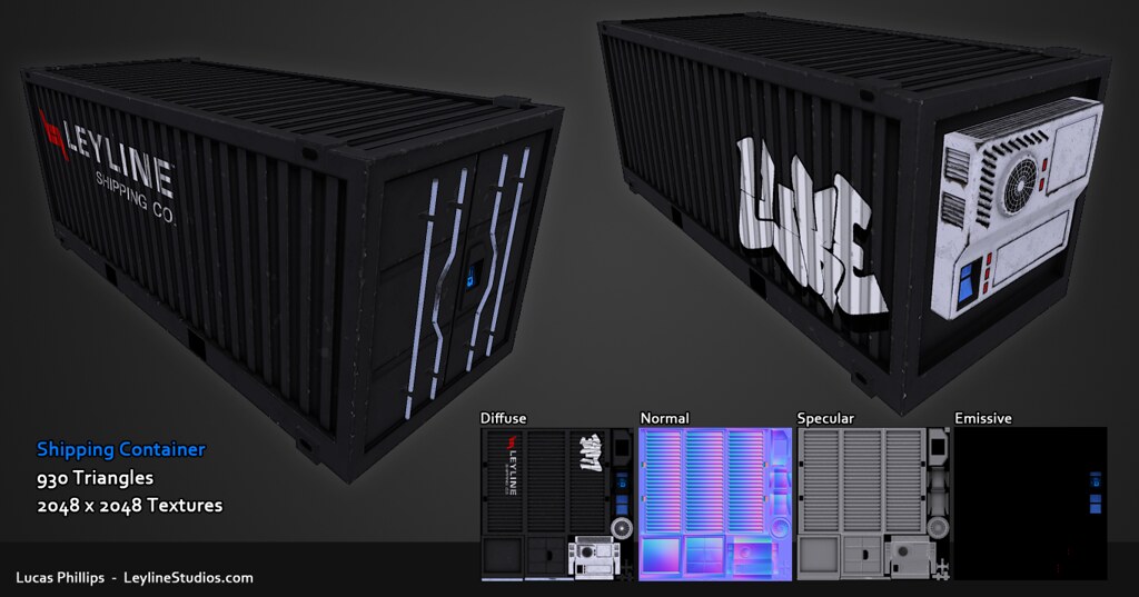
It started as a sketch showcasing some things I wanted to see on the container. Mainly a refrigeration unit.
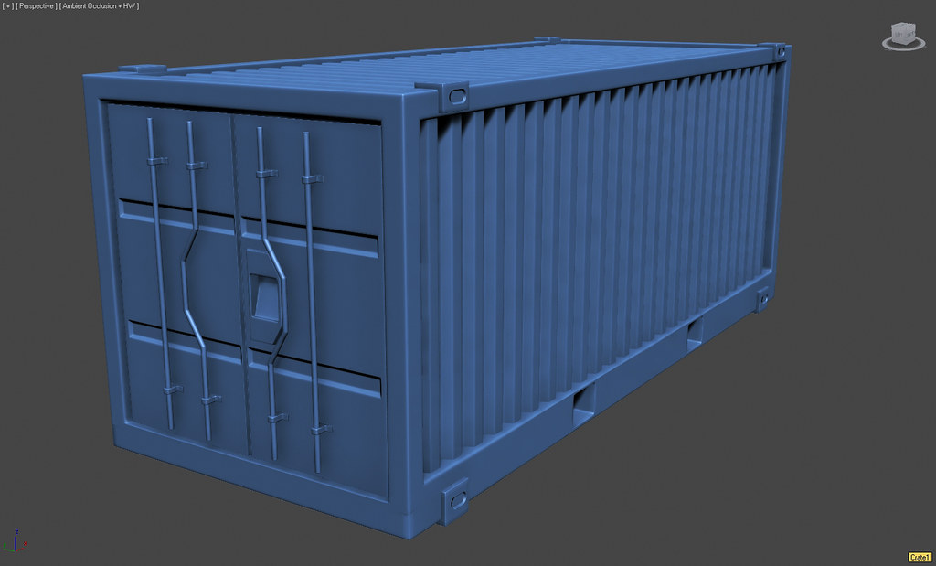
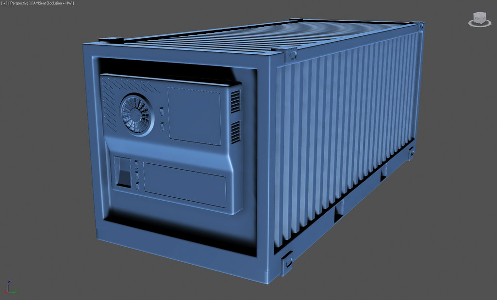
Then I blocked it out, and took each one of those pieces and created a high-poly version.
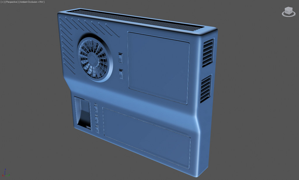
Detail of the refrigeration unit:
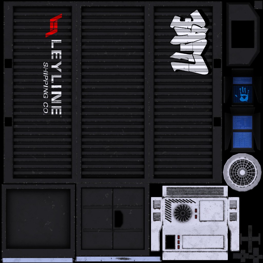
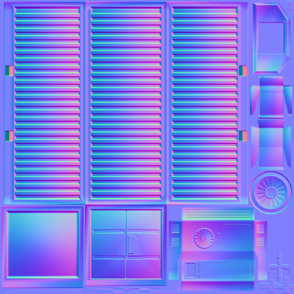
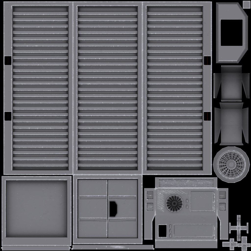
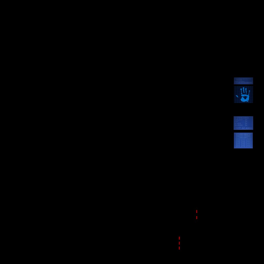
Then, I did what I thought was an "exploded bake," but I'm pretty sure I screwed that up a bit. Eventually I had decent looking normal map, and a pretty good ambient occlusion map. Using those, I created a basic diffuse map with mainly solid colors. Then I tried out dDo for adding some srapes etc.. Next, I went in and cleaned up some of those details and added some of my own. Finally I had these maps:
Diffuse:
Normal:
Specular:
Emissive:
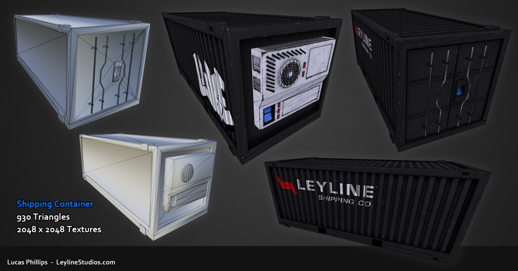
Overall, I'm somewhat satisfied with the textures and the model itself. It's one of the first things I've finished with this workflow. I'm sure there are areas that could use significant improvement, but I am still learning. Here are some portfolio shots I made up in photoshop:
And check it out in 3D here.
Getting to the end of this model raised several questions and brought up some things I am just not sure about.
1. Am I incorrect in assuming that an exploded bake involves the separation of pieces and individually rendering each object to texture? It wasn't until I finished my bakes and had 12 different .tga's to combine that I felt like I was doing something stupid.
2. What are the limitations of editing geometry after you have created a UV layout for it? I screwed up big time and ended up with some z-fighting on the mesh I thought was "done." Unwrapped it and everything. I fixed it by moving some verts around, and it seemed to keep everything intact. But it made me wonder what changes on a UV layout if you change the geo.
Other than that, any crits would be greatly appreciated. On anything and everything. From the model, to the textures, to the production shots.
Thanks for checking it out!
It started as a sketch showcasing some things I wanted to see on the container. Mainly a refrigeration unit.
Then I blocked it out, and took each one of those pieces and created a high-poly version.
Detail of the refrigeration unit:
Then, I did what I thought was an "exploded bake," but I'm pretty sure I screwed that up a bit. Eventually I had decent looking normal map, and a pretty good ambient occlusion map. Using those, I created a basic diffuse map with mainly solid colors. Then I tried out dDo for adding some srapes etc.. Next, I went in and cleaned up some of those details and added some of my own. Finally I had these maps:
Diffuse:
Normal:
Specular:
Emissive:
Overall, I'm somewhat satisfied with the textures and the model itself. It's one of the first things I've finished with this workflow. I'm sure there are areas that could use significant improvement, but I am still learning. Here are some portfolio shots I made up in photoshop:
And check it out in 3D here.
Getting to the end of this model raised several questions and brought up some things I am just not sure about.
1. Am I incorrect in assuming that an exploded bake involves the separation of pieces and individually rendering each object to texture? It wasn't until I finished my bakes and had 12 different .tga's to combine that I felt like I was doing something stupid.
2. What are the limitations of editing geometry after you have created a UV layout for it? I screwed up big time and ended up with some z-fighting on the mesh I thought was "done." Unwrapped it and everything. I fixed it by moving some verts around, and it seemed to keep everything intact. But it made me wonder what changes on a UV layout if you change the geo.
Other than that, any crits would be greatly appreciated. On anything and everything. From the model, to the textures, to the production shots.
Thanks for checking it out!
Replies
I like the sci-fi-ishy look of it with the hand scanner.
But the grooves on the front door of the container look a bit warped, not straight.
Other than that I would try some other color pallet with it, or maybe not, your choice
On the back side, keep in mind that these containers are designed to be packed tightly - try to inset the refrigeration unit a bit more so it does not extend beyond the dimensions of the box.
Finally, don't limit yourself to a single texture - every shipping company has its own color & logo. Something like the following could be made almost entirely from your model:
Try to get some more detail in your spec map. In particular, the areas where the paint is chipped will have exposed metal and would probably be pretty shiny.
Also the cooling unit is REALLY white, maybe tone that down/dirty it up some.
Since this container is "used" enough to have graffiti, it should probably also have some rust, which would help you get some color variation too.
Re: baking, you don't need to bake each exploded piece individually, you can do it all at once. Either copy your models and explode the copies (they will maintain the same UVs) and then bake, or else set up keyframes using your existing objects so they are together on frame 1 and exloded on frame 30, for example.
@DWalker - It's funny, both of those images were in my reference folder for this project. There is some back story that I originally should have pointed out. Long story short, I wanted the container to look like a spyhunter/Ironman/corporate kind of thing. So I knew I wanted it to have a biometric scanner. I also wanted it to stand out from other containers, and the one way I came up with was the handle shape. I figured that on most containers they lock the doors and serve as handles, but on this futuristic crate I figured the locks would be mostly internal, but the crate would still need handles for functionality and recognition from a design standpoint. I wanted it to look like it's owned by some ominous corporation or something that makes you wonder what's in it.
You're right about the refrigeration unit. I actually had it inset a bit more than it is currently. I didn't like how it looked so I moved it out a bit. But it does ruin it's ability to be stacked tightly.
@Broadway - Thanks for your advice. I'm going to try that when I bake my next model. Also, I might try and make the fan unit gray or something. You're right, it's much too bright methinks.
Rust. That's a great idea too. One of the problems I have though, is I can't really get my spec map to illustrate the highlights the way I want it to in Marmoset. I think I need to pump up the contrast significantly and play with the numbers a bit. I'll give it a shot, thanks.
I'm going to try and make some updates, taking all this stuff into consideration.:)