Hand Painted: Legend Of Aang, Space Sword
Hi!
This is my first time posting work to Polycount, and my first attempt at hand painted textures!
I figured a weapon with a few different materials to it would be a good starting point. Being a fan of Avatar and Legend Of Korra I figured something from either series would be fun.
Reference
I gathered up my reference's including some of the original concepts and sketches of the blade, some shots of the show, and even some fanart.
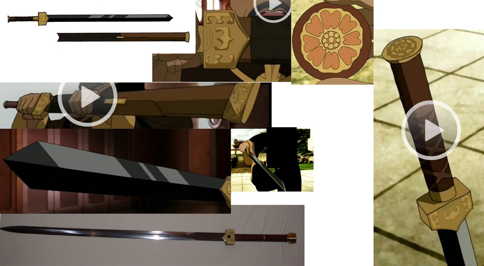
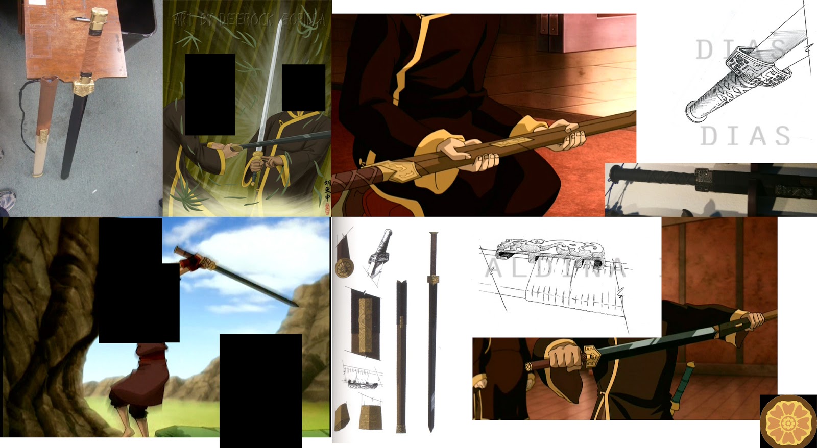
I've tried to censor out any particularly spoilerific content, although some of you might just be too clever. Sorry if that's the case!
I even managed to find the martial arts consultant for the show, and after asking if I could see the original sword it was based on, he kindly obliged!
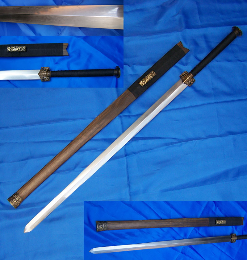
A big thanks to Sifu Kisu!
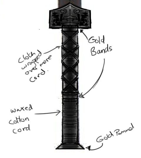
My own concept/sketch
This was my breakdown + redesign of the handle. It would go on to have further changes made to it.
Modelling
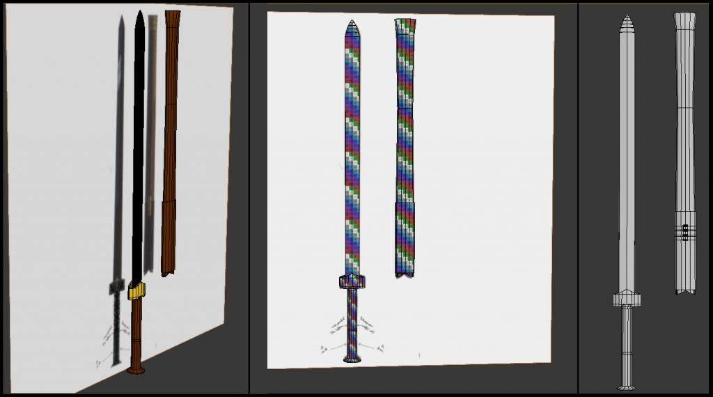
Modelling using the concept as a Proportion Reference;
Unwrapped;
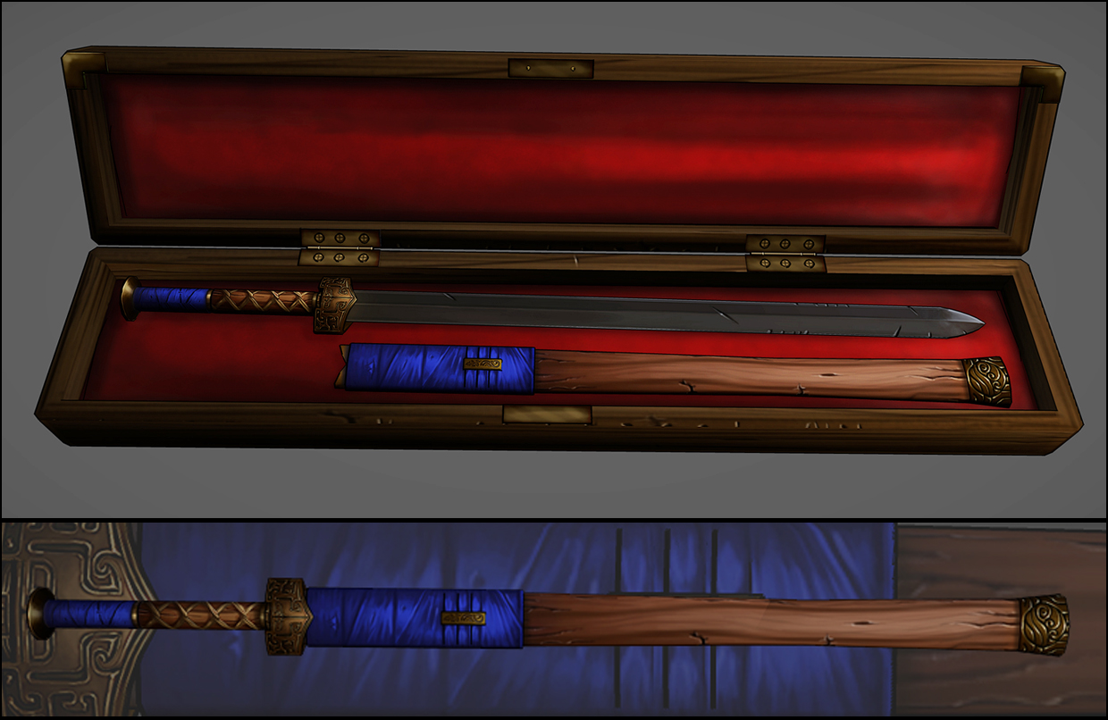
Finished Model With Additional Clip On Sheath.
Texturing
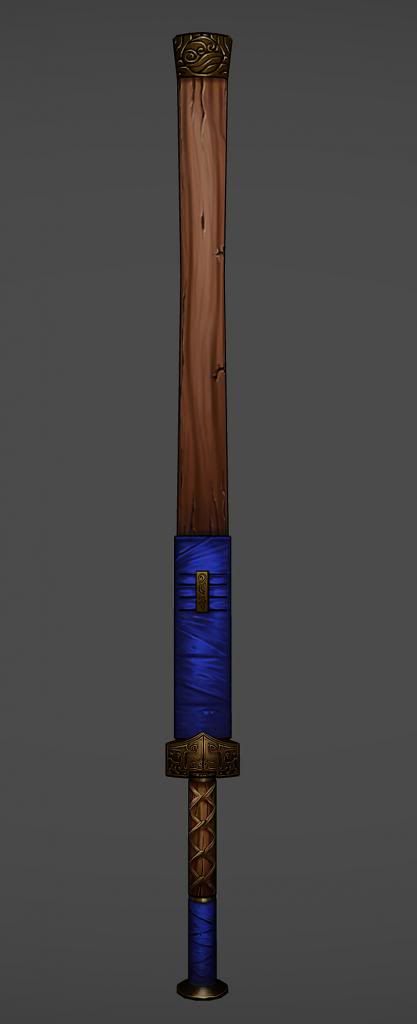
The Handle
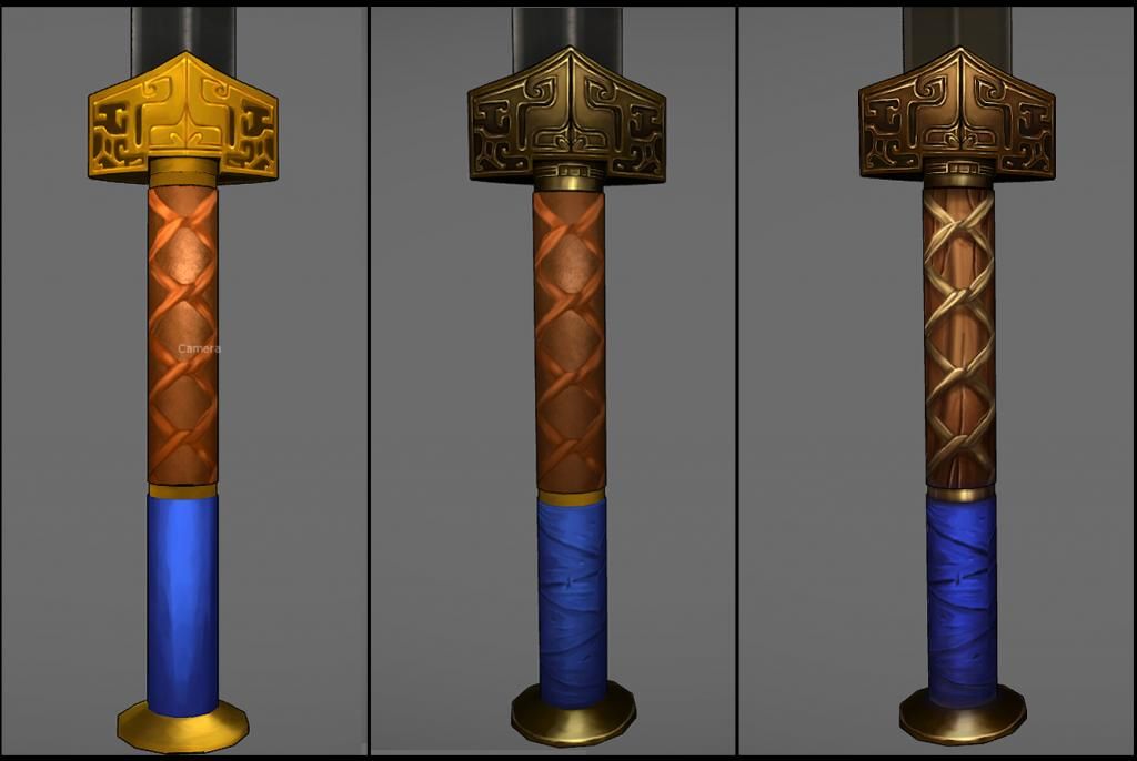
At this early stage I wasn't really happy with anything. Especially not the golden guard at the top.
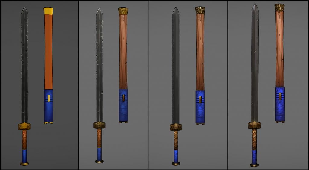
In the end I found that painting cord didn't work and a cloth wrap would be better. After a lot of repainting I made some progress.
After much updating I managed to get the right look. I refined the matrix of light fabric wrapping around the top and added shadows underneath them to make them seem more 3D.
The Sheath Cap
I really wasn't certain how the sheath or the cap would turn out as all my thought had gone into the sword.
The wood came surprisingly easily, and raised the bar for everything else. I changed the design on the cap to something more relevant to the owner.
After getting the gold right on the sword I knew I would have to match it on the sheath cap. I may have over done it though.
The Final Product
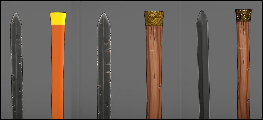
Early days, and the blade just doesn't seem right. It feels to flat and overly damaged.
Everything else is starting to come along nicely but in the back of my mind the blade is still bothering me.
After a lot of research I spend a good while trying to get a good base to add the damage and colour bounce to. This took some time, but eventually I got there.
Presentation Shots
I made a case to present the sword in, as if it were perhaps resigned to a museum in post war glory.
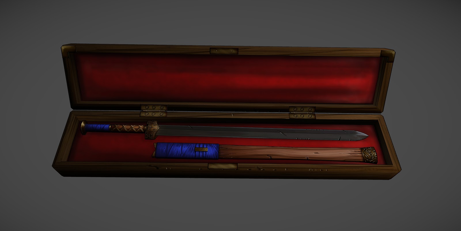
This was also a good opportunity to use up some left over UV space.
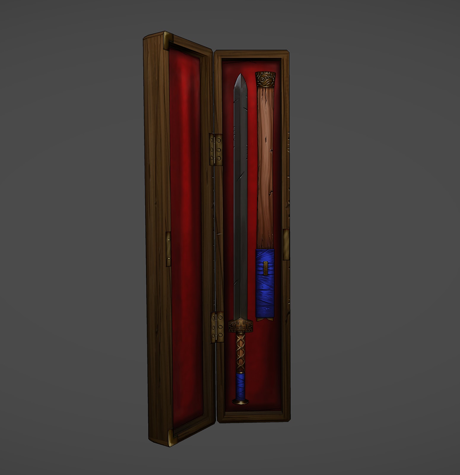
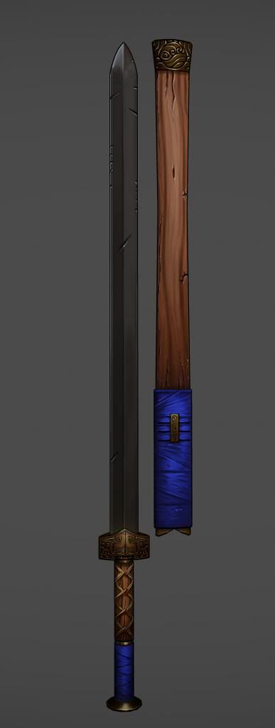
High Res Version
High Res Version
Lessons Learned:
Useful Links:
The hand painted weapon tutorial on 3DMotive really helped get me started.
I studied the texture for Bogdanbl4's Barbarian Girl quite a bit to help me improve my own.
This is my first time posting work to Polycount, and my first attempt at hand painted textures!
I figured a weapon with a few different materials to it would be a good starting point. Being a fan of Avatar and Legend Of Korra I figured something from either series would be fun.

Reference
I gathered up my reference's including some of the original concepts and sketches of the blade, some shots of the show, and even some fanart.


I've tried to censor out any particularly spoilerific content, although some of you might just be too clever. Sorry if that's the case!
I even managed to find the martial arts consultant for the show, and after asking if I could see the original sword it was based on, he kindly obliged!

A big thanks to Sifu Kisu!
My own concept/sketch
This was my breakdown + redesign of the handle. It would go on to have further changes made to it.

Modelling
Modelling using the concept as a Proportion Reference;
Unwrapped;
Finished Model With Additional Clip On Sheath.

Texturing
The Handle
At this early stage I wasn't really happy with anything. Especially not the golden guard at the top.
In the end I found that painting cord didn't work and a cloth wrap would be better. After a lot of repainting I made some progress.
After much updating I managed to get the right look. I refined the matrix of light fabric wrapping around the top and added shadows underneath them to make them seem more 3D.

The Sheath Cap
I really wasn't certain how the sheath or the cap would turn out as all my thought had gone into the sword.
The wood came surprisingly easily, and raised the bar for everything else. I changed the design on the cap to something more relevant to the owner.
After getting the gold right on the sword I knew I would have to match it on the sheath cap. I may have over done it though.

The Final Product
Early days, and the blade just doesn't seem right. It feels to flat and overly damaged.
Everything else is starting to come along nicely but in the back of my mind the blade is still bothering me.
After a lot of research I spend a good while trying to get a good base to add the damage and colour bounce to. This took some time, but eventually I got there.

Presentation Shots
I made a case to present the sword in, as if it were perhaps resigned to a museum in post war glory.

This was also a good opportunity to use up some left over UV space.


High Res Version

High Res Version
Lessons Learned:
I learnt so much from this, and whilst it took a lot longer than expected, it was worth the investment.
Hand painting is certainly something I'd do again, although in future I'd like to try the sculpting method.
There are many things that I can see that would improve this piece but there is a danger of being in an endless update cycle. Seeing a project through to completion was another important thing for me.
Credit:
A big thanks goes to all my friends who gave extremely useful input throughout the duration of this little project, (Jake, Pav, Geno, Shiv, Mira and anyone else I missed). Without their help I would not have got this far.:thumbup:
I'd love to hear your thoughts, any crits and suggestions I can take on-board for my next project! :)
:)
I'd love to hear your thoughts, any crits and suggestions I can take on-board for my next project!
Useful Links:
The hand painted weapon tutorial on 3DMotive really helped get me started.
I studied the texture for Bogdanbl4's Barbarian Girl quite a bit to help me improve my own.
Replies
I agree with you, the sword does lack the metallic sheen a blade should have. If I return to this I will definitely act on your suggestion, but if not then it is in my mind for the next project.
Thank you again! =]
only crits i have is the uneven scale of detail.
most of the details on the hilt are rather large, while the sword has a finer detail density.
but that would just be the cherry on the cake.
nicely done!
@Jess: I truly appreciate that! Your provincial villa scene was actually a large part of what got me into the idea of hand painting. Looking forward to more Chew Magna.
@Murph: Thank you!
@Autarkis: Thanks a lot! I love that episode, what a crazy coincidence! Or maybe fate =O
@jfeez: You were a lot of help during that time, the journey and the development was so great I'm glad others were along for the ride with me. As for the next project, well, you'll clearly get a very advanced pre-screening. =P
The 'useful links' is a great idea that would be a great idea on any finished project thread
After seeing the photo ref you used, I see the real dark bits on the golden hilt were meant to suggest holes going right through. But the shadows on the sheath cap are just as dark. I'm not sure if its possible to make the hilt look like it has holes going through is fully possible with a 2d texture on flat geometry, but maybe you coulda strengthened the idea of it by making the shadows in the sheath cap lighter? Well I also realize you weren't trying to replicate the reference, but just something to think about lol
The useful links seemed appropriate, after all, its about sharing the knowledge with everyone. Hopefully someone doing something similar will find use for them.
From the very start I knew that it would be impossible to paint the gaps between the ornate details, and I certainly wasn't going to model them in. So I choose to have the details rest on top of a base plate instead. This was much easier from a painting point of view, and still looks as nice!
haha, love that show, and this is looking great. Nice work.
@Wester: Cheers! Loved your 1940's New York; looking forward to more of the Maintenance Bay. =D
@$!nz: Very much appreciated, I feel more confident with them now. =]
@openstheway: Cheers!