[WIP] MK Training Dojo
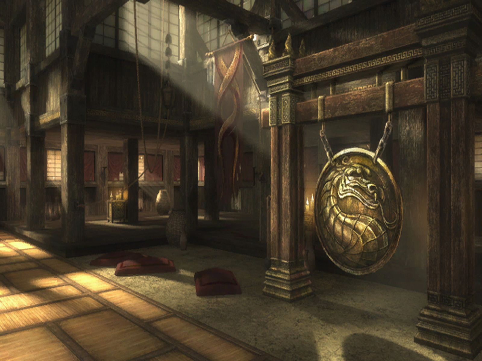
Hi Polycount, this is my first artwork thread. For my university module we were given an assignment which is basically the Brawl challenge, for mine i chose to re-imagine the Training Dojo from Mortal Kombat 9:


My re-imagination design was to first take the original scene, age it and have it neglected and then combine it with an industrial scene such as a factory but still keep the feel that the original concept did to keep it recognisable.
Here is my current shot of the scene that was handed in with the last submission:


I am aware that there are errors within the scene as it stands, such as the texture on the end of the pillar at the front, there are some lighting errors, some of the textures were incredibly rushed and the scene is lacking a lot in post processing etc but i would appreciate any feedback or advice that can be given for the environment as it stands. I need to make it presentable and do a paint-over of any changes and improvements that can be made to the level over the next week.
I can post any shots of alternate angles or individual meshes, wireframe views etc if that will help.
Thankyou for taking the time to read this and i hope you can help
Arizia~


My re-imagination design was to first take the original scene, age it and have it neglected and then combine it with an industrial scene such as a factory but still keep the feel that the original concept did to keep it recognisable.
Here is my current shot of the scene that was handed in with the last submission:


I am aware that there are errors within the scene as it stands, such as the texture on the end of the pillar at the front, there are some lighting errors, some of the textures were incredibly rushed and the scene is lacking a lot in post processing etc but i would appreciate any feedback or advice that can be given for the environment as it stands. I need to make it presentable and do a paint-over of any changes and improvements that can be made to the level over the next week.
I can post any shots of alternate angles or individual meshes, wireframe views etc if that will help.
Thankyou for taking the time to read this and i hope you can help
Arizia~
Replies
Way too much stength on the DoF here but it was my first test xD