Home 3D Art Showcase & Critiques

Fable Village

polycounter lvl 6
Offline / Send Message
theonewhoknocks polycounter lvl 6
Hey Polycount, I'm recreating the scene from this concept art that was made for Fable, and wanted to get some feedback on how the blocking out looks so far. Let me know. I haven't done any of the lighting yet, just wanted to start a thread to show progress.
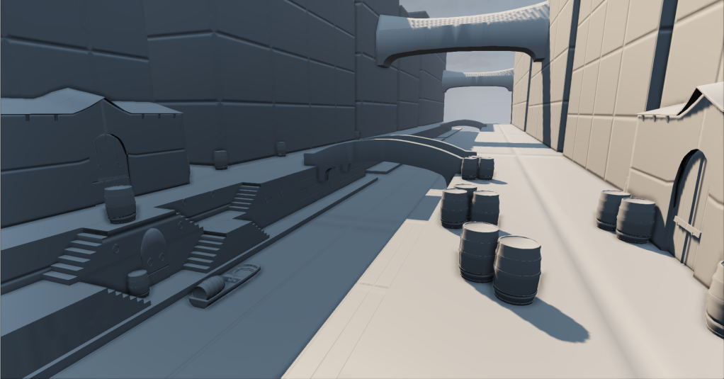
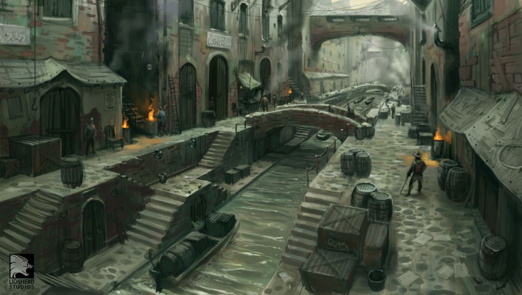
Capture.png

emrah_bws_industrial1.jpg

Replies

  • theonewhoknocks
    Offline / Send Message
    theonewhoknocks polycounter lvl 6
    It's been awhile since I've posted an update for this but so far this is what Im at now.

    SS_85_Village_zpsdd861008.jpg
  • sybrix
    Offline / Send Message
    sybrix polycounter lvl 13
    Coming along nicely.

    I think you have some scale issues here. The concept has some nice figures scattered around for scale reference. Do you have a scale figure you can duplicate around the scene next to doorways, crates, etc. so that you can maintain consistent scale?

    For example that boat looks super tiny.
  • theonewhoknocks
    Offline / Send Message
    theonewhoknocks polycounter lvl 6
    Yeah I do see that now. I'll definitely fix that.
  • theonewhoknocks
    Offline / Send Message
    theonewhoknocks polycounter lvl 6
    Improved the scaling a bit. Let me know what else you think might need improvement. Thanks guys!

    Highres_Screenshot_00001_zps8477278d.png
  • BARDLER
    Offline / Send Message
    BARDLER polycounter lvl 12
    I am not really sure what you used, or how you went about making the ground texture but it is not reading at all. The concept shows more of a cobblestone set in concrete look, kind of like this.
    321297.jpg
    Recycled+concrete+porch+walkway.jpg
    Your ground is reading more like dirt or mud to be honest.
  • ayoub44
    Offline / Send Message
    ayoub44 polycounter lvl 10
    the brick bridge it's too small and clean ; you sould realy use some very broken big brick ; i recommend you to sclupt it and try to use vertex painting to get some dirt in between the bricks . for the far away houses , are u using DOF ? i think you should use fog and make it green :) . you are now really getting thing in place you just have to give them more time and details

    hope this help and good luck :)
  • TheDerpyChicken
    I agree. The bridge looks too clean. The wall looks broken by the walkway in the lower left hand corner of the image and I think if you used that style of brick on the bridge, it would fit with the rest of the scene.
  • theonewhoknocks
    Offline / Send Message
    theonewhoknocks polycounter lvl 6
    Thanks for all the feedback guys. I greatly appreciate it! I fixed the ground and made it look more like rocks or cobblestone like ground. Also did a little more damage on each side of the ground walls. Also did some adjustments to the bridge and sculpted a bit of damage on it and well as layover a different material. I think I might have to rework the bridge again though, im not liking how its looking right now.

    Highres_Screenshot_00000_zps00b8d77a.png
  • theonewhoknocks
    Offline / Send Message
    theonewhoknocks polycounter lvl 6
    Also re did the water material
  • Vonklaus
    First off, I am loving the concept that you chose. This can be a really cool scene. I would recommend trying to work on the surface definition. As a whole, the atmosphere is starting to read but when looking at the details the surfaces break down.

    Work on the blends, lots of the surfaces smoothly blend into another with only geometry supporting the change in surfaces. The concept has some very nice examples of how to transition between surface types, a great example is the brick wall to plaster in the bottom left of the concept.

    Are you building this scene to only be seen from this camera or do you plan to take screenshots around the environment? I you plan on supporting more screenshots then I would recommend you post a closeup image. Something where we can better critique the texturing.

    Keep up the hard work!
Sign In or Register to comment.