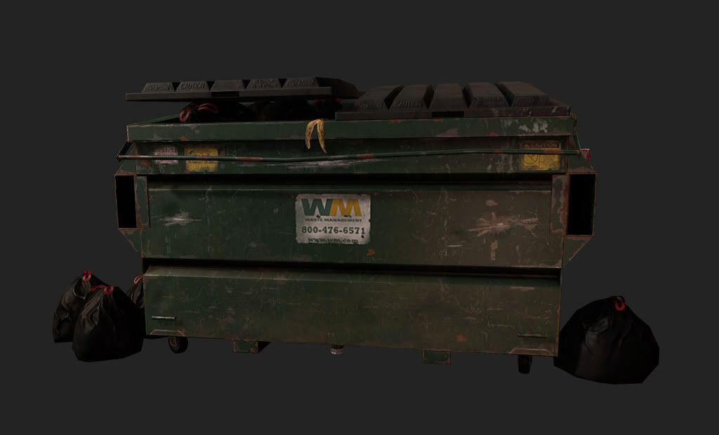
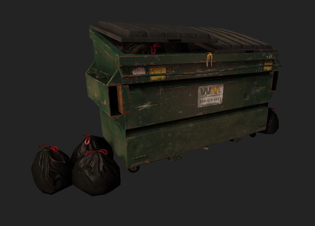
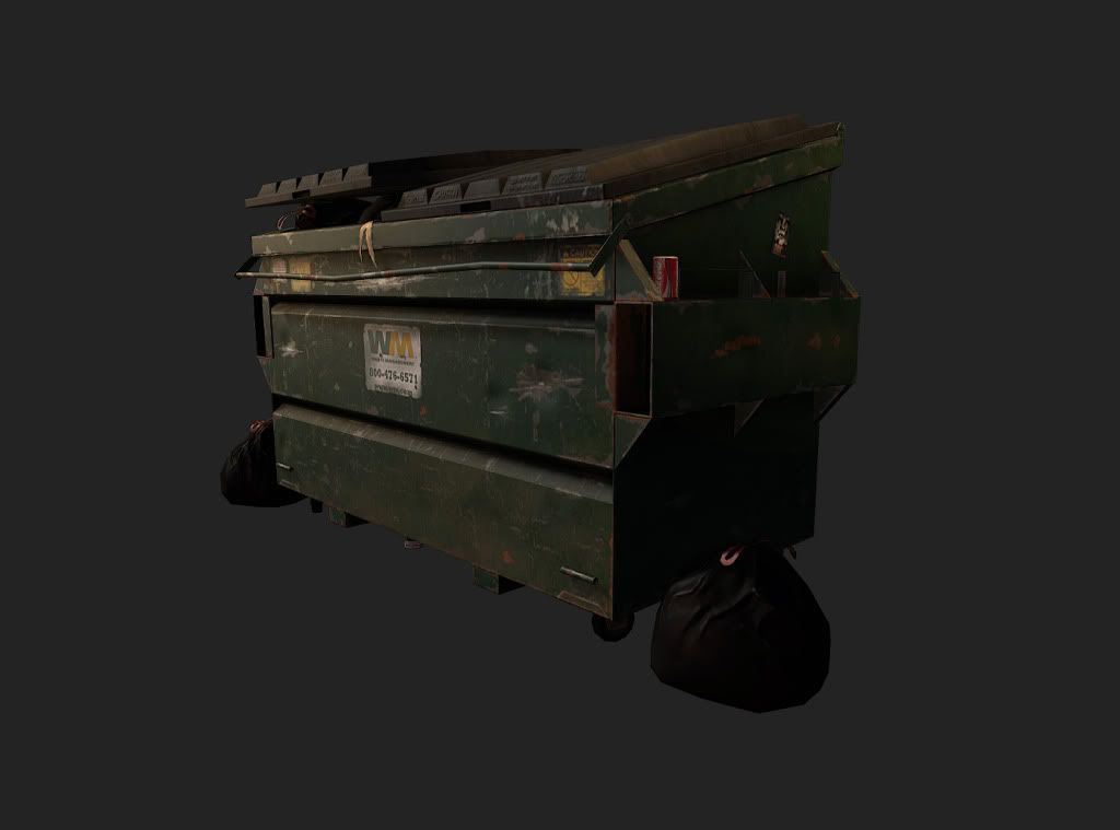
Hey polycount, first time poster here,but long time admirer of all the inspiring work on here. Here is a dumpster that I have done in my spare time. It was originally supposed to be part of a friendly challenge between me and my friends, to be done in around a weekends time, with a texture budget of 1024 x 1024. I would love to hear what you guys like and dislike about it. C and C greatly appreciated.
Looks pretty good, I like the subtle details you've included like the banana peel on the edge, but its hard to see a lot of the detail in this image, could you post some larger images so we can see it more clearly?
Thanks for the replies!!! Will be posting up some bigger, brighter images tonight.
@ewb326 - thanks for the critiques, the banana peel was one of my favorite subtle details. ^^ will do with the bigger screenshots
@wasabi - will be taking another shot at my lighting setup so that I can show off some more detail. Thanks for the critique!
@Texelion - thanks for the nice words! I will be checking the diffuse and spec to dim down the redness and over saturated look of the garbage straps. Also bigger pics on the way.
Well first impression amigo is the render size is to small like everyone is saying. overall i like the direction of detail good use of grunge placement as well as character touches like the banana. I wonder who gave you that idea. (Bombadil) this just means i need to stop lagging and post mine already anyways buddy i agree with the critiques. I think its time for you to show these chaps your other scene to. Its come a long way post that beauty up.
Thanks again for all the critiques guys, much much appreciated, I finally got around to addressing the notes you guys had. I reduced the spec and diffuse on the red straps, messed with the lighting setup i had so the dumpster wasn't so dim. last but not least, finally got around to getting some bigger images up.
again, C and C greatly appreciated. let me know what you think!
Shiiiit.. the new lighting set up is much better..
this is the best dumpster prop I have ever seen..
I love the texture details and the character you gave it..
Where is this rendered in?
Can we see some texture pages and wire shots..?
Glad you guys like the updated renders! current tri count on the dumpster with surrounding trash bags, including the 8 on the inside and the 4 on the outside is 5922 Tris.
@tombombadil - got those renders up, thanks for the critiques and the kind words. Also on my other scene, it should be up soon.
@BARDLER - I can see how the garbage bag wrinkles look like roots. When I get the time from work, maybe tomorrow or this weekend,I will use some more references and do a resculpt. Thank you for the critique!
@wasabi - thanks for the kind words man, greatly appreciated! It was rendered in Marmoset, and I got some wires and a texture flat for you.
Looks good! I like the diffuse so far, but there is still a lot of work to be done.
I think the main problem is that ur not differentiating from rust and scratches in your spec.
The scratches should be whiter and the rust should be nearly black.
Also, a simple noise pass in the spec at 2% for the paint would help a lot. Just make sure you mask out anything that isnt paint.
Also, the plastic bags should have a very high spec With white blurry highlights at the folds so it can catch the light. It really helps to have a gloss map for these sorts of things as well.
It doesn't seem like you added any dirt that may have come up from the ground, nor any dust that may have settles in the creases. Remember to add darker specs for those
You also need to implement a cube map. That will really sell the flat surfaces of the paint.
What are you rendering in?
Id doesn't look like ur using edge highlight (cavity map). I know this usually comes down to personal preference, but I recommend using it since it really helps frame the surfaces of the model.
Anyhow, I hope you implement these changes! I really like the banana peal. Its a nice touch.
Replies
I think it needs a better lighting set up..
Plus, the... red "laces" ( don't how its called ) on the bags are way too bright, they pop out of the image.
Don't hesitate to post larger pics.
@ewb326 - thanks for the critiques, the banana peel was one of my favorite subtle details. ^^ will do with the bigger screenshots
@wasabi - will be taking another shot at my lighting setup so that I can show off some more detail. Thanks for the critique!
@Texelion - thanks for the nice words! I will be checking the diffuse and spec to dim down the redness and over saturated look of the garbage straps. Also bigger pics on the way.
Thanks again everyone.
again, C and C greatly appreciated. let me know what you think!
thanks again
this is the best dumpster prop I have ever seen..
I love the texture details and the character you gave it..
Where is this rendered in?
Can we see some texture pages and wire shots..?
@tombombadil - got those renders up, thanks for the critiques and the kind words. Also on my other scene, it should be up soon.
@ewb326 - thanks!
@BARDLER - I can see how the garbage bag wrinkles look like roots. When I get the time from work, maybe tomorrow or this weekend,I will use some more references and do a resculpt. Thank you for the critique!
@wasabi - thanks for the kind words man, greatly appreciated! It was rendered in Marmoset, and I got some wires and a texture flat for you.
I think the main problem is that ur not differentiating from rust and scratches in your spec.
The scratches should be whiter and the rust should be nearly black.
Also, a simple noise pass in the spec at 2% for the paint would help a lot. Just make sure you mask out anything that isnt paint.
Also, the plastic bags should have a very high spec With white blurry highlights at the folds so it can catch the light. It really helps to have a gloss map for these sorts of things as well.
It doesn't seem like you added any dirt that may have come up from the ground, nor any dust that may have settles in the creases. Remember to add darker specs for those
You also need to implement a cube map. That will really sell the flat surfaces of the paint.
What are you rendering in?
Id doesn't look like ur using edge highlight (cavity map). I know this usually comes down to personal preference, but I recommend using it since it really helps frame the surfaces of the model.
Anyhow, I hope you implement these changes! I really like the banana peal. Its a nice touch.