Low Poly Zombie Diorama
Hey folks, it's been a while since my last post. I did these characters for a freelance commission and I decided to build a little set for them and make one of them Warhammer-like dioramas that I've always been fond of.
There's a turnaround to be found here: https://vimeo.com/46778807
I'm posting a few images but there's more to be found on my blog for the curious. Characters are 1500 triangles and a 512*512 diffuse.
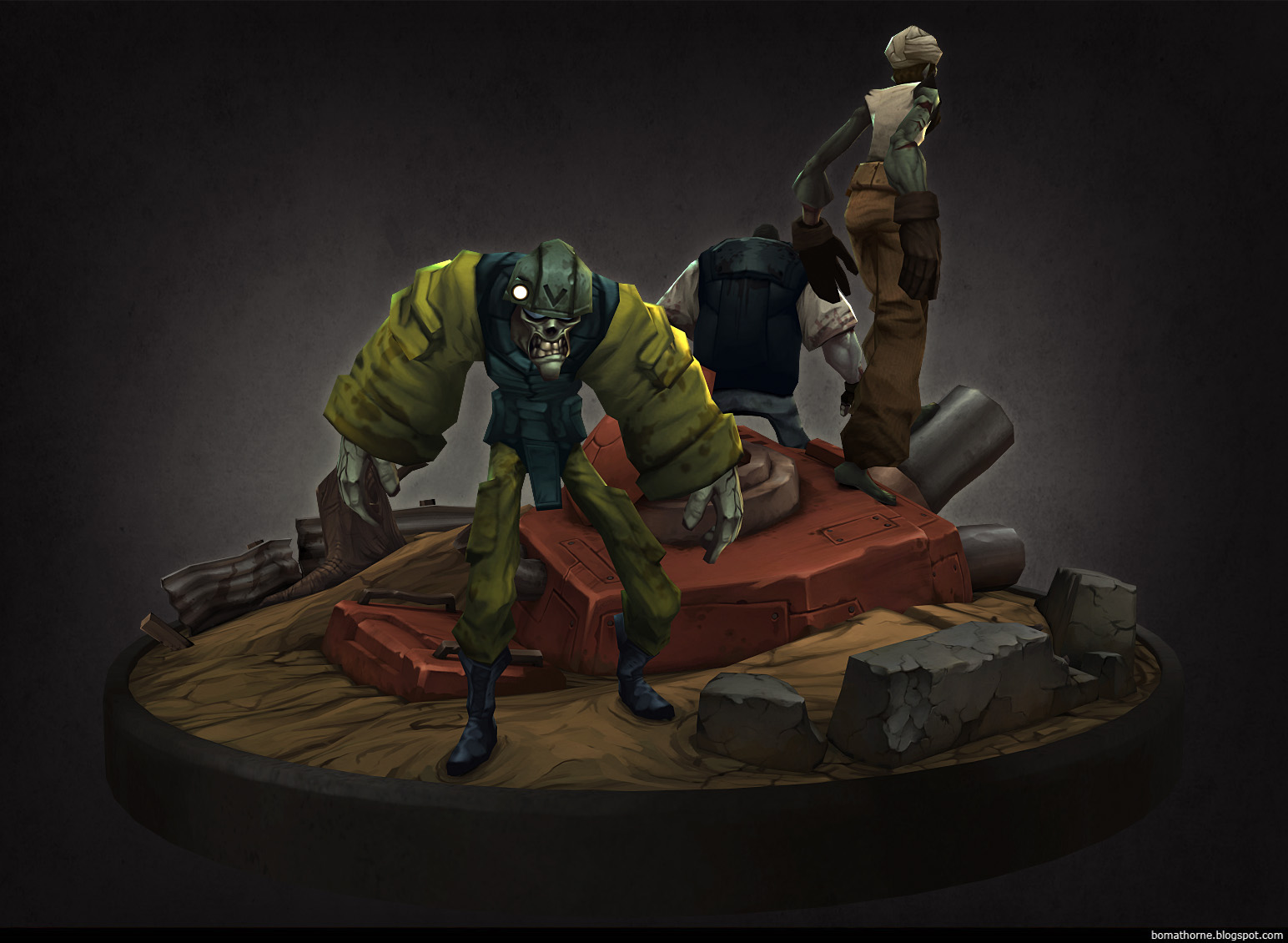
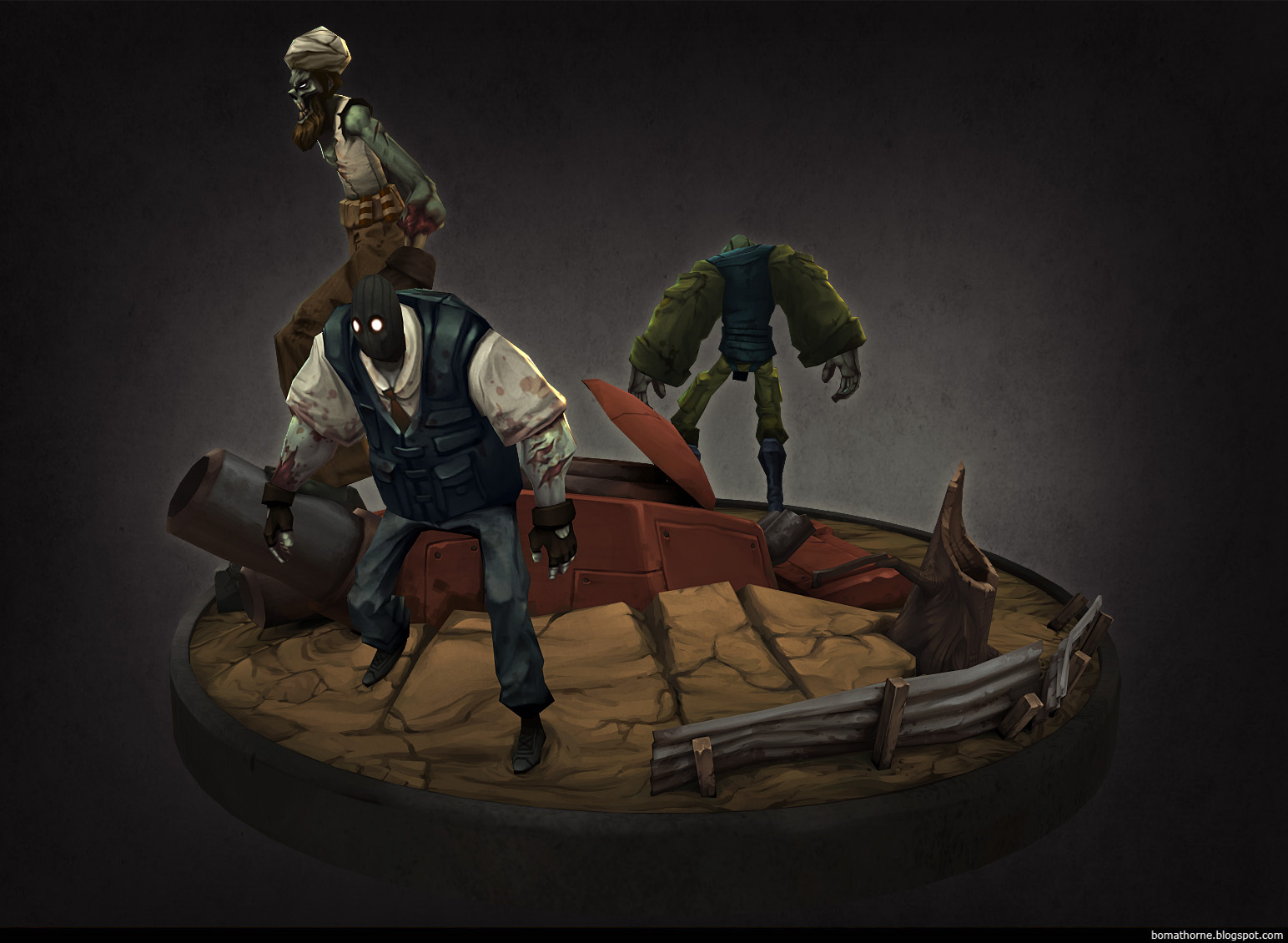
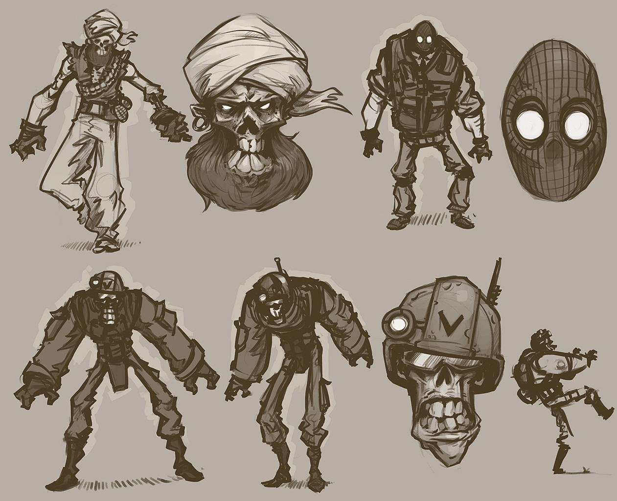
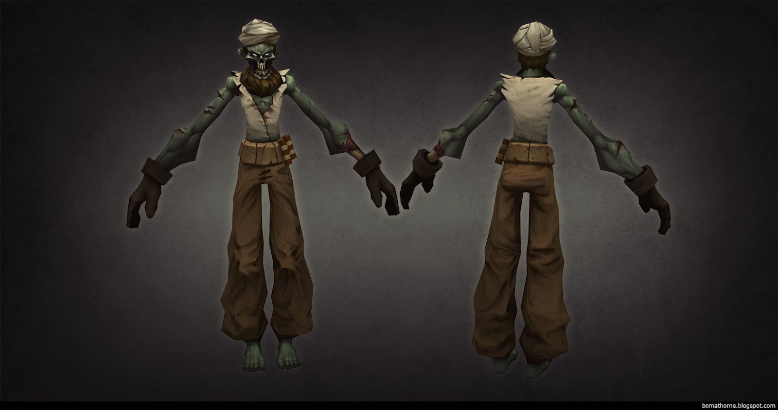
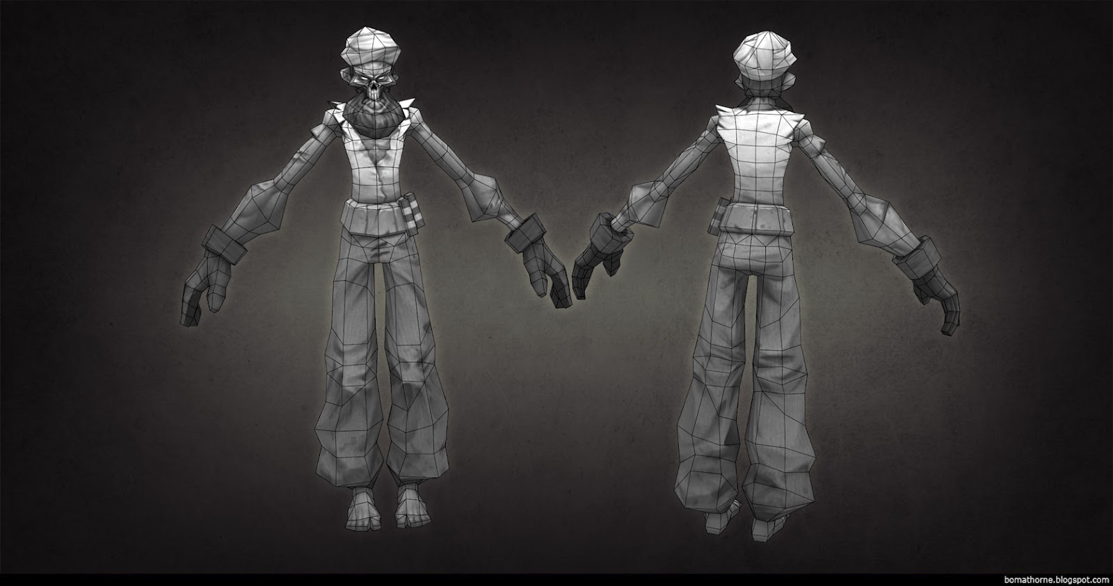
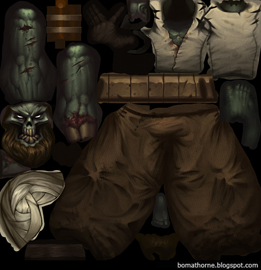
There's a turnaround to be found here: https://vimeo.com/46778807
I'm posting a few images but there's more to be found on my blog for the curious. Characters are 1500 triangles and a 512*512 diffuse.


Replies
Amazing!!
Huge fan of your stuff, especially Backwater Gospel! Love this piece; the art style is just lovely.
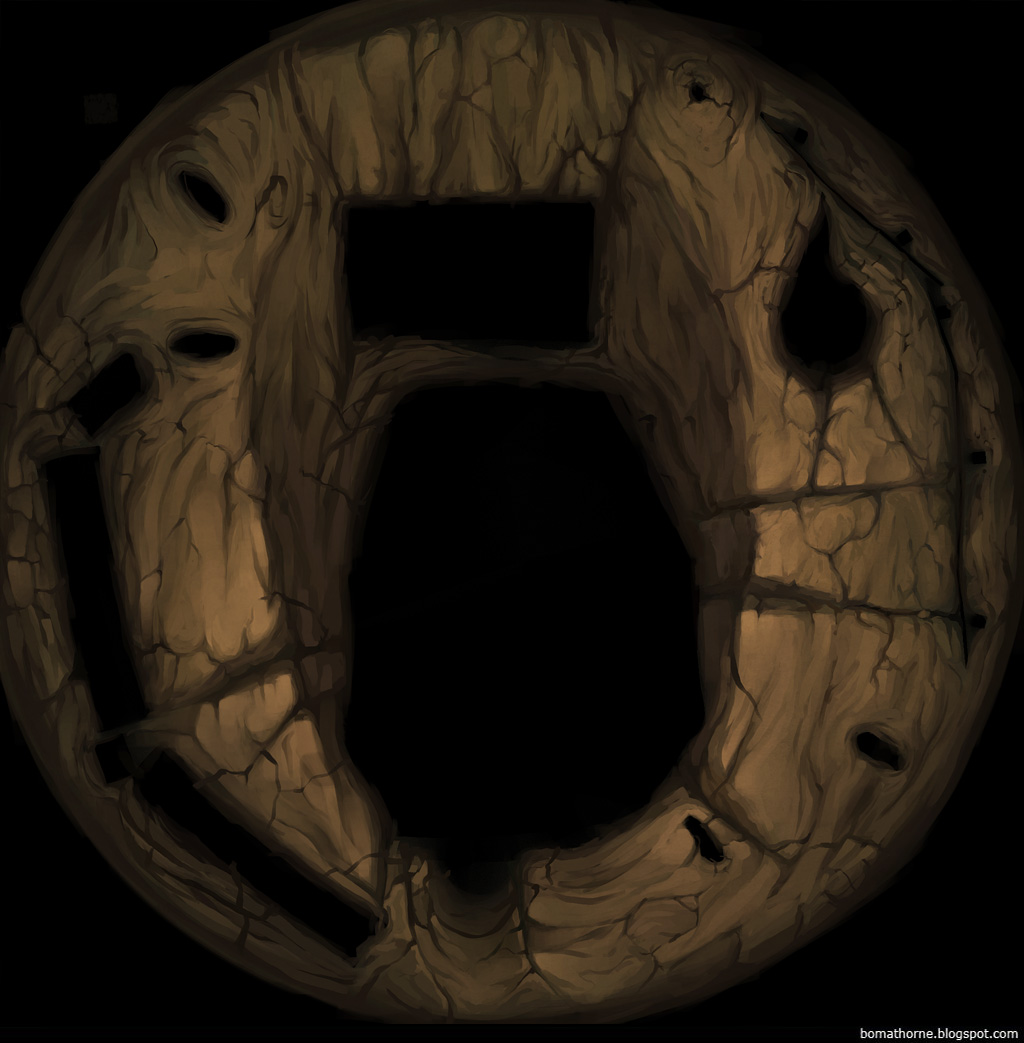
I saved a couple of work in progress pictures for the set, I don't know if they'd help you. But I like to start out with an ambient occlusion bake which is especially helpful for something like this with a lot of intersecting geometry (and unique texture space for pretty much everything). Afterwards I try to establish a colour scheme where all colours relate to each other. Like in this, all colours have a tint of that dirty green-brown in them, which makes them feel more unified.
I also keep everything fairly low in saturation to begin with, so I don't end up in the "fully-saturated-colours-corner" I always painted myself into back in the day. By having everything fairly subdued, it's much easier to pop a few areas where the interest is need with a bit of extra contrast and saturation.
For the actual painting process I don't have much to say about it; I try to always define planes and emphasize the corners, be they hard or soft. And I try as much as I can to always have some sort of gradient going on, so even if the plane is flat, there's still a gradient going on from one side to the other. And ideally, this is followed in the adjacent plane so there's a nice, strong contrast between them. And as I'm sure you've heard before, I tint my darks and lights with different colour so there's a bit of a play in the local colour of the object.
Hope that's helpful.
PS: Warhammer diorama's are cool!