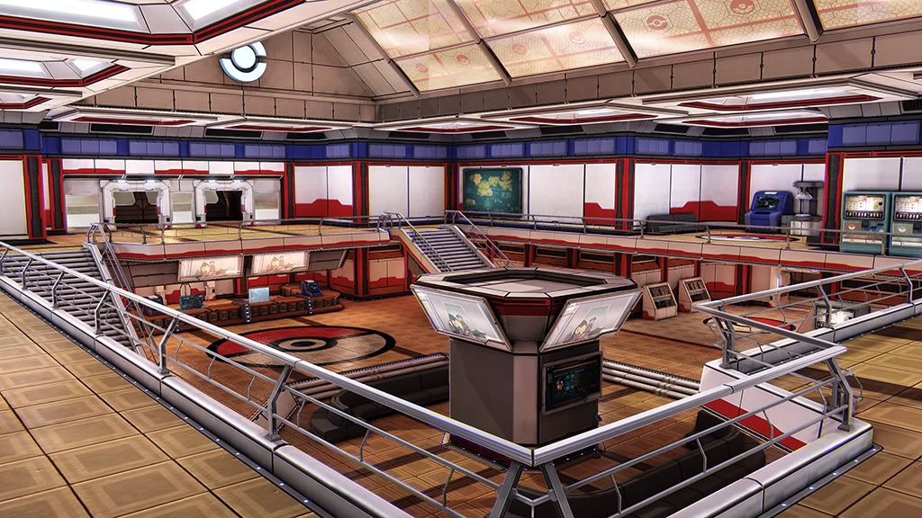
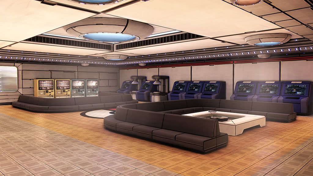
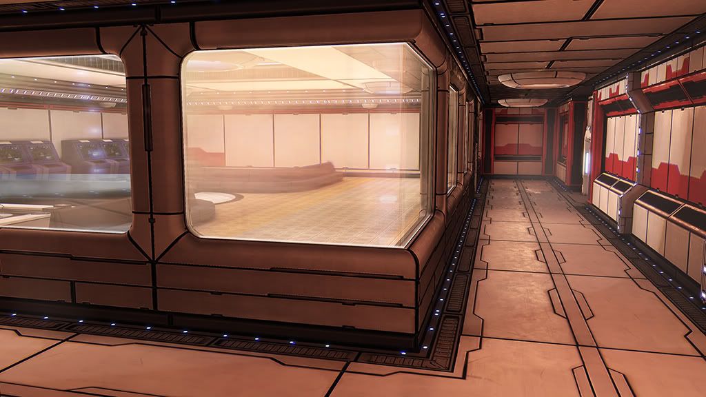
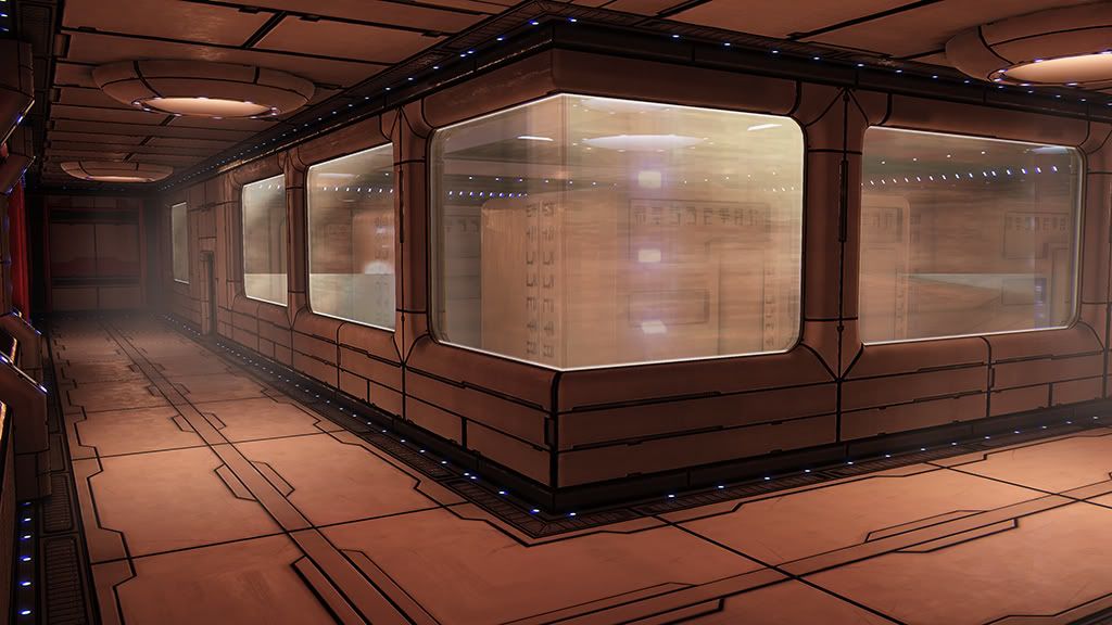
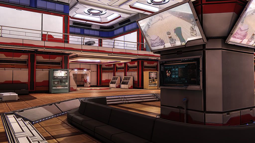
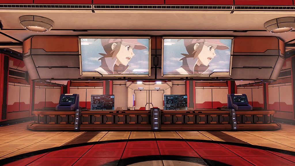
Been working on a pokecenter for my portfolio. Still got a bunch to do: some placeholders to knock out, some small props, 1 more room, and tweaks on lighting, post, and materials. Need to take another look at color scheme too. Figure I'd throw some screenshots together and get some feedback.
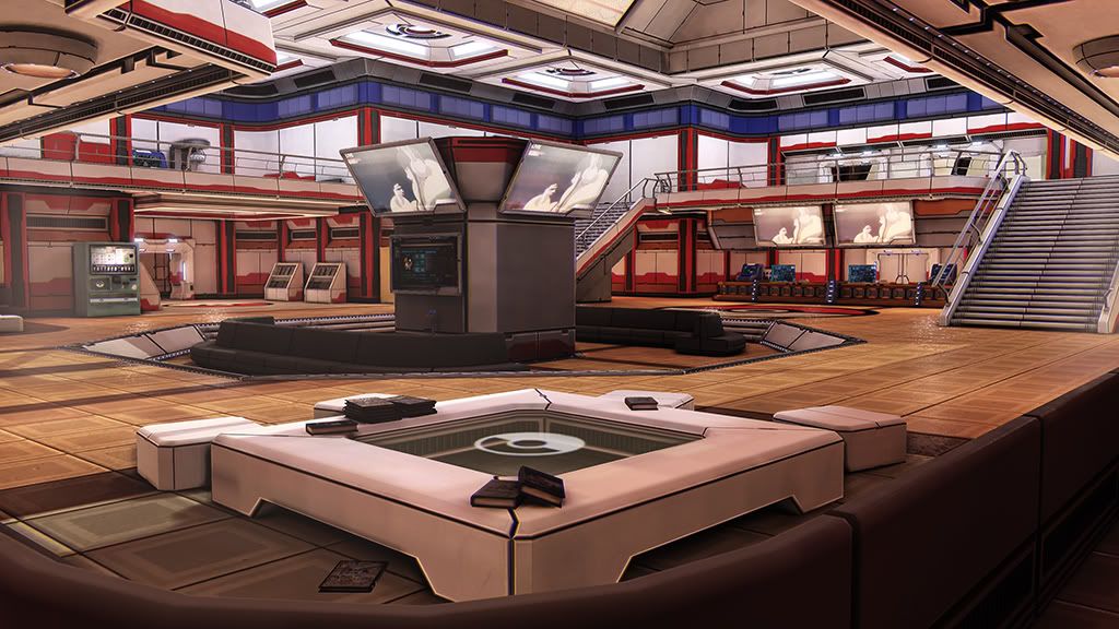
Really want to get better and get a job so any help would pretty much make me love you forever.
Looks awesome!
I haven't played a pokemon game since gold/silver, so I can't comment too much on what they look like now, but it didn't scream "pokemon" to me, and maybe that's by design. Maybe add some signage posted around, something advertising an upcoming tournament, or signs directing people to the healing section, the dueling section, so on and so forth, really try and incorporate as much as you can from the game, so someone would know right away that this is a pokecenter. Looks great so far, I just think it needs a few extra pushes and it will be exceptional.
I have to say this is incredible. I have to disagree with J0NNYquid. I think it reads as a pokemon scene immediately. The bold colors and thick cutlines are perfect for a pokemon scene!
Looks amazing. But like someone said it doesn't feel Pokemon like. Also it feels more like a lobby for a tournament or something compared to a soothing hospital. Playing the pokecenter theme and looking at the pictures they just don't sync with the same feeling.
Loving this enviro though I think there a few things that you could consider.
I dug up a image of the black/white pokecentre..
Now this isn't about the actual modelling but you can take away some of the feeling you get from this image and apply it to your piece. I'm seeing a correlation between your image and this which is great! But I think some of your larger forms are being diminished by the intricacy of the panel work. The panel work is really nice and I'm sure you will want to keep it so here is a suggestion how to keep the forms readable while keeping the intricacy!
The black cracks, Nice style but I think it a little over the top overall. You have these big forms which are then broken up into smaller panels and then even smaller panels. What I would suggest trying is thinning out the lines on the 2nd and 3rd tier of cuts inside those forms. So the Main panel shape has a thick outline, the inner panel has a thinner outline and the little panels have thinner outlines still. Varying the width of the cuts and their darkness will help smooth out the overall scene and give a sense of depth.
Remember thick lines seem more in front, while thin lines seem more to the rear.
I did a paint over to help demonstrate what diminishing the impact of some of the lines in your panels can do. (I also altered some colours to bring out the different planes of the wall and roof.
This is just an example, but keeping the larger forms clear from a distance is vital. Reward people for looking closer by having the details there but don;t make it the focus otherwise your scene will get eaten up by the noise
I hope this makes sense. Of course this is only a suggestion!
Holy shit I love you. I'll need to think of a good way to put this in. Most everything in that screenshot is off of 1 texture so might be tricky dialing back the right lines since a lot of them are from the same line on the texture. Having to reUV everything doesn't sound very nice. I'll have a good think on this. Man you are awesome. Thanks for that.
@Sixoul and J0NNYquid
I actually don't think it reads as a pokecenter very well either. If you take away the big pokeballs on the roof and floor I'm not sure you could tell. Struggled with this the whole way. Didn't look remotely close when I first started. I'm hoping some of things I'm working on now and got planned will help.
I'll post some meshes and textures later. Really want to focus on getting this done. Used 2 1024*512 textures to make most of it. Probably only needed 1 or could have just combined the 2, but did a poor job of planning. Something to think about next time.
Awesome work! I've played most of the pokemon games but I didn't read the first image as a pokecenter at all. Hmm it's kinda tricky to get the right feeling there.
I agree with Anuxinamoons paintover, i think that would greatly help the scene, i understand peoples comments about it not reading as a pokecentre straight away, i think once you see some of the screens and logos tou know that it is pokemon related.
Ways that this could be improved to read better could maybe be fonts/titles suggesting different locations in the pokecentre, looking it up it normally has a healing area for pokemon, trading area, battle and a market it may be cool to label these different areas? Then just general props, pokeballs, magazines.
With your colour scheme i think some foliage could really help balance the colour palette.
Hope this helps and as i said it already looks awesome
I think the suggestion of having signs around the place is a very good idea though.
This is essentially a hospital and hospitals have posters, signs and information everywhere.
Try looking at real-world examples to see more stuff to put into your scene - exit signs, phone numbers, fire information etc.
I think you'd also do really well to have a few Chanseys dotted around the place too. They'd be extremely easy to model and texture. And I really think that they would push the scene over the top in terms of awesome.
Just look at how amazing @jordanw's environment is with just a few simple character models thrown in:
This is so unbelievably awesome dude. keep up the good work!
It's completely different i know but having some realistic pokemon wandering around would be so amazing.
Just to echo everyone else, adding some signs/posters will really tie the scene together and make it scream Pokemon. Good job so far, though. I look forward to seeing the progress on this!
looks nice, but I am really hating the black panel shadows. Pokemon is nice and happy, and their world and buildings reflect that, everything looks pure in a sense and this looks to. I don't want to use the word realistic, because it isn't that, its as if everything is dirty.
tbh what it's missing is plants. Get some sort of indoor hedge things going on, potted plants, boxes dotted around that blend well into the walls/rooms that are filled with exotic fauna
This is an awesome start but it reminds me a lot of Snefer's environment :P Even the proportions of the windows, walls and stuff is too similar...
The original pokecenter is a lot "cleaner", in regards to lines and plating. Not everything has to be made out of big metal plates. In fact all those plates make the environment look more like a spaceship than a pokecenter..
As for the textures I'd really get rid of all those black lines inbetween plates, they are really strong right now and kind of throw off the overall scale of the scene.
Ah didn't think of looking at office refs at all. I always felt pokemon was pretty sci fi with all the tech. It just never seemed like it being so cute/cartoony. Wasn't going for cute/cartoony here so looked at a lot of sci fi refs and you're right it looks too much like a spaceship. Probably go back later and take another look at the wall designs. Man thanks Minos. Your tutorials were also a huge help. Definitely used some of what I learned from you to make this.
Took a bunch of screenshots today so update coming. For now here's a small bit of the refs I gathered directly from pokemon. Haven't seen the anime in like 10 years. Was kind of fun digging for these.
Had a problem come up that I spent most of the week on. Still can't figure out what's going on. I'll take some screenshots and post it up later. Tweaked a bunch of things and knocked out a lot of the small props on my list. Just a few more left, then need to make a lab behind the front desk. A few lightmass wierdness in these and I might have turned the sharpen post process intensity a bit too high. Turned down the black lines, but not enough it seems. Also took out the hallways. Some of the pieces looked too much like Snefer's as someone said, and it just didn't have any use. They weren't going anywhere or served any purpose.
sleepboxes. I also learned in my ref gathering that pokemon actually has it's own language. Closest thing I could find was an ancient hyrule font from zelda. Might just switch to english.
Not actually in pokemon. But seemed like it be plausible to have stations where trainers can put their pokeball in the slot and info would come up on the screen.
map looks a bit too much like a mall map for my taste
Some pokeball holders. bill's pc. be nice if I can find the time to make some nurse joys.
Wierd bake on the door. Security/decon leads to lab and pokemon storage
Food and drink vending machines. Turned the glass a bit too transparent. You can see the problem I was trying to figure out here. The square pixels all over. some are dark some are light. Think it's something in the material that deals with spec.
lounge. Plan to add a cafeteria/kitchen thing in one of the walls.
A pc/pokemon trade thing. It's supposed to have a phone on it. Might add it if I have time.
Realized I forgot to add bathrooms. Still need text on the signs
Texture flats. Didn't include the smaller utility textures and one I'm still working that has grunge in the red channel and a color mask in the blue. Trying to figure out what to slide in the other channels. Probably decals.
Didn't do a good job of planning and now towards the end it's getting kind of messy. Something to think about for next time. mask in diffuse alpha that i use for either emissive or opacity. Gloss in spec alpha. Height maps in normal alpha. Glass texture has varying paint masks and dirt maps crammed into its channels. Everything shown is half sized to fit in the 2048x1024 sheets below (...and again resized by photobucket)
Some of the spec maps are high contrast with a lot of detail. Since I reuse textures a lot, I use the material to make changes and get different looks. It's a lot easier to take away detail than to add. Most of the meshes are made with 2 textures and just playing with uvs. Originally intended to use on for walls and the other for floor and ceiling. Didn't work out that way. Need to plan better next time.
alpha channels
also use sharpen and chromatic aberration postprocess materials. Looking into what else might look good. dx11 mainly for the light reflections. Was going to use image based reflections, but putting actors all over the place started making me angry, so just threw in a few imagereflect actors and used a cube map for the rest. 7 master materials. A glass, emissive, lightbeam, leaf (probably unecessary), sky, tvscreen, and a 1 that use for everything else.
Working on lens flares JUST to get a slight haze around some lights and trying out screen dirt.
Looks great but I think it's worth a try to let your normals maps do more work. You have these really dark lines in your diffuse, I don't think you really need them since they are also represented in the normal map.
They add a harshness to the scene which I don't really feel matches the vibe of a pokecenter.
Also the dynamic ambient occlusion isn't doing your scene any favors. It adds these nasty thick dark lines around some of the objects that stand close to the walls.
Nearly done I think. Got bogged down this past month trying to make the switch from maya to max, which was rather painful. Fixed the ambient occlusion and pulled back the black lines a ton. Still looks like it needs work. Tweaking post, materials, and some panel configurations for the lobby. Added a LUT, though not sure if I like it. So just tweaking left. Going to start getting ready for another environment.
Plan has always been to add characters. Some nurse joys, pokemon, trainers, the fish dude who sells you a magikarp. But I think that'll have to wait until after I get the portfolio done.
ALL YOU DO IS FEED ME PUFFINS! I NEED NOURISHMENT!
Anyway joking asside I absolutely love this. I would love to see a little camera fly through so we can see some of the nice material tricks you did in your env..
so a few things I would recommend to make this feel more like a scene vs a few screenshots.
1 I would love to see those monitors flickering and changing to show heads up displays of pokemeon , maybe one thats a wanted/warning police flash that comes up warning trainers of Team rocket.
I would also like if you maybe color changed some of the areas based on location, example you have red and white everywhere but you added a location that was a cafeteria , changing the shader at that point to color shift into maybe, I dunno a green section, will let people know upon glance "oh this is so and so area" Color separation based on your sections will help not make the eye get lost in a overall Similar toned level.
Anyway Overall fantastic just a bit more to this and this would be a scene you would see in a modern day game hands down Fantastic job.
Although I would suggest that you stick with it to put some life in there, such as characters.
I think it would boost this really nice scene to a mind-blowing scene.
@seforin
Didn't plan on doing a flythrough. My thinking was I wanted to eventually put characters in and probably don't have the time to learn how to properly animate them so they'd be static, which I thought might look weird on a flythrough. It's not out of the question though. I did take the trouble to encode a video. Originally wanted some kind of pokemon newscast on it, but settled with a trailer. Flickering screens isn't difficult and I did set aside masks for parts of the UI texture I would want animated. And I'm also finding that a flythrough might show things off better rather than having to take a million screenshots. Seems to be more to show than I imagined.
Also took your color suggestion and applied it to the floors. Worked really well I think. Excellent call, thanks! Will further explore this.
@nathanbarrett
This is my first attempt at an environment so fumbled around quite a bit and tried to switch to max in the middle, but overall about 3 months. Even more if you count all the studying and practice I did to prepare for this. I think knowing what I know now and if I properly planned it out, I could knock this out in under a month. To be specific, reused textures on nearly all assets. So the pill bottles took ~10 minutes. Something more complicated like the trade station maybe ~1-2 hours. Pokeballs are actually a unique texture and took ~20-30 minutes. Was slow at first, but at the end was really easy knocking out assets.
So, I could use a bit of help here. Working on post, and things looks so different on my 2 monitors. Even more infuriating, things that don't look so good, actually look good on my phone. Need to do some learning on monitor calibration. So here's 2 different LUTs side by side. left is new, right is from last update
Changed wall panels a bit. Would like to get some orange in there.
Thought this room was a bit bright so dimmed the lighting a bit on the new one.
Some lightmap errors were making things black that shouldn't be.
So basically having a hard time judging contrast and saturation. Would appreciate any thoughts on the 2 LUTs.
Thanks for all the feedback! You guys are awesome.
I was thinking hospital lighting is usually pretty uniform, but I might have overdone that a bit. I'll continue experimenting with it.
Finished up post. Setting this aside to start a new environment. Will see if I can work on characters at the same time. More screenshots here http://evanliaw.com/portfolio/pokecenter/
Only nitpick is that the final images seem to have some weird treatment, can't really put my finger on what's wrong but what's that white halo around everything? Lack of AA/AF or overdone sharpen filter?
Nailed it. Over done sharpen post. It was popping all the edge highlights especially the ones with bright spec. Still can't get a handle on AA though. Got some pretty jagged edges especially from a distance.
Need to figure everything out before I retake all those screenshots again.
Replies
I haven't played a pokemon game since gold/silver, so I can't comment too much on what they look like now, but it didn't scream "pokemon" to me, and maybe that's by design. Maybe add some signage posted around, something advertising an upcoming tournament, or signs directing people to the healing section, the dueling section, so on and so forth, really try and incorporate as much as you can from the game, so someone would know right away that this is a pokecenter. Looks great so far, I just think it needs a few extra pushes and it will be exceptional.
Definitely knew this was the Pokecenter right away, given the color schemes and such. even the layout seems dead straight on. Awesome job.
Fantastic piece!
Could we see some wires and texture sheets if poss?
might be nice to get a few hospital trollys as i remember them being pushed around frequently by some fat pink thing with an egg... i think
you know, just some props to make it feel more like a hospital of sorts, maybe a cleaning station or something
looks ace though well done
LOOKS GREAT!
[ame="http://www.youtube.com/watch?v=KndNS2H8yGA"]Pokemon Red & Blue - Pokemon center (music) - YouTube[/ame]
Loving this enviro though I think there a few things that you could consider.
I dug up a image of the black/white pokecentre..
Now this isn't about the actual modelling but you can take away some of the feeling you get from this image and apply it to your piece. I'm seeing a correlation between your image and this which is great! But I think some of your larger forms are being diminished by the intricacy of the panel work. The panel work is really nice and I'm sure you will want to keep it so here is a suggestion how to keep the forms readable while keeping the intricacy!
The black cracks, Nice style but I think it a little over the top overall. You have these big forms which are then broken up into smaller panels and then even smaller panels. What I would suggest trying is thinning out the lines on the 2nd and 3rd tier of cuts inside those forms. So the Main panel shape has a thick outline, the inner panel has a thinner outline and the little panels have thinner outlines still. Varying the width of the cuts and their darkness will help smooth out the overall scene and give a sense of depth.
Remember thick lines seem more in front, while thin lines seem more to the rear.
I did a paint over to help demonstrate what diminishing the impact of some of the lines in your panels can do. (I also altered some colours to bring out the different planes of the wall and roof.
This is just an example, but keeping the larger forms clear from a distance is vital. Reward people for looking closer by having the details there but don;t make it the focus otherwise your scene will get eaten up by the noise
I hope this makes sense. Of course this is only a suggestion!
@Sixoul and J0NNYquid
I actually don't think it reads as a pokecenter very well either. If you take away the big pokeballs on the roof and floor I'm not sure you could tell. Struggled with this the whole way. Didn't look remotely close when I first started. I'm hoping some of things I'm working on now and got planned will help.
I'll post some meshes and textures later. Really want to focus on getting this done. Used 2 1024*512 textures to make most of it. Probably only needed 1 or could have just combined the 2, but did a poor job of planning. Something to think about next time.
Really appreciate the feedback, thanks.
I agree with Anuxinamoons paintover, i think that would greatly help the scene, i understand peoples comments about it not reading as a pokecentre straight away, i think once you see some of the screens and logos tou know that it is pokemon related.
Ways that this could be improved to read better could maybe be fonts/titles suggesting different locations in the pokecentre, looking it up it normally has a healing area for pokemon, trading area, battle and a market it may be cool to label these different areas? Then just general props, pokeballs, magazines.
With your colour scheme i think some foliage could really help balance the colour palette.
Hope this helps and as i said it already looks awesome
I think the suggestion of having signs around the place is a very good idea though.
This is essentially a hospital and hospitals have posters, signs and information everywhere.
Try looking at real-world examples to see more stuff to put into your scene - exit signs, phone numbers, fire information etc.
I think you'd also do really well to have a few Chanseys dotted around the place too. They'd be extremely easy to model and texture. And I really think that they would push the scene over the top in terms of awesome.
Just look at how amazing @jordanw's environment is with just a few simple character models thrown in:
Can't wait to see more.
It's completely different i know but having some realistic pokemon wandering around would be so amazing.
Just to echo everyone else, adding some signs/posters will really tie the scene together and make it scream Pokemon. Good job so far, though. I look forward to seeing the progress on this!
Have a look at Minos' work:
http://www.polycount.com/forum/showthread.php?t=73253
The green will really push the contrast. Atm it's very red and white, still looks amazing though
The original pokecenter is a lot "cleaner", in regards to lines and plating. Not everything has to be made out of big metal plates. In fact all those plates make the environment look more like a spaceship than a pokecenter..
As for the textures I'd really get rid of all those black lines inbetween plates, they are really strong right now and kind of throw off the overall scale of the scene.
Some nicer refs for this would be modern offices rather than sci-fi environments. Cleaner, less noisy and thinner materials would help this go a long way imo: https://www.google.com/search?q=modern+office&oe=utf-8&aq=t&rls=org.mozilla:en-US:official&client=firefox-a&um=1&ie=UTF-8&hl=en&tbm=isch&source=og&sa=N&tab=wi&ei=E3f3T4-1KeGQ2AWw9Yz9Bg&biw=1920&bih=1070&sei=Fnf3T6fSDK6I2gXootz0Bg
Here's some good ref for "cleaner" yet interesting wall designs: http://www.leminhnhat.com/scifi-hall.htm
Keep it up, definitely gonna keep an eye on this one
Took a bunch of screenshots today so update coming. For now here's a small bit of the refs I gathered directly from pokemon. Haven't seen the anime in like 10 years. Was kind of fun digging for these.
sleepboxes. I also learned in my ref gathering that pokemon actually has it's own language. Closest thing I could find was an ancient hyrule font from zelda. Might just switch to english.
Not actually in pokemon. But seemed like it be plausible to have stations where trainers can put their pokeball in the slot and info would come up on the screen.
map looks a bit too much like a mall map for my taste
Some pokeball holders. bill's pc. be nice if I can find the time to make some nurse joys.
Wierd bake on the door. Security/decon leads to lab and pokemon storage
Food and drink vending machines. Turned the glass a bit too transparent. You can see the problem I was trying to figure out here. The square pixels all over. some are dark some are light. Think it's something in the material that deals with spec.
lounge. Plan to add a cafeteria/kitchen thing in one of the walls.
A pc/pokemon trade thing. It's supposed to have a phone on it. Might add it if I have time.
Realized I forgot to add bathrooms. Still need text on the signs
Didn't do a good job of planning and now towards the end it's getting kind of messy. Something to think about for next time. mask in diffuse alpha that i use for either emissive or opacity. Gloss in spec alpha. Height maps in normal alpha. Glass texture has varying paint masks and dirt maps crammed into its channels. Everything shown is half sized to fit in the 2048x1024 sheets below (...and again resized by photobucket)
Some of the spec maps are high contrast with a lot of detail. Since I reuse textures a lot, I use the material to make changes and get different looks. It's a lot easier to take away detail than to add. Most of the meshes are made with 2 textures and just playing with uvs. Originally intended to use on for walls and the other for floor and ceiling. Didn't work out that way. Need to plan better next time.
alpha channels
also use sharpen and chromatic aberration postprocess materials. Looking into what else might look good. dx11 mainly for the light reflections. Was going to use image based reflections, but putting actors all over the place started making me angry, so just threw in a few imagereflect actors and used a cube map for the rest. 7 master materials. A glass, emissive, lightbeam, leaf (probably unecessary), sky, tvscreen, and a 1 that use for everything else.
Working on lens flares JUST to get a slight haze around some lights and trying out screen dirt.
They add a harshness to the scene which I don't really feel matches the vibe of a pokecenter.
Plan has always been to add characters. Some nurse joys, pokemon, trainers, the fish dude who sells you a magikarp. But I think that'll have to wait until after I get the portfolio done.
ALL YOU DO IS FEED ME PUFFINS! I NEED NOURISHMENT!
Anyway joking asside I absolutely love this. I would love to see a little camera fly through so we can see some of the nice material tricks you did in your env..
so a few things I would recommend to make this feel more like a scene vs a few screenshots.
1 I would love to see those monitors flickering and changing to show heads up displays of pokemeon , maybe one thats a wanted/warning police flash that comes up warning trainers of Team rocket.
I would also like if you maybe color changed some of the areas based on location, example you have red and white everywhere but you added a location that was a cafeteria , changing the shader at that point to color shift into maybe, I dunno a green section, will let people know upon glance "oh this is so and so area" Color separation based on your sections will help not make the eye get lost in a overall Similar toned level.
Anyway Overall fantastic just a bit more to this and this would be a scene you would see in a modern day game hands down Fantastic job.
Although I would suggest that you stick with it to put some life in there, such as characters.
I think it would boost this really nice scene to a mind-blowing scene.
Think of the fame! (:P)
Didn't plan on doing a flythrough. My thinking was I wanted to eventually put characters in and probably don't have the time to learn how to properly animate them so they'd be static, which I thought might look weird on a flythrough. It's not out of the question though. I did take the trouble to encode a video. Originally wanted some kind of pokemon newscast on it, but settled with a trailer. Flickering screens isn't difficult and I did set aside masks for parts of the UI texture I would want animated. And I'm also finding that a flythrough might show things off better rather than having to take a million screenshots. Seems to be more to show than I imagined.
Also took your color suggestion and applied it to the floors. Worked really well I think. Excellent call, thanks! Will further explore this.
@nathanbarrett
This is my first attempt at an environment so fumbled around quite a bit and tried to switch to max in the middle, but overall about 3 months. Even more if you count all the studying and practice I did to prepare for this. I think knowing what I know now and if I properly planned it out, I could knock this out in under a month. To be specific, reused textures on nearly all assets. So the pill bottles took ~10 minutes. Something more complicated like the trade station maybe ~1-2 hours. Pokeballs are actually a unique texture and took ~20-30 minutes. Was slow at first, but at the end was really easy knocking out assets.
So, I could use a bit of help here. Working on post, and things looks so different on my 2 monitors. Even more infuriating, things that don't look so good, actually look good on my phone. Need to do some learning on monitor calibration. So here's 2 different LUTs side by side. left is new, right is from last update
Changed wall panels a bit. Would like to get some orange in there.
Thought this room was a bit bright so dimmed the lighting a bit on the new one.
Some lightmap errors were making things black that shouldn't be.
So basically having a hard time judging contrast and saturation. Would appreciate any thoughts on the 2 LUTs.
Thanks for all the feedback! You guys are awesome.
Finished up post. Setting this aside to start a new environment. Will see if I can work on characters at the same time. More screenshots here http://evanliaw.com/portfolio/pokecenter/
Only nitpick is that the final images seem to have some weird treatment, can't really put my finger on what's wrong but what's that white halo around everything? Lack of AA/AF or overdone sharpen filter?
Need to figure everything out before I retake all those screenshots again.