Home 3D Art Showcase & Critiques

Tron Scene Recreation

polycounter lvl 7
Offline / Send Message
danpaz3d polycounter lvl 7
Hi all,

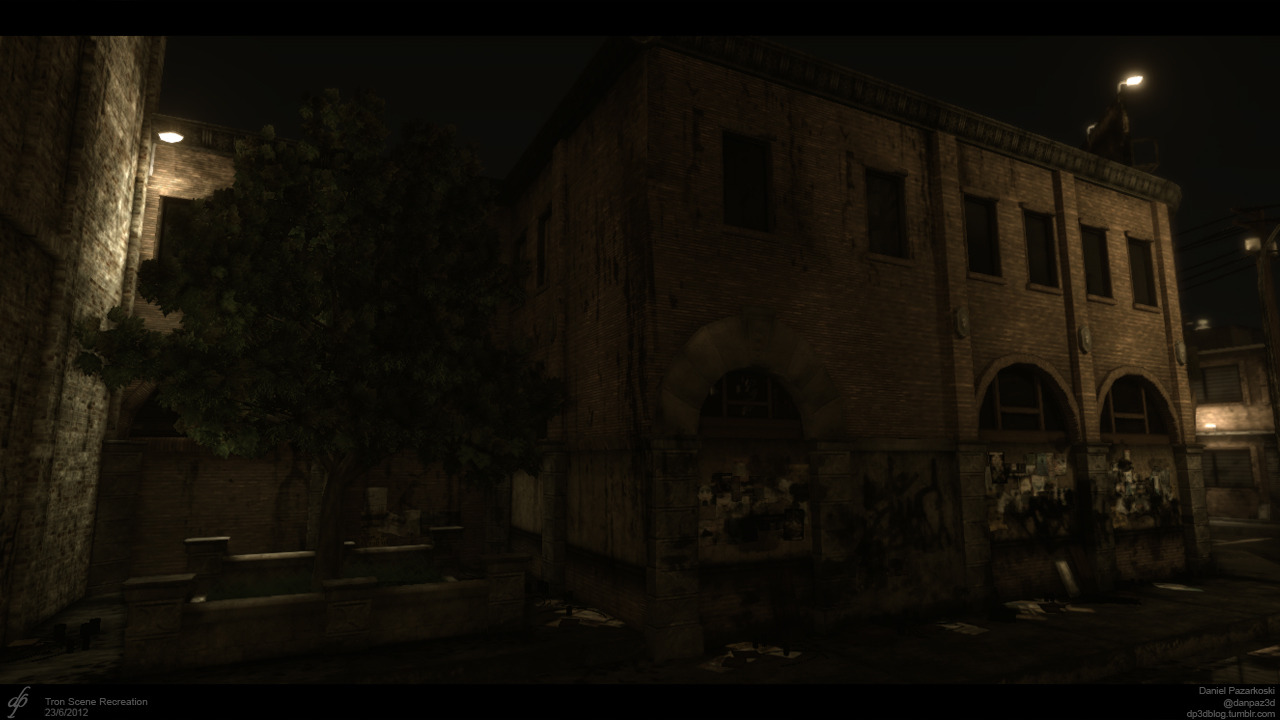
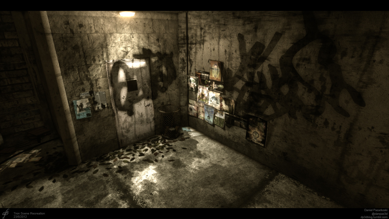
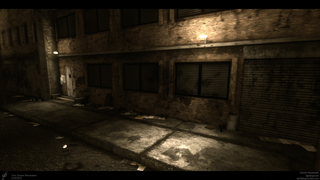
A recent project I just finished. Any questions or comments are welcome, or tweet me. Some details of this project are on the wireframe image.

As this is my first post, I'd like to say that I look forward to posting here in the future and meeting other aspiring artists/designers. Thanks!

(UPDATED) Video is posted below
tumblr_m6d5nrJw0y1rwocuuo1_1280.png

tumblr_m6d5nrJw0y1rwocuuo2_1280.jpg

tumblr_m6d5nrJw0y1rwocuuo4_1280.jpg

tumblr_m6d5nrJw0y1rwocuuo6_1280.jpg

Replies

  • Fomori
    Offline / Send Message
    Fomori polycounter lvl 12
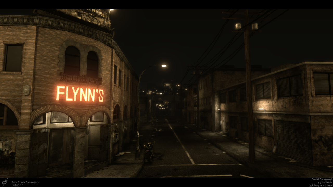
    looks pretty cool. One thing that stood out that looks wrong are the bricks on Flynn's building. They look tiny and therefore don't really read as bricks, more like camouflage or something. Could also do with darker areas with the lighting and more contrast.

    Can you show us any texture flats for this? You using normal maps?
  • gsokol
    Offline / Send Message
    gsokol polycounter lvl 14
    Looking pretty decent so far. I feel like there is too much focus on the Flynn's sign though. Its the brightest source of light and it makes the composition so left-side heavy. I cant tell if you have the city lights in the background or not..looks like you might but they are pretty short...I think it would look cool if you pull them up a bit and fill some of the dark space in the sky a bit.


    Overall the scene is looking good! The powerlines and the way the buildings on the right side are lit looks exceptionally nice. Good stuff
    Also, I didn't even notice the bike there until I've looked at this several times. I don't know if your going to go for the wet street look that most images of flynn's has, but getting a specular highlight on the street right there from the street lamp will help the bike stand out a bit. In general the street is kinda bare, so something to break it up like that would look good.
  • IchII3D
    Offline / Send Message
    IchII3D polycounter lvl 12
    Do you have a shot of what you was aiming for? I noticed you said recreation... or was it more inspired?
  • danpaz3d
    Offline / Send Message
    danpaz3d polycounter lvl 7
    Hi all,
    Thanks for your comments.

    @lchll3D Here's a ref shot of what I was going for. I just wanted different lighting, more dry and less contrast.

    http://popapostle.com/Tron/images/episodes/Legacy/Flynns-Arcade-ext.JPG

    @Fomori I just tried to follow the reference as much as possible. Here's a couple shots of earlier progress.
    http://24.media.tumblr.com/tumblr_m499l9pWVd1rwocuuo1_500.jpg
    http://25.media.tumblr.com/tumblr_m54k65hCQ51rwocuuo1_1280.jpg
    Most of my progress is on my blog. I am using normal maps, but not for everything.

    @gsokol I was thinking to go for the wet street look, but I decided to go with DX9 so I couldn't have result I wanted. As you can see in the ref image I'd have to use DX11 image reflection specular.
  • gsokol
    Offline / Send Message
    gsokol polycounter lvl 14
    You dont neccesarily need to use DX11 for the wet street look. High spec, High gloss material with some puddle decals and maybe use a reflection actor for the puddle material.
  • danpaz3d
    Offline / Send Message
    danpaz3d polycounter lvl 7
    yeah I tried that before and I do have some puddles now but can't notice them much in the shots I have given. But using the high gloss/spec just didn't fit into the entire scene well. I'll put up a video soon so you can see it in motion.
  • Oniram
    Offline / Send Message
    Oniram polycounter lvl 17
    the S in FLYNN'S looks way too polygonal. definitely put the nice smooth curves in there. the scene is looking pretty good, but it seems like the textures are all inconsistent with each other. some are too clean, others too grungy, some too low-res, some scaled too much, etc.

    id say the things that stick out the most to me are..........

    FlynnCrit.jpg

    i really really like the lighting in this scene. just work on these few small things and this will turn out looking awesome!
  • danpaz3d
    Offline / Send Message
    danpaz3d polycounter lvl 7
    Thanks for the input, I'll fix what I can and put them up :)
    I'll have another go at the wet street look as well... I just saw that a few things need to be darker as well such as the bottom left window and other stuff. I'll do some tweaks to the Post processing FX and I'll raise the sky a bit so the city is more noticeable.
  • danpaz3d
    Offline / Send Message
    danpaz3d polycounter lvl 7
    I've updated most of the fixes. Had to leave the FLYNN"S sign as it is and the windows on the right side. I have made the road and sidewalk more wet but it's not that noticeable on still images. I'll put up a video soon!
  • danpaz3d
    Offline / Send Message
    danpaz3d polycounter lvl 7
    Here it is. Forgive the low-res clip. Don't have great pc power yet to record well.

    [ame="http://www.youtube.com/watch?v=dYYLDxdIUc8&feature=plcp"]UDK - Flynn's Arcade - YouTube[/ame]

    Comments critiques welcome.
  • danpaz3d
    Offline / Send Message
    danpaz3d polycounter lvl 7
    WIREFRAME IMAGE:
    tumblr_m640lqw9ht1rwocuuo2_1280.jpg
Sign In or Register to comment.