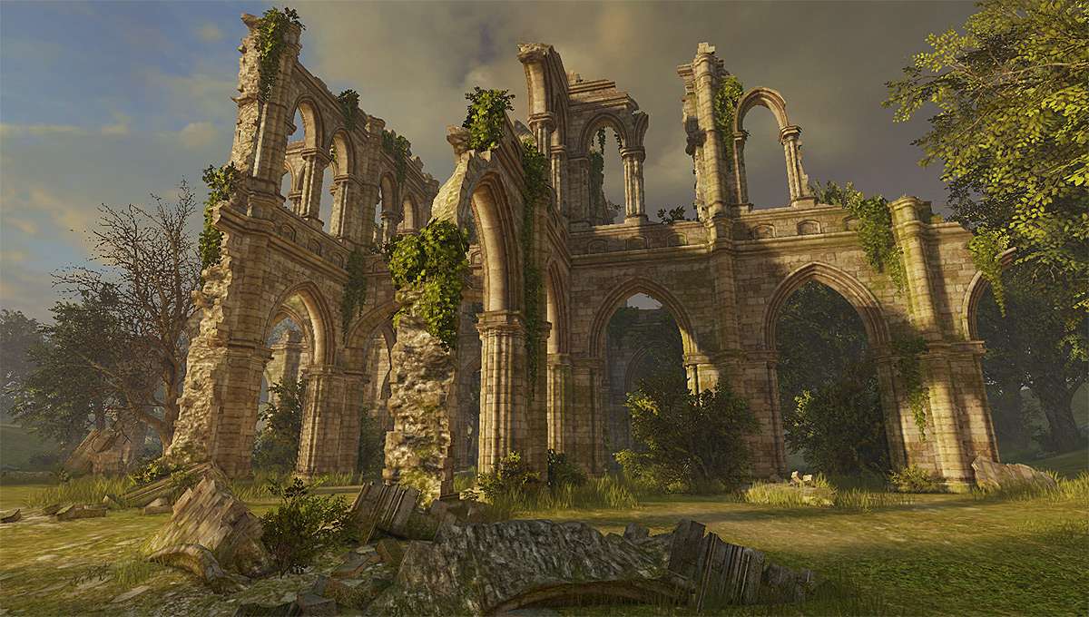
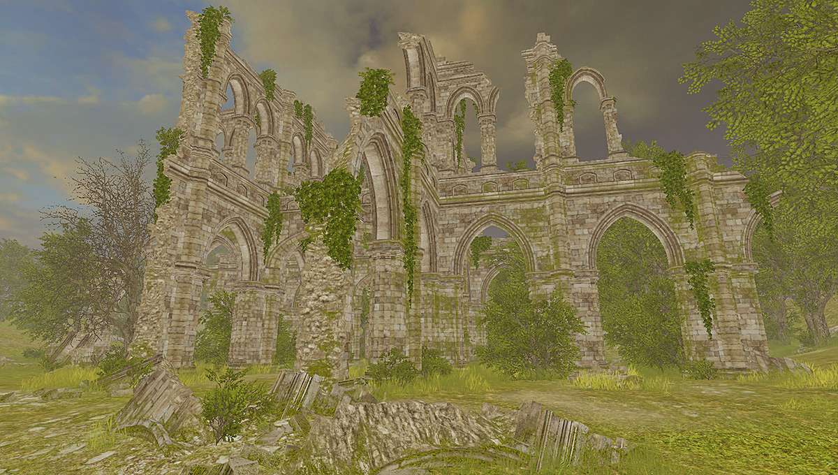
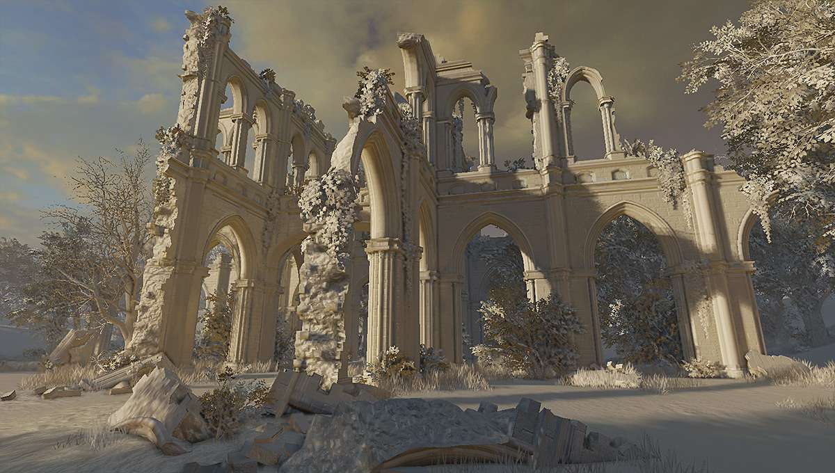
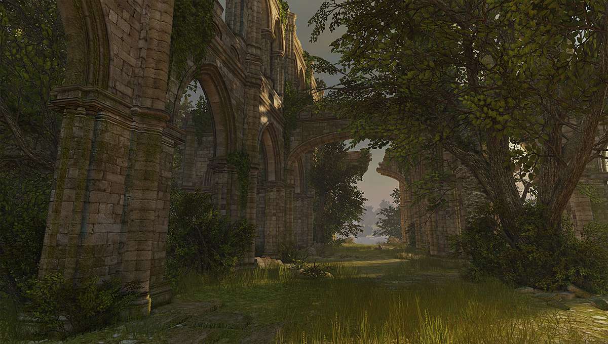
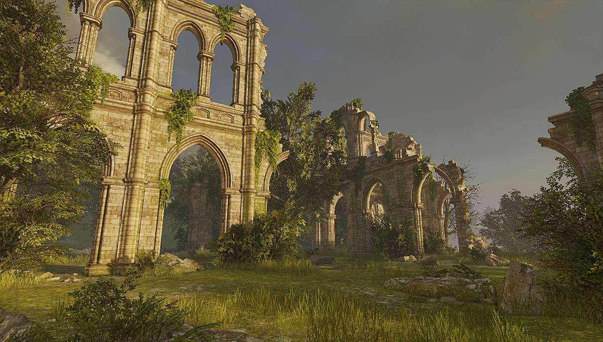
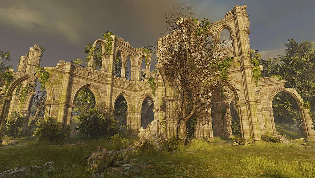
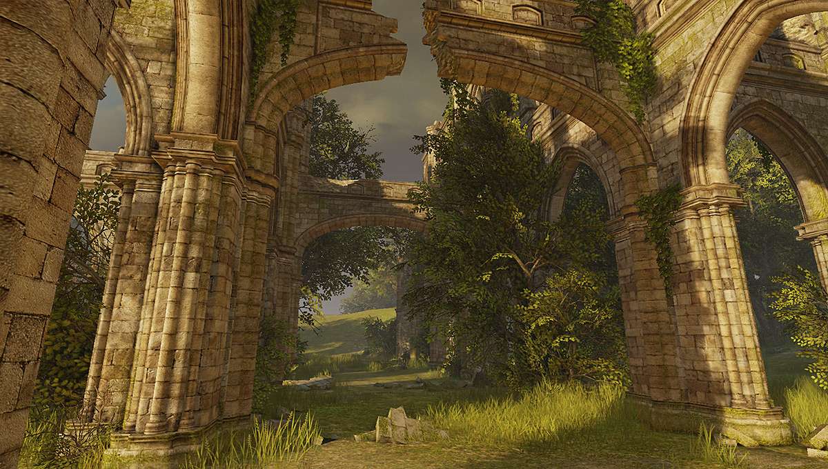
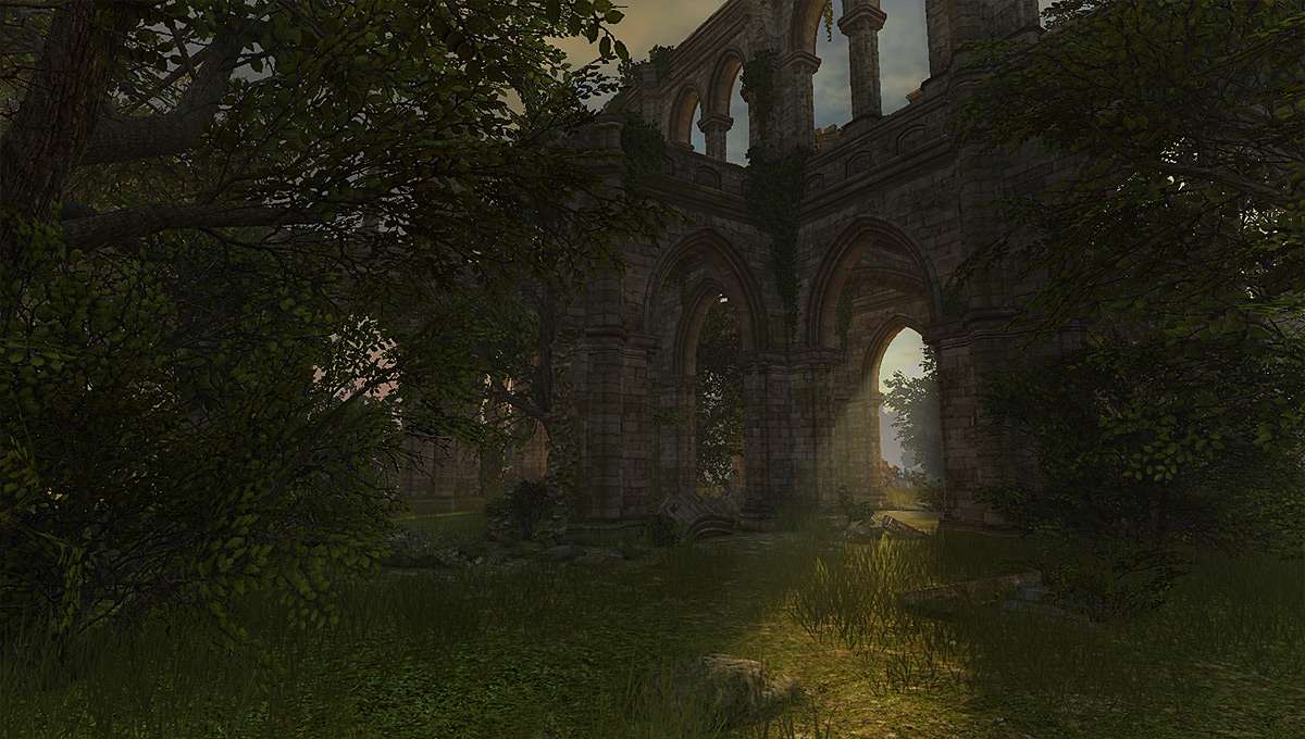
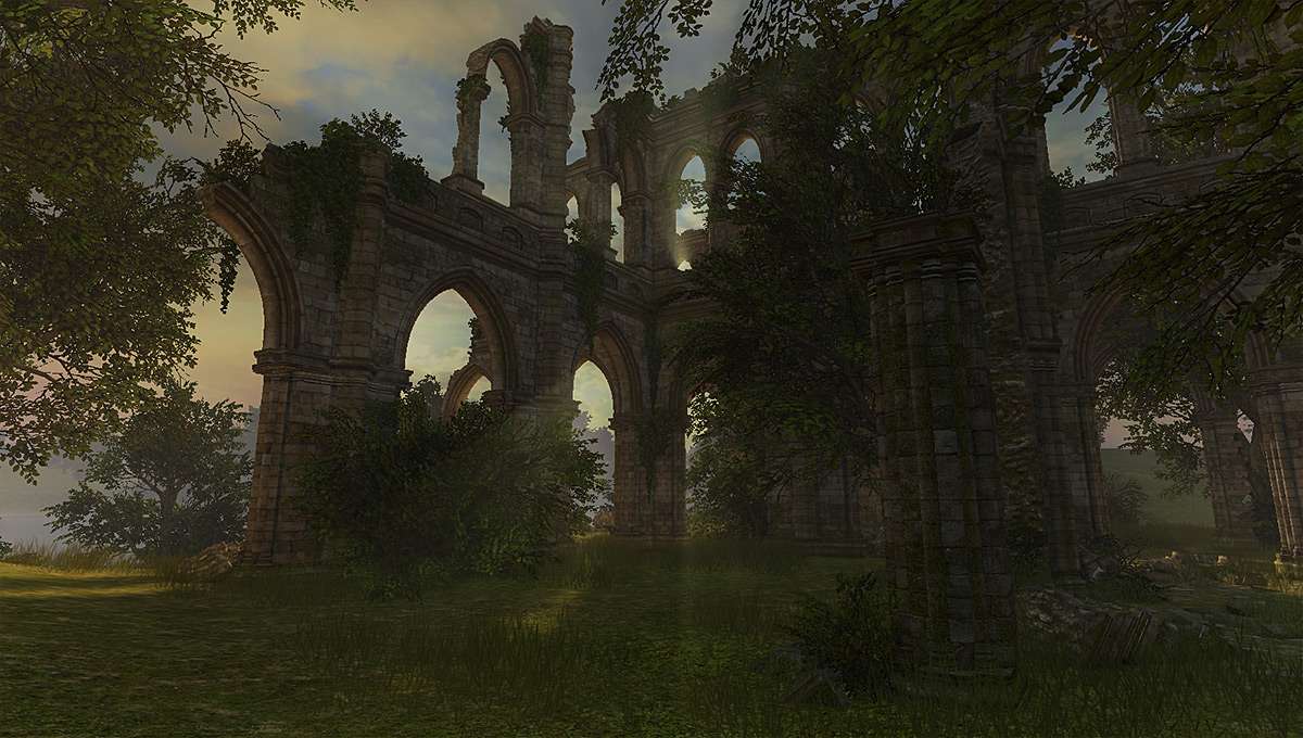
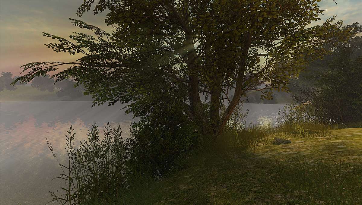
Here is a scene that I recently finished :P
I was mostly done while teaching the advanced environment and assets workshop over at GameArtisans Montreal and which was organized by Fred form GA (props to him for making this happen:)
I still did some minor polish after the workshop finished, but nevertheless all of its aspects and 95% of stuff was done during the classes.
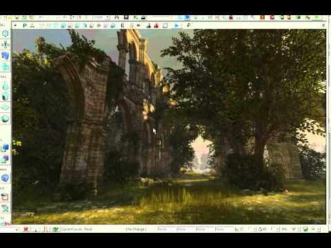
Here is a smal vid exmplaing a bit about the scene:
This is absolutely fantastic. I'd love to see your texture sheets. Maybe the only critique is..the green is a tiny bit washed out from the lighting, but I don't think enough to matter.
What with all the generosity involving UDK scenes recently, I would love to get access to this. Absolutely beautiful. Have you considered putting it up for download? Would love to know more about how it was constructed.
wow, this looks great, dude! warm lighting gives the whole thing a very tender feeling.
Some breakdowns of your pretty, optimized assets would be really nice:D Especially for vegetation - it looks so badass, I would totally love to see a tutorial on that one - as you mentioned there aren't that many. And the composition of all the objcts in the scene is also really balanced. That would also make a very interesting tutorial for me.
I'm sorry I don't know if you're looking for any nitpicks, but I was to, I would say that:
- the big-big gray cloud on the skydome doesn't provide much visual information and kinda lets the scene down. Rich warm highlights would totally fix that
- A tiny bit of color contrast would also work great. Some juicy flowers to break up the green and yellow? or maybe the cliche old torn up banner hanging on the wall?
- some falling laves particles would contribute to the mood. or some colorful butterflies
- Some birds flying around and especially sitting on top of the structures would liven up the scene quite a bit, at least to my taste.
- giant full metal killer shark jumping out of the water would also look real cool)
I'm really glad you finally got to some personal stuff, thank you very much for posting it and please keep it up!)
edit: I found a word that better describes the scene - Picturesque! Because it totally is.
Superb! There's something about your choice of subjects that really hits home with me! The same sort of "romantic" (I don't think many people know the real meaning of that word in this sense) feeling I want in my Manitoba scene...
What with all the generosity involving UDK scenes recently, I would love to get access to this. Absolutely beautiful. Have you considered putting it up for download? Would love to know more about how it was constructed.
I'm gonna echo this... However greedy it may be, I would love to see these files up close. Perhaps consider doing a cooked version, so that people can't export your files out again ?
edit: and crap, i really shoulda been in that workshop, please announce it here if you ever do it again
Man, that is really purty. I'd totally spend an afternoon chilling in that spot. Love the surrounding areas (particularly that last shot by the water). Gorgeous.
The structure does seem a bit uniformly pristine, though, considering the vines and creepers growing around it, and the state of disrepair. I would have expected a bit more localised weathering or discoloration around the vegetation, maybe.
Also, I was all sadface when I clicked on the video and saw it was only 360p
that is superb, ive visited a lot of ruins like this in real life (Fountains Abbey, Rievoulx, Tintern to name a few) and this looks very authentic and realistic. Nice to see someone properly observing their subject matter (only thing i dont like is the broken arches, arches usually collapse when the keystone is removed but thats just a nitpick). Great stuff
I'm quite fond of this scene. Whilst there is nothing overly dramatic or spectacular, it 'just looks right'. The geometry is entirely appropriate (and broken down nicely with the foliage), the texturing is clean and crisp and most importantly, the lighting is down to a subtle tee.
How much of the pieces are unique? Did you use advanced vertex paint and stuff on them? Would kill for some breakdowns! Would be awesome to know you approach on them trees and bushes to, but i guess i should have been on the workshop for that hu?
Any how, frekkin amazing work man! Great to see some new stuff from you!
Looks amazing! +1 for any more info/tuts/files/breakdowns on how you approached this. Vegetation specifically. As a beginning environment artist, that would be insanely awesome.
Man, this is OFF THE HOOK! I love seeing this type of environment. Sure, dark metal corridors dripping with alien semen are great and everything, but there is nothing like a really beautiful looking outdoor scene.
That is really motivating to see that you liked it.
I would love to put this for download, but I think that it would be unfair towards students who paid to attend the class… So I think I need to preserve some restrictions on the scene content access.
Even tho it is my scene it was still a material for the classes.
I’d love to share more info, but I’ll probably do it next time after finishing my own scene independently.
I hope u guys will agree with me
However, I think if I show just few images it won’t hurt.
Apparently there is not that much to it, since the idea was to have as simple assets as possible.
I am not using zbrush (my bad, but I was learning it and it was ok, but I didn’t need to use it since then, so I forget anyway ;p ). So it is totally zbrush-free environment.
Most of textures r photosourced and crazybumped. Sometimes photo source was combined with partial detail bakes in max (some architecture details and borders).
Here r samples of main architecture textures:
and few wires for some of modules:
In general there were around 8-10 “non damaged state” modules for architecture parts plus 2-3 “damaged” versions for each.
I’ll post few more images later on, its just quite late now here :P
@d1ver – thanks dude, I quite agree with your suggestions. Green does feel bit uniform. And I definitely did not do any “dynamics” in the enviro cauz there was no time for this during the classes, and in the end I just wanted to finish it and not stick to it for too long
The sky was quite fast one too, the focus here was more towards “grounded” stuff, but u r right about the cloud :P
Well, now I have something to aim for the future works I still need to research those cool new animated enviro features that pop recently for UDK…
@ Xoliul – ty
Well, the workshop was held “locally” in Montreal. Unfortunately there was no on-line version available. Maybe next time… However, Fred received a sad notice that everyone from the building where he rents the space for GameArtisans Montreal will get evicted in Sept So it is really unclear if he could re-open the place anytime soon because it would need significant money once again :P But I hope for the best…
But if another workshop will happen in the future I’ll post the info on PC of course.
@ LoTekK - lol, capturing and uploading vids seems to be not my friends :P I dunno if I need to do something special to make it in higher versions than 360.
I agree with your feedback that there could be some more “special” details, but I was quite tired recently after vertex painting all that stuff :P
@ yubbie - I glued the arches for the sake of silhouettes and composition
@ ambershee – I see your point. Agreed, it does not have any drama here, but I was actually more targeting towards some sort of “regular” location as if in some MMO. It was actually more done as an example of “one of many” layouts that can be done with relatively generic modules.
@ sltrOlsson – thanks:) yes, I used some vertex paint. I think only architecture pieces have vertex blending using vertex color AND grayscale mask, but stuff like stones, tree trunks and terrain use just simple vertex blend, no fancy nodes for those :P
@ synergy11 – all is modeled directly in low-poly and textured in the “old school” way. As mentioned above, some hi-res bakes were done but only for some texture details.
Awesome job! It really makes me want to do a ruins scene like this.
As Synergy said, I would love it if you could post some more on the foliage. Maybe a wireframe and the diffuse just to show how you layed out the texture and how it's modeled. I've been trying to come up with some better foliage but haven't gotten that great of results and seeing how your branches are done would really help.
Inspiring stuff Did you have a seperate material ID small texture for the broken parts of the meshes ? Any chance you could post a screen with wire of the hanging vines ?
This does look really great. Definitely caught the feel of the scene pretty nicely. But I have some questions after looking at the wires:
1. Are the arches a separate piece from the wall/collumns? I've always been taught to keep meshes in quads or tris and I'm just trying to grapple how you went about the poly flow.
2. With the sides of the broken pieces, where it is a 14+ sided polygon on the sides, next to the broken part, did it make UDK chug or develop any smoothing errors? This seems to be a small scene, so I don't think it would matter all that much, but from a technical standpoint, wouldn't this problematic?
Forgive my noobishness. Just need some form of clarification.
Btw, what kind of workshop was this exactly? is it like pay-to-watch over the internet workshop, or was this for a school?
And will you do it again in the future? Moar info plz!
As for the scene... Well, you pretty much nailed everything, so yeah!
Some samples of foliage, not as fancy as u might think :
@ mixeh – textures r mostly photosourced (majority from cgtextures:P ).
Vegetation has more manual work tho, such as placing leaves or combining brunches from smaller photos by hand. But “building blocks” of textures are all photosourced.
@ Bart – yes, usually there are 4 IDs on architecture meshes (stone wall, trims, tiled “filler” and broken stone texture for the damaged edge).
I did apply come vertex color blending tho to blend the wall with “broken” stone more smoothly, but it is not necessary to do even today
@ NuZero – I think yes, they are a separate “element” within the module.
Of course quads help to model various stuff especially architecture (makes it easier to do edgeloop selections etc), but usually that is not mandatory. Every 3d game engine converts it all to triangles anyways.
You just need to pay attention to how your triangles go (avoid triangulation bugs), which u can see when u click “Turn” in the “Edit Edges” rollout in Edit Poly tools. With that tool u can change direction of triangles in the mesh and obviously it lets u see how “real” triangle go, even if in normal mode u see multi-sided polygons.
UDK handles it just fine, as I said it converts to triangle anyways. As for the smooting – u just need to pay attention to your smoothing groups. Make sure u assign them to all faces. I usually start by selecting everything and making “auto smooth” and then go into individual faces to change their SG manually if the smoothing result is not what I want.
Well, if u bring that to ZBrush u need to have quads of course But I did low poly right away without zbrushing.
@ [HP] – that was “on-site” workshop here in Montreal at Game Artisans.org “HQ”. It was like an evening class.
As for the future, well, unfortunately it remains unclear for now :P
Here is a quote from my reply to Xoliul : “…Fred received a sad notice that everyone from the building where he rents the space for GameArtisans Montreal will get evicted in Sept. So it is really unclear if he could re-open the place anytime soon because it would need significant money once again :P But I hope for the best…”
Thanks again all u guys for liking it and for any feedback/suggestions u might have
Replies
Some breakdowns of your pretty, optimized assets would be really nice:D Especially for vegetation - it looks so badass, I would totally love to see a tutorial on that one - as you mentioned there aren't that many. And the composition of all the objcts in the scene is also really balanced. That would also make a very interesting tutorial for me.
I'm sorry I don't know if you're looking for any nitpicks, but I was to, I would say that:
- the big-big gray cloud on the skydome doesn't provide much visual information and kinda lets the scene down. Rich warm highlights would totally fix that
- A tiny bit of color contrast would also work great. Some juicy flowers to break up the green and yellow? or maybe the cliche old torn up banner hanging on the wall?
- some falling laves particles would contribute to the mood. or some colorful butterflies
- Some birds flying around and especially sitting on top of the structures would liven up the scene quite a bit, at least to my taste.
- giant full metal killer shark jumping out of the water would also look real cool)
I'm really glad you finally got to some personal stuff, thank you very much for posting it and please keep it up!)
edit: I found a word that better describes the scene - Picturesque! Because it totally is.
I'm gonna echo this... However greedy it may be, I would love to see these files up close. Perhaps consider doing a cooked version, so that people can't export your files out again ?
edit: and crap, i really shoulda been in that workshop, please announce it here if you ever do it again
The structure does seem a bit uniformly pristine, though, considering the vines and creepers growing around it, and the state of disrepair. I would have expected a bit more localised weathering or discoloration around the vegetation, maybe.
Also, I was all sadface when I clicked on the video and saw it was only 360p
(Oh and you are from Montr
Lighting is awesome, great stuff!
Any how, frekkin amazing work man! Great to see some new stuff from you!
I would also love to see breakdowns for the foliage and trees.
Also were the ruin pieces baked from high to low poly?
Cheers.
Also can you provide any information on how you created the ivy/trees?
Great work!
This literally took my breath away. And I love the shot by the shore too. Really want to play a game that looks like this.
That is really motivating to see that you liked it.
I would love to put this for download, but I think that it would be unfair towards students who paid to attend the class… So I think I need to preserve some restrictions on the scene content access.
Even tho it is my scene it was still a material for the classes.
I’d love to share more info, but I’ll probably do it next time after finishing my own scene independently.
I hope u guys will agree with me
However, I think if I show just few images it won’t hurt.
Apparently there is not that much to it, since the idea was to have as simple assets as possible.
I am not using zbrush (my bad, but I was learning it and it was ok, but I didn’t need to use it since then, so I forget anyway ;p ). So it is totally zbrush-free environment.
Most of textures r photosourced and crazybumped. Sometimes photo source was combined with partial detail bakes in max (some architecture details and borders).
Here r samples of main architecture textures:
and few wires for some of modules:
In general there were around 8-10 “non damaged state” modules for architecture parts plus 2-3 “damaged” versions for each.
I’ll post few more images later on, its just quite late now here :P
@d1ver – thanks dude, I quite agree with your suggestions. Green does feel bit uniform. And I definitely did not do any “dynamics” in the enviro cauz there was no time for this during the classes, and in the end I just wanted to finish it and not stick to it for too long
The sky was quite fast one too, the focus here was more towards “grounded” stuff, but u r right about the cloud :P
Well, now I have something to aim for the future works I still need to research those cool new animated enviro features that pop recently for UDK…
@ Xoliul – ty
Well, the workshop was held “locally” in Montreal. Unfortunately there was no on-line version available. Maybe next time… However, Fred received a sad notice that everyone from the building where he rents the space for GameArtisans Montreal will get evicted in Sept So it is really unclear if he could re-open the place anytime soon because it would need significant money once again :P But I hope for the best…
But if another workshop will happen in the future I’ll post the info on PC of course.
@ LoTekK - lol, capturing and uploading vids seems to be not my friends :P I dunno if I need to do something special to make it in higher versions than 360.
I agree with your feedback that there could be some more “special” details, but I was quite tired recently after vertex painting all that stuff :P
@ yubbie - I glued the arches for the sake of silhouettes and composition
@ ambershee – I see your point. Agreed, it does not have any drama here, but I was actually more targeting towards some sort of “regular” location as if in some MMO. It was actually more done as an example of “one of many” layouts that can be done with relatively generic modules.
@ sltrOlsson – thanks:) yes, I used some vertex paint. I think only architecture pieces have vertex blending using vertex color AND grayscale mask, but stuff like stones, tree trunks and terrain use just simple vertex blend, no fancy nodes for those :P
@ synergy11 – all is modeled directly in low-poly and textured in the “old school” way. As mentioned above, some hi-res bakes were done but only for some texture details.
As Synergy said, I would love it if you could post some more on the foliage. Maybe a wireframe and the diffuse just to show how you layed out the texture and how it's modeled. I've been trying to come up with some better foliage but haven't gotten that great of results and seeing how your branches are done would really help.
1. Are the arches a separate piece from the wall/collumns? I've always been taught to keep meshes in quads or tris and I'm just trying to grapple how you went about the poly flow.
2. With the sides of the broken pieces, where it is a 14+ sided polygon on the sides, next to the broken part, did it make UDK chug or develop any smoothing errors? This seems to be a small scene, so I don't think it would matter all that much, but from a technical standpoint, wouldn't this problematic?
Forgive my noobishness. Just need some form of clarification.
Btw, what kind of workshop was this exactly? is it like pay-to-watch over the internet workshop, or was this for a school?
And will you do it again in the future? Moar info plz!
As for the scene... Well, you pretty much nailed everything, so yeah!
@ mixeh – textures r mostly photosourced (majority from cgtextures:P ).
Vegetation has more manual work tho, such as placing leaves or combining brunches from smaller photos by hand. But “building blocks” of textures are all photosourced.
@ Bart – yes, usually there are 4 IDs on architecture meshes (stone wall, trims, tiled “filler” and broken stone texture for the damaged edge).
I did apply come vertex color blending tho to blend the wall with “broken” stone more smoothly, but it is not necessary to do even today
@ NuZero – I think yes, they are a separate “element” within the module.
Of course quads help to model various stuff especially architecture (makes it easier to do edgeloop selections etc), but usually that is not mandatory. Every 3d game engine converts it all to triangles anyways.
You just need to pay attention to how your triangles go (avoid triangulation bugs), which u can see when u click “Turn” in the “Edit Edges” rollout in Edit Poly tools. With that tool u can change direction of triangles in the mesh and obviously it lets u see how “real” triangle go, even if in normal mode u see multi-sided polygons.
UDK handles it just fine, as I said it converts to triangle anyways. As for the smooting – u just need to pay attention to your smoothing groups. Make sure u assign them to all faces. I usually start by selecting everything and making “auto smooth” and then go into individual faces to change their SG manually if the smoothing result is not what I want.
Well, if u bring that to ZBrush u need to have quads of course But I did low poly right away without zbrushing.
@ [HP] – that was “on-site” workshop here in Montreal at Game Artisans.org “HQ”. It was like an evening class.
As for the future, well, unfortunately it remains unclear for now :P
Here is a quote from my reply to Xoliul : “…Fred received a sad notice that everyone from the building where he rents the space for GameArtisans Montreal will get evicted in Sept. So it is really unclear if he could re-open the place anytime soon because it would need significant money once again :P But I hope for the best…”
Thanks again all u guys for liking it and for any feedback/suggestions u might have