Home 3D Art Showcase & Critiques

WIP- Dungeon/Ransacked castle environment

1
polycounter lvl 12
Offline / Send Message
Will Faucher polycounter lvl 12
Hey,
So I've started working on a new environment. I am going for an old dungeon/ransacked castle. I have a few concept ideas in mind, here is the inspiration:
dungeon_800.jpg
ReWrap1_L.jpg

I will be going for a more Oblivion-ish style with this. I've currently started the block-out process. Please keep in mind this was done very quickly, and I'll be refining the block-out more as I go on.
blockout001.jpg

I've yet to decide what will be put in at the far end, at the top of the stairs, but I'll get to that eventually. (Btw, that little red box is a scale reference, 120 unreal units tall). Yes, I know those steps are too small compared to the person, but I'll rearrange that once I'm back from school.

Replies

  • cholden
    Options
    Offline / Send Message
    cholden polycounter lvl 18
    Nice concept, lots of good sculpting opportunities for you. I build environments pretty much the same way. Block it out toss in some colors and atmosphere to get a feel before really digging into the details.
  • Will Faucher
    Options
    Offline / Send Message
    Will Faucher polycounter lvl 12
    Update.
    So I've worked alot on the layout and such. Improved the general look of things. At the far end, the roof/ceiling has collapsed, revealing the outdoors. There will be large boulders, and rubble and vegetation hiding the horizon line. Now, I am aware that thing whole thing is terribly lit, but that's not my focus at the moment.

    blockout003.jpg
  • Will Faucher
    Options
    Offline / Send Message
    Will Faucher polycounter lvl 12
    I'm going for a fantasy-style environment here, so I can allow myself a little bit of surrealism. However, my architecture will me far, far more ornate than in my concept. A part of me wants to stick with a real, solid pillar, instead of a fantasy-based pillar with a crystal supporting the roof :P

    *Edit*
    Small update! Continued working on the blockout! It's getting there :)
    The bird-like thing at the top of the stairs will be a statue. The focal point of the scene. What do you guys think?
    blockout5.jpg
  • MarcusF
    Options
    Offline / Send Message
    MarcusF polycounter lvl 9
    Lookin' good! That wall section next to the second level (right next to where the stairs are) seems a little empty. Apart from that, I understand this is a blockout phase, so it is a little early to crit. Keep it up though! When can we expect some hi-poly work? :)
  • Will Faucher
    Options
    Offline / Send Message
    Will Faucher polycounter lvl 12
    Thanks for the comments guys!

    @Cholden: Yeah this is the first time I am making an environment this way. It is definitely one of the better methods for sure! :)

    @Marcus: Thanks! I am currently working on the section you mentioned was a little empty, but it's like you said, it's still in block-out phase right now. I'll be getting this into UDK tonight. Once the blockout is done in UDK and I have a good sense of what I want my lighting to look like, then I'll head on into Mudbox an Zbrush for some nice High Poly work. :)
  • cholden
    Options
    Offline / Send Message
    cholden polycounter lvl 18
    Those pillars remind me a lot of the High Elf environment concepts from Warhammer Online. We built tons of big pillars, glowing gems and vines wrapped/carved all around them. There may be some ideas you could draw from them. Unfortunately, they didn't release many of those concept, but there's a few on the site
    http://www.warhammeronline.com/conceptart/conceptArt_2008.php
  • Will Faucher
    Options
    Offline / Send Message
    Will Faucher polycounter lvl 12
    Thanks for the link! I didn't think of warhammer online at all when I was drawing these pillars. The thought came to me after you mentioned it. And it does resemble it in a sense. However, I don't want to make this environment resemble the High Elf environments too much. I want to make it slightly darker themed, dirtier, abandoned, destroyed. I dislike the ever clean High elf environments. The pillars I drew are nothing but concepts though. The final result will most definitely be different. Here is a small update in UDK. Lighting is terrible, it was done quickly, since I'm anxious to start the high poly.50384645.jpg
  • Will Faucher
    Options
    Offline / Send Message
    Will Faucher polycounter lvl 12
    Update!

    Started working on the base high poly meshes. I will bring these into mudbox and Zbrush later. I will most likely sculpt the pillars , but i've yet to determine their final shape.

    blockout1.jpg
    blockout2.jpg
  • Simmo
    Options
    Offline / Send Message
    Simmo polycounter lvl 12
    This looks great so far, thanks for posting your progress. really helpful to a noobie like me to see some workflow and the steps people take on tackling larger projects like this. Thanks! :)
  • Will Faucher
    Options
    Offline / Send Message
    Will Faucher polycounter lvl 12
    Thanks! I'll be posting my sculpts soon!
  • MarcusF
    Options
    Offline / Send Message
    MarcusF polycounter lvl 9
    I'm guess you'll be adding a ton of detail as well as stone definition in your sculpts right? That main central arch looks like it is made of marshmallow. :P Looking awesome though! can't wait to see the sculpts!
  • Will Faucher
    Options
    Offline / Send Message
    Will Faucher polycounter lvl 12
    Yeah, I will be adding alot of wear and decay on just about everything. My first intention was to add a collapsed roof, but after a little experimention, I thought of something interesting. Here are the latest results of what I have assembled for my scene, as well as a paintover. I'm debating on which one I like best. I'm leaning towards the collapsed roof though.
    Crits appreciated! :)

    blockout.jpg
    blockouttest2.jpg
  • MarcusF
    Options
    Offline / Send Message
    MarcusF polycounter lvl 9
    Ohhh much better! I defiinitely like the collapsed roof better though.
  • n88tr
    Options
    Offline / Send Message
    Ditto, ruined ceiling makes it look more gothic imo. But he could be showing us a different angle of the church and hopefully the caved-in ceiling still exists? :)

    The light rays, photoshopped?
  • yubbie
    Options
    Offline / Send Message
    Looks promising. Here's some real life inspiration in case you need ideas for when you get around to detailing. As much as i love fable 2 and oblivion computer games and concept art cant yet compete with real life:
    http://www.flickr.com/search/?w=all&q=fountains+abbey&m=text
    http://www.flickr.com/search/?q=rievaulx+abbey
    http://www.flickr.com/search/?w=all&q=tintern+abbey&m=text
    http://www.flickr.com/search/?w=all&q=whitby+abbey&m=text
  • Will Faucher
    Options
    Offline / Send Message
    Will Faucher polycounter lvl 12
    @n88tr: Yes, these are all painted over in photoshop.
    Thanks for those yubbie! I was actually looking at something similar! Even though I am going for a fantasy-style look here, those will definitely help with the texturing! :)
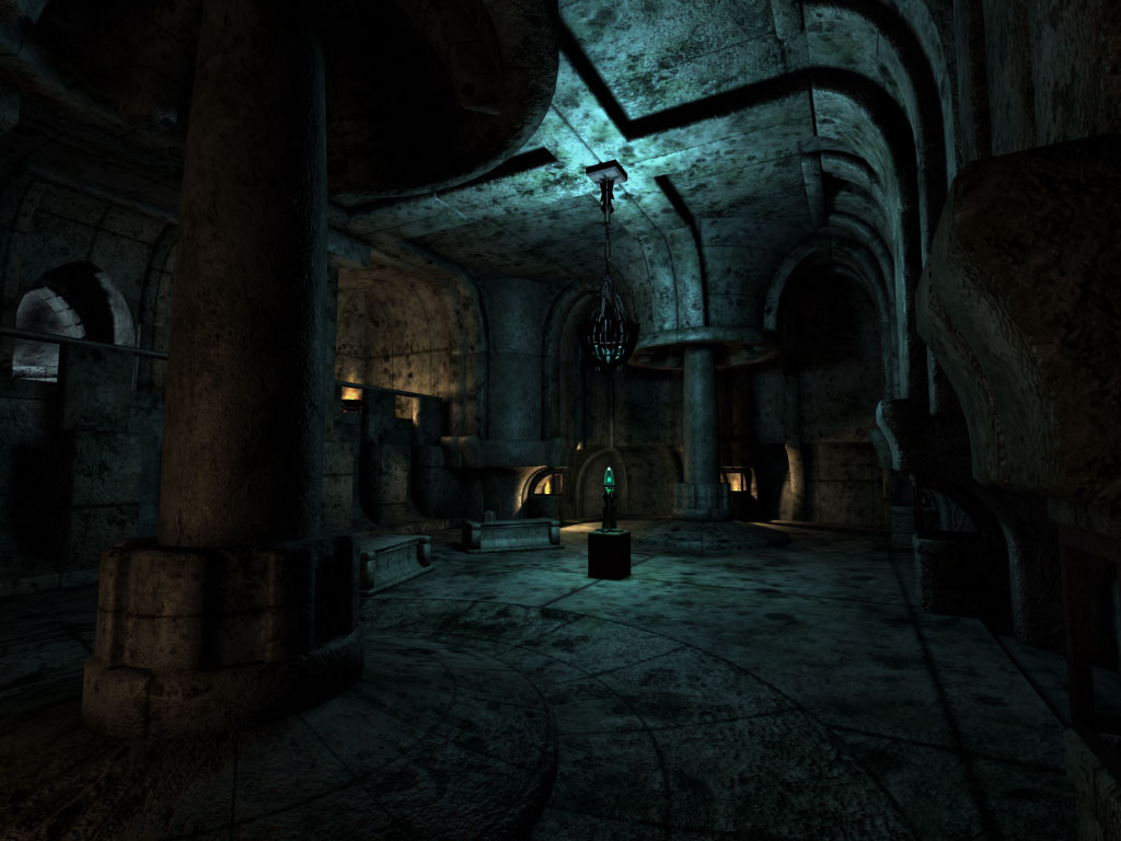
    Here is a mini update with COLOR! Thinking of adding some vegetation in there, adds an interesting contrast with the stone.
    blockout002.jpg
  • marq4porsche
    Options
    Offline / Send Message
    marq4porsche polycounter lvl 9
    Love that idea, maybe even have some ivy on some of the other pillers and such. Goo luck this is looking like a great scene so far!
  • Will Faucher
    Options
    Offline / Send Message
    Will Faucher polycounter lvl 12
    Thanks! I'll keep the vine idea in mind!
    Here is a mini update with the sculpted arches. I will add some decoration and intricate patterns in them once I get the time. :)

    blockout2.jpg
    blockout4.jpg
  • MarcusF
    Options
    Offline / Send Message
    MarcusF polycounter lvl 9
    Nice high poly work :)
    I really like the mood you have in that paintover! It's looking awesome! Looks very promising!
  • Kiroru
    Options
    Offline / Send Message
    So far the concept and the scene looks amazing
  • Will Faucher
    Options
    Offline / Send Message
    Will Faucher polycounter lvl 12
    Thanks! I've started baking a few propsand I should be getting them into UDK soon once I've got enough to work with. I'm surprised there aren't many people who are giving their opinion on this though, it would be greatly appreciated. Oh well. Thanks for those of you who helped out! :)
  • Will Faucher
    Options
    Offline / Send Message
    Will Faucher polycounter lvl 12
    Well, it's been a long time since I last updated this thing. So here's what I have cooked up. Everything is modelled and baked (with the exception of a few things that I'll finish later like vegetation and such). I still need to tweak some maps (all my normal map's green channels are flipped). And the tiling stone wall texture I have need to have it's color adjusted to fit the arch colors (the ones that are textured that is). I'm still very new at unreal, so this may take longer than I thought. But at least I can start texturing everything now! :)
    I haven't had the time to make decent materials yet and not all normal maps are applied in this screenshot. I just need to go to bed before my head dies on me. Clearly, my normal maps should be coming out better than this, but lightmass is playing screwy with me, so we'll see how it goes once I get the hang of it.

    Let me know what you all think! :)

    unreal1h.jpg
  • SHEPEIRO
    Options
    Offline / Send Message
    SHEPEIRO polycounter lvl 17
    i think your work is nice...the floor looks great (bit expensive maybe)


    BUT i think your composition isnt great at the moment...your packing ther env with too much medium and fine detail and there are not enough areas to rest the eyes on...its a bit too fussy... i would think about getting rid of those details in the centre of the roof spans for starters they take away from the statue

    maybe lighting will help if you make it quite striking
  • Rurouni Strife
    Options
    Offline / Send Message
    Rurouni Strife polycounter lvl 10
    I'm not a huge fan of the details on the roof like Shepeiro. Besides being noisy and taking away from the statue I think compared to the rest of the work they don't look very good.

    Lightmass can be funky with your normal maps. Once you flip your channels though it'll help greatly.

    Loving this!
  • Will Faucher
    Options
    Offline / Send Message
    Will Faucher polycounter lvl 12
    Thanks for the crits guys! The roof details you are talking about are the 7 feather-like objects located above the statue, correct? I'll look into that.

    I'll work on the composition. Thank you for pointing that out. I'll see what I can do.
    As for the lighting, the light setup I have now is simply to see what I'm doing. It's nothing compared to what I plan on finishing with. :)

    Thanks alot!
  • Bobby J Rice 3rd
    I like what your trying to achieve in this scene. There is alot of potential here. But I think your execution is somewhat... sloppy.

    I like the shapes over all, but in my option, the textures/UVs and modeling is wasteful. In an enclosed scene like this, i would put more effort into the in-game modeling and less into the one off bake transfers from high rez zbrushed models. Sure they look good but that process is dependent on large 1k sheets which is wasteful of texture/UV space, forces you to get clever with UV layout, and is time consuming.

    Instead, try a more trimmed approach. Try taking the arch patterns and putting them into a tiling trim sheet. Then modify your arch models to accommodate ribbon UV's. You would save texture data and maximize detail. Also, try layers of varied textures. Blend different wear and tear sheets together. Layer grunge sheets on top.

    Going this route saves the need to use a clunky 1024 or 2048 and instead lets you use 512's and 256 textures with the same or higher resolution.

    For the floor, i think the comments earlier are correct. Too expensive! You can accommodate the same look with less and probably go further. Play God of war 3 and uncharted AT. There are tons of examples of floors in those two games.

    Example:

    • Try just tiling the floor generically
    • Blend in a second rubbly version of the floor.
    • Then use geometry to pop out occasional floor stones here and there.
    • Then try a second geo sheet and vertex blend in dirt and debri on top to break it all up.(2nd geo sheet could be a dup of the main floor)
    • For the floors, it might help you to maintain an even quad dispersal. A quad per meter?Or maybe even a quad per brick.

    If you don't get good results from geo popping out of the floor, another idea would be to take a rectangle beveled cube, bake a single custom high rez brick to it, (245 x 128?) and use that to create varried popping throughout the room. This is assuming you are keeping an even texel resolution. However, based on the look your trying to achieve, brick popping might be the way to go.

    I think you'll be surprised at how much better it looks and how much faster it is to bang out.

    Good luck. :)
  • Will Faucher
    Options
    Offline / Send Message
    Will Faucher polycounter lvl 12
    Good heavens, amazing crit! Thanks alot for all that advice! Unfortunately I dont have the experience or know how to do most of th
  • Rurouni Strife
    Options
    Offline / Send Message
    Rurouni Strife polycounter lvl 10
    I will say that I learned a lot from his crit!
  • Will Faucher
    Options
    Offline / Send Message
    Will Faucher polycounter lvl 12
    Agreed. Not sure I understand how to get arches similar to what I want from a tiling texture... but I'm pretty new at modular modelling and super optimized workflows. So baking high rez models to a low poly works best for me in this case and gets me the best visual result. (Although not the most optimized method apparently).

    However, the technique mentioned for the floor IS very interesting. I'll give it a shot if time allows it. I've got until the end of august to finish my school portfolio.
  • Bobby J Rice 3rd
    I did not know this was a student project. Serves me right for not reading everything. Is this going to be playable?

    To clarify, I think one offs limit your UV abilities and confine you to a single pallet. Unless your accounting for close to or exact texel resolution, you may run into optimization issues in a production pipeline when it comes to downsizing textures for memory.

    To clarify UV ribbons, if your mesh has an even quad dispersal, and the mesh defines the trimming from the texture, then you can break up your Arch UV's into straight UV ribbons in your UV editor. Maya does this really well. (unitize then move, sew). This allows you to bake out those arch details in a straight line on a texture sheet that tiles end to end. Then you can play with your UV ribbons to line up with the trims in your texture sheet. Does that make since?

    Texture trim example: http://www.cgtextures.com/login.php?&texid=25454&destination=texview.php?id=25454&PHPSESSID=3718fac26e71695596b4b5a21e3d86ca


    But, it's not all or nothing. If you go the one off route, i would at least incorporate the under arch brick as well. Try and fill the texture sheet as much as possible. This will at least give you some flexibility as far as draw calls.

    hope this helps. :)
  • Will Faucher
    Options
    Offline / Send Message
    Will Faucher polycounter lvl 12
    Hmm I see what you mean. Interesting. I don't have the time right now to do a ton of experimenting, but I'll be sure to try this out once I get some spare time!

    As for my student project. This does not need to be playable. It is simply going to be part of a demoreel. And I'll be getting some beauty shots from it. But that's about it. So high framerates aren't that much of an issue. Sure it's nice and I'm going for something that will play well, but it's not the MAIN issue here.
  • MatthewS
    Options
    Offline / Send Message
    @ Crazyeyes
    I must say that the way you are suggesting doing the details is interesting... would you then have issues with the extra vertex counts from having to break up the uvs? And how much extra resources does the needed extra polys and vertexes take in comparison to the larger texture sheets? Also if he were to break up the objects into tiles like this how would the increased number (assuming he doesn't have each piece in an individual sheet) of texture sheets affect the performance?

    For the grunge layers, were you suggesting making them with alphas and then blending them in the editor or something else? Is it possible to blend normal texture sheets for differing damage?

    What makes an enclosed scene special in regards to this method?

    I am also still in college and unfortunately don't have enough of this type of information available-_-
  • Will Faucher
    Options
    Offline / Send Message
    Will Faucher polycounter lvl 12
    I agree with not having enough of this type of information available. Never in any of my classes have I heard of such a workflow. I'm sure it is something you learn once in a production pipeline though. I've always gone with baking high rez models to low poly models and being satisfied with my results.
  • Bobby J Rice 3rd
    Ic, that's cool. What ever works for you. :P. I would, however, approach the floor a little different.

    check this out (in HD ;) ): [ame]http://www.youtube.com/watch?v=U_h9g6DzBWI&NR=1[/ame]

    The floor has a nice realistic bump but the main brick pop is from geo. Notice the stones that are inset? They use geo and a second geo sheet that alpha's out like dirt built up near the cracks.

    Given that this is a one time screen shot, I'd go all out man.

    Good luck. :)
  • Will Faucher
    Options
    Offline / Send Message
    Will Faucher polycounter lvl 12
    I hope what I said didn't come out as criticism/complaint/negative intonation, because it's not what I meant. I truly appreciated you taking the time to help me (us) out here. It has definitely given me alot to consider, and it has also made me realize that I have a long, long way to go before I can even begin to think that I understand everything I'm working with :P.

    Thank you very much for sharing your workflow tips!

    Now before I go totally off topic, more work will be coming soon! I've gotten ALOT of texturing work done in very little time, so hopefully I can move on to lighting and post processing soon! :)
  • Bobby J Rice 3rd
    MathewS,

    I would pay attention to games like God of war 3, uncharted 2, and Dead Space 2. All of which practice this "trim" method. Vert counts can get high but only if you go crazy with too much strip detail. In my opinion the kind of scene in question is simple enough to accommodate this type of work flow.
  • Will Faucher
    Options
    Offline / Send Message
    Will Faucher polycounter lvl 12
    Nearly done texturing the gryphon. Just a few tweaks here are there, but I'll see what it looks like in UDK before I make those changes.
    griffon5.jpg
  • achillesian
    Options
    Offline / Send Message
    wicked sick, love the diffuse
  • divi
    Options
    Offline / Send Message
    divi polycounter lvl 12
    gold works really well even though i might enjoy some blue hues in the rock diffuse. but that might not matter once you have it in the environment and lit.
  • Will Faucher
    Options
    Offline / Send Message
    Will Faucher polycounter lvl 12
    Thanks for the comments!
    @Divi, I plan on making my lighting contain some blueish hues, so that may get the result you may like! ;)
  • Will Faucher
    Options
    Offline / Send Message
    Will Faucher polycounter lvl 12
    The tiling texture along the walls isn't what I wanted, so I'll be changing it. The lighting is also experimental right now, there will be a hole in the ceiling where the sunlight is popping in as well :) Oh, and not all my textures are done yet :P
    I know my lighting is too dark right now. I'm experimenting with UDKs lighting system for the first time. I'll get there!
    udkmap.jpg
  • paulsvoboda
    Options
    Offline / Send Message
    paulsvoboda polycounter lvl 12
    Looking really good so far. That gryphon turned out really really good. It's subtle but the slight highlight on the edge of it's eyebrow really sold it for me.
  • Will Faucher
    Options
    Offline / Send Message
    Will Faucher polycounter lvl 12
    Thanks! Here is another small lighting update. I'm reworking the lighting alot, and got a few new things textured :)
    udk2.jpg
    udk3.jpg
  • Mik3d
    Options
    Offline / Send Message
    Looks great man!! The only thing I can say that I personally don't like is the brinks on your wall slanting at an angle. I would just have them go straight as all of your other bricks.:)
  • Will Faucher
    Options
    Offline / Send Message
    Will Faucher polycounter lvl 12
    Yeah I've yet to arrange the UVs of that wall section. But it will most definitely be changed in the near future.
  • ParoXum
    Options
    Offline / Send Message
    ParoXum polycounter lvl 9
    Looking good overall. But what annoys me is the texel ratio gap between some objects like upper arch and smaller, wall bricks and trims. The stairs are quite lowres compared to the rest too.

    But it's nothing you cant fix :)
  • Will Faucher
    Options
    Offline / Send Message
    Will Faucher polycounter lvl 12
    Hmm good call on that! For some reason I didn't notice that. I'll be sure to correct that right away. Anyways, here is one final update for tonight before I fall asleep on my desk.
    No more white blobs of untextured props! :D
    udk5.jpg
  • fabio brasilien
    Options
    Offline / Send Message
    fabio brasilien polycounter lvl 11
    Looking great so far!!! The only thing the doesn´t look good at this stage are the columns over those rocks on the floor. This floor doesn´t look strong enough to carry such weight. It looks like everything can come down any time... I always see columns over large solid bases...
    That is it...looking forwards to see the final image! ;)
  • Bobby J Rice 3rd
    Lots of potential in this scene.
    As a whole, the floor looks like its floating on water. Also, the brick wall consistency seems out of place and not inline with the over all theme. I would enlarge the brick wall pattern and lessen the over all normal map noise. Try and let your broad strokes show through rather than the tiny noisy pocks. I think you'll get a better read. Then go back and slowly bring in the detail noise once the shapes read well.

    Same with the over all diffuse quality. It's really noisy at the moment. Try going with solid colors and patterns first, let the forms show through, then bring in the noise little by little.
  • SHEPEIRO
    Options
    Offline / Send Message
    SHEPEIRO polycounter lvl 17
    yep again from my first point and agreeing with crazy eyes----
    think you have too much small detail i would maybe change over some of the walls to rough lighter plaster esp the sloping ones as sloping brick/stone is a NONO if not changeing it too plaster maybe white washed stones with less form to them to reduce the impact of the detail, make it weaker so it does not fight with the main forms

    also i would be tempted to lighten the tone of your stone or plaster (if you change it) think it would help alot as ATM its all too consistent

    a scene should have a nice rhythm IMO with pauses, breaks and detail...
1
Sign In or Register to comment.