Home 3D Art Showcase & Critiques

the jackal - sci-fi character C&C welcome

greentooth
Offline / Send Message
garriola83 greentooth
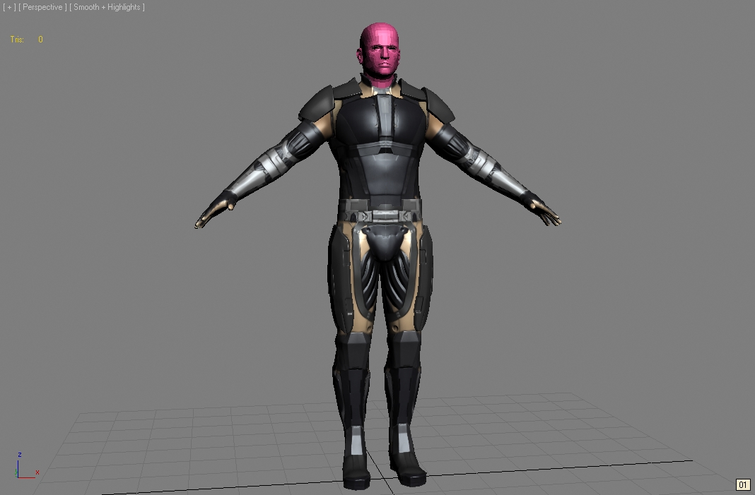
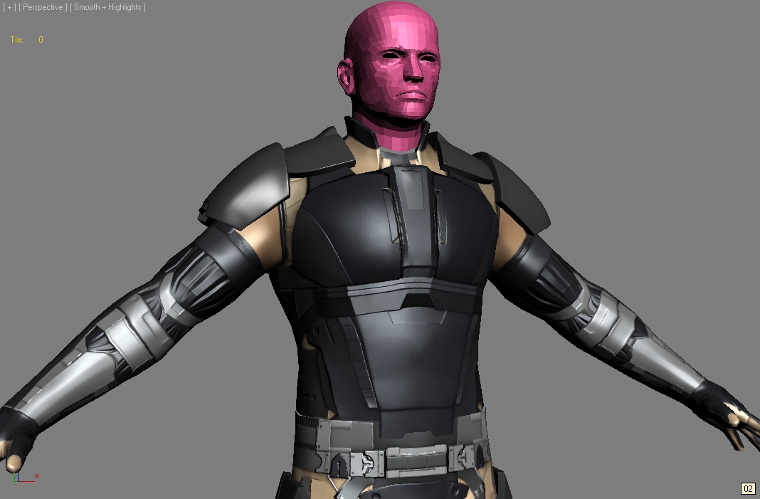
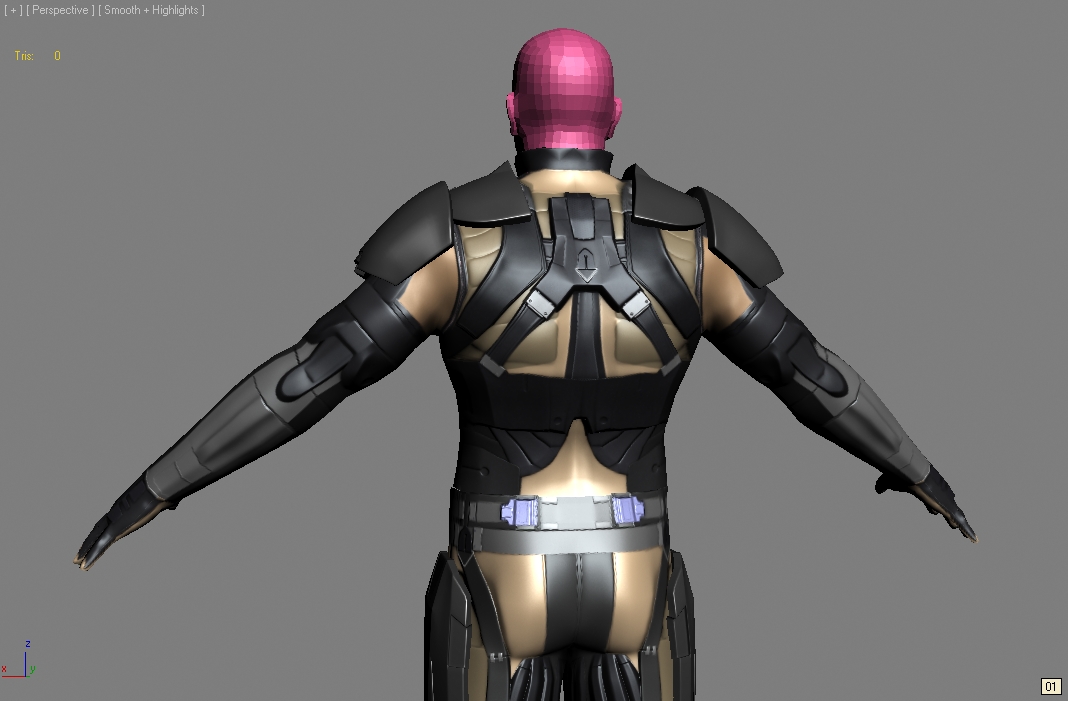
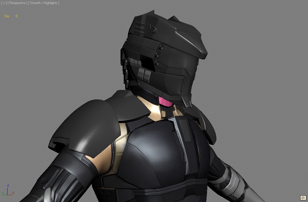
ive been tinkering abt with this character for a while
lemme know your opinions and sound advice
also the body is low poly&baked, the helmet is still hi poly
and its not too late to change the design, sleek, hard-hitting, and determined are the words i mapped for this characer
thanks in advance
4415647050_412babedc5_o.jpg
4414880869_9fc6087a33_o.jpg
4414881367_008498b665_o.jpg
4414881877_399d63baa4_o.jpg

Replies

  • garriola83
    Options
    Offline / Send Message
    garriola83 greentooth
    as for color scheme, like a jackal: black, tan, white. i put blue as a spec right now, but any other suggestions would be acceptable
  • ScoobyDoofus
    Options
    Offline / Send Message
    ScoobyDoofus polycounter lvl 19
    You mind showing the concept? It looks a bit of a mess from a design standpoint currently. I think you jumped into the deep end and forgot your water-wings with this one. Some more time spent making a more compelling design will help this shine as it appears you've got the ability to model reasonably well.
  • Harry
    Options
    Offline / Send Message
    Harry polycounter lvl 13
    elements of it look really cool but somehow as a whole it looks too noisy
  • garriola83
    Options
    Offline / Send Message
    garriola83 greentooth
    scoobydoofus: thank you for saying that. i knew that my design was super noisy as in a sense of too many things on one body. what specifically did the model made you think that it was too noisy? were there non-hamonious lines or shapes that didnt belong? or is there too much high-frequency detailing in some parts and not enough low frequency details?

    i have to admit, design is my weakest point. i'd like to go back to school just for design to make my concepts more sound or has plausibility.
    4416483428_e95b7bb966_o.jpg
    this was not the first pass, i can find my other sketches but this is the one i went with and i changed the chest piece cuz it didnt look sleek enough.

    Harry: thanks, like i asked scooby, what made you think its too noisy? was it the color? too much geometry?

    is this a case of "less is more"? and which parts did you think did or did not belong in the character?

    thanks for the feedback!
  • Ged
    Options
    Offline / Send Message
    Ged interpolator
    I dont like the skin coloured bits, makes me think that this is some kinda wierd scifi lingerie
  • garriola83
    Options
    Offline / Send Message
    garriola83 greentooth
    ged: cool beans, i think i'll put the tan as some accent color instead. but im gonna remove the muscley bits off the armor cuz i think they make the overall design too busy
  • roosterMAP
    Options
    Offline / Send Message
    roosterMAP polycounter lvl 12
    not lovin the helmet. reminds me of the power rangers.
  • ScoobyDoofus
    Options
    Offline / Send Message
    ScoobyDoofus polycounter lvl 19
    You know, the drawing looks a lot cooler than the model. I think also, at this stage, you should be presenting your model with no diffuse coloration. Its only hurting our (and your) ability to see what you've modeled and how it works or doesn't.

    I see areas where elements just didn't translate that well, or where you've made changes on the model from the concept (for the worse). You've got these straps and plates in the concept, but the model just looks like a flat humanoid mesh w/ some normal-mapped stuff projected on it. Nothing seems really represented by geometry besides the shoulderpads. Now, sometimes this isn't a problem, but here everything just reads flat and very busy with no strong sense of discernible purpose.
    I think yes, you need to concentrate on your low frequency details and how well they read when you "squint". Also, none of the stuff here rings of having a consistent aesthetic. Its all just a bunch of strappy/platey/ribbed for her pleasure(and no other reason) stuff that doesn't make any sense. No sense of rhythm to it.

    Here is, in my opinion, an example of the right way to do it:
    http://dl.dropbox.com/u/44379/undoz_sci_fi_guy.jpg
    Apologies to Undoz for using his image. Just lemme know if you want me to remove.
  • garriola83
    Options
    Offline / Send Message
    garriola83 greentooth
    thanks for the advice. i will work on the over the theme of shapes and rhythm and see what works and what doesnt.
    thats a good example, all the shapes are related and seems part of the overall design. thanks!
  • ajr2764
    Options
    Offline / Send Message
    ajr2764 polycounter lvl 10
    Looking okay but honestly I too am not digging the parts where there is skin revealed. I get a weird vibe about the character, think you should make some design descisions before moving forward with more modeling.
  • garriola83
    Options
    Offline / Send Message
    garriola83 greentooth
    yeah its not supposed to beskin but if it comes off as such then i'll fix that around.
    4418060681_a4c26233ae_o.jpg
    just a skylight render and i got rid of some parts thats too busy and purpose-less. anything else seems like that doesnt belong or doesnt seem to fit? i'll rework the design on paper but i'd like a consensus on what actually needs to go.
    so far...1. too busy 2. not enough representative/big geometry 3. consistency 4. rework color scheme. thanks
Sign In or Register to comment.