the jackal - sci-fi character C&C welcome
ive been tinkering abt with this character for a while
lemme know your opinions and sound advice
also the body is low poly&baked, the helmet is still hi poly
and its not too late to change the design, sleek, hard-hitting, and determined are the words i mapped for this characer
thanks in advance
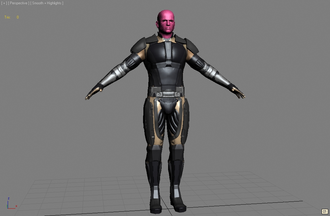
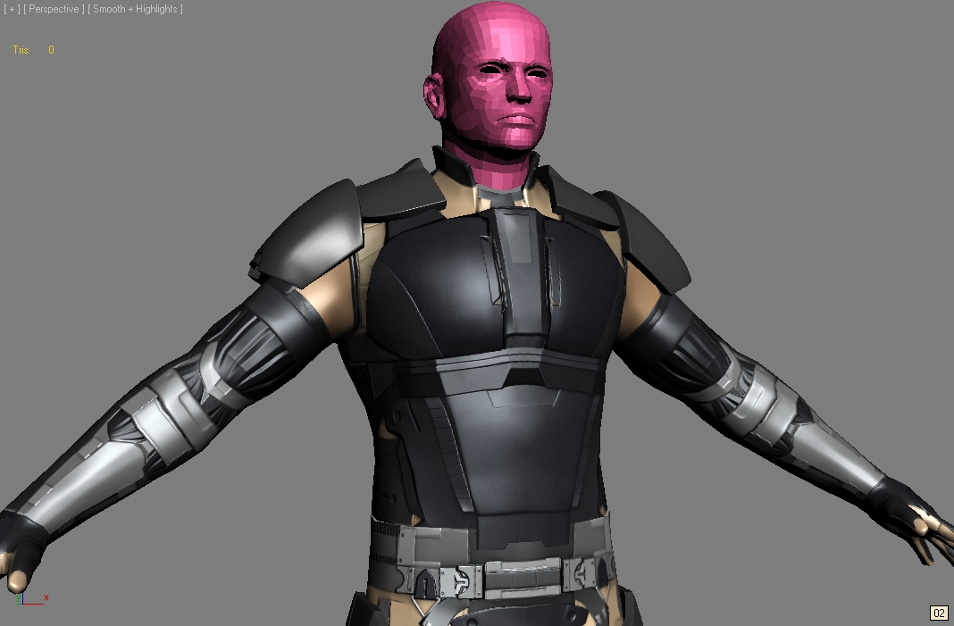
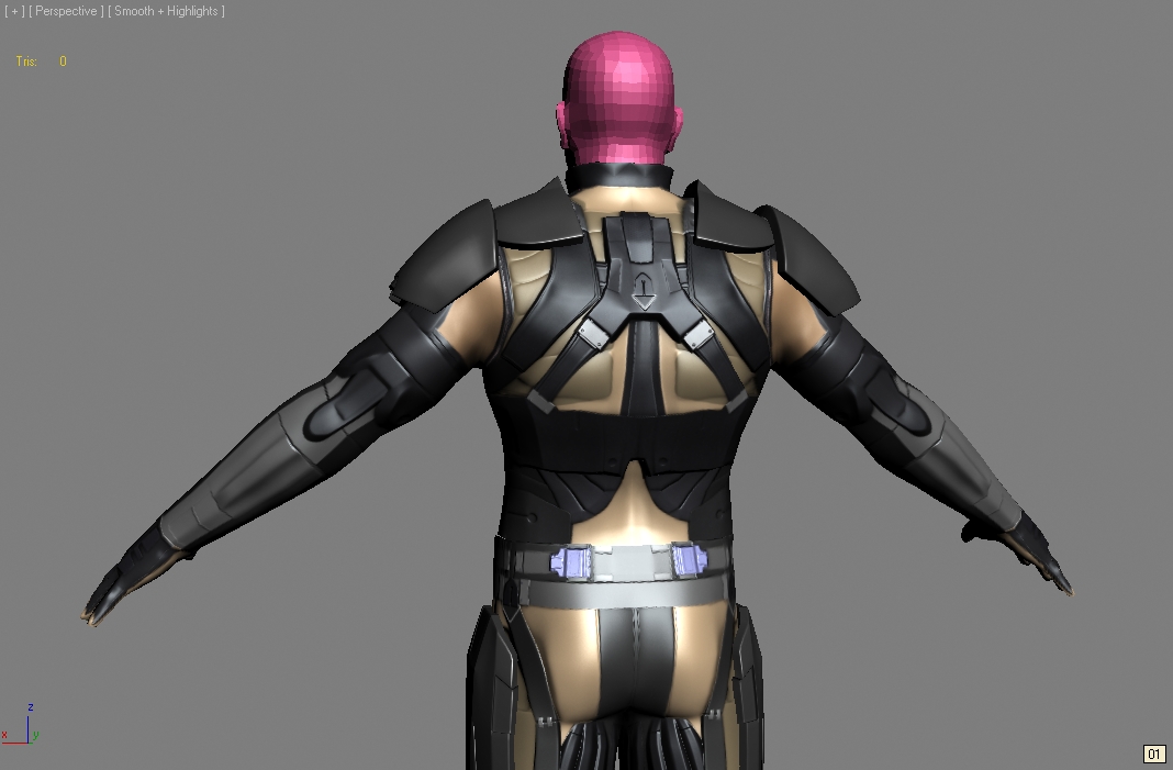
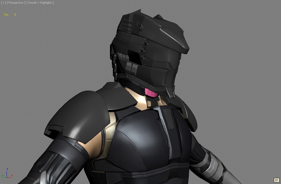
lemme know your opinions and sound advice
also the body is low poly&baked, the helmet is still hi poly
and its not too late to change the design, sleek, hard-hitting, and determined are the words i mapped for this characer
thanks in advance


Replies
i have to admit, design is my weakest point. i'd like to go back to school just for design to make my concepts more sound or has plausibility.
this was not the first pass, i can find my other sketches but this is the one i went with and i changed the chest piece cuz it didnt look sleek enough.
Harry: thanks, like i asked scooby, what made you think its too noisy? was it the color? too much geometry?
is this a case of "less is more"? and which parts did you think did or did not belong in the character?
thanks for the feedback!
I see areas where elements just didn't translate that well, or where you've made changes on the model from the concept (for the worse). You've got these straps and plates in the concept, but the model just looks like a flat humanoid mesh w/ some normal-mapped stuff projected on it. Nothing seems really represented by geometry besides the shoulderpads. Now, sometimes this isn't a problem, but here everything just reads flat and very busy with no strong sense of discernible purpose.
I think yes, you need to concentrate on your low frequency details and how well they read when you "squint". Also, none of the stuff here rings of having a consistent aesthetic. Its all just a bunch of strappy/platey/ribbed for her pleasure(and no other reason) stuff that doesn't make any sense. No sense of rhythm to it.
Here is, in my opinion, an example of the right way to do it:
http://dl.dropbox.com/u/44379/undoz_sci_fi_guy.jpg
Apologies to Undoz for using his image. Just lemme know if you want me to remove.
thats a good example, all the shapes are related and seems part of the overall design. thanks!
just a skylight render and i got rid of some parts thats too busy and purpose-less. anything else seems like that doesnt belong or doesnt seem to fit? i'll rework the design on paper but i'd like a consensus on what actually needs to go.
so far...1. too busy 2. not enough representative/big geometry 3. consistency 4. rework color scheme. thanks