Home 3D Art Showcase & Critiques

Warhammer Tomb

1
polycounter lvl 15
Offline / Send Message
whats_true polycounter lvl 15
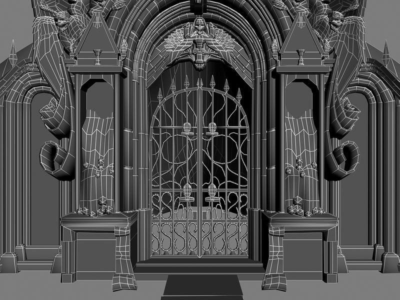
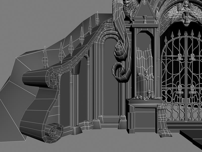
A new project for class. I have 4 weeks to work on this, but I had to have all of the modeling done this week. Their are quite a few Tri's that can be reduced (wings and circular pillars for starters). I will be working on the UV's this week, so, will trim down the Tri count in the process. The count, btw, is 66K. Is that to big? Could probably shave off about 10-8K. Will be taking some props into ZBrush later on too.

Reference is from the new Warhammer game. I don't know which one, as a buddy of mine gave me the Concept.

520538_20070301_screen012.jpg

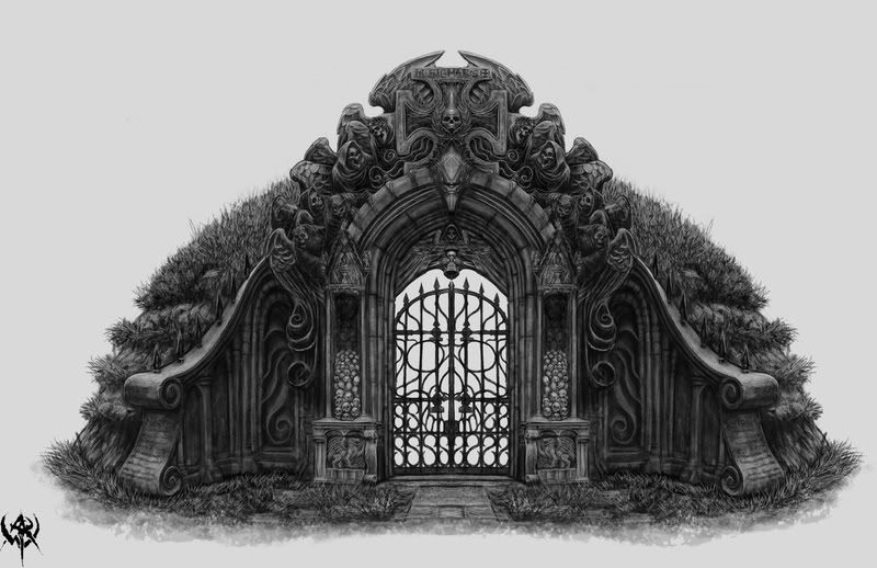
(Side note: Does anyone know who did this?)
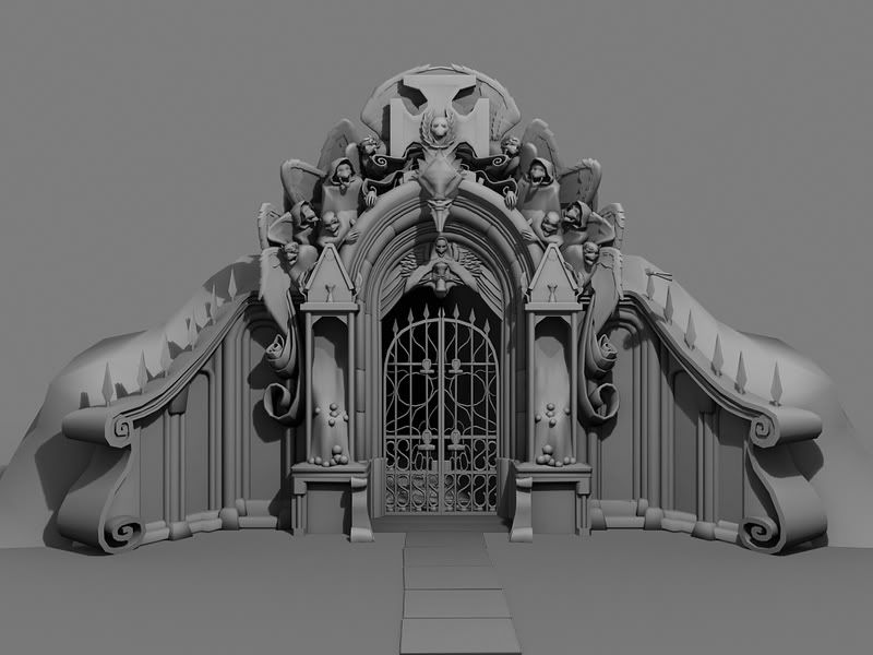
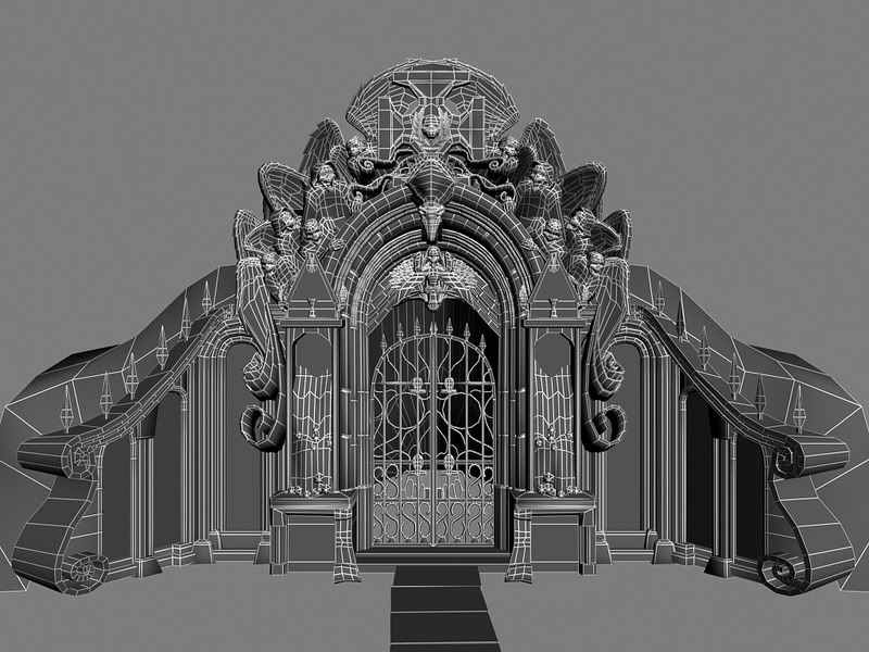
10.jpg

11.jpg

Wires

WireFrame-2.jpg

WireFrame2-1.jpg

WireFrame3-1.jpg

WireFrame4-1.jpg


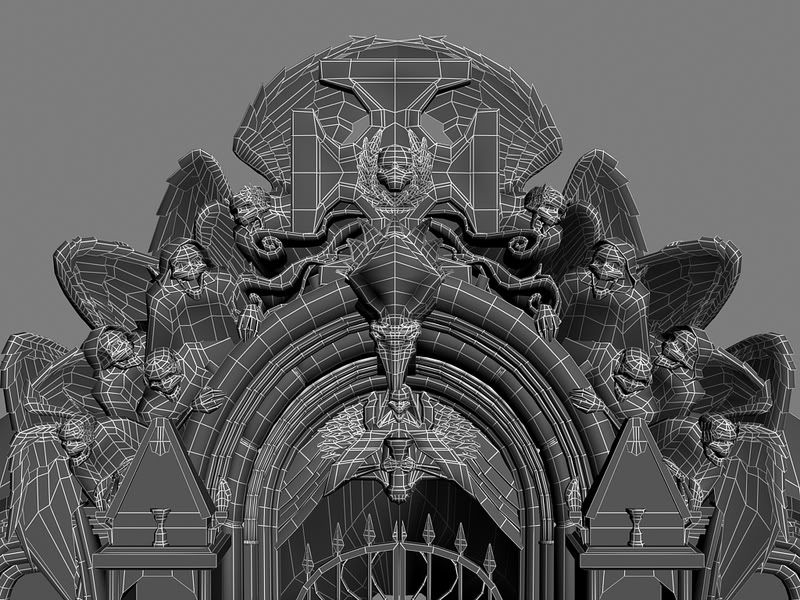
Anywho, some crits would be great.

Replies

  • Holi
    Options
    Offline / Send Message
    Holi polycounter lvl 16
    (it looks like any regular Warhammer art, so maybe http://www.karlkopinski.com/ ?)
  • Xenobond
    Options
    Offline / Send Message
    Xenobond polycounter lvl 18
    I'm fairly certain Mike Phillippi did the concept for that one.
    http://www.slothproductions.com/

    Also, here's a screenshot of the one that I made for the game.
    http://kman.cottages.polycount.com/war/temp/em_crypt_entrance01_1680.jpg
    Can't find any shots that have the lightmaps baked in, though. :(

    Can't wait to see more progress on this.
  • Levus
    Options
    Offline / Send Message
    Levus polycounter lvl 11
    Wings behind the cross (on the top), and wings just over the doors really needs those all triangles?
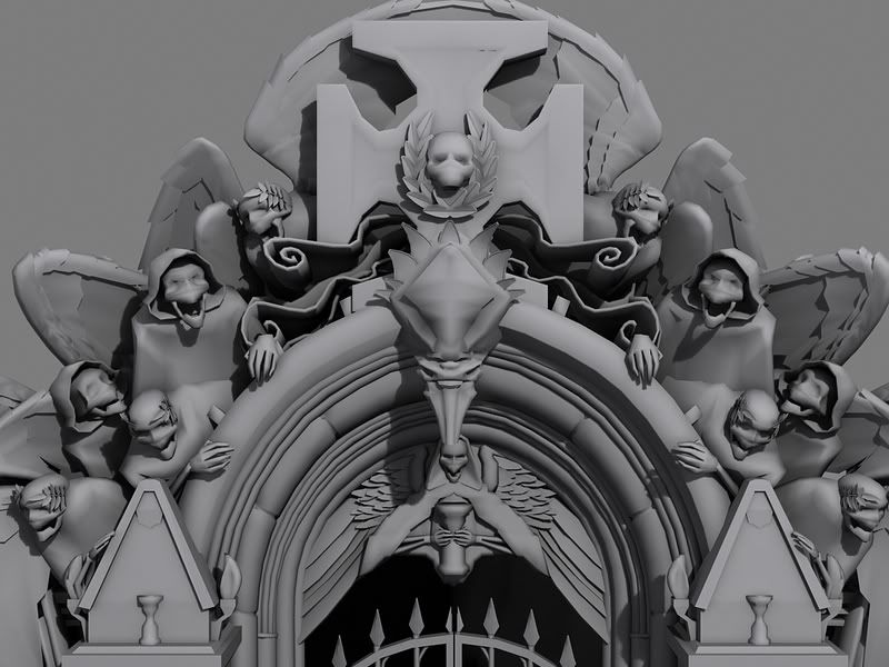
    Top of heads of all the characters, same.

    Generally, you have a lot of geometry that you can cut-off, and could put it somewhere else, for example, for spirals.

    You putted too much detail on elements that are less visible for player, and too less for elements thar are closer to the ground and thats are more visible, right?

    Anyway, its looking really nice, I like it much, keep going!
  • almighty_gir
    Options
    Offline / Send Message
    almighty_gir ngon master
    i like it man.

    but don't put SIGMAR on the stone, cos he never had a tomb... he just went east and never came back.
  • whats_true
    Options
    Offline / Send Message
    whats_true polycounter lvl 15
    @Xenobond

    Dam.

    I wished I never clicked your link lol. Yours is really good. I will probably go in a different color direction though. The concept was more "Giddier", and I hope to reflect that more so.

    It's funny too, because I see stuff that was in the concept that I just sorta "guessed" on, and see now what it actually was hehe. Thanks for the Artist name too.

    @Levus

    Very true. The wings were kinda an experiment for me. Strange shape in trying to deform it. No, I don't need that many Tri's in the wings. I might keep the skulls though, just for practicing sake. I agree on adding more geometry on the lower levels, specifically the spirals. Will work on getting the silhouette more formed.


    @almighty_gir

    I'll put it in, just to spite you >: D


    Thanks guys for the comments. Really helpful.
  • Birdman
    Options
    Offline / Send Message
    I have to agree with everyone here, it looks great.

    As for working in the a game I think the polys are way out of control. Not that is bad thing, but they need to cut be back.

    It is not always as fun, but try using an alpha on some of this stuff:
    Gates
    the leaves on skulls and above the door.

    Watch out for for polys in the arches/wing/etc that you can just fake in the texture/normal map.

    Joseph Bird
    Mythic World Artist


    PS - Xeno's tomb thing looks crazy good with some lights in game.
  • Xenobond
    Options
    Offline / Send Message
    Xenobond polycounter lvl 18
    If you're really aiming for a more reasonable in-game polycount, you'd want to see about getting that sub 10k.

    Dug one of the old max files up for this and the near lod is just under 7,500 tris. Obviously a ton of the scrolly bits and sculptural elements were ground down and faked alot. Even then, most of the polys went into the arch and the big mess above it.

    Here's a low res [25%] shot of the texture sheets. SO MUCH TRIM. Hope this helps you achieev greatness.
    em_crypt_flat_25.jpg
  • whats_true
    Options
    Offline / Send Message
    whats_true polycounter lvl 15
    I'm planning on cutting back, but I don't think the teacher is going for in-Game poly count. I want to keep a good typology, but not to go over board. If given the poly count on this, a whole lot would have been different. But I didn't so, just modeling for modeling sakes. No doubt though, their is plenty of room for optimization and faking (which I plan on revisiting), but areas, like the gate or spikes, I kinda want to keep the typology. This might be a portfolio piece, so, want it to look the best that it can be without under (or over) doing it.

    @Birdman

    Leaves and feathers can be alpha'ed. I wasn't sure about using them, but I agree with you on using them for those little parts. Would make a lot more sense.

    @Xenobond
    That helps alot. If I had a poly count, this would be a lot different too hehe. You did a lot of over tiling too it seems. We weren't given a texture size, but my hopes are going for 1*2048. He wants hi res stuff, so, I'm given the option of using another map if need to (but I really don't see that happening unless I do it for the alpha map).

    Thanks for the comments peeps. They seriously help.
  • whats_true
    Options
    Offline / Send Message
    whats_true polycounter lvl 15
    Shaved off about 20K from this model so, now its at 44,702~ tri's.

    Test texture mind you. SPC is their so I can see it better.

    Test1.jpg
    Test2.jpg
    Test3.jpg
    Test4.jpg

    It's at a 2048 CLR and a 1024 ALPHA (they're not on yet). The sidewalk and ground stuff will be on something else.
  • almighty_gir
    Options
    Offline / Send Message
    almighty_gir ngon master
    now THAT looks good...
  • Crumplecakes
    Options
    Offline / Send Message
    brilliant recreation, really nice stuff there.
  • Mike_Carlyle
    Options
    Offline / Send Message
    Mike_Carlyle polycounter lvl 17
    Sorry to throw you off whats_true, but uhm, Xenobond, Birdman.... I found a screenshot of Xenobond's in-engine version of the tomb, With Lighting! I remember when I first saw this screenie... so beautiful... im such a fan boy Xenobond, great work...

    http://vnmedia.ign.com/screenshots/warhammer/68118791.jpg

    whats_true , you have an interesting version of the tomb going there... im looking forward to see how the textures come out... keep up the good work
  • whats_true
    Options
    Offline / Send Message
    whats_true polycounter lvl 15
    @Mike_Carlyle

    You fail at reading post #3. :P

    On a side note, I'm going for a more grittier look, trying to stay truer to the original concept.

    Thanks mates.
  • Mike_Carlyle
    Options
    Offline / Send Message
    Mike_Carlyle polycounter lvl 17
    what about post #3 ? its the same item, in engine, but the one I posted had lighting on it, .. make all them nifty lil details stand out so much better... :-D

    and i thought his version was pretty good to the concept, but any who...

    a nice high poly, version without having to work within the limitations of a game engine, should make for a neat interpretation of the tomb...

    again, lookin forward to seein it with textures... GL
  • whats_true
    Options
    Offline / Send Message
    whats_true polycounter lvl 15
    Ohhk. My bad. Didn't realize that that was ingame (I thought his was~~)


    Though, I like the lighting set up of Xenobond better :P
  • whats_true
    Options
    Offline / Send Message
    whats_true polycounter lvl 15
    Hey, a gate!

    Gate-1.jpg

    Looking at the red metal now, it might be a bit to much. Will saturate it a bit more me thinks.
  • Rated Rrr
    Options
    Offline / Send Message
    Rated Rrr polycounter lvl 17
    For a second I didn't see the words "test texture." (thank goodness for a second reading) This is coming along fairly nice, I want to see more please.
  • whats_true
    Options
    Offline / Send Message
    whats_true polycounter lvl 15
    lol. Yes, that was only a test texture.

    Here's more!

    AngleTop.jpg
  • whats_true
    Options
    Offline / Send Message
    whats_true polycounter lvl 15
    More updates!

    YAY! : D

    JJJ.jpg
  • Mike_Carlyle
    Options
    Offline / Send Message
    Mike_Carlyle polycounter lvl 17
    looking pretty cool man, keep up the good work
  • whats_true
    Options
    Offline / Send Message
    whats_true polycounter lvl 15
    Thanks mate!

    Last one for the night

    lll.jpg
  • Reich
    Options
    Offline / Send Message
    Looking good Paul. I really like the subtle color variations in the texture so far. Keep it up man. Now that Hurricane is almost done you'll be bale to go back to doing fun stuff >.>
  • whats_true
    Options
    Offline / Send Message
    whats_true polycounter lvl 15
    But...this is fun stuff :\


    :P

    Anywho, another update. Working on that top portion right now.

    mmm.jpg
  • Reich
    Options
    Offline / Send Message
    well that's what i ment you can get back to this.

    Still looking god no concerns yet. keep going!..okay wait no the cracks/holes repeat to fast on those 2 flat spots in that render. maybe flip one of there normals?
  • whats_true
    Options
    Offline / Send Message
    whats_true polycounter lvl 15
    Flipped the UV's.

    Render2-1.jpg
  • Birdman
    Options
    Offline / Send Message
    It might be the lighting you have going on, but I would watch them deep blacks going on in them texteres.
  • Fishypants
    Options
    Offline / Send Message
    Fishypants polycounter lvl 18
    Bitchin! Keep it up!
  • whats_true
    Options
    Offline / Send Message
    whats_true polycounter lvl 15
    @Birdman

    Your very right. Will have to tone that down in the texture.
  • Yngram
    Options
    Offline / Send Message
    Yngram polycounter lvl 8
    This is looking great. I can't wait to see this finished result.

    You might want to turn some of the spikes on the wall though. Their stacked uvw's stand out.
  • PixelMasher
    Options
    Offline / Send Message
    PixelMasher veteran polycounter
    wow this is lookin like its will be awesome when its done, I really like the subtle hints of green here and there in the texture. only thing is i would slightly modify that shot up concrete texture, it is super easily recognizable from cgtextures, maybe add some fat cracks here and there. like you said its still wip, and a tight looking one at that.
    Cheers
  • Pope Adam
    Options
    Offline / Send Message
    Pope Adam polycounter lvl 11
    high fucking five man, really nice looking! keep going!!
  • whats_true
    Options
    Offline / Send Message
    whats_true polycounter lvl 15
    @Yngram

    Funny, I didn't notice that. Been looking at this for too long :\
    Thanks for the hit though. Will get to that ASAP

    @PixelMasher

    haha, ouch! Ok, will DEFIANTLY have to change that now. Are the marks more recognizable on those flat areas?


    Thanks peeps! The feed back is really helping. Will post an update when I get the time to work on this.
  • PixelMasher
    Options
    Offline / Send Message
    PixelMasher veteran polycounter
    yea, its the 2 flat inset areas on either side that instantly pop out to me. looks like someone riddled the area with bullets. if you were to even just get rid of the bullet marks it would look fine i think.caant wait to see this finished.
  • whats_true
    Options
    Offline / Send Message
    whats_true polycounter lvl 15
    Small update. Working on that back part. Still have a few more things to do then finished me thinks.

    ppp.jpg

    ooo.jpg
  • whats_true
    Options
    Offline / Send Message
    whats_true polycounter lvl 15
    Working on the normal maps right now. Will finish the rest of that tomorrow. Just a few more tweaks to the colors also.

    qqq.jpg

    EDIT:

    fixed that middle skulls. Didn't like how they were looking.

    rrr.jpg
  • whats_true
    Options
    Offline / Send Message
    whats_true polycounter lvl 15
    Messing with the color on this thing. I kinda like it now.

    sss.jpg
  • timwiese
    Options
    Offline / Send Message
    timwiese polycounter lvl 9
    This is looking awesome, I like!
  • Reich
    Options
    Offline / Send Message
    Paul it does look really nice but to me it seems a little noisy. there is so much contrast and a lot of dart colors that it is hard to have a focal point and a bit hard to see some of the detail.

    the base part seems fine and reads nicely but as soon as your eyes move towards the top where the winged skellys are it just gets a little overwhelming.

    it dies look great don't get me wrong. but a little more nit picking is in order i do think.
  • Jackd Up
  • whats_true
    Options
    Offline / Send Message
    whats_true polycounter lvl 15
    That's a jacked up comment man~~

    ...

    *the puns! it hurts, IT HURTS!*

    Anywho, took what you said Steve and tried to reduce the *noise*. I'm terrible when it comes to that sometimes.

    Here's what I'm gona be turning in.

    1-5.jpg
    2-4.jpg
    3-4.jpg
    4-4.jpg

    Anywho, I was in a rush, so the trees are the standard max trees. Make note *they suck*. Will replace them with my own trees later on. Looking at the ground now, the normals could be lowered a bit too. Also, how do you get rid of the shadows from becomeing straight black? Not seeing the option in UT3 (or i might be missing it~~)
  • Zephir62
    Options
    Offline / Send Message
    Zephir62 polycounter lvl 12
    A little too monochromatic for my tastes, but it's still tasty
  • Kawe
    Options
    Offline / Send Message
    Kawe polycounter lvl 8
    ace work. not monochromatic at all. that red gate is brilliant if you ask me. gets the player's attention to where it should be. same with the skull colors.
  • erik!
    Options
    Offline / Send Message
    I agree it is a little monochromatic. It's a bit difficult to distinguish shapes as it stands now. Mainly at the top with all the skeleton dudes. Oh and lighten up those shadows! Maybe put some color in them?
  • Docm30
    Options
    Offline / Send Message
    Docm30 polycounter lvl 10
    In UT3 you add a sky-light to change the ambient light.

    Looks great, by the way.
  • Reich
    Options
    Offline / Send Message
    Looks good paul not sure if you changed the texture on the front skull or if you just put a light there but it helps make a focal point and makes it a little nicer to the eyes. Love it over all!
  • PixelMasher
    Options
    Offline / Send Message
    PixelMasher veteran polycounter
    nice work man, this turned out great. the only thing i would focus on is getting some more epic lighting on this thing, right now the light levels seem pretty similar throughout, Dont be afraid to put some shadow casing geo in the way of the light to get some dramatic shadows, it helps not only add depth but also can allude to a world outside your render frame.

    also, the terrain textures could use another go over, they are kinda meh right now, maybe some stones pressed into the path or something.

    Finally I would add quite a bit more grass planes right now they really jump out as alpha cards. If you want to be really spiffy, you could make one or 2 and rig them with a bone in max so you can use unreals "cloth" simulation on them and get them to blow slightly and have some ambient motion. just an idea, there is a tutorial for it on 3D Buzz somewhere i believe.
  • John Warner
    Options
    Offline / Send Message
    John Warner polycounter lvl 18
    edit: ah fuck! am i too late? weird, i guess i didn't see page two. well, i think this still applies. what you've got is pretty damn nice! it looks great in the scene, but it's still very oblivionish.


    hey man, this is comming together.

    i think it's main problem right now is that the contrast is too eavenly spread out. squint your eyes at it and look at the lights and darks. see how it's all even like that? oblivion had the same issue. when something is flat, people add contrast to make it more 3-dimentional, but if highlights and shaddows are added eavenly everywhere, then unfortunately, everything remains flat.

    IMO, i would do this. i'll go into detail.

    1. remove the textural noise layer for now completely
    2. scale back some of those highlights/shaddows
    3. add larger, dark gradients of shaddows over broad sections, like exadurated ambient occlusion
    4. don't be afraid to add a gradient up from the base .. to darken the bottom of the object. right now it could use any sort of "very large details" (like broad shading) that you can add. basically the large shapes need to be separated.
    5. instead of adding back the texture layer, look at old cement and find one feature that really says "worn cement". understand how to paint that specific feature and add that here and there, but not evrywhere. details should stand out confidently and say something, telling a story.
    6. add some specific story-details. was there a firefight? are there bullet holes? if there are, where would they be? what happened right next to this thing? do birds come and pirch on it? is there lots of birdshit on the top?
    7. add grunge. deep redish browns are pleasing for cracks and grevases i find, but you've got to find a pallet that works good for this piece. do add some complimentary colors in the form of larger, subtle discoloration. if your main color is warm, add some cool colors in there.
    8. add a layer of dust. a flat color, and whipe it away almost completely with continual strokes from a very light eraser.
    9. add back a fine texture overlay of cement or something if you need it.

    it's a good idea to stay away from "details" in your texture overlay. that doesn't mean that there's anyting wrong with using details in a texture, and overlaying that in your model, but you've got to be very selective as to where you place those details. sometimes when i get lazy i use a sort of a.. photo-painting technique, stealing stuff from various textures.

    if you want all those protruded pieces, or any other piece, like the curved.. umm.. top armrest thing, to pop, try this--

    instead of shading them all, change the material slightly, or color, or select each of them and brighten them, (or darken them) in their entirety. that way they'll pop, and they wont fight your large-size shading.

    oh, and don't be afraid to find a solution for doing ambient occlusion if you dont have the texture space to paint it in. -- you can make a 2 pixel wide, 64 pixel long black texture with a transparent-to-opaque alpha channel, put that on a plane, and slap that around, under rims and edges and stuff, and create shadow and what ever else you need.
  • Vitor
    Options
    Offline / Send Message
    Vitor polycounter lvl 18
    anti-monocromatic is the new bloom :D I think is it looking great so far. Dark as it should be ;)
  • AnimeAngel
    Options
    Offline / Send Message
    needs lens flares...lots of lens flares :poly124:
    Looks great though.
  • Birdman
    Options
    Offline / Send Message
    I want to see some texture flats.
1
Sign In or Register to comment.