The BRAWL² Tournament Challenge has been announced!
It starts May 12, and ends Sept 12. Let's see what you got!
https://polycount.com/discussion/237047/the-brawl²-tournament
It starts May 12, and ends Sept 12. Let's see what you got!
https://polycount.com/discussion/237047/the-brawl²-tournament
Environment - Concept Art into [3D] - In Unreal Engine
Hey Polycounters,
I have been working on a new personal project based on a piece of concept art ...
from Freelance Concept Artist GIORGIO GRECU - PORTFOLIO https://www.artstation.com/artist/grecu
The concept image is called "Interior". It was for a Steampunk Stark Tower brainstorm Challenge.
Here is a direct link to the original concept image at https://www.artstation.com/artist/grecu
Below is the original concept art


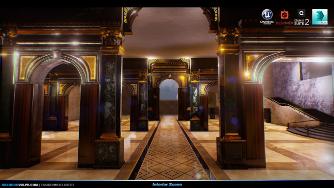
UPDATED: Above is my 3D version of the Interior scene Updated 6/8/2016

A Close up of the final image
Below is all the work in progress i have made plus some prop renders


Here are some more images with a warm feel to them


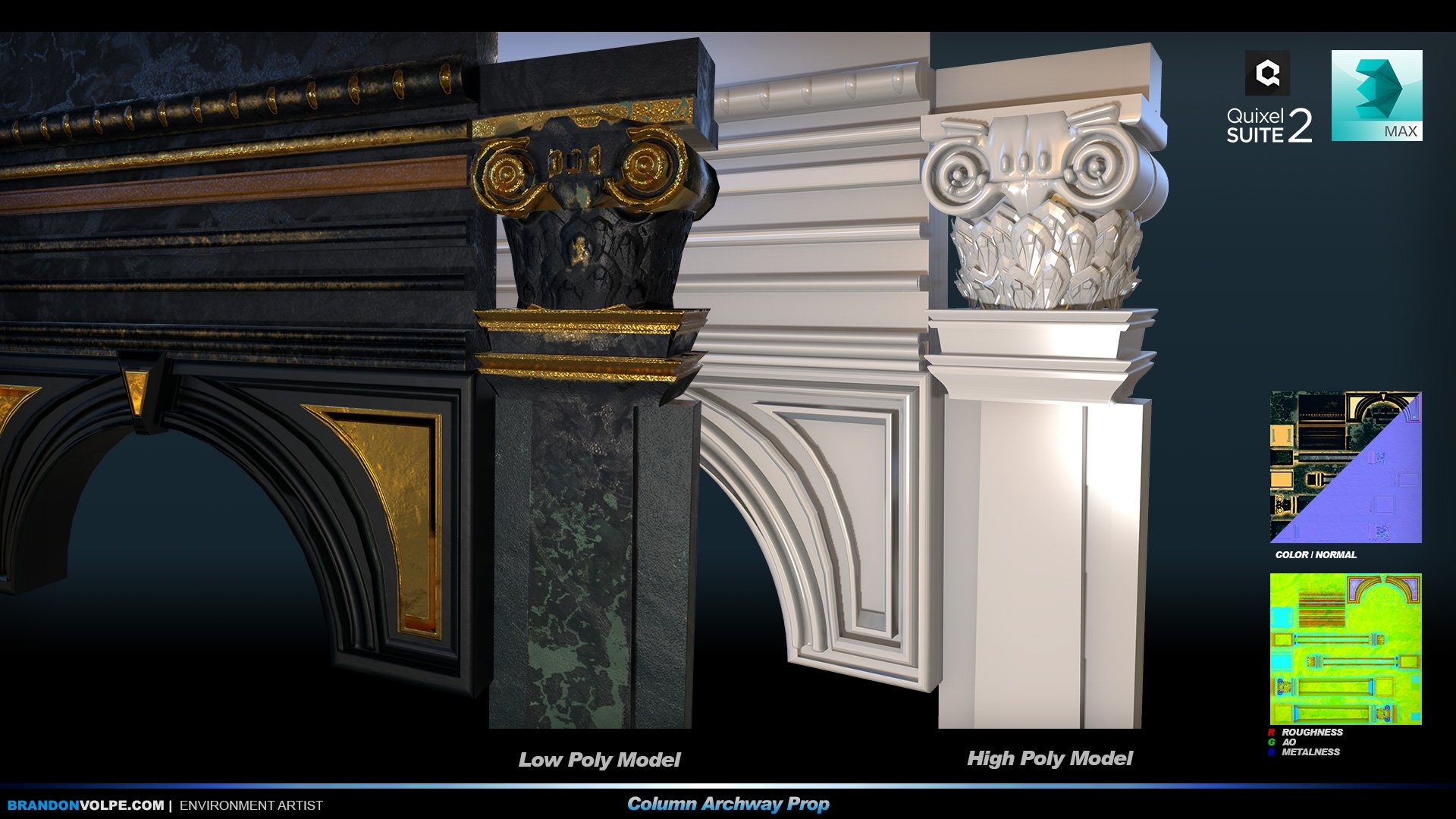
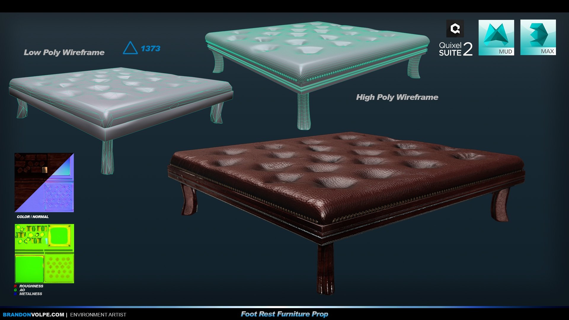
Next are the props from in the scene



I also wanted to show my textures that I made in substance designer


A breakdown of the render passes from in using the Unreal High Res Screen Shot Maker


Hope you guys like it.
As always any comments are welcome.
Thanks
I have been working on a new personal project based on a piece of concept art ...
from Freelance Concept Artist GIORGIO GRECU - PORTFOLIO https://www.artstation.com/artist/grecu
The concept image is called "Interior". It was for a Steampunk Stark Tower brainstorm Challenge.
Here is a direct link to the original concept image at https://www.artstation.com/artist/grecu
Below is the original concept art


UPDATED: Above is my 3D version of the Interior scene Updated 6/8/2016

A Close up of the final image
Below is all the work in progress i have made plus some prop renders


Here are some more images with a warm feel to them


Next are the props from in the scene


I also wanted to show my textures that I made in substance designer


A breakdown of the render passes from in using the Unreal High Res Screen Shot Maker


Hope you guys like it.
As always any comments are welcome.
Thanks

Replies
Let me know what you think of it so far.
Some close up shots
More to come soon.
I think those steps in the last pic are looking too low poly though, and could use some more roundness. It should be an interesting challenge trying to mimic that lighting in the concept. good luck and keep it up.
Above: This is the picture as is, how it came straight out of Unreal
Below: My 3D version of the original concept art
Above: Original Concept Art at https://www.artstation.com/artist/grecu by Giorgio Grecu
Enjoy, Thanks for looking
Above is my final beauty screen captures for this project, notice the upper right corner for the main changes I made on this update.
A close up of the plants and more details can be seen in the foreground.
I hope you guys like this one. It's my most current single person project and... they say your only as good as your last project, so I hope that rings true with this one (my favorite at this time.)