Unreal Tournament - Outpost23
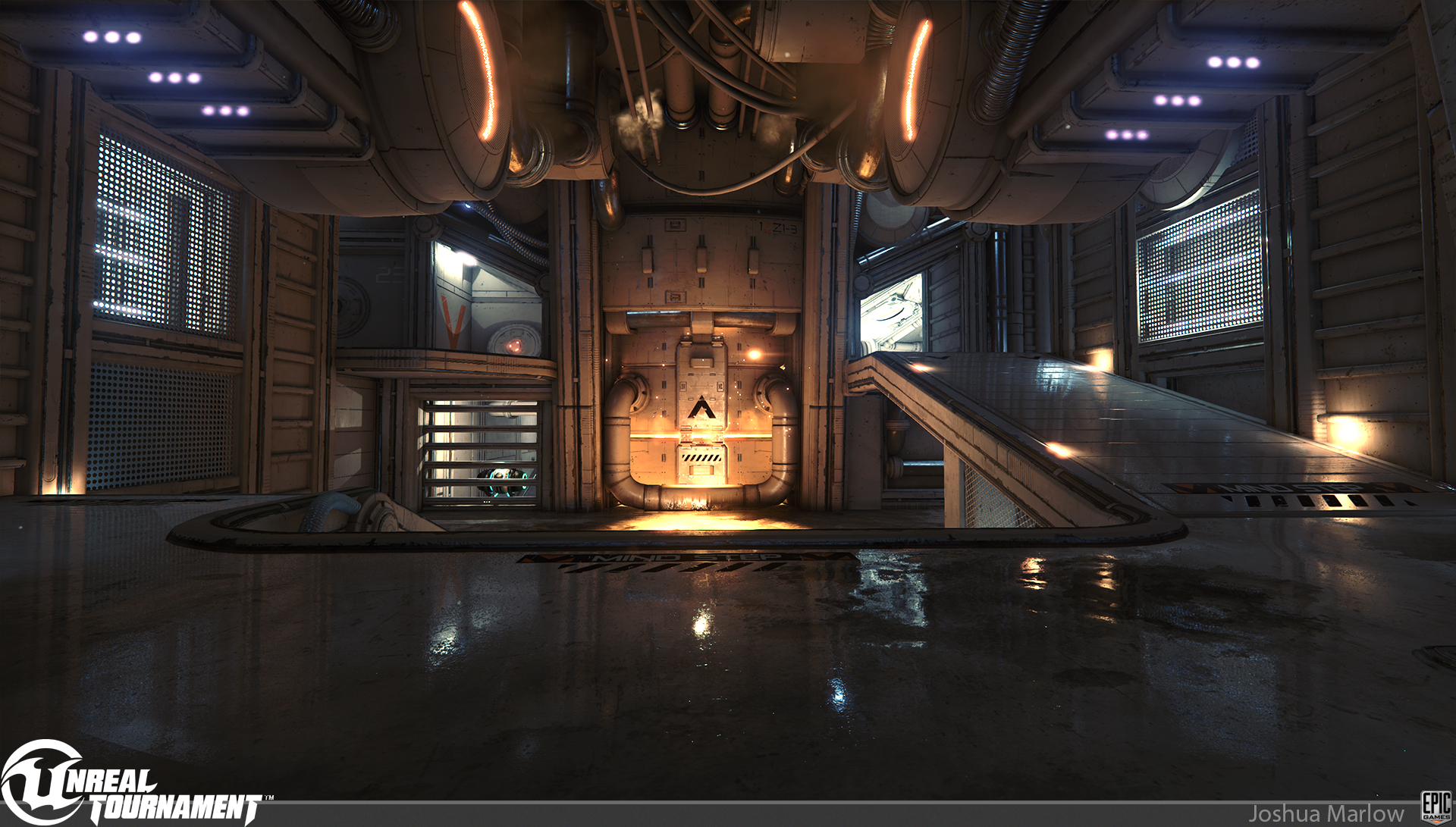
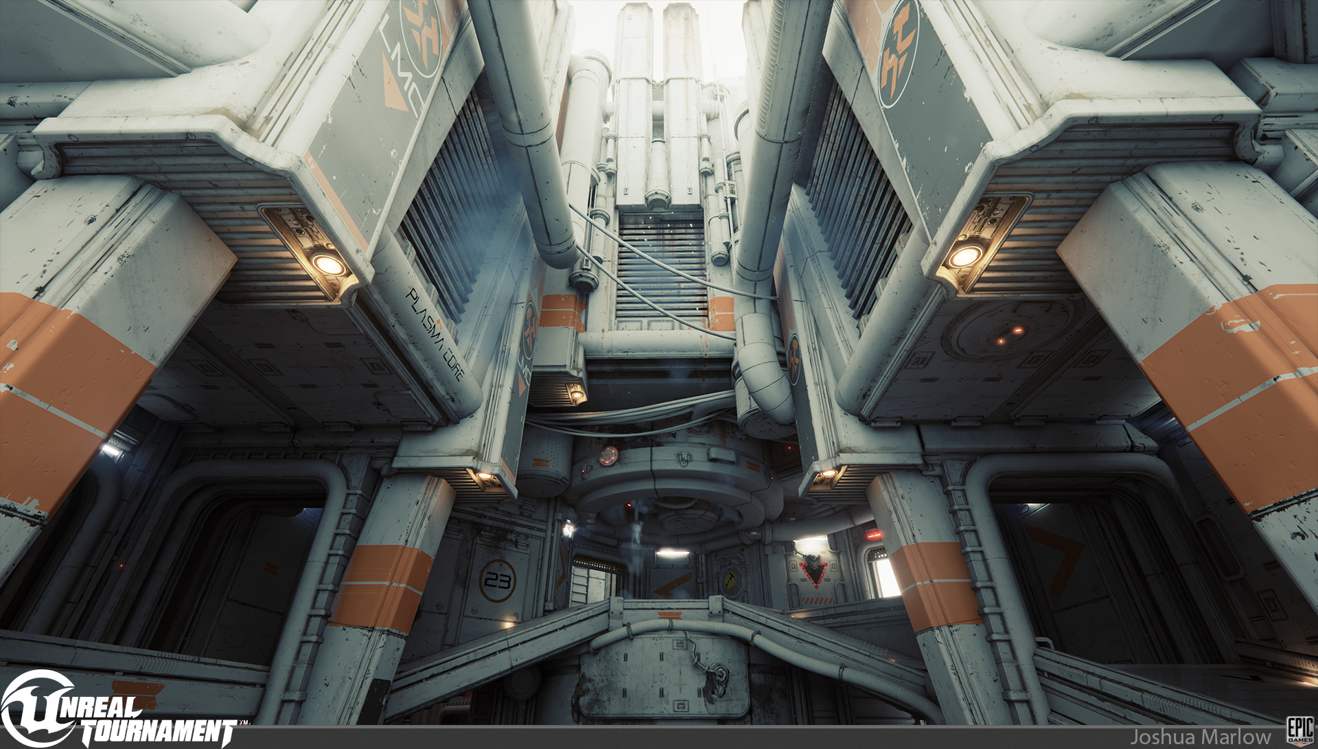
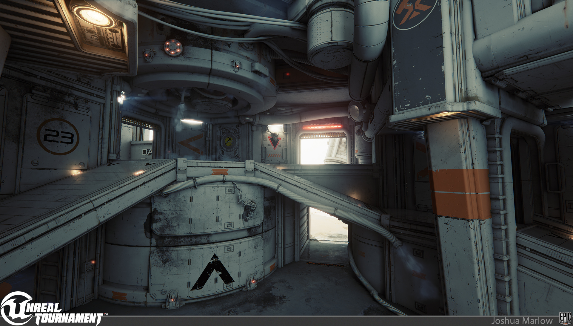
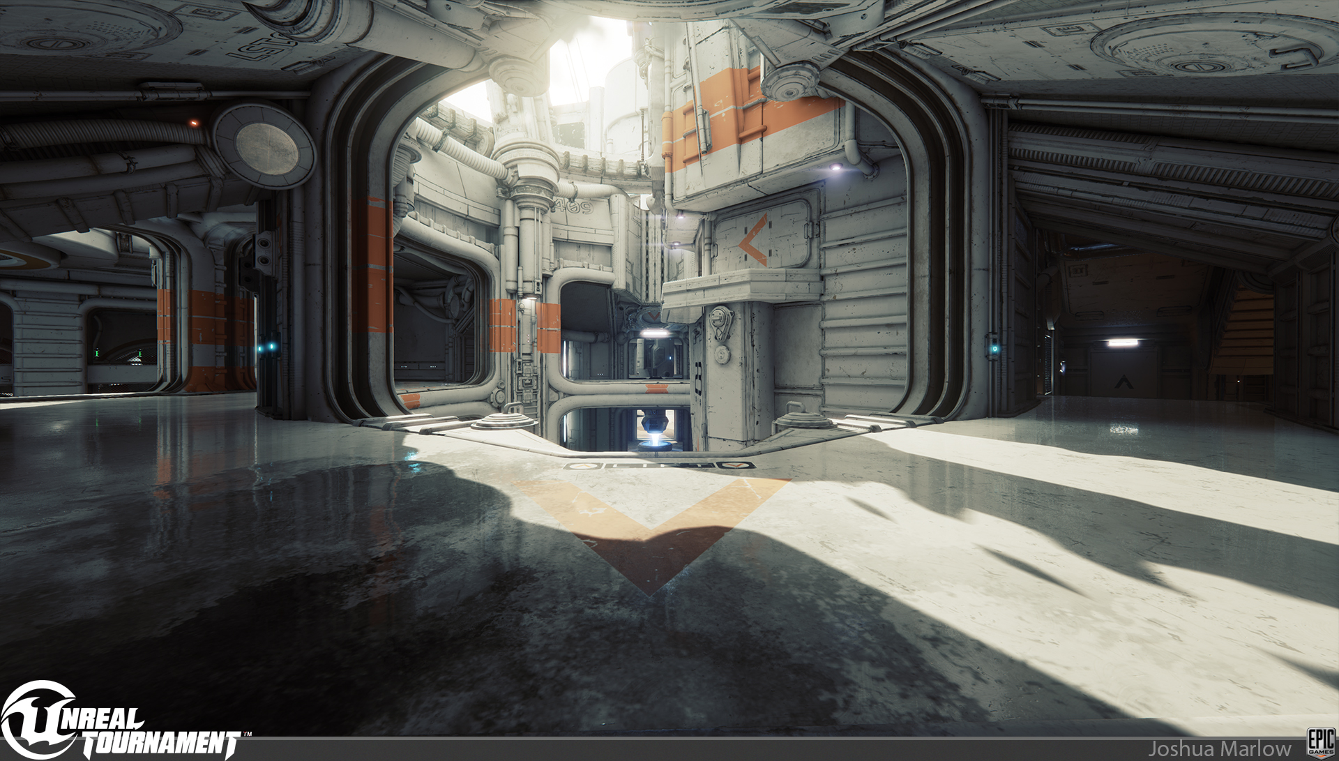
So our first meshed level for Unreal Tournament, Outpost23, just got released last Monday and I wanted to post a few screens from it. Its been a great experience so far, and it was amazing to see how many UT fans there are out there who are excited for the game. Thank you to everyone who came and played at GDC and had kind words to say about it. It was a blast making this map, and Im very proud of what we accomplished considering our environment team consists of Rick Kohler, myself, and our Art Director Chris Perna. Now on to the next map! Oh, and 120+ fps for you pc master race guys ;p
This is not the post processing the map shipped with, its just me being artsy fartsy
I was responsible for all meshes except for:
James Kincaid made the Laser Drill and small clamp
Pete Hayes made the circular hatch
Rick Kohler made the Fan Blades and canisters
Anton Migulko made the landscape outside
I was responsible for all Material/texture work of assets, except for the Landscape which was Anton Migulko.
Rick Kohler did all the decals, meshing, and lighting
Chris Perna worked on meshing,lighting, and post process
Tim Elek and Bill Kladis helped out with the environment fx
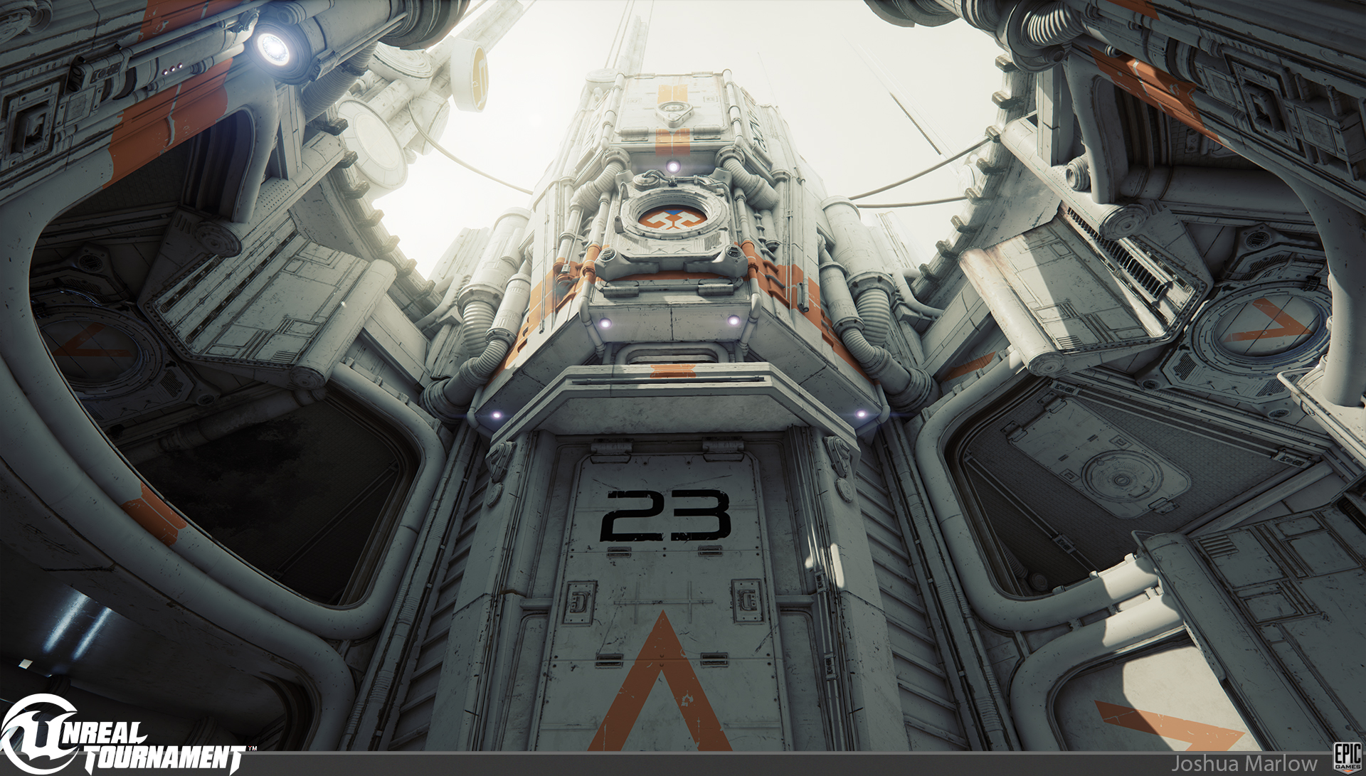
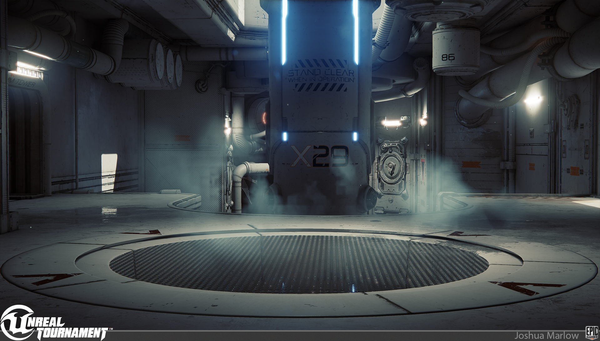
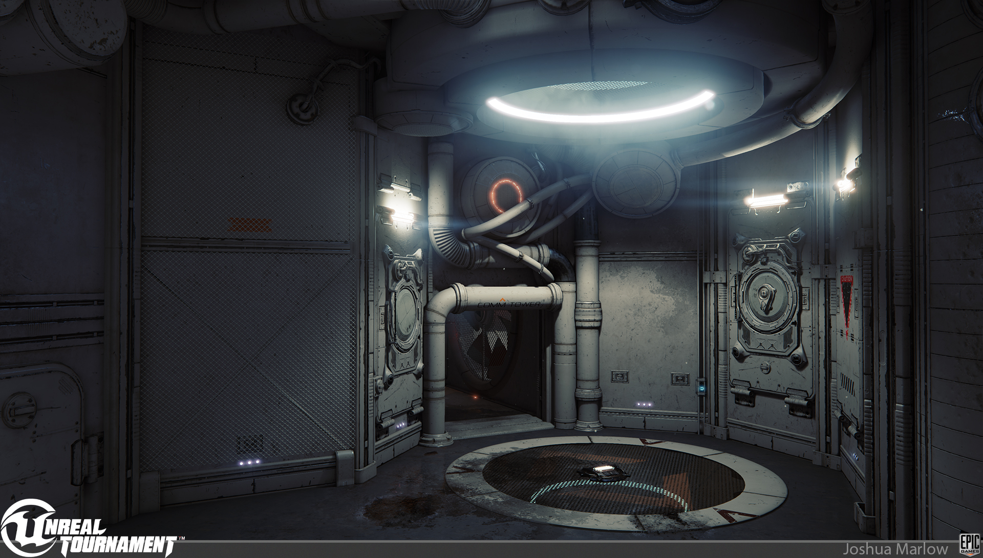
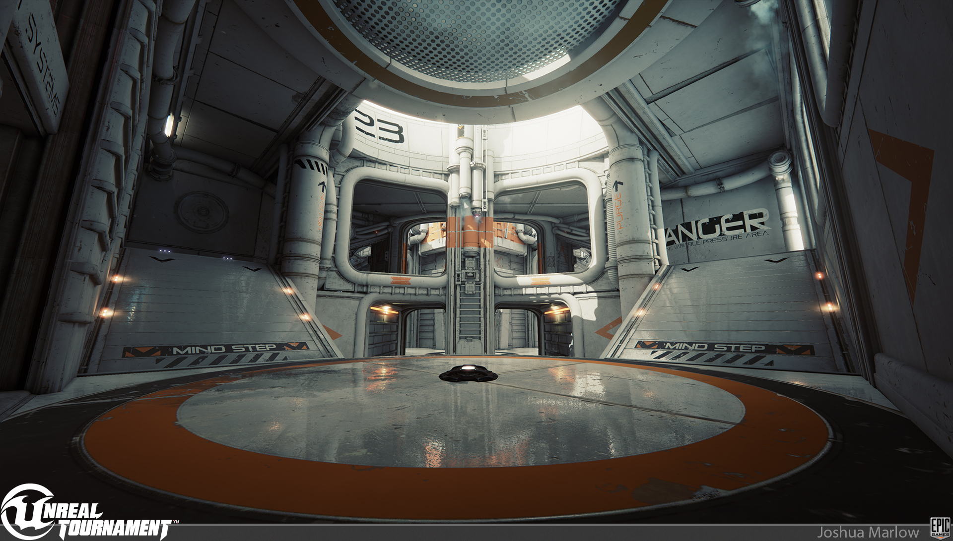

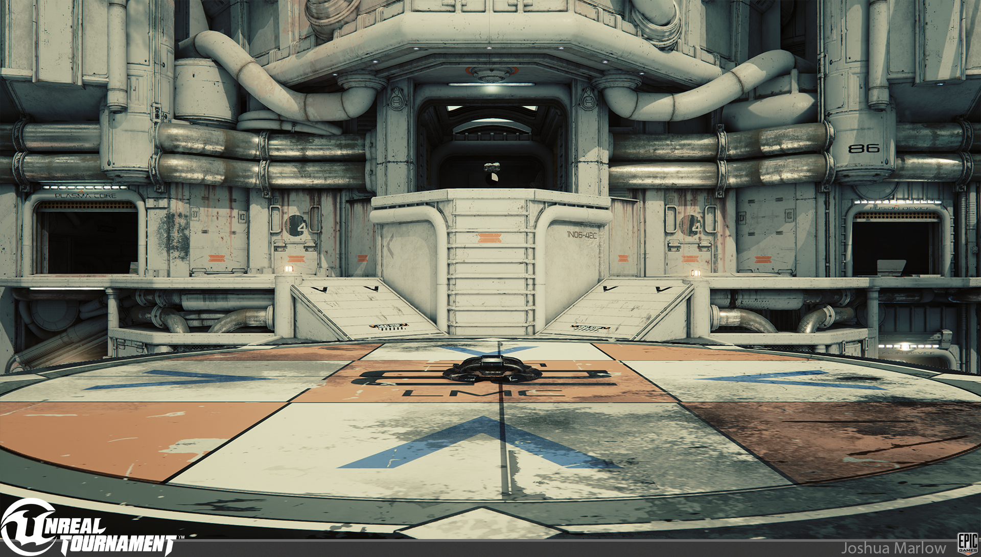
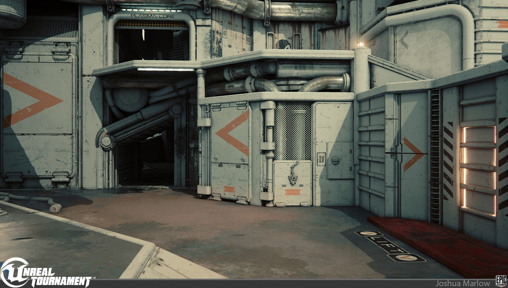
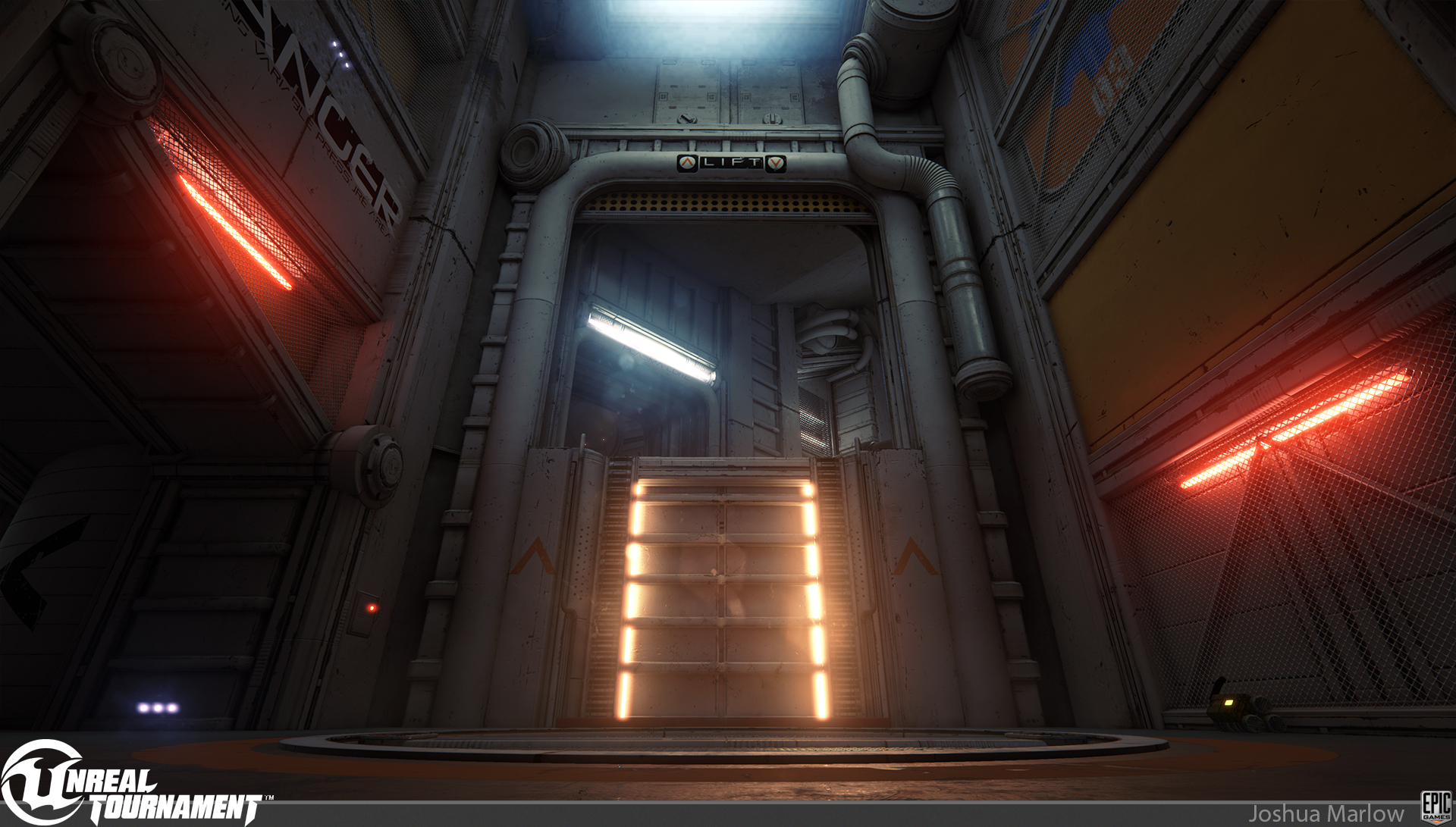
There are a few other shots on my artstation. Thanks for looking!
This is not the post processing the map shipped with, its just me being artsy fartsy
I was responsible for all meshes except for:
James Kincaid made the Laser Drill and small clamp
Pete Hayes made the circular hatch
Rick Kohler made the Fan Blades and canisters
Anton Migulko made the landscape outside
I was responsible for all Material/texture work of assets, except for the Landscape which was Anton Migulko.
Rick Kohler did all the decals, meshing, and lighting
Chris Perna worked on meshing,lighting, and post process
Tim Elek and Bill Kladis helped out with the environment fx


There are a few other shots on my artstation. Thanks for looking!
Replies
How'd you do your material/texture work?
I'd love to see some more information on the level design, modularity, etc.
frmdbl: thanks man, check out that video posted above. Also, Chris Perna, Rick Kohler, and myself will be on our weekly UT steam this Wednesday to talk a bit about the level process
whats_true: Awesome! Yeah we will be releasing the level and the asset test map I made sometime in the next month.
Tidal Blast: Thanks! Great work on the Enforcer
Holland: thank you
WarrenM: Thanks dude! It was a fucking blast to make. Thanks to the Fortnite team for Sparing Kladis and Kincaid for a couple of weeks hehe
Heartfulwarm: Thank you! So it was pretty much 3 of us that are on the UT team. We ramped up around Mid September, and we got some help for a couple weeks from guys in the office with different disciplines. We dont have a dedicated tech artist or fx guy, so we needed some help on those fronts.
peanut: thank you!
fadox: Haha, thanks man. There are some amazingly talented people out there who will push us to stay on our toes
Really cool environment.
Although it does seem a bit strange that even rubber pipes and wires have exact same shade of white as walls.
It's an interesting idea for one map but I just hope it's not an indicator that every futuristic map in the game will have a 2 color scheme.
JamesMeader: thanks!
s1dK: thanks dude
Pope Adam: Dat Phobos!
AzzaMat: you do have to "step" up onto a ramp right?
Blaisoid" thanks. Im not really sure where you would get that idea though. We definitely don't want to make identical maps. Thats the great thing about UT. The map style can be anything. This was our retro scifi set. Now we'll move on to something totally different, and something totally different after that, and so on...
Also, the master shader for this set is set up to where you can change the material to any color, and even change them to different metals, so you dont even have to have a 2 color scheme with these. Thats just the look we chose to go with
Were the wall designs/numbers/text added as decals? Been curious about the use of decals for levels and to what extent you can use them.
Thanks for the documentation on the meshes as well!
As far as decals, yes. We have almost 600 decals in the level which is pretty awesome. Rick killed it with making the decals! So we got a distance fade implemented on the decals, because they cost 1 draw call just like a static mesh does, so you can specify the distance away from the player that the decal should fade at and it stops rendering, which is great!
Makkon: Thanks dude! Yep we were totally going for Alien, Star Wars, Moon type level. I am super excited with the result and the response. So is my wife, haha. Oh, and we will be releasing the map and assets in a week or two so you can play around with them how youd like
SimonT:
TeriyakiStyle: You famous son! I cant wait to dig in. The guys on here are so fucking inspiring with all of the procedural stuff
EbolaV: Hell yeah dude!
polygoo: Glad to hear!
Well, grats once again this is looking mind blowing, It's shaping up to be a great game.
amazing work man!
I see what you mean, but gameplay should be above everything, and in this case solid colors help readability.
If the game is not fun and readable then not even the best art in the world will save it from becoming a flop.
You can still make a colorful map and make it readable of course, it's a fine line that artists struggle with every day, but in regards to UT4 and how it's looking so far, I am loving the fact that it's readable and minimal YET still good looking.
I think the 2nd screenshot shows the power and beauty of using lit particles, even if they were expensive as shit
I was going to ask about the process of creating some of the particle effects, but since it's being released in a couple weeks for people to pick apart, I'm assuming I'll be able to find out first hand.
Was there any unique bakes for the level or was it made with just tileable textures?
Thanks!
Fantastic work from everyone
Mad respec', bro.
the live stream vid is also really cool to see how you guys build it up
Way to stick to your guns with the spot color treatment! (ballsy to limit the color palette so much, and I love it
mhofever:
[HP]: Thanks so much dude! There aren't as many modular pieces as you would think in there
.polygon:
teho: thanks dude! yeah Anton killed it on the landscape!
Kevin Johnstone: Thanks baby!
ae.: We're releasing the map in the UT editor in a couple of weeks. Stay tuned!
pixelpatron: it was a stylistic choice. UT is all about..well... anything you want it to be. We are huge fans of old scifi, and wanted to do something different, so thats what we came up with. The cool thing is that when you get the map for yourself, feel free to do a version you see better for you personally
imbueFX: Thanks Bill! You killed it dude. We're starting the next map soon. Wink wink, nudge nudge. We're only a floor away haha
filthy_sandwich: Thanks so much! Actually imbueFX made alot of the environment and weapon fx. What say you Bill!
WaYWO: woop woop
benox50: Great to hear! It was a really tough balance between wanting to go art crazy and readability for twitch gameplay. Im very happy with how it came out
synergy11: All the meshes had unique bakes for them, but we used a master material that contains 3 material layers for every asset to keep the cohesive look
Rob Macko: Thanks dude! We're ooking into which map were doing next now. Great job on the kite demo btw!
dtschultz: thanks!
coots7: thanks dude! Yeah that would be Sidney Rauchberger. Hes a UT veteran!
3DKyle:
Zaragoth: are you a spy?
KazeoHin: Thanks so much! It was great meeting you at GDC, and thanks for all the awesome work you did. The Flak Cannon is badass! Get on the next weapon now yo!
bugo: dude, thank you! You and your team raised the bar so high with The Order. I feel like sticking my head in a hole, haha.
LuCh!: awesome, glad you enjoyed it!
Deathstick:
[ame]