Home 3D Art Showcase & Critiques

Sci-Fi 3D environment W.I.P

1
polycounter lvl 9
Offline / Send Message
EdHanley polycounter lvl 9
Finally finished, here are some final shots, :)

angle01.png

angle02.png

angle03.png

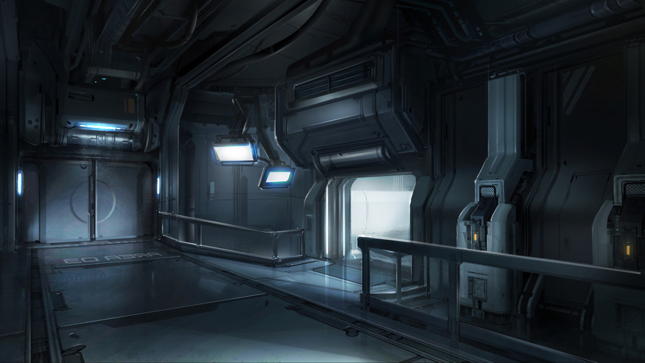
I found this piece of concept art that I have started to create in 3D and thought I would share my progress with you lovely lot. Also I think this way I will have more incentive to work on it in my spare time.
tumblr_mmslp2bmio1s6o4nio5_1280.jpg

Im not sure sure who created the concept but it can be found here - http://inspiration3d.tumblr.com/page/2

I am going to be creating the whole scene in HP first and then making the LP counterparts for putting into an engine, probably CryEngine.

Here is one of the floor tiles I have created to start with.

1.png

I have also created a smaller floor tile to border the larger ones as in the concept piece.

2.png

So far I have also created my interpretation of the generator above the doorway. I will be adding some larger pipes coming from the top at a later date.

3.png

This is what I have so far and will post more when I make a bit more progress.

SoFar.png

Edd

Replies

  • ayoub44
    Offline / Send Message
    ayoub44 polycounter lvl 10
    Great Start ; Keep it up
  • Computron
    Offline / Send Message
    Computron polycounter lvl 7
    That's definitely from Halo 4, in case you wanted to look into an author.
  • mats effect
    Halo 4 has some awesome concept art. Looks like you are of to a good start with this.
  • EdHanley
    Offline / Send Message
    EdHanley polycounter lvl 9
    Thanks guys, didn't realise it was from Halo 4. I've never really played any of the Halo franchise. Might do what you say and try and find the author of it for more possible inspiration.

    Check back for more updates if you are interested on how it progresses :)

    Edd
  • VeeJayZee
    I hate it when the concept art has a monitor! I always, ALWAYS have to put some sci-fi-ey stuff on it even if the concept art only has a lit screen LOL. It can give me tunnel vision on the whole piece sometimes XD

    Oh and the zPipe Maker script will come in handy with them cables :D Can't wait for the updates :D
  • Lloydyy89
    Looking good Edd, can't wait to see this come together. Great start!
  • KSMO
    The authors name is Josh Kao. I worked with him at Sony. theses images are indeed concepts for halo4. There are a few more images similar those in his blog, as well as many other awesome pieces, check it out. Hes a great artist.

    http://josh-kao.blogspot.com/search?updated-max=2012-12-07T09:32:00-08:00&max-results=10
    (this should link you to the page containing these works.)

    good work so far. keep it up.
  • EdHanley
    Offline / Send Message
    EdHanley polycounter lvl 9
    VeeJayZee - I've never made a piece before that had a monitor in it but I can see where you are coming from. I would love to use the zPipe maker but I normally work in 3dsmax but have been considering learning Maya, so this might be the perfect excuse to do so.

    Thanks KSMO, had a look a his work and you are right he is a great artist. The other concept in this style is also going to be helpful in bringing this piece together so thanks for the link.

    Here is a little update on some more bits and pieces I have made, hope you like.

    This is just a simple tiling wall section.
    4.png

    I'm not 100% sure what this s but I'm choosing to think that its some sort of energy device that powers the area, or something along those lines.
    5.png

    And just an overall shot of the scene so far.
    6.png

    Ed
  • EdHanley
    Offline / Send Message
    EdHanley polycounter lvl 9
    7.png

    Hey guys, I've been really busy over the last week with work, events and just stuff in general so only been able to do a bit of work on this environment. Just thought I would show you a quick update on the project.

    I've started to do a simple block out of some of the sections to get a better understanding of how the scene will be pieced together. Hope you like it so far and and constructive criticism is always welcome.

    Ed
  • ufo.mesh
    Offline / Send Message
    ufo.mesh polycounter lvl 13
    Can you post wires of a floor tile, please? And keep up good work!
  • EdHanley
    Offline / Send Message
    EdHanley polycounter lvl 9
    I'm away from my PC at the moment but I'll post a few pics of the wires first thing in the morning for you.

    Ed
  • EdHanley
    Offline / Send Message
    EdHanley polycounter lvl 9
    Here are the wires for the floor.

    8.png

    9.png

    Ed
  • EdHanley
    Offline / Send Message
    EdHanley polycounter lvl 9
    Been a while so I thought I would give a quick update on this environment. Since last time I have almost finished blocking out the majority of the scene but still need to add the detail to quite a few more objects yet.

    10.png

    I have now also started creating the low poly assets and began to bake out my maps just to see how the scene looks in realtime as well as a bit of a change from just modelling in high poly. A couple of my assets are shown below.

    11.png

    12.png

    I have baked out a few more assets too and began to put it together really quickly.

    13.png

    Let me know what you guys think. I have a lot more time on my hands now to really start to knock this thing out so should be posting a lot more often.

    Ed
  • AbKI
    Offline / Send Message
    AbKI polycounter lvl 6
    Looking awesome. Subbed, looking forward to seeing more. :)
  • Jet_Pilot
    Offline / Send Message
    Jet_Pilot polycounter lvl 10
    this is turning out great. Just try not to get overwhelmed with everything you have to make.. one piece at a time, and before you know it you'll be finished.
  • Braddish
    Looking really good eddie! One think about work flow. You might want to try doing blockin proxy meshes for all your modular pieces and build out the whole scene that way first. Then go in and start knocking off all the high poly meshes for each of the proxy meshes. It will give you a better idea of whats left to do and how it all fits together as a modular scene.
    Its a bit of a workflow preference thing, but it might help with the big picture.
  • EdHanley
    Offline / Send Message
    EdHanley polycounter lvl 9
    Yeah I know what you mean. This is the first time I've really done a scene like this before and I realise now that I should have done it like you said. I'm going to start doing it like you said now and hopefully it will be better for me. Thanks for the feedback guys, hope you keep an eye out on this project and keep on giving advice and stuff, I really do appreciate it.

    Ed
  • EdHanley
    Offline / Send Message
    EdHanley polycounter lvl 9
    Hey guys, sorry it's been a while. Kinda had graduation and other stuff and now desperately searching for a job and not having much luck! Still been trying to work on this as much as I can, pretty much finished blocking the low poly shapes in and then made the high poly meshes to go with them.

    Al thats left now is stuff to populate the scene like pipes, cables, wires... and maybe a sci-fi create or two ;)

    Let me know what you guys think and I'll try to update more often and let you know where I'm at.

    Cheers guys!

    14.png

    15.png

    16.png

    Ed
  • CDQuestia
  • EdHanley
    Offline / Send Message
    EdHanley polycounter lvl 9
    Hey, another small update on this project. I've baked out all the normals for all the assets now and got them all in CryEngine to see how they look.

    I'm still going to add a few more details to the normals using Ndo I think and I still have to bake out all the AO.

    Currently the entire scene is at 6100 tris but I still have a few more things I want to make to make it feel less empty.

    Let me know what you think so far?

    Thanks

    Ed

    17.png
  • Fridock
    Offline / Send Message
    Fridock polycounter lvl 12
    did not even noticed from a first look difference between high-poly and baked versions
  • EdHanley
    Offline / Send Message
    EdHanley polycounter lvl 9
    That's probably my fault for using a similar shader looking shader to the one I used in Max. Will probs look a lot different when I start to do the rest of the textures.

    Thanks for your interest :)

    Ed
  • EdHanley
    Offline / Send Message
    EdHanley polycounter lvl 9
    Hey!! Wow it's been a while! Been busy looking for jobs and completing art tests for a break into the industry.

    Just started back on this project and just about finished up the first asset. I have decided to stray a little from the concept to try and make it more my own style.

    I've also changed my image hosting from Dropbox as I know some people have problems when viewing at work etc. Let me know if you have any problems with the new links.

    Ed

    18.png
  • Dave Jr
    Offline / Send Message
    Dave Jr polycounter lvl 9
    Amazing, Keep up the good work!!!
  • AbKI
    Offline / Send Message
    AbKI polycounter lvl 6
    Looking good! Good luck with the job hunt. :)
  • EdHanley
    Offline / Send Message
    EdHanley polycounter lvl 9
    Hey guys. Another brief update. Done a little more work on this and I'm not sure if its starting to look a little too grey, what do you think? I'm hoping it will look OK when lit properly and in Engine.

    19.png

    Also here are the textures for the energy unit for any comments or critisism you may have.

    20.png

    Thanks, Ed
  • Chandler
    That texture looks good. Judging by this, I'm guessing you're going to be going for more color variation and texture details than in the original concept?
  • Chandler
    Also, one crit I would say for your newest screenshot is that I'm not sure what purpose the U-shaped designs on the front of the panels serve. In the concept they look like they're supposed to be hatches or doors, in which case I would definitely add a top border to them and maybe some hinges or something so that they look like they can open.
  • EdHanley
    Offline / Send Message
    EdHanley polycounter lvl 9
    Yeah, although I do love the concept, I wanted to add a bit of my own style to it.

    Good point about the 'U' shaped piece, I'll re-bake it tomorrow with it turned into some kind of hatch. Thanks for the feedback, I'll have to make sure all my other bits and pieces actually have a fiction when I make the textures.

    Ed
  • EdHanley
    Offline / Send Message
    EdHanley polycounter lvl 9
    Just re-baked out the wall segment with a hinged panel like Chandler suggested. I also added a smaller sized panel on the other wall sections so that they weren't covered up by the energy units.

    21.png

    Ed
  • tynew
    Offline / Send Message
    tynew polycounter lvl 9
    Hey Ed,

    It is looking good so far, so couple of crits.

    Your eye detail is pretty tiny and if anything you would only see all this up close, if you're as far away as the camera is ingame you might want to make the details pop out a bit more.

    You need to add some color variation, and make the spec pop out a little bit more. Right now your spec is so flat that it's making your textures look like stone. You also look like you have no cavity and emissive maps? Those will make everything better as eye candy with making edges and led screens pop more. Blues and oranges are generally what make metal less boring and strong contrast and grunge details on spec help a load.

    You've got some dirt on the door panel yet nothing on the floor panel infront of it. I'd guess if the panels were that dirty people would be going in and out, and accessing that area a bit so there would a be a bit of use on the floor.

    I'm not very good at paint overs and this one kind of sucks but I hope it illustrates my point a bit better. It's a little bit glaring on the contrast but it would look better with this just done on the spec.

    s5yUssC.gif
  • EdHanley
    Offline / Send Message
    EdHanley polycounter lvl 9
    Thanks Tynew for all the comments. I agree it does look a bit flat and boring at the minute.

    I've never done cavity maps before, but just followed a little tutorial that BradMyers82 has made on here and I can already see a huge difference! Thanks for that advice :)

    I have also created some emissive maps in the alpha and I'll sort out the specular and grunge issues next too. I'll post up a pic or two tomorrow to show what I come up with.

    Thanks again,

    Ed
  • EdHanley
    Offline / Send Message
    EdHanley polycounter lvl 9
    Right, spent some time working on the specular map on only the energy tower so far, and I think I have got it looking good now. I also added a few cavity maps on the diffuse/Specular too.

    I've put it into CryEngine so I could add some better lighting and emissive textures etc, and I am planning to take the final shots in here when its done so thought it would be a good idea to see how it will look in there.

    Let me know what you guys think.

    22.png

    Thanks,

    Ed
  • Ben_Flex
    Offline / Send Message
    Ben_Flex polycounter lvl 14
    Very cool. I like the detail of the wire underneath the grid.
  • EdHanley
    Offline / Send Message
    EdHanley polycounter lvl 9
    Just been playing with lighting in CE, its still very work in progress though. Gunna finish off all the textures now before I mess with the lighting anymore. Could spend ages just tweaking values and stuff!

    23.png

    Ed
  • oxblood
    Offline / Send Message
    oxblood polycounter lvl 9
    this is really looking nice
  • Computron
    Offline / Send Message
    Computron polycounter lvl 7
    make sure to make plenty use of the new area lights.
  • EdHanley
    Offline / Send Message
    EdHanley polycounter lvl 9
    Thanks oxblood!

    Yeah already been using quite a few area lights, so glad they included them in the SDK. Used a couple of light propagation volumes too which I've just started using, they give quite a nice effect!

    I'm a little limited to what I can use with the latest build of CE though because I'm still on dx10 :(

    Ed
  • EdHanley
    Offline / Send Message
    EdHanley polycounter lvl 9
    Just a little update after another few textures being created and a few tweaks.

    24.png

    Here is a sample of one of my textures too. This is the floor section the the right behind the barriers.

    25.png

    Ed
  • Dave Jr
    Offline / Send Message
    Dave Jr polycounter lvl 9
    Awesome job! May I see some wireframes :D
  • EdHanley
    Offline / Send Message
    EdHanley polycounter lvl 9
    Thanks,

    Yeah which objects would you like to see? High or low poly wires?

    Ed
  • Dave Jr
    Offline / Send Message
    Dave Jr polycounter lvl 9
    Low poly wires of the scene in engine would be awesome.
  • EdHanley
    Offline / Send Message
    EdHanley polycounter lvl 9
    I'm not sure how to take wireframe renders in CE, but here is a shot from Max if it helps?

    26.png
  • Dave Jr
    Offline / Send Message
    Dave Jr polycounter lvl 9
    I'm not sure how to take wireframe renders in CE, but here is a shot from Max if it helps?

    26.png

    Wow this is really nice. I might actually do a take on this concept myself... well - its on the list of many haha.

    Youve done great; nice one. - May i ask where your knowledge of C3 came from?
  • EdHanley
    Offline / Send Message
    EdHanley polycounter lvl 9
    Thanks again. I just learnt it from messing with it really, I'm still actually learning a lot as I am making this environment.

    Ed
  • EdHanley
    Offline / Send Message
    EdHanley polycounter lvl 9
    Hey guys, just though I would check in as it's been a week or so. I'm still working on this piece and thought I would post a few pics of where I'm at now. I think it's starting to get there.

    1.png

    2.png

    3.png

    Thanks For Looking :)

    Ed
  • CharlieD
    Offline / Send Message
    CharlieD polycounter lvl 11
    The lighting is turning out pretty sweet! Keep on keepin on!
  • Rhoutermans
    Offline / Send Message
    Rhoutermans polycounter lvl 12
    Already looking so awesome, can't wait for the final shots :)
  • jacksteel
    wow, really great work! the only critique i could offer is that the black text on the radioactive pillar thing, doesnt relaly look like it fits in. As the pillar has abit of rust and scratches and the text doesnt. Its just a thought. But with that said its looking great!
  • Hayden Zammit
    Offline / Send Message
    Hayden Zammit polycounter lvl 12
    Looks really great. Are you just dropping that scene from max straight into Ce3?
1
Sign In or Register to comment.