The Desert(What can you do with no diffuse maps?)
What's up, you, guys. Long time no post. How've you all been around here?)
So yeah I just thought I drop here something I've been working on for a little while.
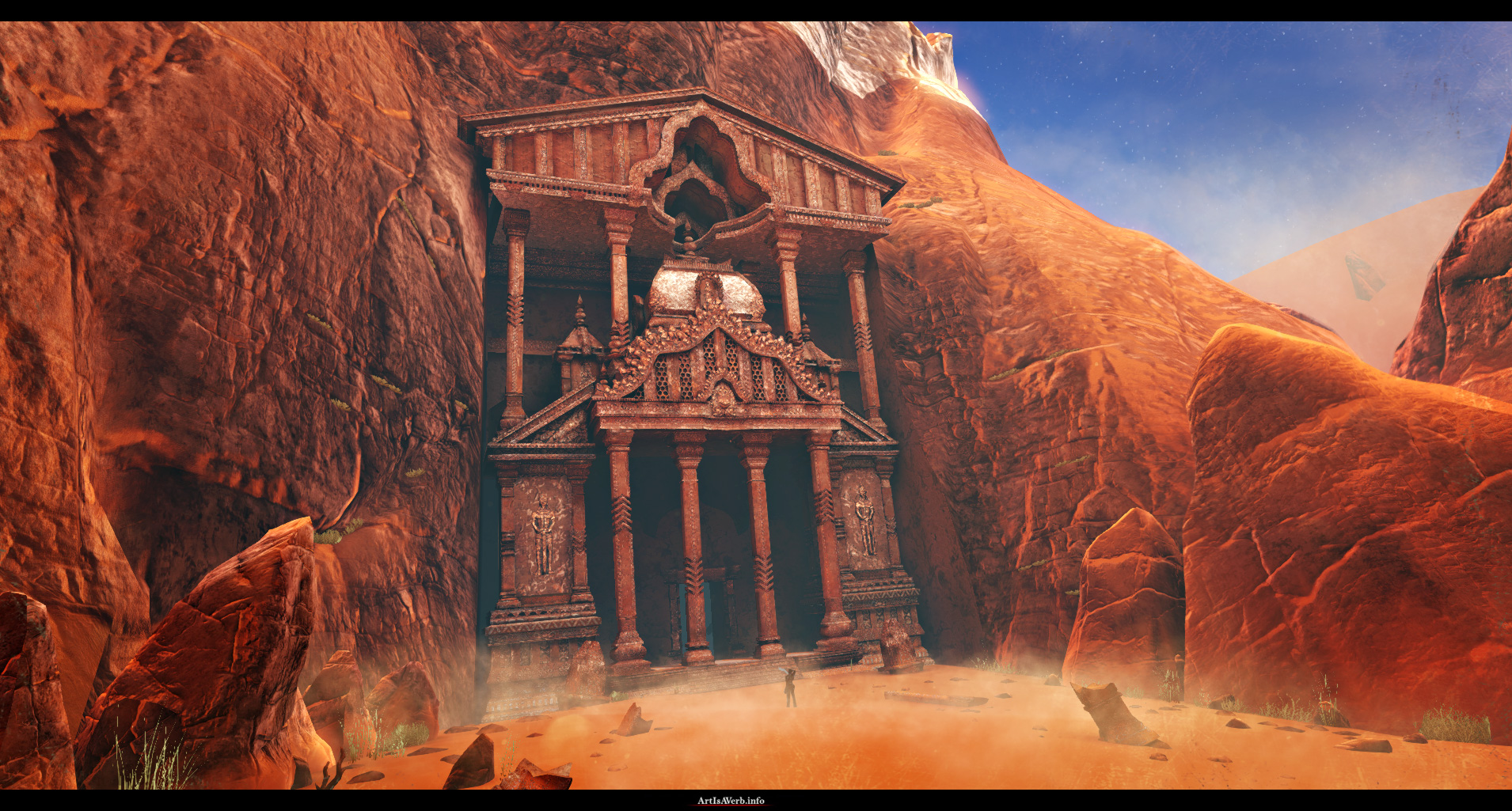
NOW YOU MAKE SURE TO HD OR I'LL FOLLOW YOU HOME AND POOP ON YOUR PORCH
[ame=" http://www.youtube.com/watch?v=QtSbrIupviQ"]The Desert - YouTube[/ame]
Unfortunately youtube blocks the video in some countries so here it is on Vimeo:
https://vimeo.com/43720484
I won't be posting much screenshots for now because this work is not about static images at all and I really want everyone to check the video out.
Now you've probably guessed by the thread title that this environment has some kind of shader trickery in it.) And you're totally right!
I figured I'd dump all the diffuse maps and do an environment without them for a change.(And a whole lot of other shader magic)
I thought I saw an opportunity to improve the way we make our games technically, production-wise and hopefully not make them worse visually.
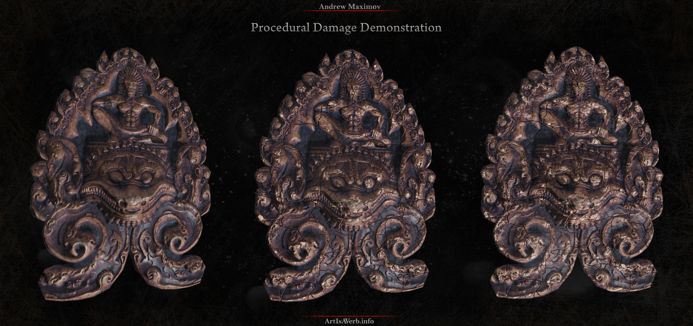
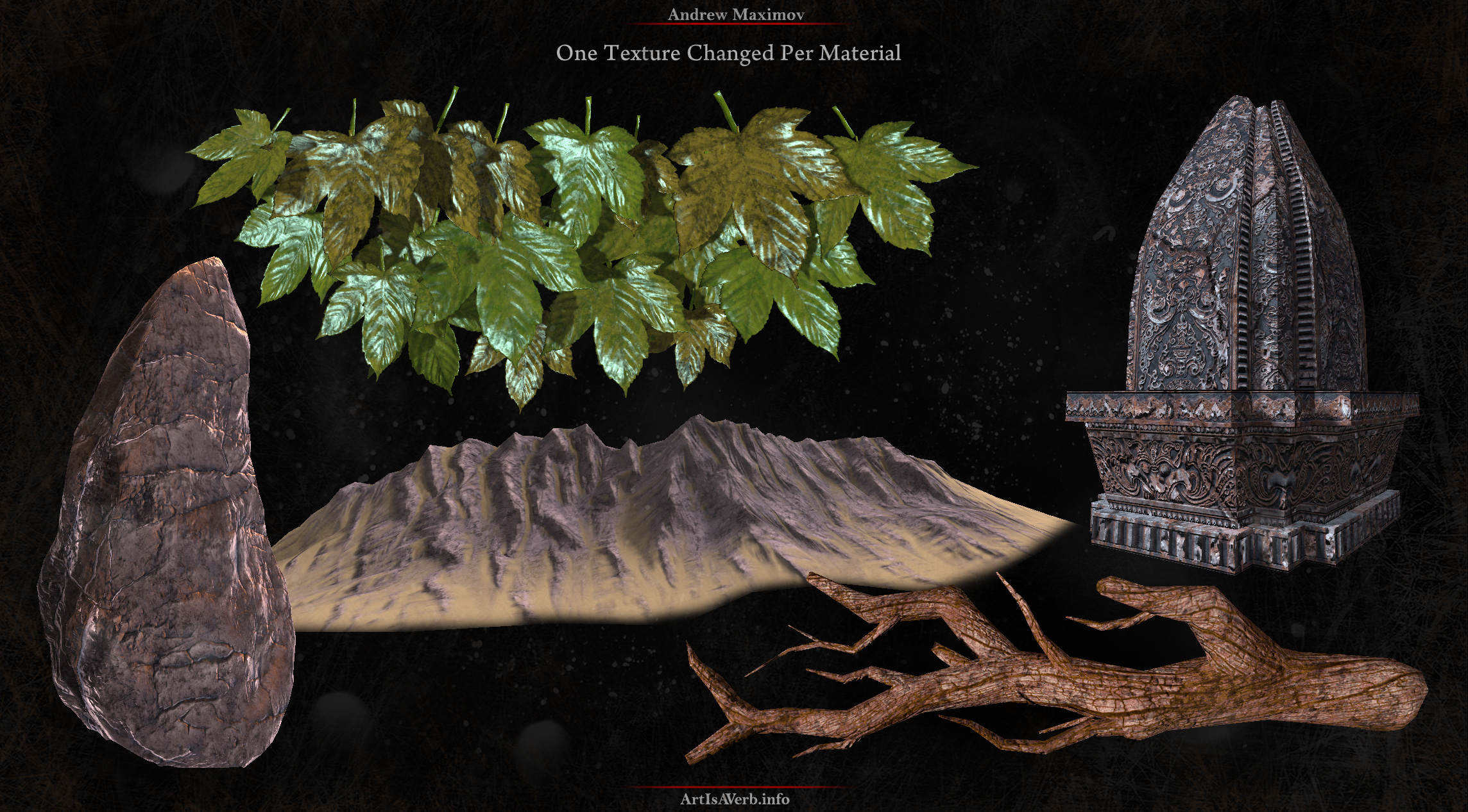
I've written a little [size=+1]paper on "procedural" materials[/size] and if you have any ideas on the subject I'm always up for chatting.) Now for those of you who ain't gonna read it I thought I'd post a couple images from it here to give you the gist of it:
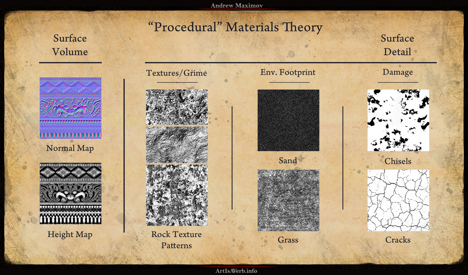

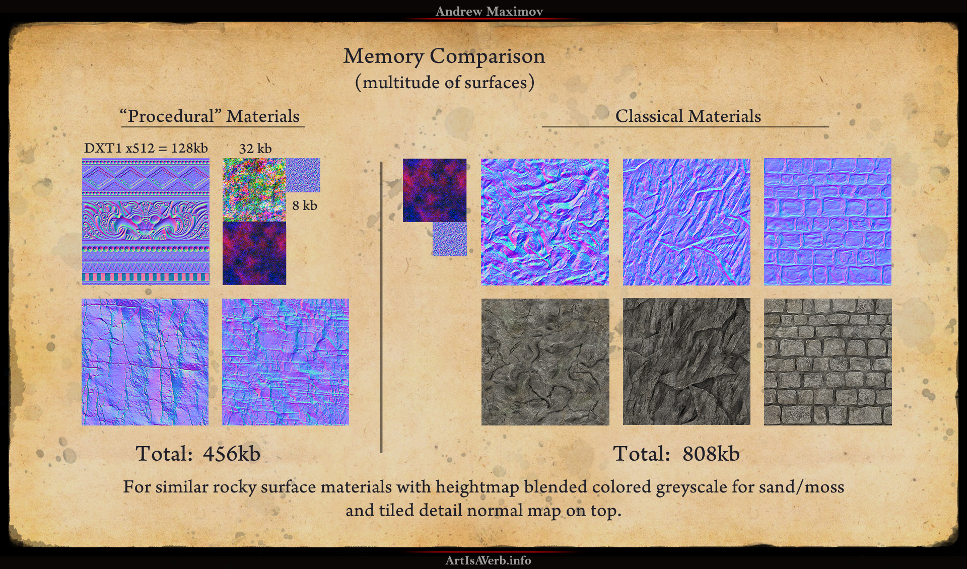

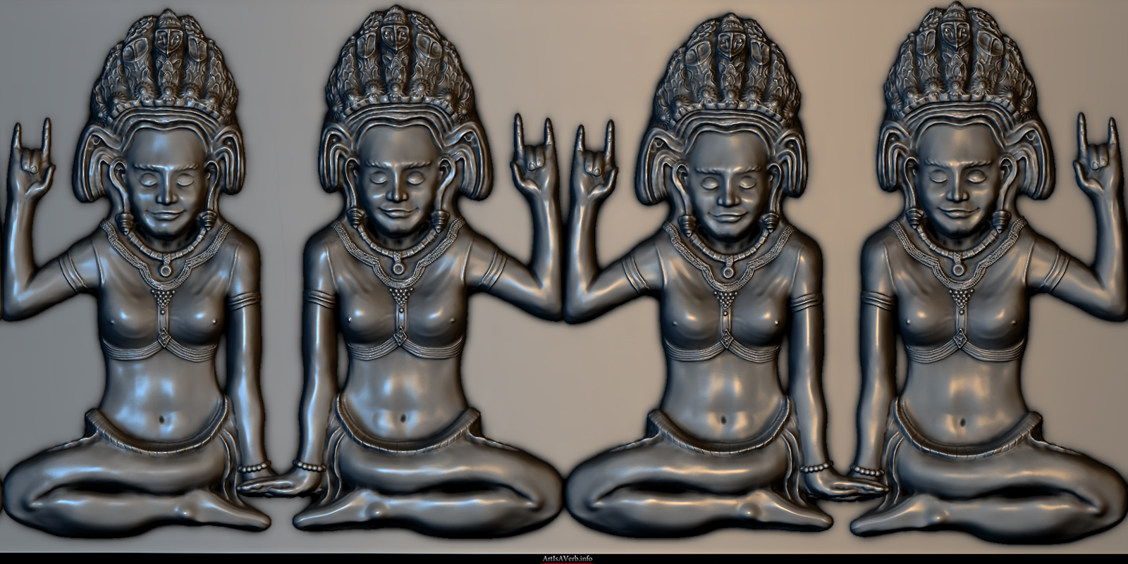
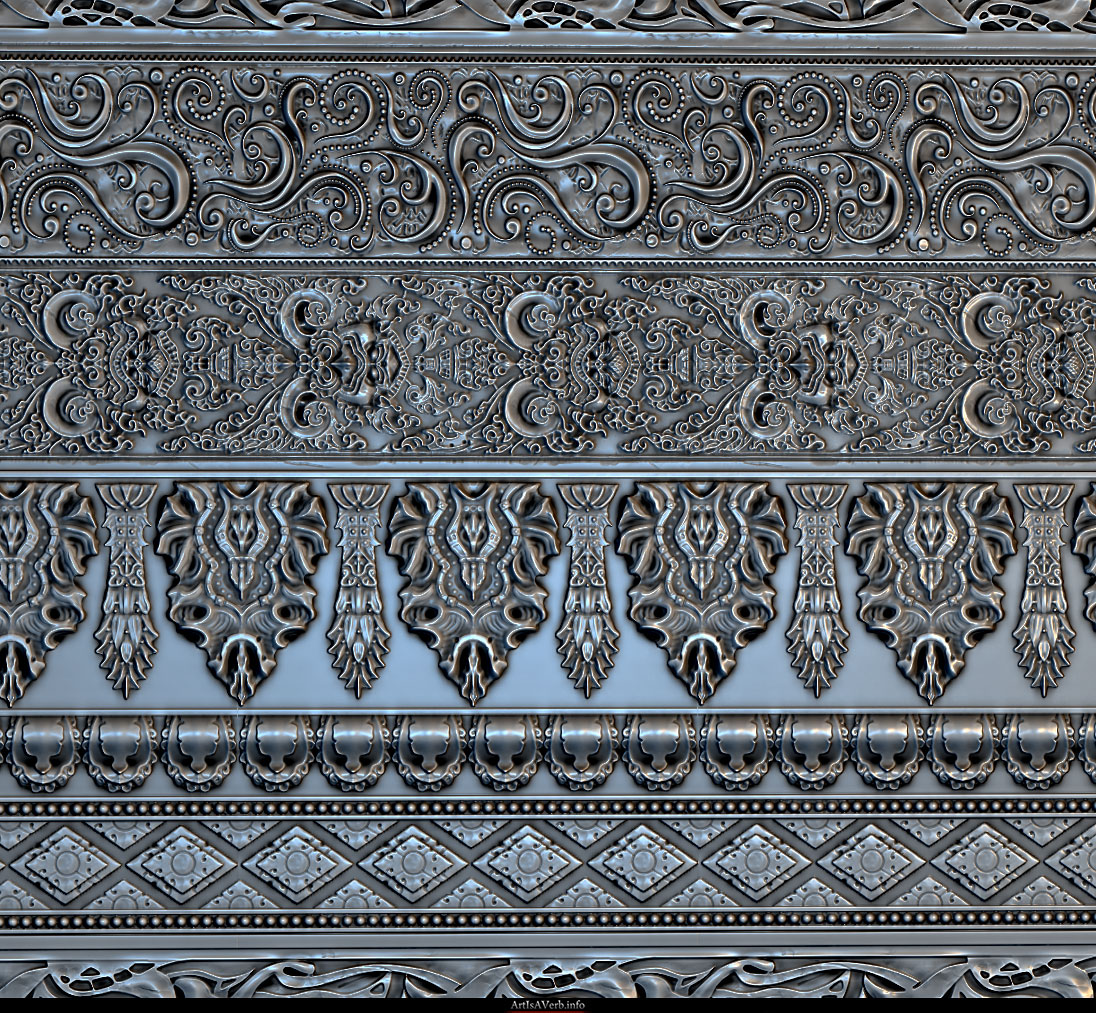
Some sculpts, or Normal Map renders to be precise:



So yeah I just thought I drop here something I've been working on for a little while.

NOW YOU MAKE SURE TO HD OR I'LL FOLLOW YOU HOME AND POOP ON YOUR PORCH
[ame="
 http://www.youtube.com/watch?v=QtSbrIupviQ"]The Desert - YouTube[/ame]
[size=+1]Please make sure to watch the video until the very end, because that's where all the project is! All the following images are merely a bunch of working materials. Thank you very much:)[/size]
Unfortunately youtube blocks the video in some countries so here it is on Vimeo:
https://vimeo.com/43720484
I won't be posting much screenshots for now because this work is not about static images at all and I really want everyone to check the video out.
Now you've probably guessed by the thread title that this environment has some kind of shader trickery in it.) And you're totally right!
I figured I'd dump all the diffuse maps and do an environment without them for a change.(And a whole lot of other shader magic)
I thought I saw an opportunity to improve the way we make our games technically, production-wise and hopefully not make them worse visually.
I've written a little [size=+1]paper on "procedural" materials[/size] and if you have any ideas on the subject I'm always up for chatting.) Now for those of you who ain't gonna read it I thought I'd post a couple images from it here to give you the gist of it:


Some sculpts, or Normal Map renders to be precise:


Replies
Now if you're interested in all of the shader trickery and technical details that are aplenty in this environment, or concepting and ideation of a project of such scale feel free to check out my making of videos.
It's a bit on the long side, but hopefully you'll get compensated with interesting info for your time.
Technical:
[ame="
Conceptual:
[ame="
Thank you very much in advance guys and gals, I love you all.
[size=+2]EDIT: Moved here from page 3, so you guys could find it more easily.[/size]
And finally, there one thing I wanted to share with you guys...but I can't seem to remember what it is....
...oh yeah, [size=+4]THE MATERIALS![/size]
Click the image to grab them!:)
There are all kinds of "procedural" materials for you to check out as well as a couple of example textures and meshes. Also there's a .PSD that makes for very smooth gradient map production as it allows you to preview your gradient mapping, normal, specular, damage and diffuse pattern influence right in photoshop! It's like you're painting your gradient map directly in UDK and can immediately see the end result! I've made a little video that will hopefully make things more visual for you:
[ame="
I hope this will help you guys to do your stuff faster, prettier and more efficient! Though it does take a little getting used to, I can't wait so see what great stuff you awesome people will come up with. Arrrgh
Oh, and just in case, if there's something wrong or I forgot to plug something somewhere - report it here and I'll get it fixed.
Have fun!
The canyon was a little bit too long I'd say but the rest was amazing, really cool and nice story-telling. I don't really have any crits actually I'm just enjoying your art. I'll take some time now and have a look at your *making-of* videos.
Again
Great Work!
Will watch it all when I get home.
It's gorgeous !
what... kind of... sorcery... :P
really gorgeous. nice work there, congratulations
Maybe camera is a bit wonky, but it doesn't spoil the experience.
I hope those additional videos will prove useful.
Yeah, I was afraid that canyon might turn out a tad too long. I started to get this feeling closer to the end but I've already composed the music to fit the editing, so hopefully it's not a dealbraker.(fingers crossed)
Huge thanks, ambershee. Have a nice watch )
Froyok, thank you buddy. I appreciate the kind words!
yodude8, thanks man! I just had to use some art buffing spells and a potion of no diffuseness. It's quite easy to brew at home actually, you just need some fresh water, tomato juice, sand, ashes of a red cow and a handful armpit hair
Thank you very Miladyknowles.
coots7, thanks buddy, I hope you dig!
Huge thanks, uncle! Yeah I wish I got to do more camera work. It's really interesting . I hope to get better ;-)
- BoBo
Great work
Do you plan on making a game or something from this ? Even without gameplay like Dear Esther. It really makes me want to walk in there. It can't just be for you portfolio
Wow dude. That's all I can say really. Probably one of the most impressive thing's I've seen on here for awhile.
Mr.BoBo thank you very much, sir! I'm really glad you like it.:)
Hey, mr_ace, thank you, man.
Well I sculpted all of those. Most in zbrush. For those that seem to be on a flat surface I did a little blockout in max so I'd have a a separate tool that I could clone later in 2.5d and not mess up my flat background. And the circular is probably the least impressive, because wikipedia has a vector image of it:) It's an aztec calendar. So I just fiddled with it in photoshop to create a more interesting mask. And then just heightmap based deformed a flat plane(in Mudbox it would be Model from Heightmap, I belivie, and in Zbrush you can just use it as a mask and then use offset in the deformation scroll). And then some layers of damage on top. Most of the rest were just hand sculpted. It's not that long actually. Around 4 hours per piece.
aobond, thank you very much, buddy. Much appreciated. I really hope your head would be ok, but I'll keep my fingers crossed just in case:D
jal, thank you man. I hope it'll be useful.
Hey, thank you, Rik. It's really nice of you to say that. If you have any ideas on the tech feel free to share. Thanks again!
Much appreciated, Jungsik. Comments like these mean the world to me actually
Huge thanks,Guedin. It makes me amazingly happy to hear that this world turned out alluring and inviting. I wish I could say it's for a game, but it most honestly is just a personal project. But who knows, maybe someday;-)
TheGoozah, thank you friend. I'm glad you enjoy it.
Much appreciated, JoshC.
BlvdNights, hellyeah, Texas, man!
Thank you very much, Alberto!
Huge thanks, artquest, I'm glad you like it.
Yeah, who need those diffuse textures. They are so 2011
And just in case if someone around here would like to know anything regarding the tech or pipelines or anything at all - feel free to ask - I'll do my best.
Either way great Environment, work is solid. The minor issue I have is with the bigger slab rocks they feel small due to the scale of the texture. but besides that well executed.
Not sure if you were making fun of this video down here in the link, lol but either way great stuff!
http://vimeo.com/4715334
Thanks,Minos. Love your stuff
I'm glad you like it, RiotForQuiet. Thank you
Thank you very much for the input, rogelio! I've never seen the video you posted thought the coincidence is pretty amazing:) Damn Andrew Kramer, too popular for our own sake:) Loved you video btw, great job, buddy!
Huge thank you, Phenom. It's always a great pleasure for me when someone appreciates stuff like this. Narrative, Camerawork and Sound are tremendously important parts of the whole that I worked really hard on. Thank you once again!
Hey there, Samfisher84, thanks a lot buddy. Yeah I guess I did:D To be honest though, I really hope they are not the most impressive part of this project.
Merci Beacoup, Clos3d! I'm glad the "behind the scenes" came in handy. Salut
That being said, procedural textures do seem cool for quickly getting a lot of neat variety out of stuff far more quickly. And your results look great! Further, I DO care about disc size. People are going to download this stuff, and the faster that goes the better. So giving a huge variety without a every last texture being unique somehow is also great. :poly142:
Thank you very much. Now as a graphics programmer, when do you think we can expect virtual texturing to become commonplace? Why don't we see anyone but id try to migrate to this technology so far? Do you expect it to be integrated into next gen engines like Unreal 4 for example? I'm also very interested if this mega texture is different for different passes, or does it hold all diffuse, normal, specular etc. info all in one texture?
I'm very glad you like it, jimmypopali. I hope you like the video 'cause that's the most important thing.) have a nice watch!
Heya, Chris, thanks a lot for your comment. Much appreciated.
I'm sorry it felt too long and overdramatic for you. I tried to break the drama thought with the hero falling down to my ridiculous falling noises:D or with Texas. But yeah I'm not the fan of the drama myself and downright make fun of myself in the beginning of the conceptual making of.
Though it has to be said that I worked hard to create an appropriate score and despite some goofiness I really wanted it to create an impact.
Anyway I hope it's not a deal breaker and you were able to enjoy at least in some way.
cheers:)
The final overlook shot on the video is gorgeous; really brilliant job on that. I'm not sure it would work in a screenshot because part of the effect is due to the eye adapting to the extremely bright bloom, but I'd take a shot of it anyways and put that up in your original post.
A bit of crit:
I've read through the paper you wrote, and watched most of the making of process. It's a very interesting technique and works extremely well on the more organic structures, eg. the rock wall, etc., but I think in other areas (such as the idols on the wall, etc.) you could push it to get better results.
It's a technique I'd assume would allow you to get much crisper, higher-res, more readable results, yet in those areas, and part of this is due to the lighting, you've chosen to add too much contrast and noise. I understand the reasoning behind this, especially in attempt to adhere to the style, but I think subtlety in the variation within the procedural textures would go a long way (ie. allow the normals to breathe a bit more - Uncharted does this brilliantly), especially in the separation between shapes and background (which in some areas in the video are pitch black lines which do more to detract from the illusion of shape then add).
And a few Questions
(perhaps you've already answered them in the paper, I may have missed that or skimmed over it, if so, I'm sorry):
1) Is this a technique you plan on using in a way which you end up completely revamping your entire workflow? Or one that you think will be beneficial to certain scenarios in the future, or even just one that lets you think about how you could use diffuse maps differently?
As in, from here on out, did you find that you had so much success with this project that you will never go back to anything else, or is this just something that will help you/make you think about things differently in the future?
2) One thing I found in the video which was concerning was the shader instruction count, which in certain cases, went upwards of 200 (We generally try to stay anywhere from 50-70/80 instructions on our shaders). Was this more due to redundancies in the shader (I'd imagine there'd be a few due to how much work was done for this thing), or is this just an issue you will face using this technique?
Again, this is really great work; extremely impressive (and so well organized/presented), thanks for sharing. Well done!
Edit: Just looking back over this again (you've given us far too much to look at
Seriously, though, love the video, and all the breakdowns and tech notes. Looking forward to setting some time aside tomorrow to watch the making ofs.
I really enjoyed the video direction, btw, especially the whole almost-frozen moments in time thing, like some kind of epic cinemagram.
Ace. Absolutely ace.
hehe this kix ass
The video is definitely very strong. With all the music, camera work and animated fx - that should have been a huge work!
Love the temple entrance and the final vista - that definitaly kicks ass!
Sorry I haven't been on skype much - been crunching to finish this up before some family stuff.
Je suis desole, Jacque
I appreciate the kind words, dtschultz.)
Lamont-さん, どうもありがとう!
Huge thanks, underfox!
Thank you very much, Add3r. I appreciate it, thought I think you ought to change that folders name "People Who's Ass I'm going To Kick Someday". Seriously. I'm waiting for you to. I know you can, so no slacking off.
Wow, LoTekK, man, that was like on of the most awesome things to say, ever. Much appreciated, buddy. I'm glad you liked this stuff and hopefully those "making ofs" will prove useful to you. Oh and I'm stoked you loved those "frozen" moments - I hoped they would be a nice touch:)
jeffro, thanks man! It's very nice of you to say that.
Hey Paul!
I just wanted to extend a most heartfelt thank you for the time you took to analyze this stuff so deeply, for the feedback and for the questions. It makes me very happy to see someone considering this technology on a practical level.
I'll try to fiddle with screenshots later on and see what I can do:)
Now your crit is extremely valid. On some surfaces this technology could and should be pushed a great deal(and those Idols are the most obvious examples), the contrast could've been less stark too. I believe that as with everything with this tech there's a learning curve. It's a pretty new approach and it would take sometime to see people really push it to it's true potential. I merely scratched the surface and I've a pretty staggering argument to back it up. The gradient maps I talked about in the paper, I hardly used them here. The majority of details used are plain old heightmaps, without any touchups at all. And let me tell you that heightmaps are far from ideal input for gradient mapping. Now I had to do this to save myself some time, and since a lot of people let it slide, it means that studios could do that too from time to time. But the silver lining here is that all the purposeful artistic editing could bring this Levels Higher. You have to edit your heightmaps in a way that brings out all the local shape relations and reinforces texture detail. You'll have to do this a couple of times to realize what particular consequences your particular edits trigger. It's an unusual thoughtprocess for texture artists and will definitely require some cognitive effort at first. And now I personally feel that with conscious edits people could bring out a lot more then we imagine right now. There are always people who come up with exciting and unexpected ways to use things, and they'll raise the bar even higher. Even compound materials of metal and rock/concrete, as you awesome guys at Epic like to do, are pretty damn possible with this even from a single gradient texture.
Just in case, what do you mean by "allowing the normals to breathe a bit more"?
Now on to your great questions!
1)So far I think that this technique could and should replace 1/2 to 3/4 of the diffuse textures we have in games. Watching through all the E3 videos I was looking at textures and thinking that so many of them could be done "procedurally" with no real loss in quality visible to the final player.
So I would consider it reasonable to use diffuse maps only where gradient maps will prove insufficient.
But if I ever finally get a job someday it probably won't be up to me decide what tech to use.
Now I know I could be wrong and that's actually what I'm trying to do here, to find all the smart people to prove me wrong and explain me why this idea is unreasonable in real-life production. But until that happens you can be sure that I'll bug every single person I know or will work with to try to implement this or find out why we couldn't do this. In fact I would be endlessly indebted to you man, if you could pass this idea on to someone at Epic who might know about this thing more then we do, so he or she could help us straighten things out. I would be endlessly thankful for that.
2.)Defintely redundancies and inefficiencies on my side. But also some on the side of UDK, like why do parameters increase the instruction count? I thought the shader should just bake at level start and not care whether you hardcoded the numbers or input them through a material instance. Also right now you can't input vector parameters(4 channels) into a "custom" node - it only sends 3 channels. To circumvent that you have to append vector parameters to their alphas wasting another bunch of instructions.
I've made a bare bones comparison to give us a more accurate idea of what's going on:
Conclusion 1: 2 point gradient mapping costs almost nothing. So using it at places as such:
Should be a no brainer considering we save a whole diffuse and opacity map for basically no cost at all.
Conclusion 2: Generally with 4 point gradient mapping replacing a diffuse map will cost us 14 instructions. 16 if we want to add diffuse texture pattern on top, but we could try to incorporate it into the gradient map.
Now would cutting 1/2 of your diffuse texture budget be worth adding extra 14 instructions to 1/2 of your materials?
Seems like a decent trade off to me but I really don't know enough to tell. This could depend on sooo many things.
Now if engine creators would implement gradient mapping themselves it would get even more optimized. And if they allow to compress normal maps with gradient maps into a single RGB texture, the benefits would be just too obvious. I think One texture per material is more then enough for artists to put in. Let artists define the variety, the essence, the seed of the surface and lets make our tech do some work.
I was really hoping that the good people of the internet could help me get to the bottom of this. And even though this environment hasn't been getting much practical interest in it's technology I still have hope.
I'll keep bugging people anyway until they tell my why this is wrong:)
So yeah, thanks you very-very much once again Paul, you're awesome. And I'm really sorry this turned out into a wall of text.)
p.s. There's a chance that UDK has trouble determining instruction counts for custom nodes, so we might know even less.
Keep up with the great work!.
looks amazing btw!
and yeah, the canyon is reeeeealy long! xP
awesome job man!
only thing that caught my eye negatively was the artefact sitting in the sand at the start... could do with more polys to bed it in to the sand