Search
-
Re: Sketchbook: Wizo (Art Dumpage)
 Loving the updates Wizo. The colorized version is definitely a step up. As for crits - The pinkish colour mostly on the neck reads (just my opinion) a bit milky compared to the rest of the skin. I'm just going to guess here, but it looks like your going for subsurface scattering on the skin, reflected light from the inside…
 -
Re: [Finished] Wizard dude
 Hi travesty. Nice work. The first shots look a bit strange in that the head looks un naturally gaunt. The neck volume looks pretty low, sort of alien like. You have modelled a worried or concerned expression which by default should be neutral. How did you do the clothing? If you use something like Marvelous designer you…
 -
Answered: Quixel Suite 2 Training and Questions
 Do anyone knows where I can how to use Quixel Suite 2, I had never used Quixel Suite in the past or substance, I`m new in this and want to learn Quixel as I found out pretty amazing tool. Where do I learn how to use it Quixel Suite 2? I can`t wait for Quixel to upload training, they´re good, but they are kinda slow…
 -
finally finished the "goth" girl
I would say she came out more burlesque than goth. So it goes. Next up, learning to rig. The textures still need some minor refinement, and for some reason, OSX desaturates the hell out of my colors when I screen shot using the finder. Not sure the best way around, may have to do final grabs in windows. Very frustrating.… -
Re: (WIP) (UE4) Silent hill street
 Thanks for your feedback. I took note of it for this little update, so I decided to model and animate the lying figure creature from silent hill 2. This one will be useful for some shots in my final project. regarding the fog I always tweak the settings a little bit trying to get a good ratio to the distance without hiding…
 -
Re: [Riot Art Contest] - Mercenary Katerina
 Reply by danpaz3d · · Home› Contests & Challenges Archives› Riot Art Contest› Riot Art Contest - Character ArtThanks! Yeah, I'm going for the more stylised version. More, I'm trying to make it more like the in-game model. Thinking how the geometry would fit her animations, considering how her neutral pose is in-game, her legs are pretty spread out and she does some pretty crazy attack animations. Here's a vid I used for reference.…
 -
Re: Tie Interceptor
 The stylized feeling perhaps is because of the relatively clean wings with edge highlights, some colour choices of panels and the overall tint. I reckon if you tint it to more neutral tie fighter colour and lower the edge highlighting a bit it would help. But that's all opinion and style choice of course! :) slight cooling…
 -
Re: The Beast - The Great Goat

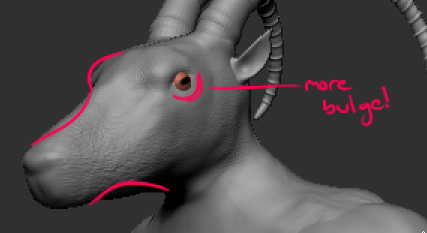 First thing I noticed is the size of the hands, they should be much bigger on your sculpt. Look at how thin the wrists are compared to the hand itself in the concept. Definitely push the contrast there! You also might want to do a neutral pose closer to the concept, with a little more hunch in the back. That will sell his…
 -
Re: What do you guys think?
 Good to know. I'll put together a new floor texture, I'll take out the hexagon pattern, probably the culprit in the noisy floor you speak of. I'll look at my original floor pattern and see if I can remove the hexagon pattern via nDO and start there. Shouldn't take me very long to mess with the details and come up with…
 -
Re: Cavity vs Curvature maps
 First one is a cavity map where darks represent the cavities Second one is, uhh its sort of weird and not really "correct", its the thing you can get out of crazybump where gray is neutral and darks are cavity and whites are convexity, this map is hard to work with Bottom one is a curvature map where each channel contains…
>1745 results