Search
-
Re: Material Definition: Advice, Challenges and Presentation
 Let's talk about what material definition is, first. Material definition is being able to clearly tell the difference between adjacent materials, as well as being able to tell what each of those individual materials is made of. For example, I could look at two flat grey materials with different gloss values and assume that…
 -
Re: run down city environment
 Hey Matt, I think your making some good progress with this image so far man. One thing I think you could do to really push this image (beyond what you have mentioned so far), is to really take the time to play with the intensity/color of the sunlight coming down onto the city streets. If daytime is your intended look to…
 -
Re: [ce3][wip] Escort room
 I'm not huge on the concept as I feel it's a bit loud and lacks focal interest. However, you've done a good job putting the scene together to capture its feel. There are some changes in your latest update that I'm not sure were for the better. There are a lot of little things that I think you can fix to push the scene…
 -
Frankensteins lab
 Hi! I've started a new project and I thought I should post it here. This will be my first Pimping thread, but I've just made a model that I really like and thought it was time to post it for some critics and comments. So I've based my model on Stephan Martinieres concept for Frankensteins lab:…
 -
Re: Gypsy Caravan
 Talking about lighting this tutorial might give you a good start, especially when using marmoset. Although the tutorial is focused on lighting for characters and thus not everything will be applicable or usefull for lighting hardsurface models (from my experience) it will be a good start with some valuables do's and…
 -
Re: Decompression [CS:GO]
The banners seem overly bright; a subtle normal map would also help give them a more natural cloth appearance. Also, replace the black in the texture with a very dark grey - in life, even the darkest cloth reflects some light. The ground lights in the first image are very bright. While this might be visibly appealing,… -
Re: [WIP] Rhaegar Targaryen

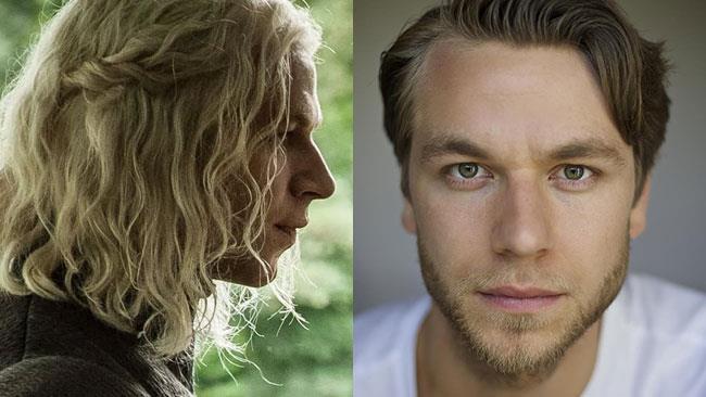 Tried doing a paintover. Then rememberd "Oh, right, the only thing i can draw is horses" But basically i think it's mostly there. But i'm looking at wilf scolding's eyes and his left eye is droopier than his right and his nose tilts to the left. His nose is a bit wider at the base than you have it and it slopes a little…
 -
Re: UDK Scene
 good start. - There is a major problem with scale. The pipes and valves r too big which makes all the other objects (barrels and especially forklift) seem tiny. The foreground valve is especially huge by looking at which the ceiling height feels like an average human would touch it with the head. -Lighting. In a dark…
 -
Re: Celtic Village UDK Environment
 Looks like an excellent start, I'd do a little more work on your lighting it's feeling a little muted right now, I'd try to get more contrast of light and dark areas in your scene. Your torches are so saturated and bright that they just draw my eyes right to them, and I'm not given the opportunity to appreciate your other…
 -
Re: SciFi Hallway UDK
 It feels boring to me because it lacks any personality. The textures are repeated constantly. There is no feeling that it has been lived in. It like the people who were supposed to be there just got tired and left right after it was built. It also lacks props, and your lighting has no mood associated with it. One thing I…
>90515 results