Search
-
Re: [WIP] Wildcats Characters

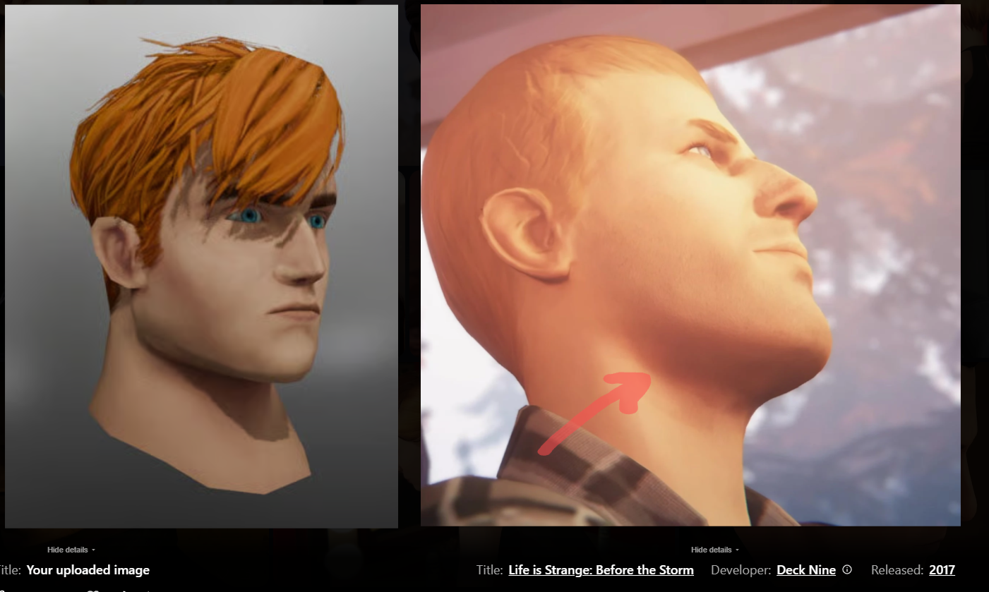 I would push it further than life is strange did it, but still notice how the shadow beneath his chin is reddish hue instead of the darker brown: Even here - the red from the cheek is almost the same hue as around her jawline: You can see it a lot more pronounced here in Spiderman. Especially the ears, but also nostrils…
 -
Re: Help: Need advice on how to land a job
 I thought about it for a while and will be more straightforward: The presentation of your single assets is lacking. (The presentation of the square as a whole is nice but that won't matter depending on the role you are applying for.) The light seems pretty diffuse and washed out most of the time and is not suited to show…
 -
Re: Enviroment WIP - Warehouse district
There's a bunch of things here that I think you need to fix, even this early. - The proportions of your architecture are screwy right now. Unless you have a specific photo that you are working from, I'd recommend adding a thick entablature (horiztonal trim at the top) to the building on the right. Just google entablature… -
Re: Baking AO, what options do i have?
 Saving out a complete map will bake the scene lighting into the model, if no lights exists then the default viewport lighting is baked. If you don't have lights set up in the scene then you should. I think your errors might be coming from the UV layout and it might be using the wrong channel.
 -
Re: How to recreate One Piece anime-style shading & glow (Paint Tool SAI 2 + After Effects)?

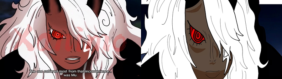 The first thing that stands out to me is the colors are different. I would suggest picking colors directly from the reference, and filling your art with those. The next thing that I see is proportions. The reference face is shorter overall. One trick I like to use is to put the reference and the art right next to each…
 -
Re: Jukebox Hero Prop

 First of all, I love that prop, great job! I agree with the others about the wear. I feel it and the level of dirt, in this case the lack of it, is inconsistent. Some notes on what I'd expect to see on a jukebox this worn: My rule of thumb for grime: - It accumulates in corners, hard to reach crannies and under overhangs…
 -
Re: UDK - Weathertop (LotR) Inspired Scene
 Hi Tim! The scene is looking cool, I like the elegant straightforwardness of it. Going by the older scene shots, I would say your diffuse is too bright. Even though you are going for a very white-colored rock surface, consider damping the brightness on your diffuse texture so that more subtlety in the lighting can show…
 -
Re: Renders From My Demo Reel. (warning: 16 images)
 I guess as harsh as comments can be just for the sake you can still learn from them. Be open and take whatever you want from them. That's what polycount is about. Anyways..... my feedback to you. it seems you know the basics of 3D and your aim is more visual 3 media... but you still gots lot to learn on how to set up a…
 -
Re: Weekend speed environment.
 Pretty sweet, especially for a weekend project! If you're going to take it further I'd recommend creating some sort of focal point by either lighting, a specific repetition in a key area, or maybe a little unique set piece model that fits into the current style. I dunno if it's just me but I feel like it might be a little…
 -
Re: Environment: Tunnel
You did a great job with the textures awesome work! I'm not sure if all of this is modeled or if this is all normal maps? Either way you did a great job building the scene. I like it all but the lighting specificily the lighting effects being cast on the floor. That effect should be defusly scattered all over, Kat talked…
>90506 results