Search
-
Re: Help creating Overwatch Edge Decals?
 Hey, one other thing to consider is that the edge decals read best when hit by light. Check out the edge decals in indirectly lit places, they are is much less visible.
 -
Re: Abandoned Cathedral
 Some very solid base assets here. Bit over saturated and there might be a bit too much contrast in the diffuse, especialy in your darks. This is a common mistake, making single assets look really cool by increasing contrast and bumping up saturation, but if you want the lighting and shadows to look better in the scene,…
 -
Re: Gabrielle from Xena: Warrior Princess

 The inner side of her eye socket is a bit on the shallow side. Getting the shapes of the lids better defined is going to help get your likeness a lot more easily. Looks like the orbits needed to be popped out a bit too. It'd be worth grabbing a reference where her bangs aren't hiding her forehead shape. Tip of the nose has…
 -
Re: OneLungLewis - Sketchbook
 I tweaked her female curves a bit, she was looking a little mannish. I raised her hips a bit and put some meat on her thighs. I shrunk her shoulder width a slight bit and trimmed down her stomach to try and capture that slight curve from the side going into her crotch. I also put some more mass on her calves and enlarged…
 -
Re: Portfolio Critique Needed - 3D Environment Art

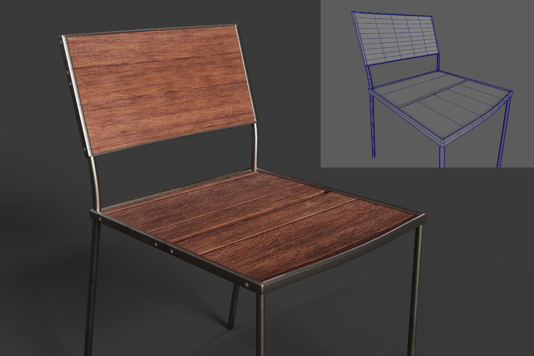 TLDR: Your stuff is too clean and lacks a soul. Ideally you want to create art (for games anyway) that doesn't look like it's a render from a corporate catalog. Example: Your problem isn't so much the models, but the materials/lighitng/composition of your scenes. Most models for games and environments (yes those that…
 -
Re: How can I make powerlines?
 slightly beyond the scope of the discussion.... @ codies they had very impressive power lines in Colin McRae (though might have been f1 memory is a bit hazy :) ) , IIRC it was done as antialiased curves drawn as postprocessing effect.... It had the benefit of a nice smooth line with no vert corners and none of the…
 -
Re: Sci-fi theatre environment UE4
 Looking great ThinkKlinck! I like the solid beam you have coming down and adding a cone of heavenly light around it would help push it further. I had a scene awhile ago where I made an asset with kind of the same thought in mind. What I'd suggest to make your heavenly light beam is to first fit a cone that runs from the…
 -
Re: Handpainted Church
 This has been fun to watch develop! I did a lunch paint to further push the character of your scene. Color and lighting are the big ticket items here: We're looking at a lot of mid-ground details, and because the lighting is kinda flat, I feel the image is a bit bland (which sucks because there's some nice stuff here). Do…
 -
Re: The Monthly CHARACTER Challenge | October 2014 | the Soothsayer
 Hey there everyone, Baldi here, http://www.artstation.com/artist/Baldi-Konijn the artist of the original concept. Let me start by saying. Holy cow, what an awesome interpretations of my concept! I feel very humble that my concept was picked so thank you for that. I read through a lot of the comments here and I apologize…
 -
[RIOT CREATIVE CONTEST 2017] - Character Art - Jhin Eternal 4th Place - Guillaume Biju-Duval
Topic by Hydralord2 · · Home› Contests & Challenges Archives› Riot Creative Contest 2017› Riot Creative Contest 2017 - Character ArtSo i was searching for some great ideas for a Jhin Skin and i thought about using the number 4 as base. I check a few Jhin builds and guides and i found that Video where jhin was going super fast thanks to his Passive combined with some nice music from Initial D. That in Mind i Decided to go for a Racing Skin. Here's a…
>89351 results