Search
-
Re: Sketchbook: Kyra Booth
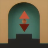 This looks AMAZING! I absolutely love the 3d rock texture on the pillar. It turned out really amazing, I am also really impressed with the cups stacked up, the form ready really well and the shaders on them turned out great.
 -
Re: Gun Rigging Help Needed! - Blender
 The video in your Drive is not shared with the internet, so it’s unwatchable. You should check the Sticky in this section about sharing animations/videos. If this is for importing into a specific game, it would be good to explain which.
 -
Maya to Max | Hard/Soft Edges - Smoothing Groups Problem

 Hi everybody! I'm currently a bit stuck, but for the past 2 days, I've been trying to move a model from Maya 2018 using Hard/Soft Edges to control the hardness of edges. Problem is when I export the model (with Game Exporter) to FBX I have had this shading problem. From my understanding, Max doesn't use Maya's hard/soft…
 -
Baking lights SUCKS!! Does your studio use dynamic environment lighting?!?
 <start mini rant> Just a micro rant but I've been 'stuck' using Unreal tech for the last 4 years and am getting pretty damn sick and tired of baking lights. Even using Beast just sucks. Looks great - but takes an f'n long time. Seems like there is just so much overhead involved w/ static lighting - lightmaps, lightmap…
 -
Re: [Sticker] See You In Hell
 The cartoonish style works great! However, the steamcommunity is fillied with similar stuff. Try to find something that sticks out, or is a reference to some well-known ingame joke. But for your first creation, definitly not bad!
 -
Re: Sketchbook: Kikimora
Love the lighting on the figure, and the soft bounce lighting! What's the source of the red light? Need to see the source, otherwise it's a bit confusing. Also why does the red light cut off in a diagonal mid-way up the wall? Statues typically have a base below them to stand on, they're not just stuck in a niche all alone.… -
Re: Hip Hop is Dead [UE4]
 @Pedro Amorim : Thanks! I will see if I can find a Big L cassette or record cover and give him his due. All my old tapes got trashed years ago so I'm stuck with what I can find online. @Earthyn: Thank you. The repetitive detail on the speaker area is bothering me also! I will have to look for a way to hide that better.…
 -
Re: SMG_Sexy
 @Jordan & toxic: thanks. @racer: alright ill get on that. i was afraid it may have been too wide already, but i think once i went and tapered up the bottom part of it (making it into a V like shape) it sort of seemed a bit better. i was also afraid that making the magazine a bit wider would make it look weird, which is why…
 -
Re: Copyright, IP, and infringement. Oh my!
 Ahh what the hell... someone might read it. I wouldn't call fire sharing new its older than some of the posters we have here... I think the fact that the industry is still around after such a long battle shows it's managed to minimize it to a point it can survive and for the most part keep moving forward to bigger and…
 -
Re: New portfolio, redesigned
 If your theme allows for it, I would also suggest disabling all the image rollover effects altogether. They makes things annoying to look at for a basic UX reason : the user will often point the mouse where the eyes are drawn (and vice-versa), with the brain focusing right there, so to speak. By throwing a rollover effect…
>26584 results