Search
-
Re: Cactus McGraw
 It would be cool to see more of those sharp highlights from the concept in there. Also the flowers around his neck are a little plain. You could add more color. The torso in the concept is alot larger than yours. It could add presence to your character to play around with that. I think you did a pretty good job. I just…
 -
Re: [WIP] [UDK] Supernatural: Winchester's Blood
 OniLolz, Link702 Thanks, and cannot add more color tone cause the TV show have that kind of tone Jackablade Ya, i posted the character only to show what i have so far, but i know i have a lot of work (and i mean A LOT!! :p ) And i did use picture because i really wanted to use the real character of the tv show. And the…
 -
Re: Need help with trees!
 Much better! I personaly can't say that i see the difference between them niether.. Btw, i got some really good tips back in my playground squad thread when we did the personal projects. Johan Carlsson had some great points, though the picture he made me is now gone. He pointed out that you should add small branches…
 -
Re: She Wants the Sub-D
 Question: Any reason you didn't add all the edge padding when baking out RGB mask? The benefits of doing so are you get edge padding while texturing without having to add dilation afterwards (Seeing seams from no edge padding while working can be annoying, especially if you're sharing wips) . And you don't need the…
 -
Re: down_limit's workshop
 Hi all, first of all I would like to admit that I like this ward of treat protector, but I have to say that I have not seen your concept before and I dont think that your ward looks like mine at all. of course all dota items look like each other, there is no point of reporting me for stealing idea. I made easy ward as I…
 -
Re: DDS Textures - Reduce texture size by replacing with upper mipmaps?

 This is what I was thinking possibly happens. iirc it reduces squares of 16px down to something like 3 colors. I did this test image over a decade ago., blown up so you can see the pixels better But I wonder what happens in practice.
 -
[WIP] Overwatch Widowmaker Fanart Skin
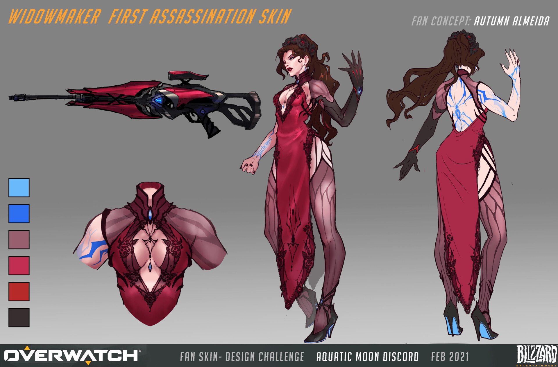 Hello to my fellow polycounters! I’ve been working on a character in the evenings after my day-job, in hopes of pushing my portfolio forwards. In the past I’ve either had a fairly generalist portfolio, or the chosen designs were not visually strong. I’ve reflected a lot lately, and decided to push forwards with a stylized…
 -
.dds mipmap viewport render in max.. how?
 I am quite confused.. I have a mipmap http://www.crazybump.com/MipmapTest.dds.zip that i took from http://www.polycount.com/forum/archive/index.php/t-60842.html the concept is that the colours will change with the distance from the camera according to the mip map level(?).. i am trying to render it in viewport and render…
 -
.dds mipmap viewport render in max.. how?
I am quite confused.. I have a mipmap http://www.crazybump.com/MipmapTest.dds.zip that i took from http://www.polycount.com/forum/archive/index.php/t-60842.html the concept is that the colours will change with the distance from the camera according to the mip map level(?).. i am trying to render it in viewport and render… -
Re: Rat Bird!
 Shrike, that's a good suggestion. The original concept didn't have a propeller (although he did later add one, check it out! (http://christianpearce.blogspot.com/). I don't plan on doing anymore to this though. I've moved on! Thanks for the comments! Pewell you'll have to take the name up with the concept artist! Im a fan…
>68033 results