Search
-
Re: How to recreate One Piece anime-style shading & glow (Paint Tool SAI 2 + After Effects)?

 The first thing that stands out to me is the colors are different. I would suggest picking colors directly from the reference, and filling your art with those. The next thing that I see is proportions. The reference face is shorter overall. One trick I like to use is to put the reference and the art right next to each…
 -
Re: How to recreate One Piece anime-style shading & glow (Paint Tool SAI 2 + After Effects)?

 I think you've already got a good understanding of how this kind of anime post-processing works based on your initial post (a faint blurring on a duplicate of the lines layer, some glow effects on the flats, some color correction, and so on). But, attempting to recreate it on your own lines and flats loosely based on a ref…
 -
How to recreate One Piece anime-style shading & glow (Paint Tool SAI 2 + After Effects)?

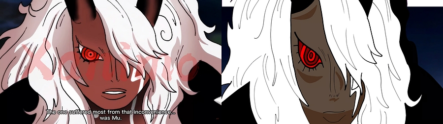
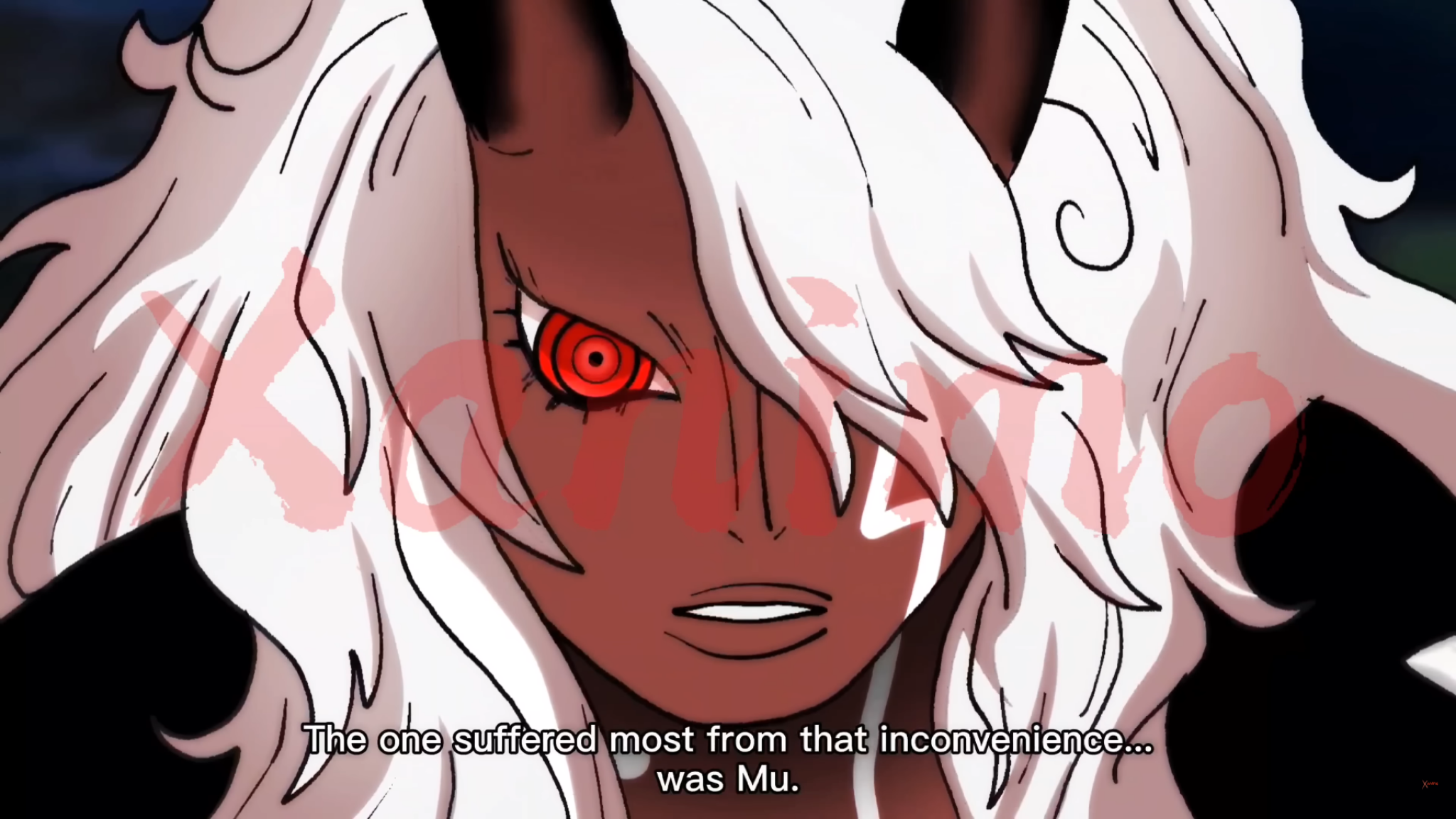 Hi everyone, I’m trying to recreate this kind of anime coloring/shading style from One Piece (image attached). What I’m specifically trying to achieve: * Strong cel shading with soft transitions in some areas (like the face and hair) * Intense glow/red eye effect * Clean but dynamic highlights in hair (not overly…
 -
Re: How to recreate One Piece anime-style shading & glow (Paint Tool SAI 2 + After Effects)?
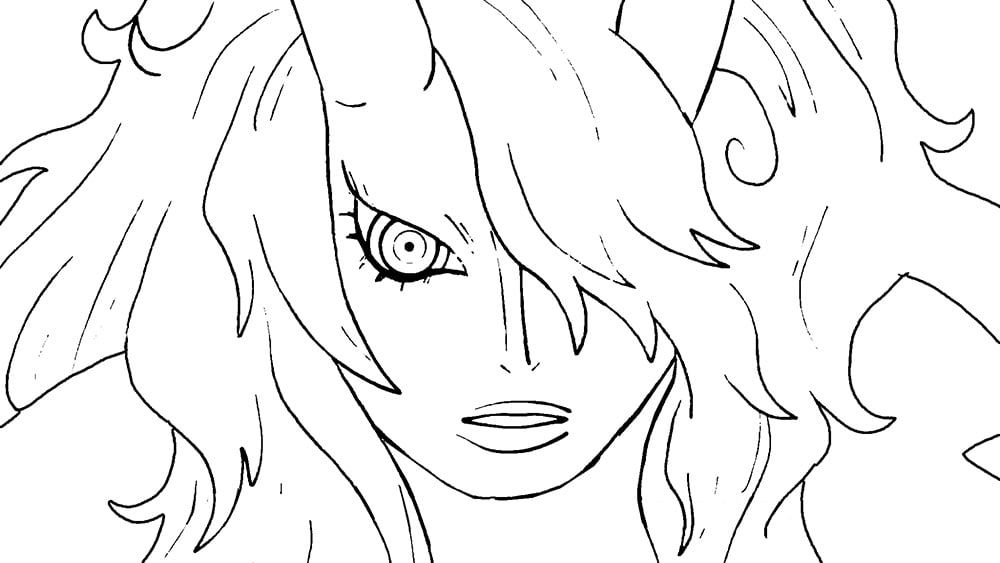
Thanks for the reply, and put the images to understand better, as last thing, do you think that the refference has some soft , gaussian blur at the end? because it looks like it was all layers flattened and added some blur in all the image, or i may be wrong? ty
4 results