Search
-
Re: What are you working on? 2D! 2016
-
Re: What are you working on? 2D! 2016
-
Re: What are you working on? 2D! 2016

 Lutzbot, love'n that moodiness and handling. Daven, sweet design! Great stuff, everyone! Take 2 on this character:
 -
Re: What are you working on? 2D! 2016

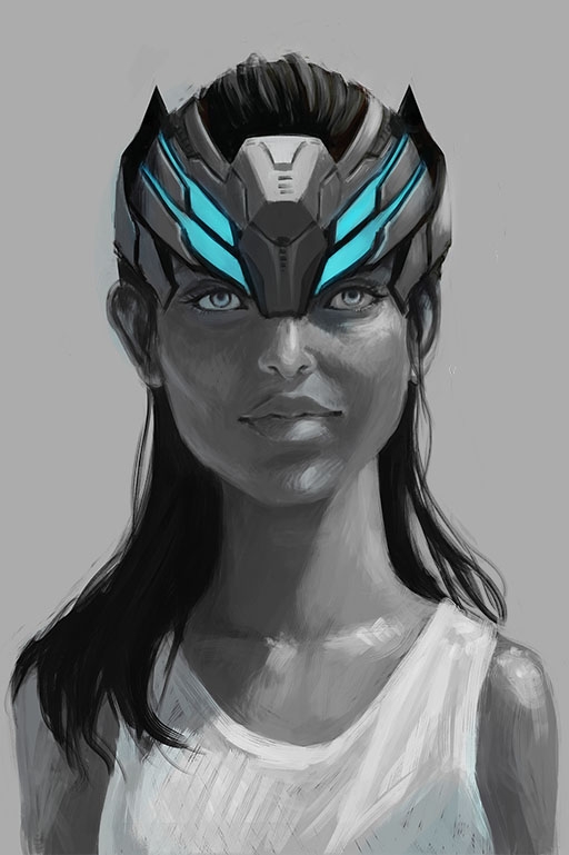 working on getting better at faces, hard surface sci-fi stuff and values
 -
Re: What are you working on? 2D! 2016
-
Re: What are you working on? 2D! 2016

 Pirate Crier in progress. Still trying to find my way past hard edges, both in outline and color variation, but the cartoon-ish appearance works for the moment.
 -
Re: What are you working on? 2D! 2016

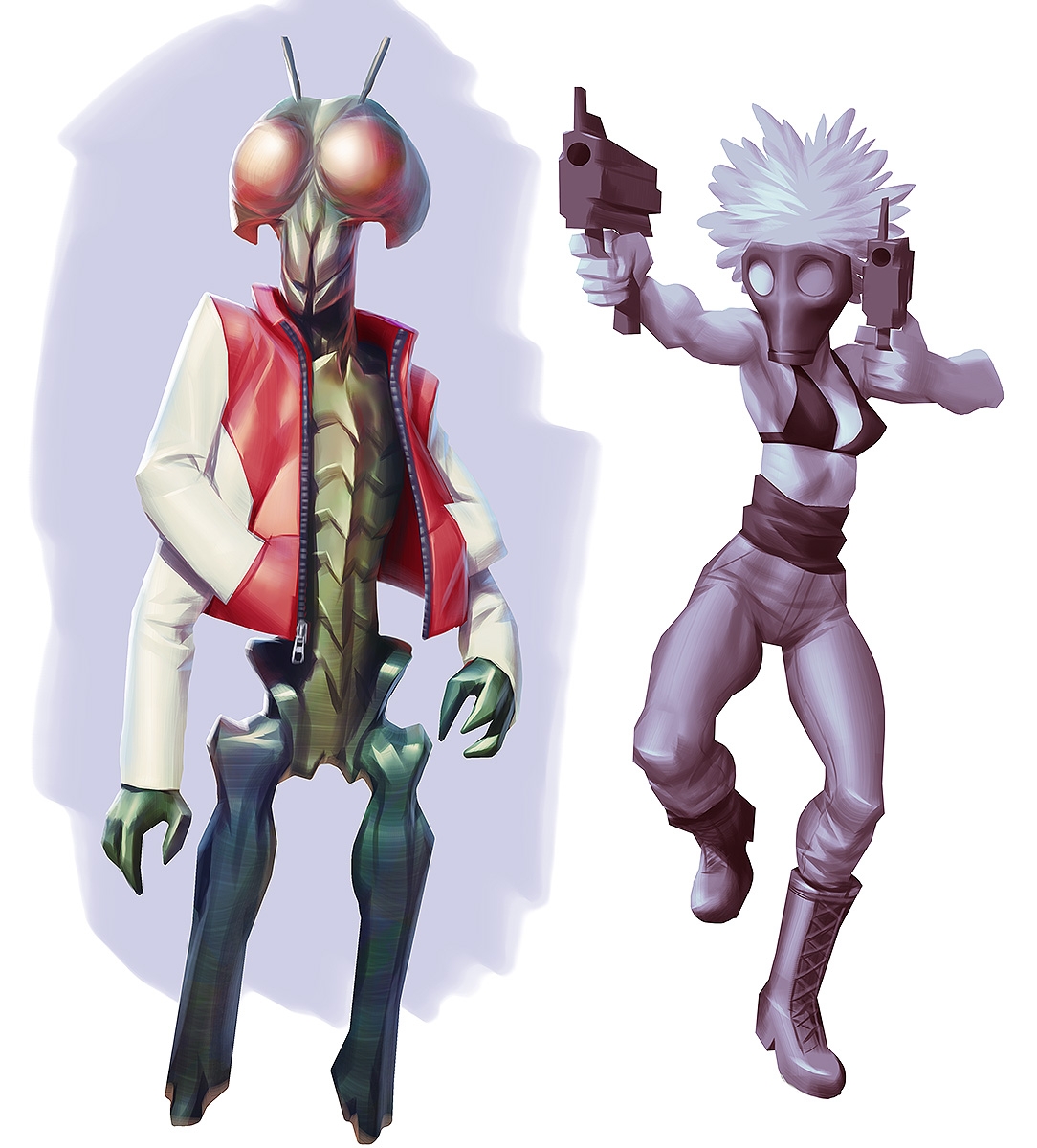 Thanks Johannes! Your stuff is getting so wild that it's getting really hard to keep up. Really love this one, man! Still giving that black/white to color method a whack, and I'm liking it more and more. I don't have as much flexibility with local color, but what I'm able to do with the values while painting makes it worth…
 -
Re: What are you working on? 2D! 2016

 This page is great! :) @beccatherose - Sweet design and pretty colours! I feel the anatomy where his biceps and deltoid and pec connect is quite off, I'd suggest some more anatomy-study or use of reference. That goes for his entire torso, lots of weird bumps. You need a better grasp of anatomy to elevate your paintings. @…
 -
Re: What are you working on? 2D! 2016
 @Stinkhorse, I could probably do that with more images and text in a new thread. I'll try to make that happen in the near future. I may need a reminder :) @gillespionage , it may be surprising but just the opposite is true for the train knight. It is simply overworked. It just was not working for me, and I went through…
 -
Re: What are you working on? 2D! 2016

 Posted a character earlier and I finished the vases and patterns that I was talking about. This place's black interface obviously works best with some value and color since the contrast against a white base makes my eyes buuurrn (I toned it down a little by resizing). Anyway I really like the production sheets circulating…


11 results