Search
-
Re: Piping Horror
 @Two Listen: You might be right about that inverted look. I'll be looking into that especially considering the direction I'm going with the update below. Having some sort of light catch there would be a good idea especially seeing as the spine swings out through there and up into the tail, it creates a little shelf…
 -
Re: [UDK] Who don't like Zelda?
 The fog and lighting are really killing your scene right now. Mainly, I'm going off of the top image since its the closest to your ref. The fog makes everything look really muddy, and the general color of your scene just doesn't look good. Youve lost the bright, saturated look of the ref. I'm guessing your mainly using a…
 -
Re: Modelling a path on top of ground (for games). Also UV tiling question.
 Hm. So you've have the grass on top, with floating path geometry (red). You'd have grass->dirt texture on the side (yellow). And you'd have Path_End texture on the light blue? The only problem I can see with that is the path would have to end on a specific polygon (the path end on the left is different to the one on the…
 -
Re: Environment: Alleyway Scene
 Hi adam, neat scene the textures look pretty solid and the composition is neat. The glowy sign bugs me so I'm reiterating what ott said in image form; which one looks better? (go with the right one, please ) also your texture under the door looks like it is set to additive instead of modulate. In the right foreground the…
 -
Re: Soldier - Realtime Normal Mapped Char
 You've chosen a realistic style so you really ought to go back over it and make a significant upgrade to the detail level. While its fair enough that less is sometimes more, you have not chosen a 'less' style. Also, the big thing about normal maps is the fact that they can realistically fake more detail due to faking…
 -
Re: Northern Campsite
 I like night the best. It has a nice contrast between the sky's lighting and the fire. By the way, do you have GI (global illumination) and AO (ambient occlusion) enabled in your Marmoset scene's renderer settings? If so. maybe turn up the brightness and occlusion strength respectively to give the lighting more oomph. If…
 -
[WIP] Anime Style Character

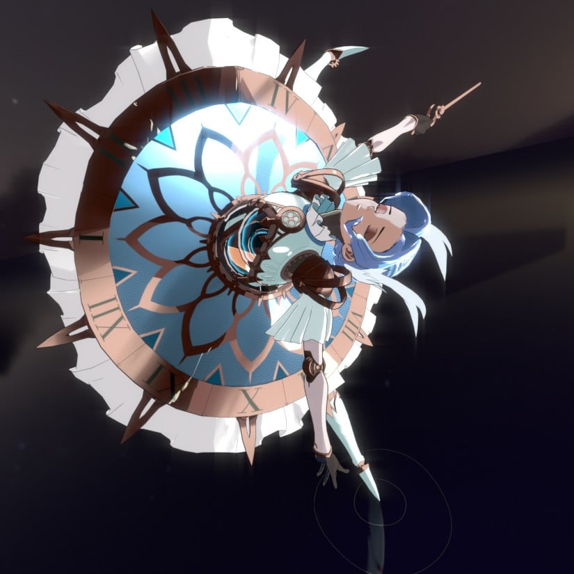 Latest Update - 11 June Currently taking a month off work due to burn out. But I want to look for new work involving more characters. I saw listing for Anime style characters so decided to give it a try. So working on a new character which I found a concept art done by Hans Chen Aiming to have it done before the end of…
 -
[WIP] Tea House Tavern

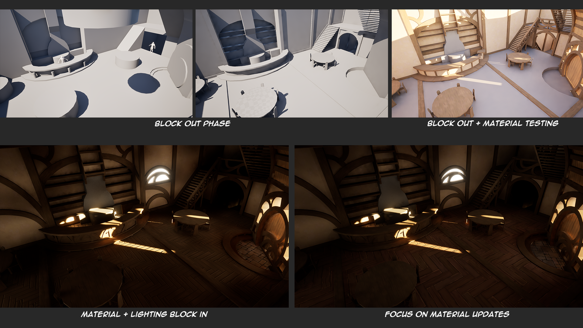 Critique & Advice Welcome! I'm currently working on recreating Oscar Molin's concept of 'Mergo's Tea House' (with permission), a whimsical tea house style tavern. Original Concept: https://www.artstation.com/artwork/0l32qe I have made it through the block-out phase, and I'm currently finalizing the tiling materials for all…
 -
Re: Stylized 19th century room
 Man, I dig this piece! Cool concept and great outcome. I was looking at a couple things that are very minor that might give you a little extra punch, most of them are taste, so do what you will with the suggestions. I firstly thought your scene was lacking a bit of contrast. It was very mid-tone heavy, so I took it in PS…
 -
Re: Managing lights in 3ds Max
 I wonder if containers could work better? I've run into performance issues when I get a lot of containers in once scene but they would handle the instancing/updating a lot better. I agree with monster I think you're starting to dive into an area that not many people have to go, at least not around here. Most lighting in…
>89262 results