Search
-
Re: Gothic 2 monastery remake

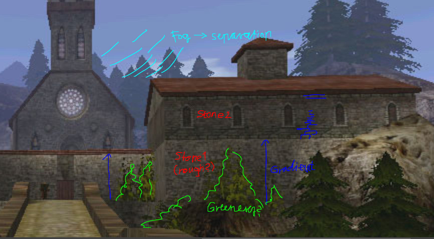 Hi! I think ziz makes a good point, the environment would benefit from some more geometric detail. I would look at the silhouette of things, that those don't read overly low res/ facetted. Situations that silhouette the most would be probably edges/ corners. I think generally having more geometric detail around camera/…
 -
Re: HP7
 This movie, from my perspective, was made purely for the fans of the books. Hands down. The violence: The book is more violent than the movie and is surrounded by the impending doom and theme of death. The gunfire magic: Again, book related. In the previous chapter of the series (Half Blood Prince), they continually talk…
 -
Re: [UDK] Midgard
 Wow, thanks alot guys. I'm glad you like it, made those many hours worth it :) ! Kennyties: Yeah the cart is pretty big now that I look at it, also you are right - the pillars come up straight through the planks, they have textured 'holes' but they don't read from anywhere but right next to them. Coots7: .... damn it…
 -
Re: What are your go to workflows for fixing pinches and general iregularities on a form?
 What software and modelling methods are we talking? For Sub-D/poly-modelling I would normally use the relax function on a vertex selection and constrain it to the surface. Sometimes it's necessary to insert extra geometry to 'stabilize' the shading. For low poly modelling there's also the option of duplicating the mesh,…
 -
Re: Why use underescores for naming things in 3d industry?
 Some engines are super strict. I can't remember the exact reasons, but our last game engine would break during the building stage if we didn't export art using all lower case naming. To make things easier to read, we just separated words using underscores. (spaces were not allowed, because they'd also break the build)
 -
Re: king of sandwich
 all this has made me want a sandwich now. mine are easy: corned beef / branston pickle / pickled onions / white bread. cheese / branston pickle / white bread. butterfly cut sausages / ketchup / thin white bread. apart from the ketchup, all of these things are kinda hard to find here in Japan.
 -
Re: [WIP] Hard Surface Asset for Scify Hangar Project. Maintenance Terminal.
 Hey, I think having the top cover on makes the silhouette more interesting. Also on the screen portion, I think the emissive map can be pushed more and this could make for some interesting emissive lighting to highlight the edges of the top cover. I think the modeling reads well, you have a good base for the texturing.…
 -
Re: Weekly Substance Challenge
 That's very juicy Caser. It reads to me as broken taffy-like paint or clay, while the brown material reads more like a generic raw material like plaster or mud My only bit of feedback would be to remove the grey outline in-lining the breaks. The red material is very choice. Nice work.
 -
Re: Whats your IQ score...?
 oh nice some JordanN sperging ! i missed this. Also i love u @danr Jordan, when you were "downloading and reading game art" on your cellphone and not taking breaks thats the same as procrastinating, except you are doing it at a job. Doing art is different than reading shit\ "gathering references"...
 -
Re: Sketchbook: Zaki Saati

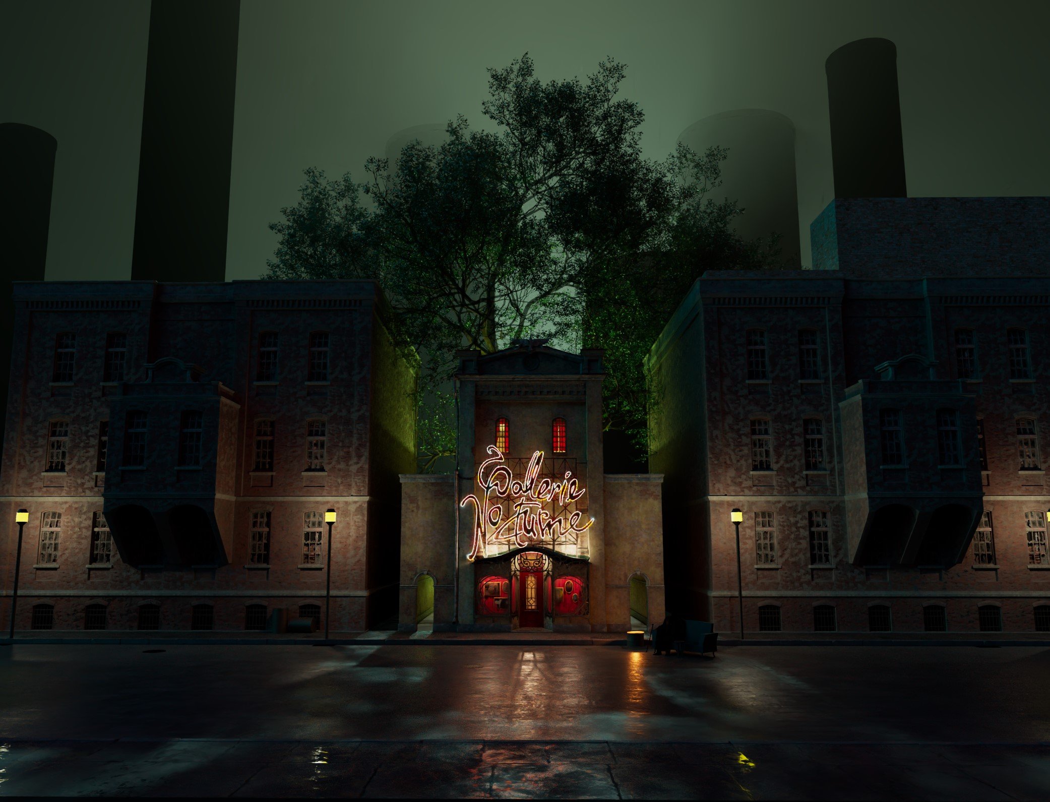 + Improved lighting and composition + Glass shader and texture for the showcase + Broken windows + Lowered the height of street lights + Pushed the buildings to the sides to create some space and release the tension from being too close to the main building. This also created two alleyways where I will add a fence and some…
>39316 results