Search
-
Re: Illidan [WiP]
 hey, looking cool. i say keep the body style you have now. its lookin pimp so go with it. Work with making the horns mesh better with the head and maybe work with the hooves. They sorta just blend in with the legs so some sorta border between skin and hoof might be nice.
 -
Re: Arena Net Environment Art Test
 Not sure if it's because of the render, but I see some black outlining going on with your alphas. Looks like the texture map is bleeding past the alpha (your previous post has the moss on a green BG, so I'm not sure). It's noticeable mostly at the base, which looks more like it's with the flowers, than moss.
 -
Re: Blender- Render out realtime black outline

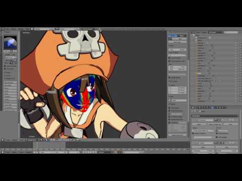 Thanks, RN. Noted. Using the data transfer modifier :- ) I still need more practice. I am studying this atm: https://www.youtube.com/watch?v=STTeYMyBHNc There is also a downloadable blend file. Seems you can shade the character using vertex color. Still need to get how it works.
 -
Re: Mudbox serious painting problem
 Your UVs aren't the problem, although they do need more spacing between the shells to accommodate bleeding. What you need to do is increase the polygon count of the model you're painting. Use Mud's subdivide tool and uncheck the option to smooth the model. The more polygons it has to work with, the better the paint results…
 -
Re: Atom Suit
 As others have said, I prefer the bake to the textured version. I think if he were textured in a more stylized way... I'm thinking of how RobG textures his 3d pieces... Could be total win. Either that or a blend of what EQ mentioned. As it stands, the project turned out looking great.
 -
Re: [Cry] The Order inspired environment
 Great, so I'll try to highlight the dome with a bit of sunlight and hopefully some lamplight can break the flatness of the lighting. I'll try some blend layers on the walls too, they are kinda boring as they are. And I an't believe I didn't notice something was up with those drawers, thanks for the helpful advice Shadacer!
 -
Re: Is anyone using Ornatrix to make hair?
 Marmoset has alpha-to-coverage http://www.marmoset.co/toolbag/learn/blending Solves the sorting problems, but doesn't fix the hard edges you get from intersecting planes. Still have to adjust those, like your white hair example. Nice job btw! edit... can you show a wireframe?
 -
Re: Industrial Environment Project
not had a chance to change the texture much yet, after watching the video though i decided using AO maps would probably help my textures a bit so I've made one and put it over my diffuse with a multiply blend mode, which is what he did on the texture tutorial. -
Re: Hanska's Sketchbook
 My only critique is that the croc's lower body kind of blends in with the background on your key shot. It might be worth trying to brighten up the background a little bit or to increase the size of the magenta spotlight. The design is really awesome. It'd be great to see him rigged and animated to fight something with…
 -
Re: Texture Critique/Help Needed
While we do occasionally accept images that have been blended like this, it has to be well executed and with clean results that don't degrade the image. This one just isn't working. The overall quality is poor and the texture seems to be applied only to the sky, which sort of ruins the continuity of the "grungy old image"…
>11472 results