Search
-
Re: 216 - Pi meets Deus Ex Environment
 Hey, looking really good! Can't really understand why no one posted in here yet. D: A few things I've noticed: (I hope you don't mind painting over your shots to illustrate better what I mean at some points.) First of all I really like the overall feel and style of the environment. You matched the Deus Ex style pretty well…
 -
Re: Looking for help/pointers on achieving a certain style via rendering...
 Yeah, compositing might really help on those. Now of course some post processing could be done on a plain, fully rendered image in photoshop - but you would get much more control by compositing the passes after the fact. I tried it recently using a free After Effects plugin called Normality. Here is some info :…
 -
Re: Cliff Scene
 I'm confused what your goal is for the scene, is this for your portfolio? If so then you are going to have to post different angles and some close-up shots so we can see textures. Right now it seems like it's a lighting study since that's really the only thing of interest. As far as the total composition I'm going to have…
 -
Re: Latest Character
 I have to agree with Daz, it looks good and you have some skill but your UV layout needs work. I like that you prioritized certain pieces and made them bigger than others so you can pack more detail into that part of the texture, such as the face. But it cost you, the fleshy parts of the arms come off really low res, you…
 -
Re: Sewer escape scene
 I think I could look a little picky, but omni lights make the scene quite unreal, because shadows are completely off. The lighting devices you chose, light at max in an half space. Try area lights right above the emitting surfaces. I'm quite sure they will change the whole mood.
 -
Re: emissive glow/bloom in max
Video post has a glow option, its not going to be realtime in the viewport but it will cause certain materials to glow. They won't emit light until you turn on advanced lighting like Radiosity or Light Tracer, something that bounces light. Each method has their disadvantages... The 3dsmax help files have a neon tutorial… -
Re: Blender Weighted Normals

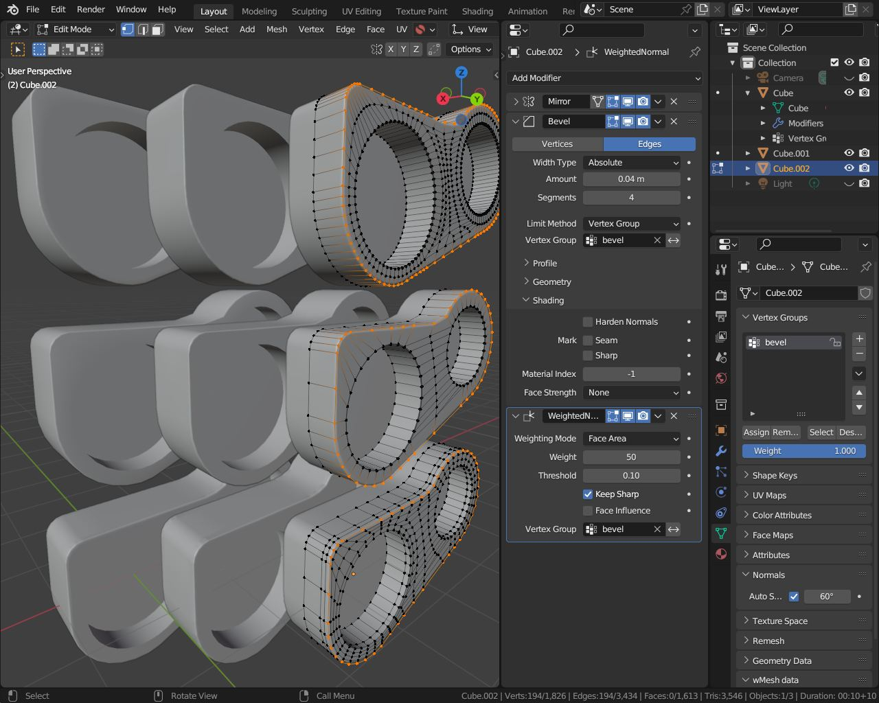 This may depend also on the used topology.. also on the reference there seems to be a smaller blend/round/fillet than the shown wider (angular ) bevel/chamfer (depending in which app you are more familiar with).. so the left one has no weighted normals (almost no difference; at least with these options) and i tried the…
 -
Need help on destroyed Temple

 Hey guys what's crackin? I am doing the Artstation Challenge and I am gassing out a bit. I am struggling with the lighting and don't know how to really push this to the next level. Seems to be a lot of pros doing the comp which is cool, makes me want to step this up. I've put point lights around on the pillars to see how…
 -
Level Design Workflow/ Pipeline
Hey guys not sure if this is the correct thread to be posting this in so please feel free to delete or move :) I and going to be starting my 3rd year of games desing at university next year and decided to get some practise in over the summer. I will be creating 3 levels in unreal as part of a project and wanted to ask some… -
Re: Modular Hand Painted Building
I like where this is going. Do you have a reference? What stands out to me is that all the textures except the plaster seem too light. Try making your midtones and shadows darker. The highlights on your edges should really stand off. As to the individual textures: Roof Tiles - The darker areas under the slates - possibly…
>90535 results