Search
-
Re: [Environment] Blade Runner - Unreal Engine 4 - Deckard Apartment
 Wow. Thank you for this detailed review and breakdown, really some strong points and guides for the work I can put back on it. I will try to work on the lightning as suggested, getting soft shadowing seems indeed important. The lightshafts are a blue print from UE4 demo scenes, as I dont know how to get real time…
 -
Re: Abandoned Gas Station - UE4
 I like what you've got so far. The window blinds give it a nice touch. :D I'm certain you will get to it in time but be sure to add sufficient lighting inside or tone the exterior light down. Because right now, the sight is drawn towards these big bright spots. Good work on the textures. That's a lot of progress from the…
 -
Re: Character Design for Critique

 Hey! New here too, first post! Good to meet :) Looks awesome! the lighting and rendering are great. Sorry, no design critique but I have some drawing feedback: When it comes to areas of improvement, the arms and hands stand out to me. I think you could add a little more structure to the forms. They look a bit bubbly and…
 -
Re: Flower Girl Meets Tree Ent Scene.
 almighty_gir, I experimented with your night idea, I think the scene does look more interesting with night. I can actually mess around with the lighting rather than using a dominant directional light. jettly218, thanks I'm trying to improve my texturing the most so thats good to hear. skodone, I tried to add that bit of…
 -
RGCA - Knight Fight
 Topic by ToKoMotion · · Home› Contests & Challenges Archives› Reallusion Game Character Animation ContestHi, my name is Tobias and I finally found the time to join the RL contest. Already saw some great stuff here and hope to find more time to work on my entry. Just created a quick teaser to get myself in the right mood for the contest:poly121: [ame]www.youtube.com/watch?v=Xofnjlkr9po[/ame] I will try to update my thread…
 -
Re: [WIP] Wildcats Characters

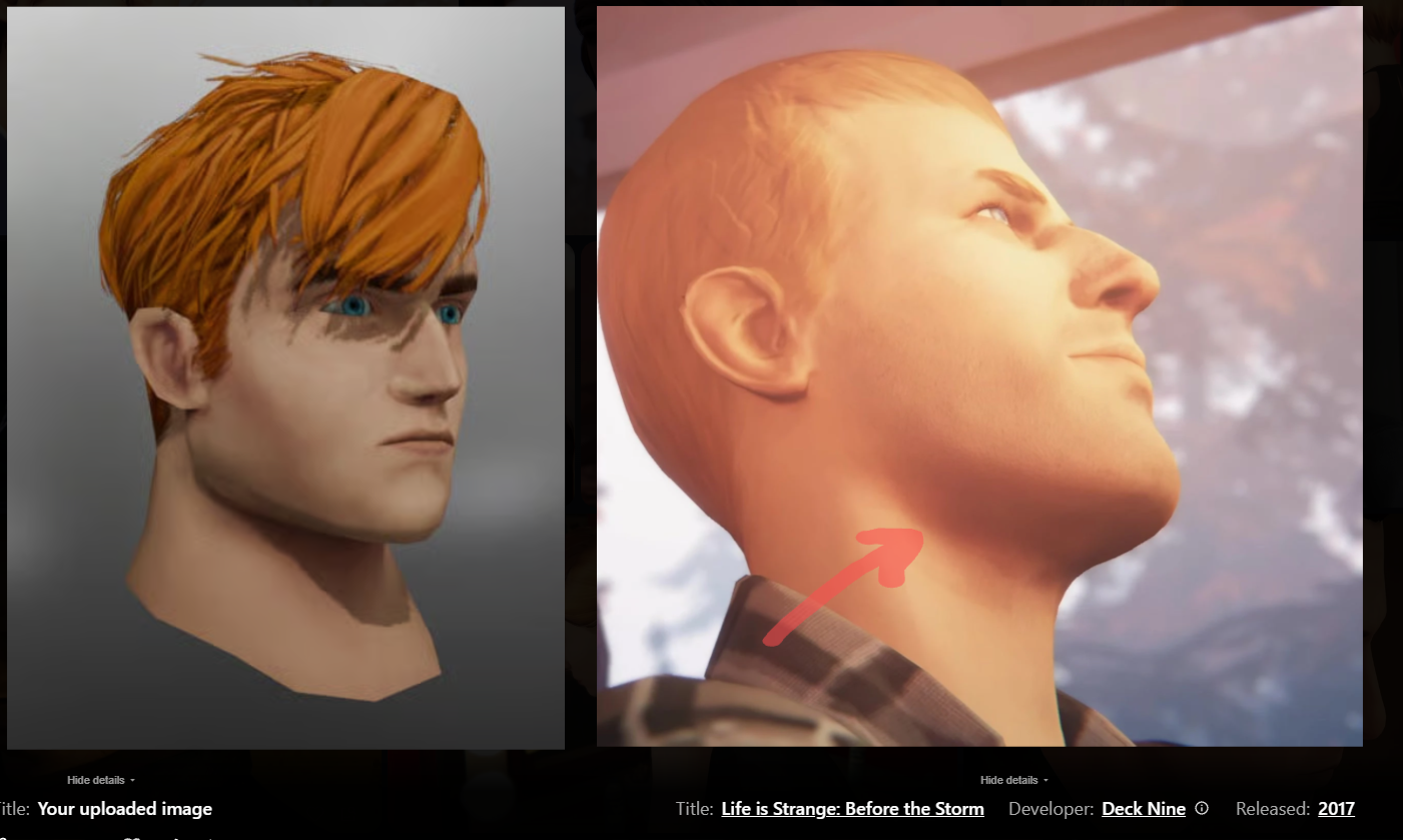 I would push it further than life is strange did it, but still notice how the shadow beneath his chin is reddish hue instead of the darker brown: Even here - the red from the cheek is almost the same hue as around her jawline: You can see it a lot more pronounced here in Spiderman. Especially the ears, but also nostrils…
 -
Re: [UDK] Sci-fi Hologram room
 I really dig the concept, Sorken and your scene is well on its way to replicating that :) *Deep breath* With regards to the overall colouring of the scene, you've got it pretty close - with grungy greens and greys. Although your scene appears to have a fairly uniform value overall. If you blur your vision and look at your…
 -
Re: How to recreate One Piece anime-style shading & glow (Paint Tool SAI 2 + After Effects)?

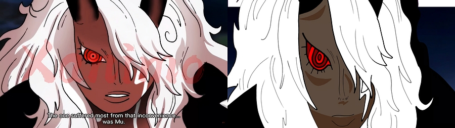 The first thing that stands out to me is the colors are different. I would suggest picking colors directly from the reference, and filling your art with those. The next thing that I see is proportions. The reference face is shorter overall. One trick I like to use is to put the reference and the art right next to each…
 -
Re: Making a fighting game in udk?
Thanks for the responses. I will check out UDN forums ^^. I understand that making a fighting game is hard I am not really making it to be like a AAA title. I want to learn about animation, so I though a fighter might be idea because it is centered around the animations. -
Re: recent grad /w a crap reel, would love some crit
The reel didn't strike me as being that crappy, although the intro and ending screens seemed a little gimmicky and the song is weird, which might turn some people off. You'd probably be safer to keep those neutral so that nothing distracts viewers from your work. The gallery part off to the side looks like it has some…
>90506 results