Search
-
Re: How much of ZBrush do you guys actually use?
 Noth I don't do much of a character modelling lately , more of environment stuff: walls , rocks , tiling surfaces , etc and use Zbrush more like a manual touch to SDesigner. To fix taste related things. To weed out some obviously procedural looking things like slope blur produced erosion or curvature edge masks. Once…
 -
Re: Legend of Zelda - Disting's Take
 Try making the hair get less saturated as it approaches white, and more saturated as it approaches links head. Also try to make it a bit warmer or cooler as well. So the white color at the tips would actually be a very bright very low saturation orange or green. This contrast in value and temperature will make it look more…
 -
Changing saturation of polypaint?
 Hi guys! Is there a way to change the saturation or brightness of polypainted objects without re-painting them in zbrush? Thanks for your time!
 -
Re: [UE4] Hospital Corridor

 The scene is looking pretty solid so far. Here's some areas I think you can improve on though... 1) I think in the bottom left hand corner you should add some junk like a broken bike, trash, bins, 2x4's, etc. This'll help pull attention more towards the back and I think adds to the overall composition better. 2) I'm not…
 -
Ati cards windows 7 saturation control?
 Is there a way to adjust the desktop saturation with ati cards. I can do this at work with my nvidia card but I can't find a way to do this with ati.
 -
Re: jamaican resistance
Doing great dude liking the new changes you made to the eyebrows and beard it looks so much more natural like that for real. I know it's really hard texturing a black person and making them look natural from experience allot of trile and improvement in my experience anyways. So I know what your going through mate. As for… -
Re: Where have all the promising projects gone?!
 modern social media is the problem. eventually more and more ppl will get sick of the addictive sensationalism or validation chasing that social media ultimately boils down to. and for that reason! 95% of content and classes are for beginners, because 95% are beginners and will always be beginners, its an endless stream of…
 -
Re: [WIP] Chhatrapati ( Final Major Project)

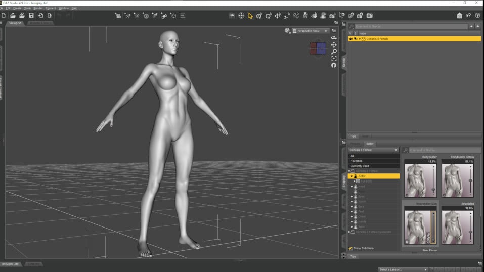 Nice character! When sculpting the blank try and relax the pose. Feet apart and splayed. Hips slightly forward, arms 45 degrees and hands relaxed and or fingers splayed to combat the rake look of the fingers in the end result. With the hips forward turn the figure to the side view and balance out the shoulders (backwards)…
 -
Re: [Finished] Numenor Inspired Environment UE5

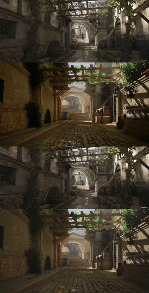 This is great, love seeing the progress on this! One thing I think could help is to do a bit of color grading, to recapture some of that softness from the concept... reduce the mid tone saturation, and pull up the black point. Here's a quickie animated GIF
 -
Re: Feed back for my hero
 I think it would behoove you to take a step back and really think hard about his anatomy and design. There is much to be worked on. Another big thing thats off is his netural pose. Its compleatly un-natural. Check out naughty dogs characters. See how natural their poses are. Legs are not out all crazy and such. What are…
>13763 results