Search
-
Whimsy Town Vol. 1 – Scenery Essentials

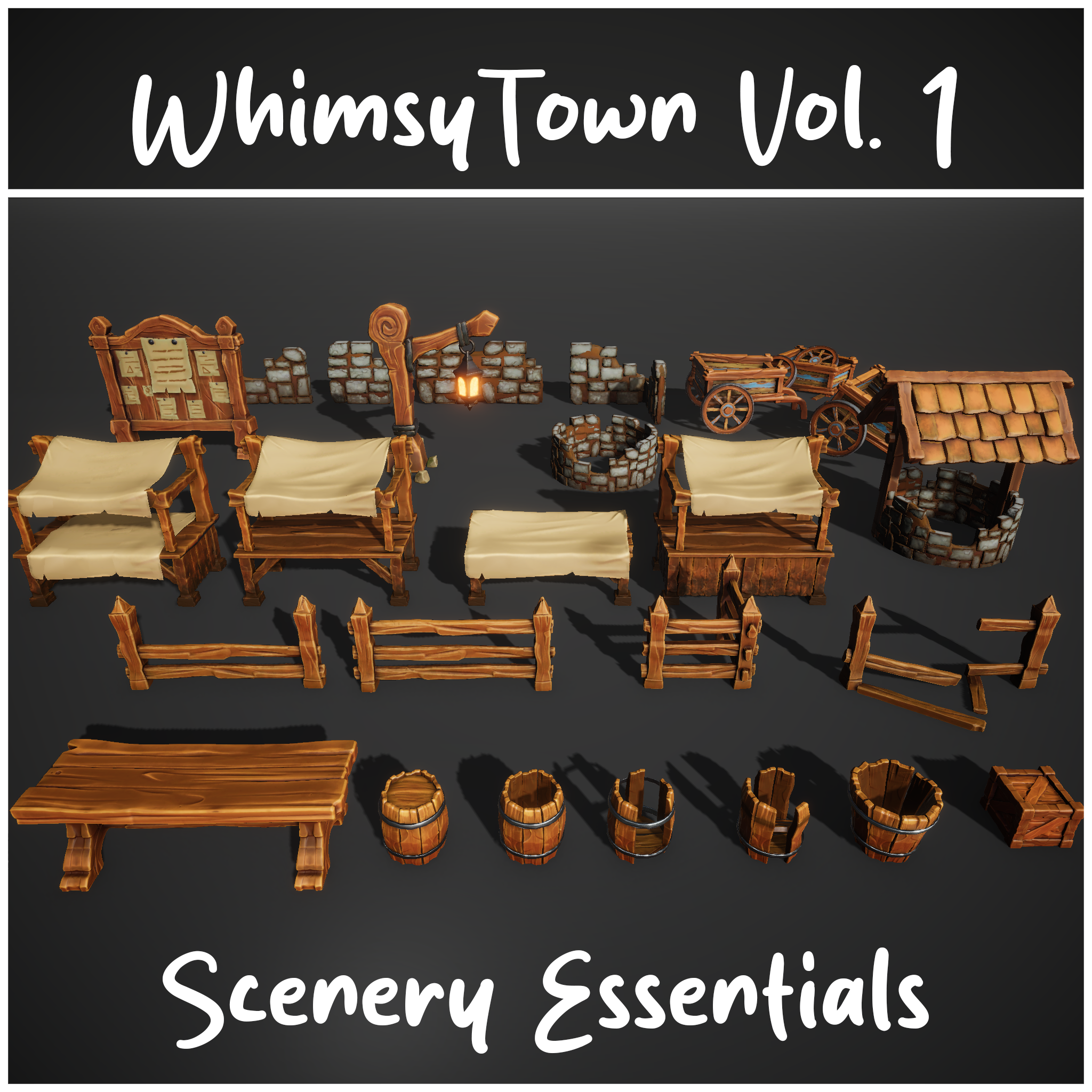 WhimsyTown Vol. 1 – Scenery Essentials is a stylized 3D asset pack designed for Unity game developers and environment artists. It includes a charming collection of low-poly props to build cozy medieval or fantasy townscapes. This volume features handcrafted scenery elements such as market stalls, carts, barrels, fences,…
 -
Re: 2014 Gamasutra Salary Survey
![[HP]](https://us.v-cdn.net/5021068/uploads/userpics/PW2278Q17H7M/nK9DV1HH4CBZK.jpg) +1! It's really annoying. As for the chart itself, there are too many variables in these kind of charts. Like, just where you live (rents, cost of living etc) will change how these numbers look. Here in Cali for example, you're lucky to find an apartment cheaper than 1500$ a month. (Average is around 1700$) That said, the…
+1! It's really annoying. As for the chart itself, there are too many variables in these kind of charts. Like, just where you live (rents, cost of living etc) will change how these numbers look. Here in Cali for example, you're lucky to find an apartment cheaper than 1500$ a month. (Average is around 1700$) That said, the… -
Re: Help? Looking to grow/improve as an artist.
 That top chart completely explains my overall situation. I jumped back and forth a lot between doing 2D stuff and 3D and never really found solid footing in either. Now that I've got a solid focus in mind, I'm definitely hoping for my skill set to resemble that bottom chart. Thanks for that! Really cool stuff and insight…
 -
Re: 3DSMax 2011
 Maybe not on a chart, but 3ds Max is the number 1 3D professional animation tool (by revenue and by seats). If you looked at it on a chart, you'd see that pre-economic melt-down, we were having record quarters each quarter. Since early 2009, 3ds Max sales have been increasing every quarter again. So, if customers vote with…
 -
Re: GPUs. Nvidia's Pascal: GTX 1070 and 1080 and what this mean's for the future.
 oh yea... It's a madhouse! everyman for themselves... I have been seriously butt hurt today! very red sore icy hot cream right on the tenderest puckered up parts butt hurt today. Wouldn't be so bad when I decided to take the shaft of my founders pricing which I chalk up to my contribution to further the developments…
 -
Re: LOW-POLY ART
First off, why did you render this with non-uniform lighting? Or light it at all. In most low poly based games, there are no lights and all light info is painted into the texture (see "Dota 2 Art Guide"). For presentation make the material self illuminate to simulate in-game lighting. Also, I'd probably re-work my UVs if I… -
Unity 6 HDRP Golf Course 18

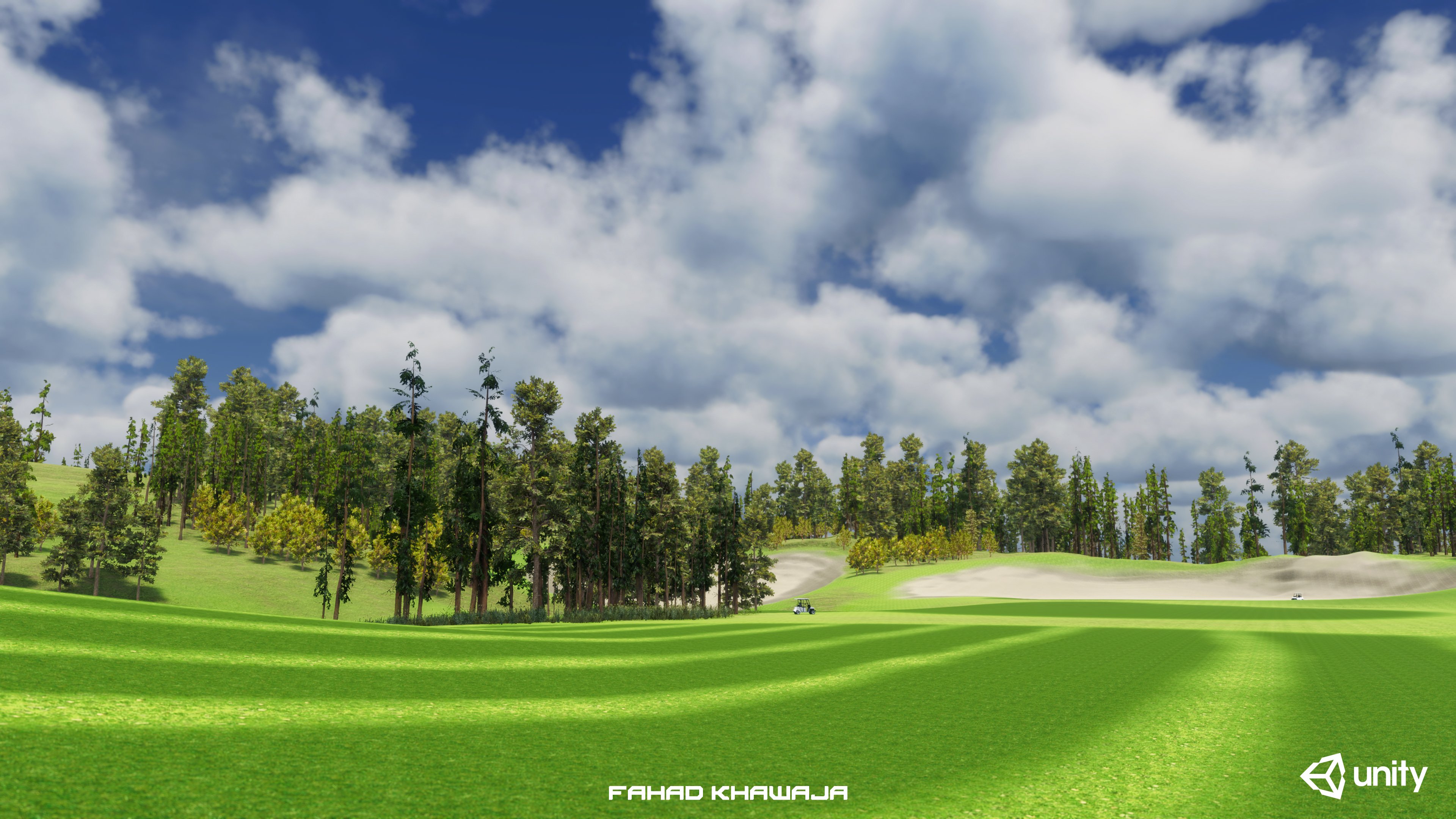 Hey all, made a fictional golf course environment to test new features of Unity HDRP terrain and lighting. Whole environment from blockout to final is done in 18 hours, used Unity Essentials and free assets. Most time spent on Unity forums figuring out warnings and errors related to terrain, hdrp shaders and art directing…
 -
Re: Male back anatomy - help needed
 This is a zoomed in version of the muscle chart I use for anatomy: Frohse Muscle Chart Posterior I think what is going on is you have the trapezius terminating rather suddenly at the back, it it seems rather flat as opposed to being more rounded. Biggest thing about the lats is I think you're missing the interaction of the…
 -
Re: Evironment #2 new lighting attempts
 Pick and choose where those crystals are growing. Too many and you'll clutter the scene with light and not really draw the eye to where you want it to go. Which brings me to the next point... What's the focus? The lift? Whats at the end of the tunnel? Set up your material for the stone surface the cave is made out of. Is…
 -
Re: PBR Wood Roughness Texture
 Did you remember to invert the values? In Unreal Engine 4, a black value is actually full shiny and a white value is very hard/rough surface. Marmoset works in reverse. Or, if you don't want to do this step, you can just use Dontnod's chart. The values are already UE4 compatible.…
>1599 results