Search
-
Re: Texturing Project, Mr. Smiles: Please Critique!
 his head is quite large and proportions in general make him appear to be about 12 years old or so, its a fairly memorable armour design though, keep at it
 -
Re: Halo: the Movie redux
 Its just a proof of concept - a bunch of guys running around a studio back lot in Halo-ish armour with some quick CG and a lot of stock footage dropped in.
 -
Re: Sketchbook: Terrorcouple
nice work so far, if you look carefully at the concept there seems to be a large strap of leather or something wrapped tightly across his chest in order to secure the armour? -
Metal workflow?

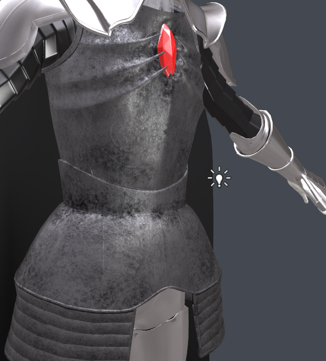 I'm texturing an armor and I'm having some issues, I'm currently trying to figure out the best workflow of how to do this quickly. Some say you should use the gloss map as a spec and then the specular map serves as the color of the specular light. I found this didn't work very well. Currently I'm using an albedo map for…
 -
Re: Advice for aspiring character artist?
 slipsius, I like the idea of doing multiple armour/equipment sets. Do you think it would be effective to do different character states too? Like a wounded version, or a starving/straggler version?
 -
Re: ArenaNet 2014 Character test
 Really nice! Great for your first character in Zbrush. She might be a bit wide in the torso, elbow joints look a bit weird, armour doesn't look like it would work or deform in game.
 -
Re: Project Champion (REBOOT)
 Great work! Can I ask how you did the armour on your Gladiator? Did you export a low poly mesh of the guy and then model around it in a 3D modelling package, then import it back in?
 -
Re: Mercenary
 Nah, looks like that was just the Helmet. @soulty: I feel like the helmet is out of place with the rest of the light-armour-modern-mercenary feel. It's all pretty solid though, modelling/texturing wise.
 -
Re: Dracula
 Looks pretty damn awesome except his face looks totally out of place to me. It may be the contrast between the dark colours of the armour and the pure whiteness of his face... or the anime facial features.
 -
Re: aquaboy
 Nemo is miles ahead of the rest and suits the body, its a 'theme' more than a mere colour choice. I would push his armours yellow tones more to orange a bit though. r.
>6677 results