Search
-
Re: Do you prefer Video or Text tutorials?
 I think some of you view video tutorials in the wrong light. If you need a fast answer right now because you're blocked at work, a video tutorial isn't the right choice. However, if you're winding down at night with your ipad on your patio with a beer in hand, then watching a video on something you aren't totally familiar…
 -
Re: Feedback for textures and lighting---P250
 The image seems washed out a bit. Are you using a very dark black (near RGB 0,0,0) in the texture? If so, that can cause lighting issues since you would need very bright lights to make sense of the details.
 -
Re: Term 1 - Development Projects Progress

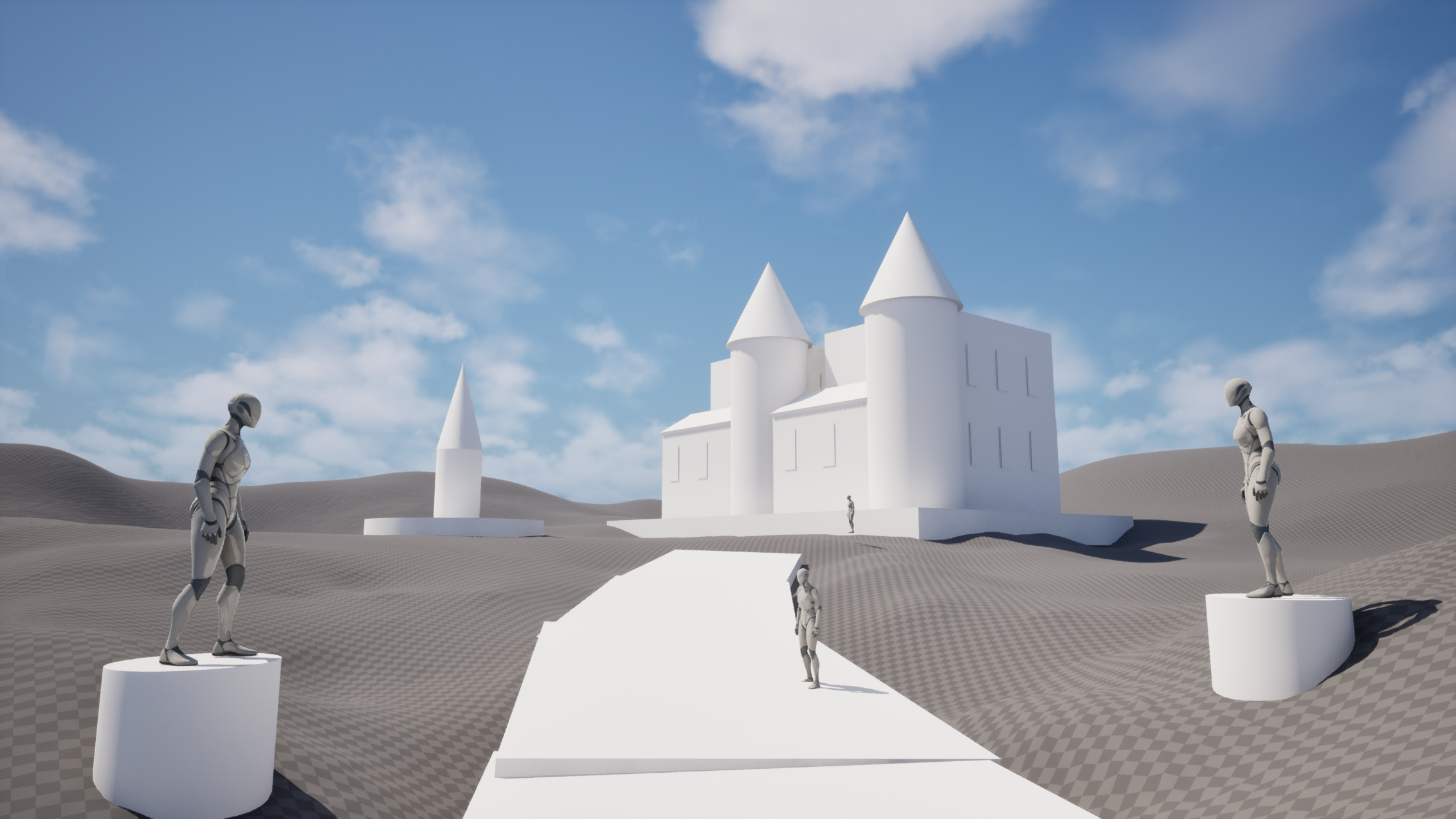 Hello Everyone! This Week's Update. I have added a few more elements to my composition blockout in UE5.7 to push the layout and overall feel a bit further. After that, I jumped into the main centerpiece of the scene, the gothic house. I am building it using a modular workflow, or at least as close to modular as I could…
 -
Re: Lighting across meshes inconsistent, can't work out why

 Thanks for the responses! I've taken a look and tried your suggestions, but now I'm a bit more baffled than ever. I've set the static lighting scale to 0.1 and tried a bake but it didn't seem to change anything. The indirect lighting quality is set to 1. The Compress Lightmaps setting is currently enabled but the engine is…
 -
Foliage Lighting like a Nut Sack.
 Anybody know what this is about? It looked fine when I placed it but after building lighting on Preview quality (For 40 dang minutes!) it came out like this. EDIT: I think it might be because the origin is below the terrain? Is there any way to fix that other than having the grass floating?
 -
Re: What Are You Working On? 2014 Edition
 Dat Terrain! Sweet environment man :D Think that the cows could be simpler more geometrical, and the ship might need some a more clear design (maybe a few more polys if it should be round) - and maybe a less saturated color on it to go with the rest. + maybe some red lights instead of green to work with the red "beam"…
 -
Re: Rage tech/workflow?
 Interesting I guess folks missed some of my questions over the weekend relating to the tech as well. Here was the original thread but it fell off the map. http://www.polycount.com/forum/showthread.php?t=89650 Also just quoted it below """"""" Hello everyone, I did not see a thread yet talking about the final resulting…
 -
Re: Wip illustration, c&c are welcome
 Hi seework, Firstly - really interesting image! Pretty much everything about it is very intriguing to say the least :) I think you're absolutely right about the brighter values in that they're overblown out of saturation. Areas such as the light on the wall, the skin and the neon sign all make a lot of use of less…
 -
Stresses, should I just give up or keep on going?
 Hello everyone, I have been plucking away for a couple few years at computer graphics. I have a two year degree in computer animation, but feel like I should know much more than I do. Some people just seem to get it faster, and I have to fight myself to get better. I always have procrastinators fear with projects. I have…
 -
Re: [UE4] Desert Environment
 I like your assets a lot and the lighting's getting there! I think you should definitely utilize the blue light less and maybe pull back the brightness and saturation of that blue a little. Strategically place the blue light where you want players/viewers to look since it will draw their attention almost immediately. I…
>89262 results