Home 3D Art Showcase & Critiques

Mecanique (Operation: Windmill)

1
polycounter lvl 12
Offline / Send Message
ErichWK polycounter lvl 12
So.. I've been working on this the past couple of weeks. I graduate from the Art Institute of San Diego in a week, and have a portfolio show in two weeks! Sooo.. I got a lot of work to do, so hopefully this brand new bag of coffee will be put to damn good use.
beckmann_render_progressbottom.jpg
beckmann_render_progressfull.jpg
beckmann_render_progresstophalf.jpg

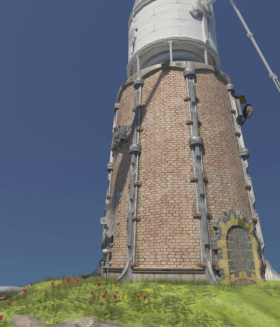
I rendered this in Maya using Maya's Physical Sun and Sky. . Rendering has always been my Achilles' heel and is something I need to learn. I've also been setting up a scene in Unreal's Editor. . .but..it's going slow because I've been learning that as I go a long. Haha. I'll try to do both and we'll see what happens! As the week progresses I promise to post some better wireframes. . I can't for the life of me figure out how to do real renders of Wireframes in Maya. Any critiques will be very appreciated! Thank you!

Untitled-1.jpg
Untitled-11.jpg

Replies

  • whats_true
    Offline / Send Message
    whats_true polycounter lvl 15
    I was like "THIS LOOKS SICK", until I scrolled down and saw that grass and then I was like "UGGH! D; ". It needs a lot of work cause iIts far to obvious that they are planes. More grass clumps will help solve that me thinks. Other then that, great modeling mate! Keep going.

    Oh, and to get REALLY good wire frames with very little effort involved at ALL....use max lol Maya has always been tricky and icky (well, maybe different for the newer version. idk).
  • ErichWK
    Offline / Send Message
    ErichWK polycounter lvl 12
    Oh yes..my grass! fuck, I forgot to..uhh... hide that in my closeups? -__- haha. All my friends tell me that my grass looks like pubes. But yea. i will just riddle the scene with my grass clumps it's just so tedious. Looks good from far away, though!
  • aipash
    Offline / Send Message
    aipash polycounter lvl 7
    My thoughts exactly! You could get by with leaving it up by the windmill itself. If you wanna go this route, instead of having a big grassy plain right there mix it up with some dirt and what not. Anything but those planes... kick ass model tho kudos to you! Good Luck with graduation, if its anything like Art Institute in Pittsburgh I know you are in for one hell of a ride. By the looks of it, you will be just fine! ;)
  • wester
    Offline / Send Message
    wester polycounter lvl 13
    A good way to get rid of that "card" look on those alpha'd out grass pieces is to make the blades of grass less opaque the closer to the ground it gets. . Instead of disappearing into the ground the grass will blend into the ground.
  • Rokkx
    that baking on your blades and the upper part of the building is really good dude, proud of ya!
    and ya that grass kills it >.< Try Wes' tip
  • Famouz
    Offline / Send Message
    Famouz polycounter lvl 8
    That looks so cool.
    Remind me of "feel good inc".
    I like that style, there should be a whole game with this style.
  • Taylor Hood
    Nice hard surface bits there. Also, the grass made me cry : D
  • Steve Schulze
    Offline / Send Message
    Steve Schulze polycounter lvl 18
    Some kind of anti-Don Quixote windmill?
  • ErichWK
    Offline / Send Message
    ErichWK polycounter lvl 12
    It's a trap, basically. ;-)
  • poopinmymouth
    Offline / Send Message
    poopinmymouth polycounter lvl 19
    With grass planes, you need to pull the shading from the underlying plane or it will always look weird. You can semi disguise it by putting a vert on the bottom edge, so you have a V shape instead of a straight line, and make sure the planes don't go straight up, they should always have an angle.

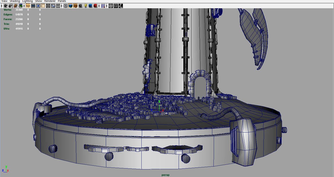
    You should also try to use larger ones, with more overlap. Right now you'd need tens of thousands of triangles to get good coverage. Scale them up, so you can have lots of overlap, and with the same amount of triangles, you can have better coverage.

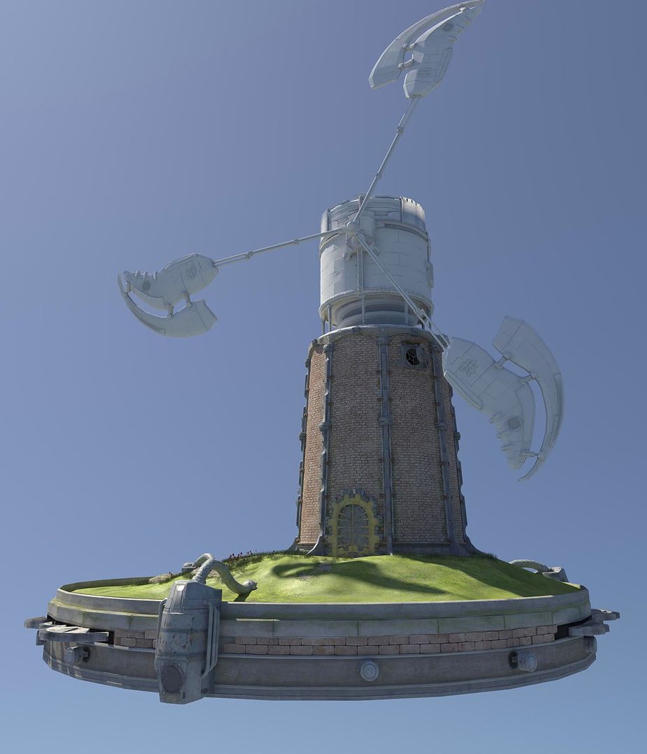
    Love the windmill design though, looks fresh.
  • Stertman
    really great model.. very impressed when i first opened the page, but yeah, scrolled down and as others have said, the grass ruin it.. and i feel that the attachment of the "wings" are a bit weak? would it stand up against a storm?

    great modeling and texturing otherwise..

    cheers
  • onionhead_o
    Offline / Send Message
    onionhead_o polycounter lvl 16
    this should make a fine portfolio piece.
  • killingpeople
    Offline / Send Message
    killingpeople polycounter lvl 18
    really nice lighting. agreed with the base comments.
  • konstruct
    Offline / Send Message
    konstruct polycounter lvl 18
    damn this thing is cool- It has a real nice sense of scale.
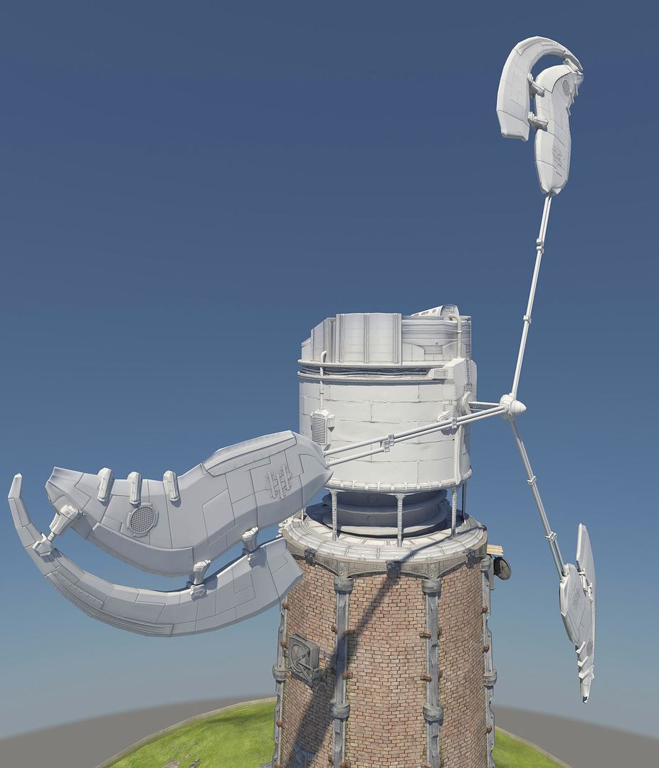
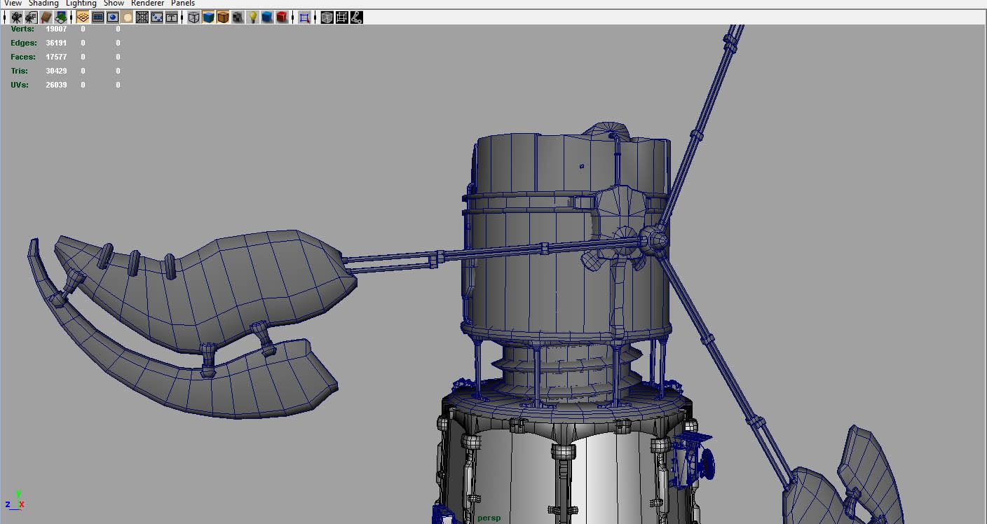
    I cant help but think that the top needs something. maybe an observation platform? large antenna? satellite array? right now there's just these boxy forms that come to an abrupt stop.

    also - I second what everyone is saying about the grass and also the way the windmill blades are connected to the central rotation point.

    I like how elegant it looks being thin. Maybe you could still have the thin part if you made the connection points more reinforced, then used some cables to help assist the visual attachment of the two heaver pieces (the blade, and the central pivot) with some cable work. that way its not just the thin piping doing all the heavy lifting.
  • vcool
    I was singing Feel Good inc. then came in here and irony hit like a sledgehammer to the face.

    I like it, but as every has said - the grass is bad.

    How did you make the normals? Hard surface poly modelling or sculpting?
  • ErichWK
    Offline / Send Message
    ErichWK polycounter lvl 12
    Oh wow! I'm so suprised and stoked for the positive words and really really excited to try some stuff out to make the grass better.

    @Poop: Thanks so much for the ideas on how to make better grass, I will get on it asap.
    @Sterman & Konstruct: You're right. I also like the elegance and simplicity but. . maybe I can add something cool to make it look sturdier. I'm gonna draw some concepts up and see if I can reinforce it some more. Also, since I am on a super strict time schedule I will get to new modeling last but you're right it needs some slight more touches! There's just so much I want to do with it. . . but so little time.

    and @vcool: Mostly everything was hard surface. But my rocks were zbrushed and so was the big water tower looking thingy to get that "welded" look. And same with the bricks to get the plastering look between the bricks.
  • BradMyers82
    Offline / Send Message
    BradMyers82 interpolator
    I'm no environment artist, but don't a lot of people use a "look at constraint" for things like grass. This way you never are looking at them from the side, and you get way better coverage with less.
    But yeah, definitely try what Poop mentioned, I'm sure you will do fine.
    The grass is a minor detail imo, on what is turning into a really great scene.
  • praxedes
    grass- yes...

    The design is cool as, though! I also get that feel good inc vibe. And you have inspired me to investigate this Physical Sun and Sky thing, of which I have no knowledge- I too find rendering and lighting a PITA and, as Starship Troopers would have it, Want To Know More!

    ~P~
  • crazyfingers
    Offline / Send Message
    crazyfingers polycounter lvl 10
    Natural sun is definitely one of the better "make awesome" buttons around haha.

    Really cool design, i like the blend of old and new, but i'd feel bad for anyone walking out of the door at the wrong time ;).
  • praxedes
    just did a real quick and dirty render of a hand I have on file using that natural whatnot- and that's the awesome :) Truly an "I win" button for mr renders :P

    ~P~
  • rasmus
    Apart from the grass, is it a design choice to have the main cylinder of the tower consist of so few segments? Looks a bit odd. Also, no normals for them bricks? Agree with the top needing something to finish it off, it's quite abrupt as it is. Off to a good start, with a good sense of scale.
  • Frump
    Offline / Send Message
    Frump polycounter lvl 12
    Here's a really short simple post about how to render wireframes in mental ray. :)
    link <-

    Be careful not to make the physical sun and sky too obvious, get a custom skybox in there. Also, sometimes the sun and sky washes out your textures and gives overexposed lighting. If that happens you will have to gamma correct your textures, which is all kind of fun(there are actually scripts to do it fairly easily). Overall I'd advise you use it as little as possible. It's the same as one big spotlight or directional light and some blue ambiance with final gather cranked. Easy to set up yourself and with less headache. I know how the week before the portfolio show is, so maybe it's not the most ideal time to learn about lighting and rendering, but this book by Jeremy Birn is awesome for an intro to lighting.
  • slipsius
    fantastic post! i thought the first picture was real life until i saw the grass! very nice!
  • praxedes
    @frump- thanks for this- I wondered WTF I was doing wrong when I tried to render a textured model and it completely bleached out. I will investiagte your tip :P

    ~P~
  • ErichWK
    Offline / Send Message
    ErichWK polycounter lvl 12
    So I worked on more stuff!
    Which includes
    -New grass and made ivy!
    -Textured the giant Screw
    -Textured the top water tower looking thingy
    -Textured the base of the top section
    -Pushed Brick Normals, added more grunge on certain textures
    -Messed with Gamma in Mental Ray so it stops over blowing and Desaturating my shit.

    beckmann_render1.jpg
    beckmann_render2.jpg
    beckmann_render3.jpg

    @Frump - Thank you for those tips! They will come incredibly handy.
    @Rasmus - Yea, it was a design choice to keep the base fairly bare because I am planning on letting nature overtake the bricks and after I'm done texturing what I have I'm going to make pipes weaving in and out of the bricks.


    I hope my grass looks better...I would still REAAALLY like to have grass cover the entire pedestal. . but I can't find any scripts that really help to quicken the process, and placing 30k tris with of grass by hand doesn't sound terribly appealing right now.

    Once again, any critiques and suggestions will be greatly appreciated.
  • ErichWK
    Offline / Send Message
    ErichWK polycounter lvl 12
    And upon looking at these photos a little bit more..it seems my brightly colored textures are still getting desaturated... I may just try another lighting system unless I can figure something out with Physical Sun and Sky. .
  • Rokkx
    Your Ivy looks nice and the grass looks much better as well.
    and I agree, you should try using some other form of lighting. maybe ut3? ^.^
    Question, are the pipes that run from the pedestal to the tower textured?
  • Krynn72
    I think the ground is still really weak in comparison. The overall grass texture is too low resolution next to all the other assets, and the grass planes, while better than before, still are very fake looking. Its just too obvious that they're planes. To be honest, I'd probably just change the whole ground type to something else, rather than have grass. Grass is a pain to get looking right, and you will probably spend a lot of precious time working on it, if you get it to the point where it looks right.

    I'd suggest just using a higher resolution texture thats more rocks/dirt, and really short, semi-sparse grass.

    Something like a combination of this: http://mayang.com/textures/Plants/images/Repetitive%20Plants%20Textures/grassy_bank_7160794.JPG

    and the bottom right corner of this: http://www.griquas.com/2006/21Sep/040.jpg
  • Tumerboy
    Offline / Send Message
    Tumerboy polycounter lvl 16
    you're definitely in the pastel-y range, but the shape is delightful. Nice work!

    I'd beef up the center spindle as well as each of the arms, as they all look like they'd snap off under that much weight in a brisk wind.
  • ErichWK
    Offline / Send Message
    ErichWK polycounter lvl 12
    Krynn - thank you for the suggestions! You're right. . . Grass is a giant pain the ass right now for me, especially without some sort of terrain brush tool. I'm going to finish texturing the rest of my scene and I will go back to fix the grass. When I did this envision having this thing in an environment that looks like this.
    1392268-Mitre_Peak_Milford_Sound-New_Zealand.jpg
    and this
    253_dalkey4.jpg
    Something with really saturated green vegetation mixed with machines have always appealed to me. But you are 100% right. It's hard to do, and I should play to my strengths in order to make this look bangin.
  • A.Kincade
    Offline / Send Message
    A.Kincade polycounter lvl 9
    Grass looks better. Vines are a great touch. Diggin the water tower thingy. Coming together very nicely good sir. Keep up the good work. Cant wait to see in completely finished.
  • ErichWK
    Offline / Send Message
    ErichWK polycounter lvl 12
    Here's a quick update...kicked Maya's Sun and Sky and trying some other stuff, Render times are absolutely unbelievable..an hour for this... I dunno if thats normal but I will try messing with some settings and see if I notice any deference. I still haven't worked on the grass, and getting awkward results with the vines.
    I still need to add some antennas and structural support (hopefully) on the propellers, but I have about another day left to work on this so we will see how much I can churn out.

    I'll post individual props out tomorrow. Hope it's coming a long.

    beckmannrender.jpg
  • Killaball
    Hey its looking a lot better, if I can offer a suggestion? I'd say try to match the tall grass' color to the ground grass' color. Also it seems that all the tall grass is about the same size, maybe have lower grass around the outside of the taller grass to add some difference. But it could be that way already and I just can't see it in the renders.

    Lastly the spec on the ivy looks off, but I'm sure you see that.
  • konstruct
    Offline / Send Message
    konstruct polycounter lvl 18
    this is turning out great. Id love to see a whole scene of these, similar to this early ue3 shot.

    the only things that bug me atm, are the bright turquoise Ivy, and the connection between the the windmill propeller and the watertower looks very unbelievable,

    I know time is a harsh mistress for you, but I imagine you could reuse some components from somewhere else on this piece and construct some sort of mechanism/antenna to the top of the tower to spice up the silouette a tad. It wouldnt even need to be anything too big, just something for the eye to roll around and marinate on for a second or 2.

    lastly if time permits, youed be amazed how much a few large weed/shubs will add to the overgrown look, especially if they are kind of dead and dried out looking

    I DEMAND A SHRUBRY!
    grail092.jpg
  • praxedes
    If this a low poly mesh then 1 hour seems...harsh....I thought my render times were shit...

    Looking mighty fine though!

    ~P~
  • Jeremy Lindstrom
    Offline / Send Message
    Jeremy Lindstrom polycounter lvl 18
    the right most fanblade looks like it would crash into the ground. Also, do the people coming in/out have to worry about getting chopped by a fanblade? Maya physical sun and moon you need to add a gamma node in there to fix the washout of the textures. The fan arms themselves look a little weak to me as well, but looks like this has some potential. :)
    File textures may get washed out, because of incorrect gamma. The mia_exposure_control applies gamma correction on the final image. Mental Ray expects file textures to be 'gamma neutral', which they are (probably) not. Chances are you've created them for a gamma of 2.2 or so, which is the default for computer screens. If the mia_exposure control corrects the final rendered image to the gamma you specified, the textures would get gamma-corrected again, which causes them to look washed out.
    There are two main methods to solve this problem: Change the Mental Ray internal framebuffer gamma and the Exposure control gamma, or gamma-correct each filetexture.


    The first method is the easiest to implement:
    • Open you Render settings, Mental Ray tab. Find the Framebuffer section and open the Primary Framebuffer subsection. Set the gamma to 1/desired gamma, so 1/2.2 = 0.4545 for a end-result gamma of 2.2
    • Set the Gamma of your mia_exposure_simple to 1.00.
    Alternatively you could use the MR Gamma correction MEL script to correct the gamma. This will add gamma correction nodes to all file textures, counter-correcting them for the specified gamma, so the end result should look good.
  • ErichWK
    Offline / Send Message
    ErichWK polycounter lvl 12
    Dekard, you are a both a scholar and a gentleman. I used the link you gave me, which told me to use this script instead http://toi.bk.tudelft.nl/?module=meldb&page=details&sID=39 and here is my result.

    new_render1.jpg

    So far the best render I've achieved yet! Also the angle to the original pictures was weird so it gave an illusion that the blades were too low or hit someone walking out of the door.

    Regarding foliage, I may just say eff it and not do the grass and just try to get the vines rad. If I work on the base grass a bit I can get something that will look good with my beauty shot which will be something like this I think. Thanks Konstruct and Kill for your ideas, they are much appreciated but time is running short.


    Also! A concept of possible propeller beefer-uppers?
    concept_render1.jpg
    And is that a shading error on my door??? Ugh..haha. I will fix that....some..how.


    THANKS AGAIN! Critiques appreciated
  • Jeremy Lindstrom
    Offline / Send Message
    Jeremy Lindstrom polycounter lvl 18
    like where the propeller beefier uppers are heading glad I was able to help someone finally. :D Just a suggestion but would sell the texture a bit more would be some directional oil/dirt/grime coming from the fanblade sections similiar to what an airplane wing dirt/oil looks like..
  • Tumerboy
    Offline / Send Message
    Tumerboy polycounter lvl 16
    way better. I don't know that I'd add a bunch of crap around the spindle center. I like the simplicity of it now, I just think the arms themselves are what need the beefering uppering.
  • ErichWK
    Offline / Send Message
    ErichWK polycounter lvl 12
    So.. should I make them thicker? Or add more connections between the arms. To me it looks fairly fine.. but that is probably because I've been looking at it for 100s of hours and everything is becoming one giant blurry blob to me. But if the national consensus says thickening, or more connections, then it shall be done!
  • HandSandwich
    Offline / Send Message
    HandSandwich polycounter lvl 18
    This is awesome Erich. When I graduated from AICA-SD 3 years ago there was nothing near this good at any of our portfolio shows. I agree that something needs to be beefed up in regards to the prop arms. Not sure what. However, I do like where your sketchover is going. It has some good victorian/ornate but techy feel to it, kinda like GoW. Keep it up and good luck.
  • ErichWK
    Offline / Send Message
    ErichWK polycounter lvl 12
    Oh wow, You graduate from our school? Yea.. we have a lot of great artists graduating from our school these days. A few of them work at Cryptic now and I think another works as a concept artist at Sony..but I may be mistaken.
  • dlx
    I think you should add more connections connections between the arms. The dark texture on the upper section seems to work against the composition. I would lighten the top and add some darks at the bottom of the structure.
  • jacob07777
    Offline / Send Message
    jacob07777 polycounter lvl 14
    Damn Erich, this is kickin some major ass!! Puts my lighthouse to shame lol

    Already graduating dude? That's sick, this will definitely be a nice portfolio piece. Let's see some texture sheets eh?
  • Tumerboy
    Offline / Send Message
    Tumerboy polycounter lvl 16
    I think thickening is all you really need. Beef up the center of the spindle, and then step down the 3 segments to the blade, going from thickest/most tubes, to thinest/fewest tubes.

    Who do you know at Cryptic? (I know there are AI people, but I honestly don't remember specifics)
  • BradMyers82
    Offline / Send Message
    BradMyers82 interpolator
    Hey, great job so far with this, it's turning out really awesome!

    Looking at the black and white version, gets me thinking that the colors are not doing this piece justice though. I mean, it looks way better in black and white, IMO.

    I guess a lot of people are liking your color scheme, but to me it seems over saturated, and bright. I also think that the main bricks are a tad too clean. I think some of that directional grunge, you have going on the outside base (where you have darker areas near the top, and it fades down) would help the main brick area.

    Anyways, keep up the good work!


    [Edit] I do like the changes you made with the lighting, I just think you coud pay with the hue sat/ and levels some more on certain areas (grass and gold door bits in particular).
  • ErichWK
    Offline / Send Message
    ErichWK polycounter lvl 12
    @Tumerboy Adam williams and Lawrence Durbin. Cool cats. And I will do some tests to see what looks the raddest and can be done in the the least amount of time.

    brad: Yea. I had to over compensate the saturation with the original lighting scheme, I will tone it done a little bit, or maybe mess with the gamma a little bit. And about the bricks, yea you are right. I will try to figure out something. It's a tileable texture I made so I can't really have the top part a different color compared to the rest. So I can try to make some sort of alpha grunge map. I will see how that works out. Thank you again for the words! I'll post it all tonight...cause god knows I'm not going to bed.
  • Tumerboy
    Offline / Send Message
    Tumerboy polycounter lvl 16
    right on man, ya, I guess they're alright. . . (can't act like I like them too much, since they read these forums too. . .)


    Brad, I think what I like so much about the color version is how happy & Myazaki it feels. The black and white one takes so much away, and just turns it into an industrial feeling scene. I like that in color it DOESN'T feel industrial, despite most of it's components being industrial.
  • ErichWK
    Offline / Send Message
    ErichWK polycounter lvl 12
    Time to Rush to a 24 hour Kinkos to get this shit printed. . Though this is all I could get done in time for my class, Doesn't mean I can't go back and fix it for my portfolio show. I beefed up the arms a bit, but no elaborate victorian decor, That will be later. Grunged the grass, Added Antennas and slightly desaturated the colors. And yea, Tumerboy! That's exactly what I was going for! I looove color and bright bold imagery. It's a nice change of pace from the dark browns and grays.

    here is what I'm presenting.
    mecanique_portfolio.jpg
  • praxedes
1
Sign In or Register to comment.