Home 3D Art Showcase & Critiques

Italy scene round 2

1
ae.
polycounter lvl 12
Offline / Send Message
ae. polycounter lvl 12
This is the first scene i created when i started working on my modeling, i think its about 2 years old this project is a challange to me to see how far ive come.
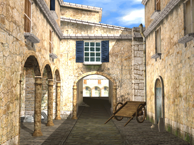
wipshot16.gif

Ill have updates soon :) just polishing off some art assets as we speak. my goal for this project is to update not only the modeling but how the general feel and look of it overall :)

Replies

  • Tumerboy
    Options
    Offline / Send Message
    Tumerboy polycounter lvl 17
    oh, I remember this one. I'd love to see another go on it!
  • indian_boy
    Options
    Offline / Send Message
    yea i remember this one too!

    cant wait to see the exponential growth in awesomeness.

    gl with the project
  • ae.
    Options
    Offline / Send Message
    ae. polycounter lvl 12
    Sorry for the lack of updates been working on a game project and been busy did this in my spare time i think its a little noisy what do you guys think?

    italywip1.jpg
  • Rated Rrr
    Options
    Offline / Send Message
    Rated Rrr polycounter lvl 17
    Cool man, already looking 100x better. Only thing that feels remotely odd is the trim around the arch, seems like it should be divided up instead of one big object. Keep going.
  • Tumerboy
    Options
    Offline / Send Message
    Tumerboy polycounter lvl 17
    agreed. The wall feels good, the arch is off, but not bad. The noise isn't bad. Leave it there, move on, and then come back once you have more objects to compare/match it to.
  • Microneezia
    Options
    Offline / Send Message
    Microneezia polycounter lvl 10
    graffiti artists who like to build their own furniture ftw
  • ae.
    Options
    Offline / Send Message
    ae. polycounter lvl 12
    hahah :P thanks for the crits guys ill throw the arch into zbrush and fix it up :) add some more detail to it.
  • ae.
    Options
    Offline / Send Message
    ae. polycounter lvl 12
    more work on this didnt really do too much been busy with other 3d work :P

    italywip2.jpg
  • SHEPEIRO
    Options
    Offline / Send Message
    SHEPEIRO polycounter lvl 17
    nice, id loose the grey transition from the top and change it to water damage, and along the bottom id shorten it alot and replace most of it with a broken underlay of a different type of brick
  • Tumerboy
    Options
    Offline / Send Message
    Tumerboy polycounter lvl 17
    agreed. I'd also clone out the lighter patch towards the bottom of the tiling texture. That gave the tiling away much faster than anything else in that texture, and my eye went straight to it.

    The windows are kind of confusing to me? Are the windows boarded up from the inside and the glass is just broken out of some panes? You could probably afford a little more texture space and polys, and split the wood, glass, and background into separate pieces. That way you could selectively remove certain panes, or replace them with boards in different places on different windows, without requiring the texture space for multiple complete windows.

    Looking good though, keep it up!
  • pliang
    Options
    Offline / Send Message
    pliang polycounter lvl 17
    More to the windows, the color choice of the boards can use a more uniform color and the board geo can be shifted around to make it less repetitive. There doesn't seem to be a room and looks like it has been sealed off by cement by the looks of it.
  • ae.
    Options
    Offline / Send Message
    ae. polycounter lvl 12
    Awesome crits guys keep them coming, i decided to make wooden board decals to put on my windows so that i can mix and match like you guys said :)

    update:

    italywip3.jpg

    After i get a the basic layout done im going to throw this into ut3 :)
  • MoP
    Options
    Offline / Send Message
    MoP polycounter lvl 18
    looking pretty good!

    the new transitions on the upper wall are better, but the bottom part with the brick is really too big (high) i think, it tiles really obviously and doesn't look very natural. I think what SHEPEIRO said originally is a better idea - just have a very thin part chipped away, like probably not even the height of one and a half bricks at most. and try to make it not tile as obviously :)

    this whole scene should look really nice if you finish up the rest to this quality, and light it nicely.
  • Tumerboy
    Options
    Offline / Send Message
    Tumerboy polycounter lvl 17
    ^ Agreed ^

    I'd also put a plane with a darkish color behind your glass, so at least it doesn't look like all the windows have been plastered over.
  • ae.
    Options
    Offline / Send Message
    ae. polycounter lvl 12
    thanks for the crit guys is this better?

    italywip4.jpg
  • ae.
    Options
    Offline / Send Message
    ae. polycounter lvl 12
    Lighting test?

    italywip5.jpg
  • PixelMasher
    Options
    Offline / Send Message
    PixelMasher veteran polycounter
    nice work so far man, your texture skills have really improved over the last few months. Only thing I'm not digggin is the lighting in the test, its too purpley andsaturated i think, just my opinion though, cant wait to see more!
  • fmnoor
    Options
    Offline / Send Message
    fmnoor polycounter lvl 17
    I'd worry about lights once you've got the scene blocked out.. but I like where this is going. NIce stuff :]
  • Microneezia
    Options
    Offline / Send Message
    Microneezia polycounter lvl 10
    Whats up with the modeled ceramic roofing? is that fully modeled?
  • AshleyTayles
    Options
    Offline / Send Message
    AshleyTayles polycounter lvl 9
    Looks good! Only think I dislike is the purple lighting.

    Subscribed.
  • ae.
    Options
    Offline / Send Message
    ae. polycounter lvl 12
    Whats up with the modeled ceramic roofing? is that fully modeled?

    im gonna use that for normal map projection :) also i was just playing around with the light set-up :poly142:
  • ae.
    Options
    Offline / Send Message
    ae. polycounter lvl 12
    Made a brick texture and finished the modular roof :)

    at this point im going to start importing the models and materials into ut3, i just need to find a way so it does not compress the textures :S

    italywip6.jpg
  • Talbot
    Options
    Offline / Send Message
  • Microneezia
    Options
    Offline / Send Message
    Microneezia polycounter lvl 10
    it would be cool if the roof had multi-colored tiles, Im not sure how this happens or if its just a style most likely I guess, I like to think they are replacement tiles, but thats unlikely. The rest of your building is worn but the roof is fresh and pressed. Dont mean to stomp all over your roof like a drunk santa...but also can I see how you projected that down? and wires? - I like me some tile roof! also check out that mini tile-chimney wth is that for?? and, you need one!

    tile.jpg
  • SHEPEIRO
    Options
    Offline / Send Message
    SHEPEIRO polycounter lvl 17
    the tiles you have are incorrect, trust me ive done a few of these including itallian rooves and they all pretty much go like this

    ....(
    ......)
    ....(
    ......)
    ....(
    ......)

    with an overlap. yours as you have them currently would be extremely leaky
  • killingpeople
    Options
    Offline / Send Message
    killingpeople polycounter lvl 18
    it would be cool if the roof had multi-colored tiles, Im not sure how this happens

    It's magic!!

    The manufacture makes different colors, obviously right? But they don't really mix the tile up real well themselves, there's no need. From what I've seen, they load them to a pallet in stacks of 5 or 10, so they must be loaded by hand. The roofer will usually be the person who mixes them up all nice-like. With "Indian Popcorn" roofs like these, left over tile of the same style, is usually mixed in to save money.
  • carlo_c
    Options
    Offline / Send Message
    Hey ae looking good so far. Agree with shep about the roof, check the bottom of the tiles in this pic.

    Antique_Coppi.jpg

    In regards to the texture compression with UE what I found to work was setting the LOD bias of the texture to -2. You can find the setting when you double click a texture in the generic browser.
  • Tumerboy
    Options
    Offline / Send Message
    Tumerboy polycounter lvl 17
    Edit: Stupid second page I didn't notice. . .
  • ae.
    Options
    Offline / Send Message
    ae. polycounter lvl 12
    threw these into ut3 tried my best to stop the textures from compressing but couldent really stop it :P, i will probablt throw this into cryengine to see how good it looks in that :S

    italywip7.jpg
  • Tumerboy
    Options
    Offline / Send Message
    Tumerboy polycounter lvl 17
    compression is a necessary evil. Don't try and stop it, make sure your textures look good with it. They'll be that way when the player sees them one way or another.

    ETA: Looks good! Your lighting actually looks really nice for what I assume was just a first stab. Start flushing out the foreground and adding some depth!
  • ae.
    Options
    Offline / Send Message
    ae. polycounter lvl 12
    yeah i just threw down a directional light just to get some light into the scene, i wont work on the lighting until i have everything ready.

    i need to make around 20 props for this scene so dont expect alot of updates from me for awhile :P also like the note i will be fixing the roof/tiles i just threw tha in, and the tunnel will open on the other side just closed it off for now :P

    also is there anyway i can get my specular to shine a little more in the material editor?
  • Microneezia
    Options
    Offline / Send Message
    Microneezia polycounter lvl 10
    vector constant > specular emmisive?
  • PixelMasher
    Options
    Offline / Send Message
    PixelMasher veteran polycounter
    to boost the spec, jsut multiply it with a constant node and push the value above 1 which is the defualt brightness of your spec. I usually end up boosting most of mine to around 1.2-1.3x to get that extra pop after light maps have been baked.
  • ae.
    Options
    Offline / Send Message
    ae. polycounter lvl 12
    ill give those a try :)
  • ae.
    Options
    Offline / Send Message
    ae. polycounter lvl 12
    working on a bunch of props right now, this is one ive completed so far :P im so happpy its the weekend, its been hard getting to work on my 3d layely do to work. cant wait to blow this joint one day and work on games full-time :P

    italywip8.jpg
  • ae.
    Options
    Offline / Send Message
    ae. polycounter lvl 12
    i wasent gonna post this because i dont like posting without making some pregress but i was sick today so was unable to finish a couple props i wanted to finish, so i just messed around with the lighting in unreal tell me what you think and if possible i would love to see a paint over :) im looking over at you vig :P

    italywip9.jpg
  • haba_haba
    Options
    Offline / Send Message
    brick wall look IMO too clean in comparision to rest, little damage on bricks would also look nice
  • bluekangaroo
    Options
    Offline / Send Message
    bluekangaroo polycounter lvl 13
    its looking good, im guessing you have post processing...id say turn it down a bit unless ur going for a more stylized look
  • ae.
    Options
    Offline / Send Message
    ae. polycounter lvl 12
    EricV wrote: »
    its looking good, i'm guessing you have post processing...id say turn it down a bit unless ur going for a more stylized look

    thanks for the critique man, i am actually going for a more stylized look been looking into how to get simple black lines into the geometry which is harder than i thought as some of the geometry are bsp brushes.

    right now i think im at a point where i want to set a mood in the scene and stick to it throughout the rest of this process. i was looking at some street fighter 4 and Darksector screens and hopefully if Im able to cross the two styles together. i might turn it PP down a little, and of course reduce the sharp black shadow on the left :thumbup:

    I would love more crits on the lighting itself as it the area of my work flow I need work on the most.
  • PixelMasher
    Options
    Offline / Send Message
    PixelMasher veteran polycounter
    I find to create interesting lighting the quickest and most natural way to do it is to have some crazy shit for the light to shine through to create interesting crossing shadows and shafts of light over the piece. stuff like opposing awnings, wires, balcony's etc would be really fitting, if you are planning on keeping it alley like.

    esoecuakky since the confining walls would pretty much force a tall composition, something breaking up the skyline and casting shadows would be ideal.
  • ae.
    Options
    Offline / Send Message
    ae. polycounter lvl 12
    I find to create interesting lighting the quickest and most natural way to do it is to have some crazy shit for the light to shine through to create interesting crossing shadows and shafts of light over the piece. stuff like opposing awnings, wires, balcony's etc would be really fitting, if you are planning on keeping it alley like.

    esoecuakky since the confining walls would pretty much force a tall composition, something breaking up the skyline and casting shadows would be ideal.

    yeah it doesent help that the scene is bare bones right now but i plan on creating: wires, balcony's etc to interlace so that interesting shadows are created. but how about the mood as of now do you suggest i change it or keep it in place, i personally love it but my eyes lie to me sometimes.
  • bluekangaroo
    Options
    Offline / Send Message
    bluekangaroo polycounter lvl 13
    ae. wrote: »
    thanks for the critique man, i am actually going for a more stylized look been looking into how to get simple black lines into the geometry which is harder than i thought as some of the geometry are bsp brushes.

    right now i think im at a point where i want to set a mood in the scene and stick to it throughout the rest of this process. i was looking at some street fighter 4 and Darksector screens and hopefully if Im able to cross the two styles together. i might turn it PP down a little, and of course reduce the sharp black shadow on the left :thumbup:

    I would love more crits on the lighting itself as it the area of my work flow I need work on the most.

    cool cools. Street fighter 4 has a real nice style going on...would be goodl to see ya pull smthn off in that vein :)
  • gamedev
    Options
    Offline / Send Message
    gamedev polycounter lvl 12
    Are you using my scene as reference by chance?
    alleyway2.jpg
  • JasonLavoie
    Options
    Offline / Send Message
    JasonLavoie polycounter lvl 18
    hmmm...

    Although, I have seen a reference picture (real) that looks like what ae is doing, but the air conditioning unit really struck me, as it does look like yours... although most air conditioners kinda have the same feel, but the colours used for the text for example... maybe to close for comfort.
  • ae.
    Options
    Offline / Send Message
    ae. polycounter lvl 12
  • Harry
    Options
    Offline / Send Message
    Harry polycounter lvl 13
  • whats_true
    Options
    Offline / Send Message
    whats_true polycounter lvl 15
    I knew that air vent looked familiar.
  • gamedev
    Options
    Offline / Send Message
    gamedev polycounter lvl 12
    No worries man.

    My advice however, would be to rarely use existing game art as reference. What you see in others work is the culmination of a lot of learning, trial and error, and research. If you don't do these things yourself you'll stagnate, and even worse you won't learn valuable lessons that can be applied to future projects. The scene you're referring to was completed over a few months working with other artists and went through several stages before arriving at what you see.

    As for your current assets for this environment, my crit would be to spend more time on each asset and get it right. Focus on your photo ref and hone your workflow and skills. .Nail down the materials and texturing before moving on. Each piece looks a bit rushed.

    Best of luck,

    -Tyler
  • ae.
    Options
    Offline / Send Message
    ae. polycounter lvl 12
    moving toward my original design and taken influences from the new ref i have found :) spent the weekend working on some other stuff so didnt get much done :(

    thanks for all the advice and feedback guys :)

    updated shot:
    italywip12.jpg

    props ingame:
    italywip13.jpg

    wont update this until i make some real progress on the design.
  • SHEPEIRO
    Options
    Offline / Send Message
    SHEPEIRO polycounter lvl 17
    red brick is way too saturated and dark and even. is it from HP
1
Sign In or Register to comment.