Home 3D Art Showcase & Critiques

Old Gas Station

Hi Everyone,

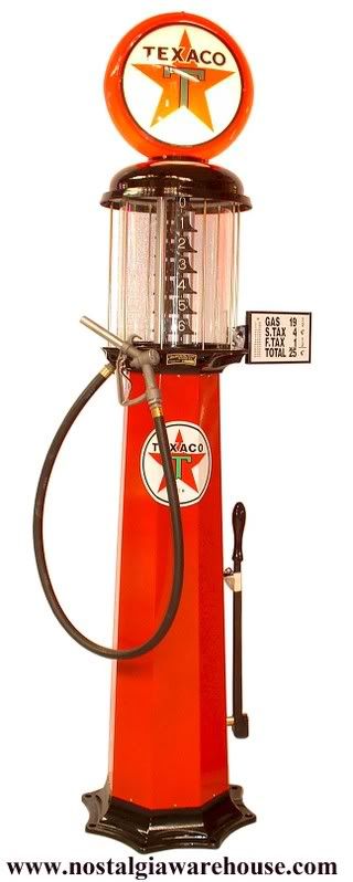
This is my first post here, I've been too intimidated to post anything until now, but I figure the only way to learn is to get some advice from people who are better than me, so here goes. I am working on this old gas station from some reference pics. My goal is to create a portfolio piece showing that I can create next-gen game assets from a reference photo. Here are the reference pics I'm using :
antiques.jpg
TexacoPump.jpg

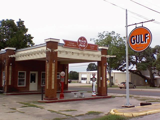
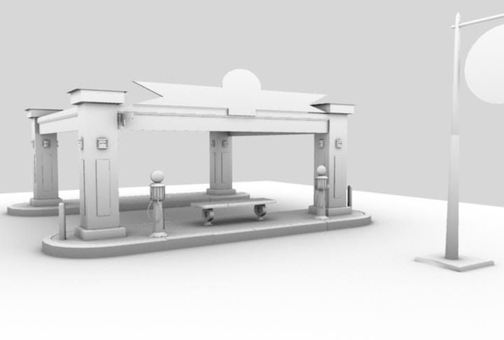
Here is what I have so far:

GAS_AO.jpg

GAS_UVS.jpg

GAS_WIRE.jpg

PUMP_WIRE.jpg

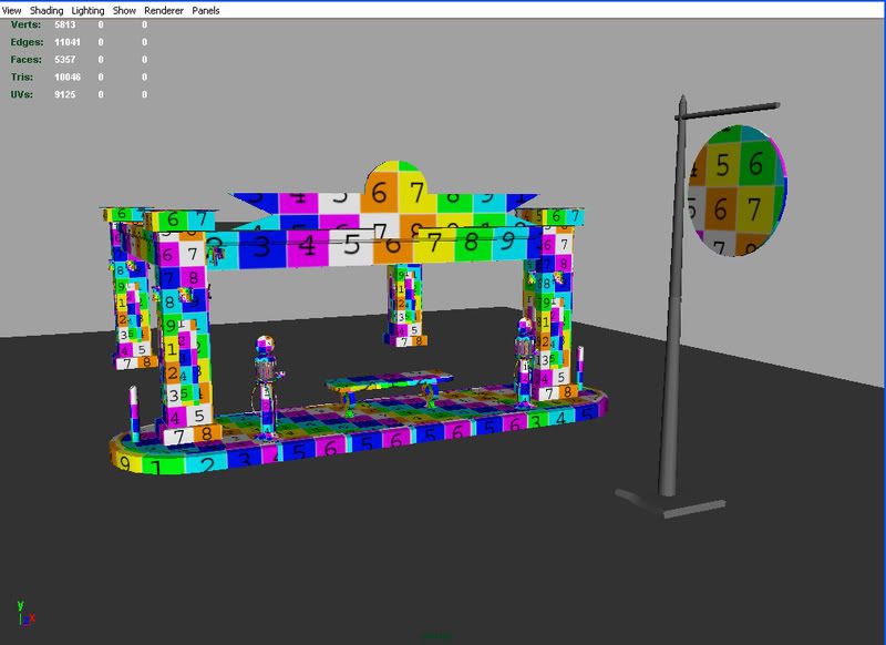
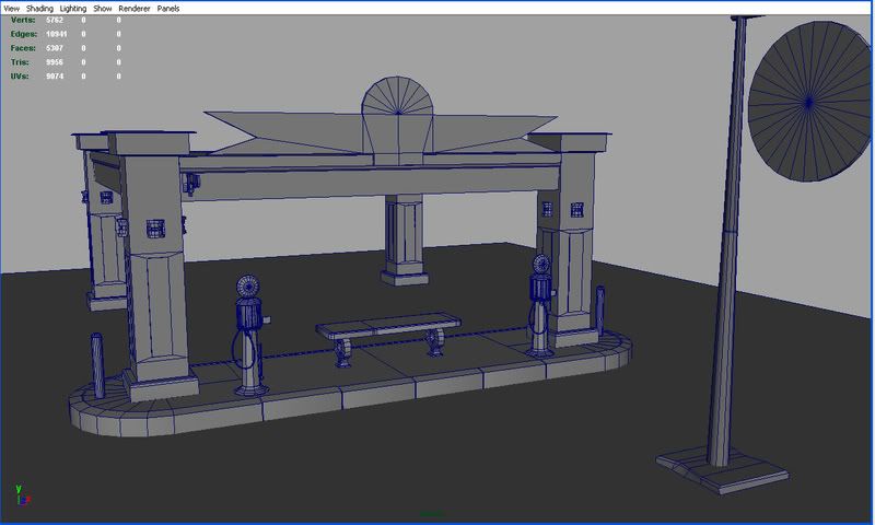
I also had some questions about how I should layout my UVS and an acceptable poly count for an asset like this. I would like to stay under 25,000 tri's and I am planning on making a 1024 sheet for all the non metal things, then another sheet hopefully 512 or another 1024 for all the metal stuff. Is this right? I would like to make this project using the same pipeline as a game company, so I hopefully might get hired soon:\.

Anyways I think this is a great site and I hope to continue improving and get to know all of you here.

Zack

Replies

  • zacko9000
    Options
    Offline / Send Message
    Just bumping this since I haven't got any responses
  • Mark Dygert
    Options
    Offline / Send Message
    Looking pretty good so far keep at it =)
    With polycount if no one responds you can assume one of two things.
    1) You're doing a pretty good job and if you keep working on it, you'll get to a good end result on your own.
    2) You're doing it so wrong that anyone that happens on your thread, leaves clawing at their eyes.
    Either way there won't be much idol praise tossed around and you should push above what you've done. "Art is never finished its just abandoned in a near perfect state".

    Ok enough babble...
    Crits:
    - The scale for things is off just a bit, things are a bit too wide and not tall enough. It's important to get down into your scene on a human level and not hover above it. It also helps to view it often from the perspective of your ref. Also making a measuring stick about the same height as a person helps get a sense of scale.
    - The bench gives a good indication of scale. In the ref the top of the seat doesn't match the bottom of the indents in the supports.
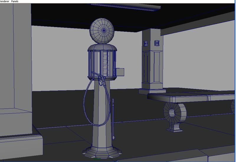
    - The gas pumps in the ref look to be taller then a normal human, but in the scene a normal person would dwarf the pumps.
  • Tumerboy
    Options
    Offline / Send Message
    Tumerboy polycounter lvl 17
    good start.

    The whole thing is too wide. Look at the sign, and the placement of the pumps and bench, in your shot compared to the ref. The bench is too big too. ETA - Vig beat me to it.

    Your UVs need some help. You've got drastic variation in pixel density between the upper roof, and the column and the pump itself. That may work out fine if your textures are different sizes also, but usually it's a good idea to keep things in roughly the same pixel density range.

    your poly usage is ok, but a little inconsistent. You've put a ton of detail into the pump, compared to almost nothing in the column right next to it. Obviously the pump is going to draw people's eye more, so it might get a bit more detail, but not a ton. Even the pump is a bit inconsistent. I know the post for it is faceted, but look at how many polys your using on the rounded top compared to the post (which is most of the actual visual impact of the pump). It looks like you pussied out on the base of the pump. Try and get those little scallops in, it shouldn't be too hard. I never have any clue about how many tris a scene should have overall, I just look at usage and make sure it's reasonable.

    I don't know where you got your plan to break up metal objects in one sheet, and non metal objects in another. You're better off just breaking individual assets into separate maps. Bench, Pump, tiling brick, tiling cement, etc.
  • zacko9000
    Options
    Offline / Send Message
    Thanks for the crits guys, I definitely see the height to width ratio is off. I'll have to fix that today. Yeah the pump definitely has issues, I'll also fix that today. I am going to try and finish all the modeling and uv issues also. For some reason I thought that combining as many objects as possible in a uv map would be good, but I will take your advice and just seperate them so I can keep the uvs consistent.
  • Mark Dygert
    Options
    Offline / Send Message
    Also remember you're UV's are never set in stone. Later on, after you've textured everything you can create a copy of your mesh(es), rearrange the UVs and use transfer maps to transfer the textures from the old UV layout to the new. So don't worry about doing your UV's "wrong" because they are totally fluid at any point in the process.

    But do keep one thing in mind, it works better if you transfer big pieces to the same size or smaller but scaling tiny pieces bigger creates a bit of a blury mess, just like it would if you scaled the piece in photoshop.

    Good luck I think you're off to a good start, glad to hear you're working on the scaling issues =) Keep chuggin along.
  • zacko9000
    Options
    Offline / Send Message
    Bad Storm here last night, so I couldn't post any progress, so here it is.

    GAS_FRONT_AO.jpg

    PUMP_AO_02.jpg


    I have to study for a test for my stupid non-video game job so I am going to be delayed on finishing this one :( Hopefully within the next 2 or 3 days....
  • Tumerboy
    Options
    Offline / Send Message
    Tumerboy polycounter lvl 17
    lose the GI renders. it's just going to make it harder for us to give you quality feedback since it hides a lot of shit (I know, that's why it's so tempting!)

    The scale is much more reasonable, and that alone makes it feel more "real."

    You may have misinterpreted my point on the pump. I stated that th post it's on had fewer polys than the top did. I did not mean you should add geo there just for the sake of adding geo. My point was more that the top is a little over complicated for a passing game asset. If this were a "Fill your tank" game, and all you did was stand next to the pump looking back and forth between your gas tank and the numbers clicking away, that would probably be fine. But If this is just a normal environment asset, it probably does not need to be as detailed as it is.

    I still like the scalloped base on the real one more than your sunburst base. I'd try for the original shape.

    I know the original picture shows the beams up top to be very thin, but in the renders you show, it doesn't look right. I'd beef those out to 2x4" size or better.
  • zacko9000
    Options
    Offline / Send Message
    Thanks for the quick response Tumerboy, I'm using maya ambient occlusion for renders, do you think a gray lambert or my uv check texture would make reading the forms easier? As for the pump, I'm going to get rid of the extra polys and redo the base, I kind of dug the sunburst shape, but I'm gonna go for a model as close to the ref as possible. Back to work for me.
  • Tumerboy
    Options
    Offline / Send Message
    Tumerboy polycounter lvl 17
    It all depends on the stage your at, and what you want critiques on.

    If you want crits on your modeling, then grey with wires.

    If you want crits on UV, then UV checker as well as UV Layout.

    Normals - Grey, w/normals and a light to show it.

    Not until you get to full textures and lighting would I start throwing AO around.
  • zacko9000
    Options
    Offline / Send Message
    A little bit more done. I am thinking of doing two versions of this model, one from the reference and another version after a zombie outbreak.

    GRAY.jpg

    GRAY_02.jpg

    GRAY_03.jpg
  • zacko9000
    Options
    Offline / Send Message
    Quick update. Pretty much done modeling, cleaning up uvs. Had a couple of questions about textures and stuff. As of now the ground is a bunch of planes next to each other. I am planning on making 3 or 4 different 512*512 sheets for the asphalt that fit together. Is this the right way to do this? I am trying to to do this project just like a game company would do it, so anyone who works in the industry and has some advice would help me a lot. I also was wondering what would be an acceptable size texture for the building itself? Sorry for all the questions, I haven't really talked to anyone who has worked on any next gen games so I'm kind of flying blind here. Entire model should be right around 25,000 tri's.

    WIRE_03.jpg

    WIRE_02.jpg

    WIRE_01.jpg
  • Mark Dygert
    Options
    Offline / Send Message
    yea, now things are shaping up nicely! Keep going!
  • zacko9000
    Options
    Offline / Send Message
    Thanks for the kind words Vig. I know this is probably a pretty boring environment to to look at, kind of wish I chose something with more pop, but oh well... By the way, I had another quick question, can Zbrush 3 support overlapping uvs?
  • zacko9000
    Options
    Offline / Send Message
    More stuff done. Keep getting delayed from working on this, stupid job and life stuff taking too much of my time. Anyways C & C is appreciated.

    COLOR_PROG_01.jpg

    COLOR_PROG_02.jpg

    COLOR_PROG_03.jpg

    COLOR_PROG_04.jpg
  • Kevin Johnstone
    Options
    Offline / Send Message
    Kevin Johnstone polycounter lvl 19
    Try taking a less saturated pass on the reds and textures in general. Your references push more toward the desaturated orange end of the red spectrum whilst your version pushs more toward the opulent red / burgundy end of the spectrum.

    I'd let realism in terms of cinematic realism be a guide here instead of photo replication.

    Look at old photos of the deep south, those faded hues and sepia tones, try to let that style be a guide and turn this piece into a true slice of americana, its got enough distinctive cultural elements to work well in this style.
  • diminished_Self
    Options
    Offline / Send Message
    diminished_Self polycounter lvl 12
    it says GULF on the street sign, frontier gas on the building sign, and texaco on the pumps. make up your mind and use consistent signage.

    same thing with your colors. you have three different reds being used right now, and none of them match even slightly. be consistent, it helps to sell the scene.
  • Ged
    Options
    Offline / Send Message
    Ged interpolator
    very blurry renders, if your using max change your render settings to something like hmm I cant remember the name... catmull clark?
  • zacko9000
    Options
    Offline / Send Message
    Thanks for the replies.

    Kevin: After looking closer, I agree with you. I am going to try and match those colors closer and make them less saturated.

    DiminishedSelf: You're right , the Gulf and Texaco signs don't make much sense, I think I am going to change the pumps to Gulf signs. As far as the frontier gas sign, I didn't know that Frontier was an actual gas company, I just thought it was the name of a gas station. After looking at it I think I am going to change that sign too, maybe I will just make it exactly like the reference.

    Ged: I am not sure why the renders look so blurry, I am using maya MR with a HDRI dome and final gather set to 500. When I render at HD 1080 settings everything is clear and nice, but the CCIR 601/Quantel NTSC setting is much blurrier. I can't figure out why this happens. If you have any suggestions, I would love to hear them so I can get better renders.

    What do you guys think of the lighting?
  • Tumerboy
    Options
    Offline / Send Message
    Tumerboy polycounter lvl 17
    There's lighting? I thought it was just enough to show what's up. If you're trying to actually light it for a final render, I'd a) hold off until you're closer to done with modeling/texturing and b) ditch the skylight approach and try standard 3 point as a starting position.

    You've got smoothing errors on the curb pieces, causing each one to look rounded over.

    Diminished was simply saying that ALL signs should match. They are all signs for the same gas station, so they should all say the same thing. Yes, I understand that in reality there are franchise stations so the station has a name, but is selling Exxon gas, but it doesn't read right to your viewer, so it's better to just make them all match.
  • glib
    Options
    Offline / Send Message
    On the subject of blurry MR renders, try playing with the filtering. It defaults to a Guassian 3X3, trying going to a mitchell or lancos 4X4.
  • zacko9000
    Options
    Offline / Send Message
    Quick update. Changed signs to match and tried to match the reds better. I haven't fixed the smoothing errors on the curbs yet, but I do see what you guys are talking about. I also changed render settings to lanczos and I think they look better. I am going to try and finish texturing today and then work on normal and spec maps. Thanks again for the comments, it's nice having other 3d artists taking a look at my stuff, especially since no one lives near me that does 3d. Heres the pics:

    COLOR_RETOUCH.jpg

    PUMP_RETOUCH.jpg
  • |Buddy|
    Options
    Offline / Send Message
    |Buddy| polycounter lvl 11
    I wonder how come the GULF sign is so scratched ;) (The hanging one)
  • zacko9000
    Options
    Offline / Send Message
    Is the scratching too much? I kind of thought it might have been through some tough weather so it would need some weathering. We get a lot of tornados and hail where I live so I kind of based it off of that, but I can tone it done if it looks out of place.
  • |Buddy|
    Options
    Offline / Send Message
    |Buddy| polycounter lvl 11
    Yeah i think you could try making it look more like worn off paint or some other natural decay, it looks to me now more as if someone would do it manually. I would also expect the decayed part to be rather dark than solid white.

    keep up
  • Tumerboy
    Options
    Offline / Send Message
    Tumerboy polycounter lvl 17
  • |Buddy|
    Options
    Offline / Send Message
    |Buddy| polycounter lvl 11
    Yeah, might be just a rust stain or something too.
  • zacko9000
  • zacko9000
    Options
    Offline / Send Message
    Hey guys, had some catastrophic computer failures and have figured out 4 of 4 sticks of RAM are bad and will need to be RMA'd. Managed to finish pretty much everything except lighting. Theres more crap on the sides of the building, but my computer is in such bad shape I can't even open Maya without Bluescreening. Think this one is ok at best, I think it looks like the reference, so at least it has that going for it. I can't decide if I want to include this on my demo reel. So if you guys have opinions on that I'll be glad to take them. I desperately want to work in the game industry, but I guess I'm not there yet. Oh well here's some pics before I ship off the RAM and be down for at least 3-5 days (stupid computer, always fighting me tooth and nail)


    FULL_01.jpg

    PUMPS.jpg
  • zacko9000
    Options
    Offline / Send Message
    Any comments or crits? I'm not sensitive so let em rip.
  • bounchfx
    Options
    Offline / Send Message
    bounchfx mod
    what's up with the tiling of the side of the stone bench thing? like super bright highlight out of nowhere doesnt seem to make sene.
  • zacko9000
    Options
    Offline / Send Message
    You're right it does look weird. I tried to make it look like an indention on the bench but something is going on with the normals I guess. I'll have to fix that spec issue also.
  • danr
    Options
    Offline / Send Message
    danr interpolator
    your bricks look very small
  • zacko9000
    Options
    Offline / Send Message
    Here's some different shots:

    BARRELS.jpg

    TRASH.jpg

    BENCH_FIX.jpg
  • Mark Dygert
    Options
    Offline / Send Message
    Hey! Cool you updated! Some nice progress!

    Crits:
    - Curbs are pretty new looking, normally curbs take quite a bit of abuse.
    - Some of the sidewalk damage doesn't make sense, for example there are a lot of cracks under the bench, which make it look like something impacted the ground under the bench?
    - Looks like its time for a saturation and dirt pass?
  • zacko9000
    Options
    Offline / Send Message
    Thanks for the crits everyone.

    "Crits:
    - Curbs are pretty new looking, normally curbs take quite a bit of abuse.
    - Some of the sidewalk damage doesn't make sense, for example there are a lot of cracks under the bench, which make it look like something impacted the ground under the bench?
    - Looks like its time for a saturation and dirt pass?"

    I am starting to notice the curbs do look a little too new now that mention it, I can fix that pretty easily so I'll do that today.

    As for the sidewalks, they are pretty retarded looking, I will fix those also. Less cracks and maybe some stains.

    As for the saturation and dirt passes, how exactly would I do those. I assume I can do an AO pass and layer it for dirt in After Effects, but I am not sure about how to do a saturation pass. If anyone has any settings they recommend for Maya for AO and sat stuff I would be mucho grateful for those. I know I have been pretty lame about updating, had some insane computer troubles and after nearly beating my rig into oblivion, I finally was able to reset my BIOS and run with one stick of RAM. I cannot wait to build a new computer.....
  • Mark Dygert
    Options
    Offline / Send Message
    Some really simple ways to add dirt:
    - Take a photo, any photo, blur it, overlay or multiply it over your texture.
    - The AO idea is a pretty good one. It can help if you put a tiny amount of crazy bump occlusion overlaid on your bricks.
    - Play around with various "crap brushes" take some samples of photos, blur them, noise them, crank up the contrast and then make a brush out of it. Then set the brush to scatter. And paint on a multiplied layer.

    ZackoGasStationDirtPass.gif
  • zacko9000
    Options
    Offline / Send Message
    Hey Vig, thanks for the quick reply. I see what you are saying about the dirt and stuff. I am going to look at some tutorials on AO, it's been awhile since I used maya instead of Crazybump for that stuff. I'll also mess around with Photoshop and see which one looks better. What about the Saturation pass, I still am not sure what that is exactly.
  • Mark Dygert
    Options
    Offline / Send Message
    Well that's kind of what the blurred photo is for. It knocks around the colors and normally gets you good results. You can also go into photoshop, create a new adjustment layer play with the hue/sat or brightness/contrast, then apply a mask to that layer and paint out different areas with different opacity settings. That will probably give you more control. I like using photos because it makes for some randomness I don't normally think to paint in.

    The idea behind the hue/sat brightness/contrast pass is to paint more contrast/sat into the hidden or protected areas, and wash out unprotected areas.
  • zacko9000
    Options
    Offline / Send Message
    Hey guys got a problem. I was working on a dirt pass in Photoshop but cannot get it to work in Maya. The main building uses a tiling texture. I want to use a layered shader to keep the tiling texture and then add the painted stains and such as a multiply layer for the layered shader. I connected everything up and set the inverse of the dirt layer as the transparency for the dirt layer. I then connected the layered shader to a lambert shader so I can use my normal maps and such. The only thing is that the layered shader is not layering the dirt pass correctly and there is no option to adjust how it layers it i.e. multiply, etc. Any ideas?
  • zacko9000
    Options
    Offline / Send Message
    Maya is being a dirty whore and I still can't figure out how to make this layered shader thing work. If I can't figure it out soon, I am going to just do AO passes and punch my computer in the face.
Sign In or Register to comment.