The BRAWL² Tournament Challenge has been announced!
It starts May 12, and ends Oct 17. Let's see what you got!
https://polycount.com/discussion/237047/the-brawl²-tournament
It starts May 12, and ends Oct 17. Let's see what you got!
https://polycount.com/discussion/237047/the-brawl²-tournament
Ark Machine
polycounter lvl 17
most recent image:
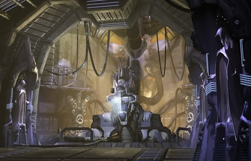
Hi
This is my current project here...
story: it's a machine that holds the body of Christ, who sacrificed himself to man for us to harvest god's power to use as a weapon.
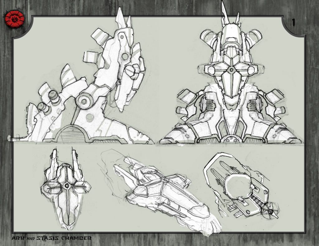
Here's the concept
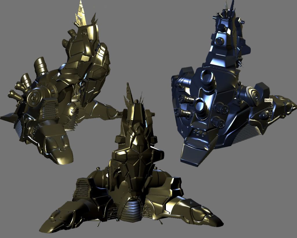
High Poly
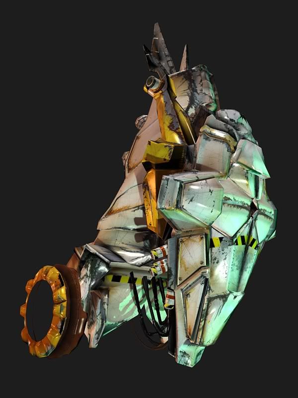
Current WIP Textures
Looking for crits, WIP
thanks much :P
ADM
edit: sorry for the large images
Hi
This is my current project here...
story: it's a machine that holds the body of Christ, who sacrificed himself to man for us to harvest god's power to use as a weapon.
Here's the concept
High Poly
Current WIP Textures
Looking for crits, WIP
thanks much :P
ADM
edit: sorry for the large images
Replies
are they staight photosourced?
no photos, all hand painted... well there's a metal photo underlaid beneath all the paint
there's not spec on this yet, just a phong or something from max so that explains the wierd glossyness
http://features.cgsociety.org/story_custom.php?story_id=4678&page=1
also id like to see a new color scheme:
I think a bit more thought could be given to the wear and tear - i'm not sure what kind of environment this is in or if it's regularly dragged across the floor on it's face... especially towards the top of the machine, you got a little over zealous, with huge swathes of unmotivated paint missing all over the place.
So I'd definitely keep the direction and material choices, just apply them more subtly and intelligently.
I think I'm liking the direction of the paints and all so I'm gonna stick with it now, but go back and re work the damage. Considering this portion of the machine is elevated off of the ground, I'll probably cut the paint wear way back.
thanks for the looks everyone, Thanks ae. for the good info too!
roger that on the nonsensical wear and tear. agreed! will fix!
Im looking forward to the end result dude, just tone down the damage a bit and it should look great. also, maybe play with some iridecants in the spec to add some cool otherwordly elements to the metal, resistance did a good job of this on their machines.
I think the color sceme is dope, helps it pop, especially for such an important item in the game world. the monotone version in the paintover looks cool but it would be more fitting as a background machine that ties more into an overall environment, I totally agreee with the color to make such an important piece stand out and read well.
Spark
Here is a prop i made (semi similar) that might help show what i mean.
http://img.photobucket.com/albums/v648/stimpack/maiden.jpg
(concept wasnt mine)
im loving how motivated you are! your gonna go places man.
first of all the cross shaped piece which i assume is housing the body, dosnt have anything except the shape to distinguish it from the rest of the mechanism which makes it a bit confusing. try changeing your texture up a bit to draw the eye towards that focal point
also the yello and black warning marks across the front of the cross shaped part dont make sense to me those are typically used as a "danger zone" marker around weapons so it wouldnt be on the functional part of the weapon at all caus if it fires your dead if you are there regardless. would love to see some concepts of this sucker working/fireing as well. its sooooo cool but also a bit confusing.
Did you hide pieces of the original mesh in the textured wip version?
I've decided that I'm not happy at all with the texture... too much damage of the wrong kind in the wrong places... indeed, the proceedural spec is eating away all the detail right now, and my ambient occlusion was flattening the thing out too mcuh.
So,, gonna scrap what I got so far, and post some new stuff soon. In the meantime, here's the wireframe and normals... this is still in a stage where I can fix this too so crits on this would be also very appreciated. I've got some errors on there to fix (bottom of the base has a big ol' wierd shadow, symmetry seams etc.
Thanks again for everything people!
5800 polycount
The whole "jesus inside" part needs to be understood easier, so maybe some ornamentation, symbols or decoration on the sarcophagus would help convey that.
realized very quickly that the damage was not placed correctly, and in fact, probably shouldn't be very damaged at all.
I'm in the process of re-working the texture as we speak. i think I'll show more 'worn paint' and much less 'chipped off paint'.
I'm also going to reconsider the color palette.
So far, I've just reworked some colors here, and reduced the damage, but ultimately, I'm going to scrap the whole thing and start new once I get a color pallette that I like.
suggestions from here? disgregard small normal errors, I see 'em :P workin on that too
i like this paint over, i also really dislike the orange! hues of blue with a white illimination would be awesome!
keep going man your finishing alot quickly! did you read that tutorial i posted alot of good information in there also check this one out also:
http://www.game-artist.net/forums/vbarticles.php?do=article&articleid=22
Edit:
And I also think, these areas should be glass/clear for light emitting as others have said.
Circled some areas I thought that could use some work. Maybe try giving your low poly mesh some more love.
It is, FRiday night and time for the beer drinkzingz, but tomorrow afternoon I'll have some reworks to post and most definitely major updates, possible completion by monday.
thank you again everyone!
cool, but daark has a good point.
holler!
But as long as the cross shape comes through loud and clear, and you aren't using dark, warm, evil colors, it should be fine.
I think keeping it all white/blue will leave it feeling cold and cliche'd sci-fi.
Agreed, that's why I said red and white should be pretty prominent colors in the palette. Orange is about as much of the red I would drop down to though. I'm not too keen on the browns and yellows unless you're doing a dirt map at the bottom or something.
Also, with all that light, I think it might be a bit overdone. As said, the "cross" needs to be the centerpiece I would think, so it should have more pop than the rest. That's kinda what I had in mind when I posted the picture with areas on the "cross" painted red, for glass/light emission.
-woog
I did some thinking and discussed the idea with some comrades. We agreed that the red color scheme would in fact be a good idea. After all, the Knights Templar sported some big mean red crosses on their tunics, and were the fabled defenders of some undisclosed Christian relic.
Sectaurs stated the cool blue grey would end up looking sci-fi cliche, and I think he's absolutely right, especially after I experimented with a few cool color schemes.
So here's a new paintup with just some base color to get an idea of the direction I'll be taking.
thanks again for all the attention and feedback for my piece. It's going to be a much better work in the end because of you all.
go yellow or light blue, or some other light colour that u'd associate with the sky
I will add more color variation as I work along. :P
If you look at the pictures you posted, you were right. Red is used as a color of POWER, but not the color of God, which is rays of light.
The pictures you posted are pictures of people draped in red who are more interested in using the name of God to further their own interests.
When I look at the first picture, I see a group of old men who are part of an organization that tried to rule the whole world by sending armies in to invade everyone in the name of god, convert them to their religion, and make the pope the ruler of the world. I also see a group of people that burned women at the stake, and tried to hold back all forms of human advancement so that they could be the source of all information.
In the second picture I see a soldier and doves. The doves are a symbol of peace, but this man is a crusader. He invades civilizations, and converts their citizens at the tip of his blade. So in the end he spreads the word of god and those who pretend to speak on behalf of the almighty are the rulers of the now conquered and converted civilization.
In the third picture. The man is holding a WHITE cross. The only real religious symbol there. He is another so called soldier of god, but the red crosses on his gear look more like a symbol of someone who spills blood in the name of the lord, but like the man in picture 2, the only cause he advances is establishing and maintaining the POWER of the men in the first picture.
Here is a real godly image. A baptism. It's blue for water, and the white for the light that shines down from the heavens, and from behind the heads of anyone that is good and holy. The man was not about power and rage, he was about peace and purity. He doesn't extend a sword, he extends his hand.
Your new WIP looks great, but it looks like a very evil machine. The spikes are using long pointy lines, used in art to denote scary people / places, or the badguys. And the color scheme makes it look like some kind of Nazi war invention, or something demonic. Even that red glowing cross looks very evil. :poly122:
edit:
Also, how would you color the opposing forces or machine if you are already using their colors? Your machine looks and feels so demonic, it would be hard to stylistically tell it apart from the bad guy's imagery.
Oddly enough, if you're interested...the serpent in the Garden of Eden that tempted Eve was bronze. So bronze would be a "demonic" color.
Both fair points. I had assumed that the people using his machine would be using it for pure good, maybe that's not the case.
i shouldnt post crits on low sleep
okay here's some focussed bit of criticism: [keep in mind that im an atheist, so i dont have any religious inclination in wat i say, just the knowledge from having read the bible, koran, torah etc and other info from research]
the shade of red used is not really like the red in the english flag etc it might be ur lighting, or my monitor, but the dark shade of maroon red is very foreboding. if 'shadow' is the true evil, then u picked a very shadowy shade of red. also, the glowing cross looks a lot like a glow from, say, a very deep crack in the ground
also, the spikes at the top of ur machine are very reminiscent of horns imho.
@quaags:
unfortunately, u have to consider that if jesus was to be 'the bad guy', his 'colour scheme' wouldnt change so to speak.
taking ur point into consideration, why should colour determine allegiance to good / evil? if simply being 'jesus' doesnt imply 'good'... then why should 'dark red' imply evil?
jesus is jesus. i would suppose the light blue / white depicts his image, like daaark suggested. now if this is evil jesus, then those same colours would have to be used, but 'evil' would still need to be depicted.
hope i made sense!
the basic idea goes like this; the shifting of two realities has begun. A complete and separate reality apart from our own is merging with the one we exist in. During this shift, our universe was ravaged by its new inhabitants. Our God was unable to smite the invading force, for they were not of his own creation. They had their own creator. God came to his human creation and sacrificed himself to his children once more, so that this time they may use raw power in the material realm against those that seek to destroy our reality.
This is still a rough idea, not completely fleshed out. But, it helps you see that there is kindof two sides of the story here. The machine itself is an instrument of war, and has a very striking image. In a sense, the machine is sort of a prison, a crucifix, a war machine and our only salvation all at the same time. I'm trying to capture that essence in its design, using bold design and color choices. It's a heavy idea, so I'm giving it heavy imagery.
I don't intend for this piece to be controversial, or to portray any religions in poor light. I look at it like a story to create some cool environments based around.
Yes the dark shadowy red takes your head immediately to blood. In essence, remember that this machine is essentially the blood of human salvation in this story. Not to mention, it's kindof like medical equipment and I think the red cross sells that little nugget too ;P
Here's a texture update: still no spec yet btw.
Oh, I didn't mention the spikey antennae on top of the machine. They are antennae but I imagined them as a crown of thorns.
and just to throw this into the discussion: Blue was Lucifer's color. lulz!
Also concidering the templar colors, thier dogma would totally support using a relic as a weapon. they are the guys who used to have giant gem encrusted crosses dragged into battle with them to intimidate and inspire awe in the enemy. good refrence for ya, watch Kingdom of Heaven, the plot is false, but the cross they carry in battle is a direct refrence to the templars irl.\
best of luck on your revisions!
-Woog
A little more work during the conception phase of this object would have really helped out and now you're feeling the pain.
This object is supposed to carry the body of Christ? But it is very difficult to even understand what it is that I am looking at. Someone looking at this should be able to tell what it is in a few seconds without reading the thread. This is why profile thumbs were created. If you can't tell what it is in black and white then it's a no go.
The only way that I can see that you can help viewers relate to what this is, ...is in the texture. Bathing this thing in red like you've done doesn't give us a clue that Christ is inside. Regular people equate red to the devil, evil, etc.. White and gold colors are usually more "Heavenly".
I know you're a very talented artistic guy, you just have to dumb it down and make it simple for the rest of us retards out there.
Hope this helps, ps. I hope your Unearthly Challenge entry wins! My fav entry!!
You made sense, but I'm not so sure you understood what I was saying. I wasn't saying Jesus was evil, I was implying that whomever is in charge of this weapon might not necessarily be good, you know the old cliche of something invented for the good of mankind being used for evil, that kind of thing. but now that Pope Adam explained his idea more, Alignment isn't so much of an issue.
I still say keep the red, and find a way to make it work.
in that way, i suppose the dark colours are justified.
and just a little crit:
if ur gonna keep this colour scheme, then i agree about the glow from the cross. avoid that being red.
and i ddnt know blue was lucifer's colour. that's some pretty interesting piece of knowledge.
btw: maybe just for crit's sake, u should stick with 3-point, all white lights? heck, maybe even 100 self illumination, cuz the colour scheme seems to be a bone of contention at the moment...
good luck with the piece
its an interesting idea and all!
MightyPea, I think I lost the scale as well, and I believe I lost it in the texture. The Meta-Knight thing... I think that I've overdone the saturation level of the red color, which gives it an almost cartoony look. I think I'm gonna drop out a lot of color saturation here, or at least be more sparse with it. I'll be going in after some desaturation and adding in some secondary colors on the paints - right now they don't have much at all and I think that is what is making it look 'cartoony' and kindof flat... which destroys the scale.
I'll work on it over the holiday. I hope everyone enjoys the long weekend (in the states anyway :P )
thanks for all the crits everyone, keep it coming :P
ADM
Early WIP shown here.
and a quick slap together with the Ark