diablo 3 inspired enviroment
polycounter lvl 16
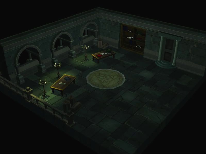
hi guys, this is my first post here, and i wanted to show the new enviroment i just completed, my diablo 3 room! critiques and compliments are greatly appreciated ")
josh
josh
Replies
1) Your render is blurry. Until you post a clean shot, you're not going to get quality feedback.
2) Centerpiece is illusion-breakingly polygonal. This day and age, round better be round. Especially considering your three arches are.
3) AO bake lighting pass. It's a must for classy presentation.
4) Highlights on floor and wall bright too thick. This makes your textures appear muddy and low resolution. Pixel detail. Each one is important.
5) Textures too green. It'd be something if this were the lighting, but those babies are high saturation to a fault.
6) Floor modeling work. You need small height changes, bricks popped out here and there, etc.
Overall, it's an ok start, and you can get it where it needs to be. Study those D3 shots.
thanks for being brutally honest. I do plan on doing an AO pass, just gotta figure out how lol as for the green, i do have a green world light, a friend of mine who did a d3 level did the same and, well i felt like it gives the authentic dungeonesque feeling. Thank you though, i do plan on using this as a point to improve from
Your textures are hand painted? If so, you're on the right track. I think you cna kick up the detail on it a bit more, get in there and really get more bang for your buck out of your textures.
I think you can use a bit more geometry in here. Just my opinion.
Are you planning on lighting those candles with little particle emitter effects? I think it would help sell the scene a lot more. Also consider that candles (your primary source of light in this room) creates a more reddish glow, and would eat away at the green overlighting. Red and green are complimentary colors of course, however I usually find them ugly together (christmas colors) perhaps replace your green lighting with a damp cool blue light, I think it would still hold the dungeon-like-feel.
It's very clean in this dungeon. Add some dirt, spiderwebs. Make a little spiderweb alpha that you could repeat in different areas such as corners, arches and off of the candle holders.
I think you've got a really nice looking start here, and a very unified concept... it's well on it's way to fitting right in to the Diablo universe in my opinion. Put some more work in to the detailing and lighting and you'll have yourself a very cool set. thumbs up man!
Some exemple of 3D background :
http://www.ggschool.co.kr/board/g_list.html?code=vr (I think it only works with IE)
And for you :
- http://www.ggschool.co.kr/board_new/skin/gallery/read.html?num=105&rdap=0&code=vr
- http://www.ggschool.co.kr/board_new/skin/gallery/read.html?num=79&rdap=0&code=vr
- http://www.ggschool.co.kr/board_new/skin/gallery/read.html?num=24&rdap=0&code=vr
- http://www.ggschool.co.kr/board_new/skin/gallery/read.html?num=173&rdap=0&code=vr
- http://www.ggschool.co.kr/board_new/skin/gallery/read.html?num=15&rdap=0&code=vr
the polygons loading is really slow... please take a cofee while...
you brought up a point that i actually wanted to ask about, the alpha spiderwebs, i wanted to do them, and curtains too, except the method i was taught for creating the alpha textures didnt work in photoshop