Art Test Docks

mod
Hey guys, I applied for Splash Damage and was given this art test to do. They seemed to like my portfolio, but sadly, I was turned down (with zero feedback), so I thought I'd see what you lot had to say. Any tips would be much appreciated!
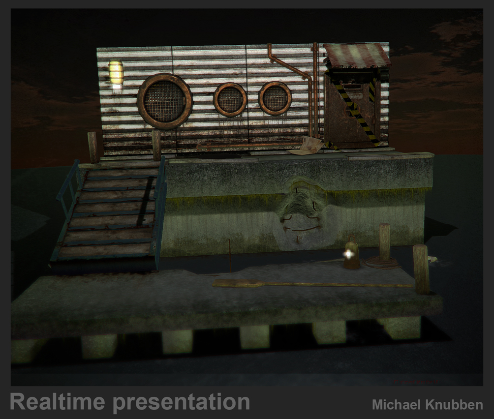


Realtime images are in Xnormal, with some post-processing (light bloom, SLIGHT contrast adjustments, depth of field-ish effect, vignetting....)
Oh, and here's some more of my stuff: http://flickr.com/photos/michaelknubben/sets/72157603935116965/
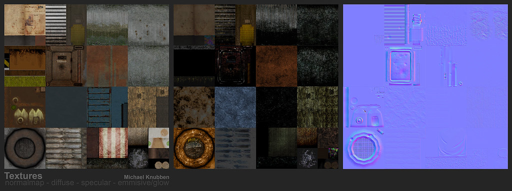
I don't believe I'd shown the next-gen environment textures here yet, either. Any comments on those would be much appreciated as well, as they're part of my portfolio.
Realtime images are in Xnormal, with some post-processing (light bloom, SLIGHT contrast adjustments, depth of field-ish effect, vignetting....)
Oh, and here's some more of my stuff: http://flickr.com/photos/michaelknubben/sets/72157603935116965/
I don't believe I'd shown the next-gen environment textures here yet, either. Any comments on those would be much appreciated as well, as they're part of my portfolio.
Replies
Only real crit is that you might have gone overboard on the grunge (too much noise in the composition?) oh and your light sources are emitting no light.
Still definately not bad, another pass maybe?
Don't know about the modeling, if that was the scene, then i guess that was the scene...
The watercooler. I've seen the concept in teh past, my guess is that they were expecting something that looks like out of doom3, not a granite watercooler.
To me the windows don't look like windows they look like the top of those ciggarette bins you get used to get in fancy hotels and establishments and they pop out so much that they appear as though they are floating against the wall and not integral to it.
The wall texture doesn't match the rest of the scene and is a bit of an eyesore, colour matching it with the blue wooden stairs would have helped the scene.
The lamp textures appear to be completely washed out/blurred.
The tape on the door looks weird.
Lastly, I know it's all personal opinion but there seems to a scale issue with the building being too small, maybe it's the camera/view? Seen your work before and know you have the talent so don't worry, you'll def get a gig, me on the other hand needs to work on a portfolio.
Good luck
Did they give you any options for using alpha textures? Some small plants and overgrowth would help a lot I think.
All the textures are just sort of 'there'. Nothing in the scene draws your eyes or makes you really pay attention to it. You'd run through this in a game in .03 seconds and not remember it.
Looking at your flickr, you've got some great critter skins. I really dig 'em!
Also I think most of the stuff is all over the place. The thing above the door makes it look like a restaurant but it is obviously not a restaurant, heh. It is in the concept but you added those weird restaurant stripes. Then we have the upper wall.. I can't really tell where this is scene supposed to be located... it doesnt look indoors or outdoors. In fact I didn't see what it was until I looked at the texture you provided below.
Also it looks like it's a dirty environment but it isn't really dirty. Instead of building an extra prop I would've saved some texture space to dirty things up and break up the monotonous textures. You did a good job on dirtying some stuff while leaving some other really clean. I'm mostly thinking of the ground pieces. And there doesn't seem to be anything showing that the whole thing has been in water for some time (more than a few days).
Ya.. biggest issue is coherency I think.
Other nitpicky things is that you can clearly see the seam on that water dispenser. I mean.. there's gotta bea seam somewhere but I wouldn't show it off like you are doing.
For those looking for the art test rules: http://www.splashdamage.com/envarttest
Looking at your flickr.. those animals look very badass. Maybe not next-gen but still impressive I think. Holy crap.. I'd like to see those things in a game
Also I'm sorry if I gave way too much critique now..
Last question.. did you make your own concept from their concept? I think it could help a lot.
Hope it goes better next time
I think your work is awesome though, I dont see why you shouldnt be working already with the skills you have
Good luck applying to another company, you probably won't need it.
edit: btw unlucky pea meister, as sectaurs says those creature skins are sweet!
something along the lines of what big sandwich games has, this its just random floating thingamabob but hey thats my opinion. anyways your scene looks decent and im surprised they did not even give you any critiques about the scene itself good luck next time
Pea: Oi! What do you think all that stuff I was giving you while you were working on this was? Bananas?
We don't really have time to give everyone who applies detailed feedback on their art tests. Just looking at them all is a chunk out of the work day - we'd never get anything done if we gave feedback on every art test we receive.
Your portfolio in general is strong, but it's mainly old-school diffuse work, and you've only started adding normal-mapped work recently. I personally like it, but I'm not the directors or leads who make the final decision on who we hire or not.
Keep at it, it's clear you know your stuff. Maybe you'd be more comfortable working on titles which aren't using normal-maps etc. for now, since that's where your main skills seem to lie?
Armanguy: Part of the point of the art test is to see what an applicant will do with it. It's intentionally a very generic concept, we want to see what the environment artist can do to add flair and originality to a location which might otherwise be very bland.
Troll, or just a moron?
Anyway...
Pea, You have a great portfolio, but I see why they didn't like the test. I think you missed the mark when you guessed at some of the materials. Overall there is a bit too much lighting info in all the textures. The metal might have been a mistake, technically its well done, but I'm not sure it reads well when compared to the art test ref.
- The caution stripes on the door read as armature and look like they're painted right over the door wheel? It took me awhile to figure out it was crime tape.
- The damaged sections of concrete are kind of weird, the edges are pretty clean and the broken parts are pretty smooth.
- The biggest thing that reads as an error in material interpretation would be the floating dock. You made it an anchored concrete pier when that type of dock is normally wood and floats. It and the walkway are meant to move up and down with the tide.
Still, MoP told me all I needed to know, for which I'm very grateful.
Target Renegade: It was never overwhelmingly clear to me how far I could stray, and I assumed I shouldn't. If freelance work has thought me anything, it's that uninteresting (or sometimes downright poor!) concept art is not reason enough to stray from it
Bringing the door further back sounds like a good suggestion, thanks. It would make it look more like a pressurised door, which makes sense.
Stimpack: I could have rounded things out more, I had the budget, but it was a pretty ridiculous budget for what it is. Truth is, the concept art had things looking pretty boxy. Looking back on it, I wish I didn't follow it so closely, but hey... in the end, I did. You could probably overlay the concept art onto my image and it'd be close, that's how blindly I followed it, heh. The scale is definitely something that irked me too.
3devo: The grunge is too noisy, I agree. In fact, a lot of the comments in here point to that, so it's definitely something I'll be working on. thanks!
I wish I could have gotten the lightsources to actually emit light, but I did this in Xnormal, so that was a limitation.
Strangefate: Again, the noise. I was told to make it very grungy, but I guess I should work on how I do that. I absolutely see what you're saying with the fading to black, I didn't really notice that before. And yeah, the modelling... I modelled what I saw, as I was going for texture artist. I was surprised enough to be given this art test
The watercooler is something I probably shouldn't have included. The texture was just slapped on, at least that's something I should have clarified. I had only just finished the normalmap, and I only did the watercooler for fun, way before I started on this art test. Still, doom3 is something they specifically said they didn't want to see. Or rather, There was a comment to the effect of my portfolio being too doomish, which I suppose is right. I'd want to work on getting more (and certainly better) photo-sourced textures in there.
gcmp: I get what you mean with the grate. Is that something a lot of people think? I wasn't sure how to interpret the windows on the concept, so this is the direction I went in.
How doesn't the wall match the scene? Are you saying I should have made both metals the same colour, or what? I was going for a white, corrugated (if that word applies to this type of metal sheet) metal sheet-wall that had rusted over time, and accumulated dirt.
dakkon: I did add some moss, and green hanging plants, but in the end those ended up reading like they were on the texture, I suppose. There's some under the bridge as well, but that doesn't show either. The corrugated metal might be a bit large, yeah. I hadnt' seen it like that before, but then it's been mentioned that the scale of the entire thing is pretty off.
sectaurs:if it reads like corrugated metal on the model though, isn't that good? To me, it seemed like the three materials worked together to make a convincing metal, but I may be wrong.
And the next bit I don't really understand. Which planks are recessed? Is this a visual illusion that I'm missing, or am I just misunderstanding you? All of the planks are level, except for the ones on the concrete, of which all of them are sort made 'imperfect', but certainly none of them are recessed. Fair criticism, though, I'd love to know how to make things more memorable. Especially since textures were the point of the art test.
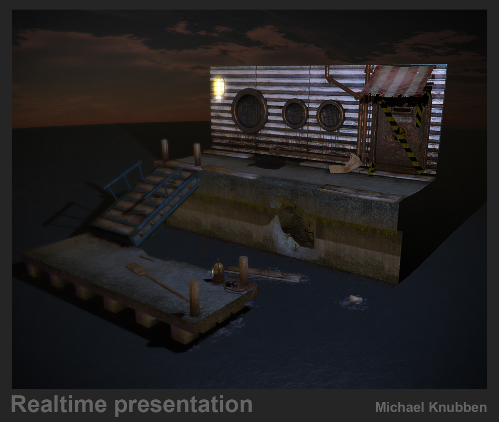
Kawe: Hah, well. The test rules said it should be textured like an outdoors. The green-tinted render is lit oddly, perhaps, but I liked the atmosphere it created. In the end I spent far too long thinking about whether to go with it or not, so I added the other shot as well, which has more 'regular' lighting. Also, there's the sky
Nevertheless, I see what you're saying, even if the way in which it's said is slightly annoying. About the seam: it's not that apparant. I could've done more to make it into an actual seam (ie. beady solder-stuff or whatever), but it seems to me I chose the right place for a seam. It made for much easier texturing, at least. Any suggestions on better placement of a seam with examples are welcome, though.
Xnormal has an option for emmisive maps, and that's what you see there. Still, do you think I should darken the actual lamp itself?
I'm hoping the caution-tape is only so unclear because of the angle, because it's really pretty far out from the door. Is there anything I could do about the texture to make it clearer, though? I could definitely emphasise the edges a bit in the normal map to make it clear that it's plastic, not painted on.
eq: Thanks man. That's something that a lot of people have said, so it's something I'll be paying attention to.
ericv: Hey, we could be rejection-buddies, how about that? haha.
Thanks for the words.
Zephir62:I wouldn't say I have a portfolio that warrants just forgoing the art test. I mean, people with much stronger portfolios do art tests as well, you know. Quite often they might be of a smaller scope (like SD's own prop art-test, for instance), but still, no art test at all? That doesn't happen a lot, I think. Unless your portfolio is just exactly what they want, ofcourse.
And I can't say I've ever personally met the guy. Although I might have, but for no large amount of time. I would have loved to have work with the people I know from Splash Damage, though, so even if he's this raving mad bastard, as you seem to indicate, it'd probably even out somewhat, eh?
Thanks for the kind words, though. I hope they turn out to be true.
Rooster: Maybe I should just run those skins through the nvidia normalmap-filter and be done with it, eh? That'd be sweet. NEXT GEN, HERE I COME!
Armanguy: I personally would have preferred doing their prop art test, but oh well... It wouldn't have demonstrated anything in terms of tiling textures and the likes. thanks!
Mop: Yeah, ofcourse I'm grateful for your tips! I just would've liked to have had like a final word from the guy himself. No sweat though, I get that you're drowning in applications. My portfolio's a bit sci-fi-y, glowy panel-y in the normal-map department, so I'm going to see about getting some more regular-world materials in there. I really enjoy the former, though
Vig: too much lighting information, are you sure? You know, any pointers on individual textures (just you doodling over the texture sheets, telling me which ones in particular you mean) would be immensely helpful. One thing I learned is to just stop watching the individual textures so much, and just see if they interact in a meaningful way, and I thought that was what I did on these. Still, you've worked with this stuff longer than I have, so feel free to just show me. I'd appreciate it!
Ged: thanks! I've just added some normalmapped stuff to my portfolio, but nevertheless, I'm getting pretty fucking antsy to get back to work in the industry.
Hey there nice job on the environment. I thought u did a great job there, id say 2 things possible change would be the crates to maybe windows or something and the sign covering above the door could be out extended out more .. But i also wonder as someone who did an art test and HAD so many questions as wondering if i had it done correctly or if something is unclear... anyway could u fight that it is out door, i look at it and its a boat dock scene with the exterior of a building at the top. ?? I dont know i could be wrong. But again nice job nd like the portfolio as well. Nice stuff, good luck to you in your search im doing the fight for work as well.. Later
Chris Youngblood
The water cooler is not quite there IMHO looks as though its made from cardboard.
The lantern looks like it has too much self illumination.
Another thing is its normally considered bad form to moan about not getting the job , especially as MoP works there.
You can take it as read that if they don't want you then they are never going to get back to you with feedback.
I have never had a company get back to me with feedback on why they don't want my sorry ass:)
Best thing you can do is work your ass off and keep applying.
If it helps then you can be happy that whatever you make is probably better than what I can cook up.
And the watercooler isn't textured yet, which, fair enough, I didn't make very clear. It's just something I added, and I probably better hadn't, in hindsight. Ah well, that's something I can do better next time. I am going to finish it, just to add it to the portfolio. I like the concept
Thanks for the other suggestions.
Kawe: nah man, no matter your skill-level, fair criticism is fair criticism, eh?
Thanks.
Roo: I'm considering it, but I just need to get a shitty job right quick to pay the rent. But yeah, I'm interested. You still looking for a team-member?
Pm/mail me if anyone wants me along for the (wild?) ride.
glad peeps are posting these, I always thought polycount should have an art test section where maybe some of the old timers put together some 'industry standard' type art tests for noobs to work on and get feedback on.
btw have you thought about using peoples crits and re-sending? i dont know if itd work but the worst that could happen is you improve your portfolio piece right :]
It seems to me that as it was an enviromental test, you were miss led. It seems that your texturing ability is one of you strongest points if not the strongest, this is reflected in your portfolio. Seeing as the texture on this piece seems to have been given the most love, I'd think as an employer thats where your interest lie.
And I'm just reaching hear - but I think it was viewed that, you didn't use all the available resourses to produce what would have been a higher quality result.
I think, it be a Eviron. test is what screwed you.
Thats my 3.7 cents
I hope you find a job... for us both
"didn't do it 100%, but it should be enough to give you an direction.
Basically, you have to think of where weatherign would take palce and how people would build it. (why shouls somebody just put a big beton block somewehere? They would build it out of panels...
Rubish and dirt in corners give the scene a "story". Try to use more photo references and textures. all teh stuff you see is bascially cg textures overlayed ore multiplied over your scene."
Don't forget the ao lightmap
Really looking forward to you polished version!
question though. for art tests when given a concept like the one given here is a good thing to stick to the basic concept of 3 windows, a door, the higher dock, ramp and lower dock while adding secondary props as you see fit? Or is changing up the concept a little by adding oh idk, a fish mark there instead of the 3 windows a better idea?
basically is it foolish to semi stray from the given art test as long as it looks good, fits in with whats required? or should you closely follow the given concept and change the way the scene looks by textures and secondary props?
sorry if this was already asked tryed to read all the coments and i might have glazed over a few.
Doesn't hurt to ask, and it can even help as it shows them that you are open and willing to receive feedback.