The BRAWL² Tournament Challenge has been announced!
It starts May 12, and ends Oct 17. Let's see what you got!
https://polycount.com/discussion/237047/the-brawl²-tournament
It starts May 12, and ends Oct 17. Let's see what you got!
https://polycount.com/discussion/237047/the-brawl²-tournament
Portfolio WIP
polycounter lvl 17
(Scroll Down for updates)
Hello all at PolyCount.
I am a Senior at the Art institute: OC and figured it was about time i got some outside critiques on my work as i work on my portfolio in these last few courters. Well i guess it was also suggested by my teacher...but none the less here I am.
So here goes an Environment that was kinda started on a whim for another project. For the most part I was producer on a project (in school project) and we had to pitch a new game Idea. As a last minute thought by the team we decided we would make a level and animate a walk through to show what the playing style would be. I created the level in a few weeks and I got many complements on it so i figured id take it further.
There is a lot of back story into the level but i don't want to have a page of typing to bore you. Short and sweet it is an alien planet thats environment was destroyed with the Voyager finally crashed here (ya know the satellite that we put all the nifty info about humans into). So thats kinda the short one sentence gist of it.
So i'll post some pics and let the rest of you do the talking. I know there are a few texture issues and so on (like spec map) But thats all i'm going to say.
Interior of the cave at a low angle looking out through a type of window
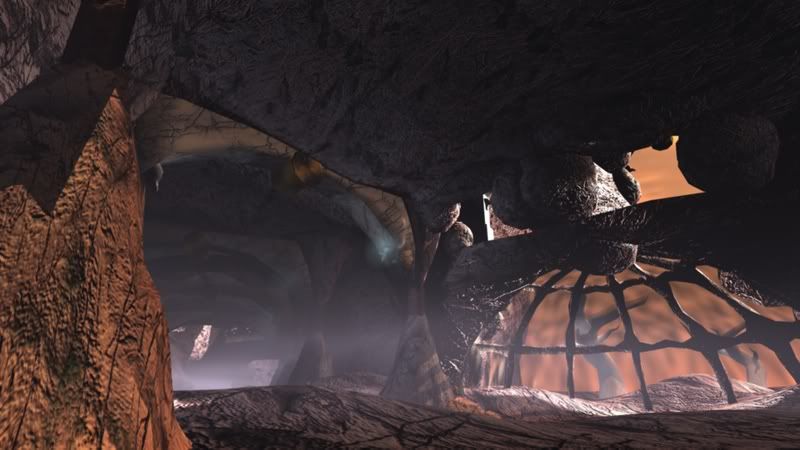
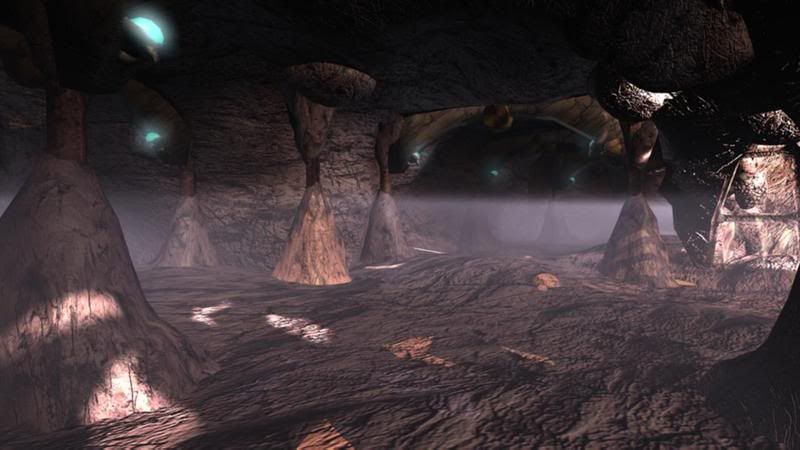
More of a head level render of the inside of the cave.
Just for kicks one of the original renders of the level when it was first made
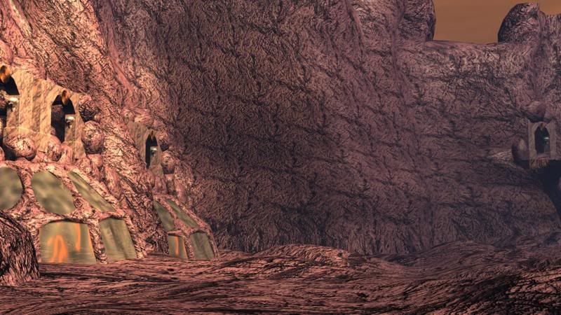
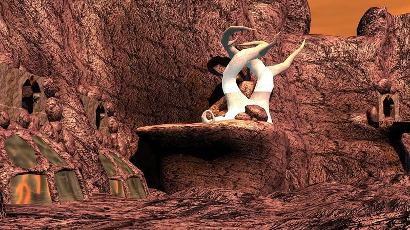
And that same shot now with a little more work put into it. (Trying to break up the tiling)
Hello all at PolyCount.
I am a Senior at the Art institute: OC and figured it was about time i got some outside critiques on my work as i work on my portfolio in these last few courters. Well i guess it was also suggested by my teacher...but none the less here I am.
So here goes an Environment that was kinda started on a whim for another project. For the most part I was producer on a project (in school project) and we had to pitch a new game Idea. As a last minute thought by the team we decided we would make a level and animate a walk through to show what the playing style would be. I created the level in a few weeks and I got many complements on it so i figured id take it further.
There is a lot of back story into the level but i don't want to have a page of typing to bore you. Short and sweet it is an alien planet thats environment was destroyed with the Voyager finally crashed here (ya know the satellite that we put all the nifty info about humans into). So thats kinda the short one sentence gist of it.
So i'll post some pics and let the rest of you do the talking. I know there are a few texture issues and so on (like spec map) But thats all i'm going to say.
Interior of the cave at a low angle looking out through a type of window
More of a head level render of the inside of the cave.
Just for kicks one of the original renders of the level when it was first made
And that same shot now with a little more work put into it. (Trying to break up the tiling)
Replies
The tiling is a bit bad as you stated. perhaps you could break it up visually by putting more columns in.
its just one big open space right now. looks a bit 1990's
Yea thats been an issue..population. Although in the 2nd shot it look more open then what it is, it's a "fork" in the cave so you would probably never see it from the angle. But none the less the population needs work...a lot of it.
Also the outside is going to have "goop" other wise known as an ocean of green/blue stuff that the aliens lived off of...just have to figure out water.
Quick Black and white of the exterior.
Alex
That makes since that the first pick is a little more "put together"
The art director of the project wanted a good dramatic shot of the inside and that was the spot we chose. Also i have used that angle for a few other projects so a little bit more time has been spent in that area.
As for the coloring yea i love the colors in the First concept. That was the feel that we wanted to go for for a color pallet. However due to a few teachers different views the colors of the lights in the area have changed many times so it has lost it's feel. The rocks that are all supposed to be the purple color are all brow. They used to be much worse like a really umm...crap brown...
For th most part i think i need to clear out the textures and get everything back to gray, and take out the lights. I think it is effecting the way i am dealing with the level. Instead of worrying about silhouette and placement, i'm looking at the textures and lights.
In some shots I see only shading,- no shadows
As for the texture tiling,- maybe use a bigger texture so that the tilesize becomes automaticly larger- resulting in less repeating optical seams.
The 1st concept image seems to play alot more with colors and light,- if you place some colored lights with casting shadows in the scene it might look already alot closer to the concept
So i had some time to get some further work done on the level (Senior Portfolio 1 final)
I worked on a few of your suggestions along with coming up with better ways to populate the level. It still lacks it...But thats because i got caught up with re-dewing a few to many things. But in the end i think it was well worth it so far.
The Lighting is not final yet, and is a little over saturated on the inside. But i wanted to blow it out and then work backwards to try and a better mix of the colors inside the cave.
Enjoy
(Quick note: A few of them are from the same camera angle as the old renders so if you scroll up u can see exactly how it changed)
(Need to make the broken version of it still...so it looks like it actually crashed)
Critique away
I'm not really sure what app you're using, maybe you said and I just didn't catch it when I skimmed the thread... but this little guide I wrote up about lighting should cover most of the basics in 3dsmax and should translate to Maya well enough.
http://boards.polycount.net/showthread.php?t=51209#Post260972
But yes i just realized that i had raytrace on instead of shadow maps.
None the less thanks for the link it answered a few questions for me and should help me out on getting some more lighting done in there.
Although i think i'm going to take a step back from that and get back to adding props.
Your inner cave shots have much more interesting lighting than the outside ones. The outside shots look very washed and flattened.
I think it'd be beneficial to have some more objects casting shadows on the rock face, or at least along the ground. You can see where the middle tree is, how much more interesting those shadow shapes on the rock make things - at the window area, things are just being bleached out by the sun and it's hard to tell what's happening.
Remember that you can have objects outside of the screen casting shadows - you don't always have to see what's obscuring the light (and in many cases, it helps push the believability that this is a whole world instead of a scene set up for the camera).
Your background atmosphere shows that there is a sort of orange haze, but this isn't being reflected in the scene itself. Perhaps adding a tinge of orange fog would help push things apart; but don't do so much that people realize there's orange fog everywhere. P:
It's just a matter of playing with your light/shadow more and tweaking some of your materials; you've got something nice to work with already.
I'm a Maya user, but there's probably something just like it in Max - under your lights, you can still use raytracing and get soft shadows by adjusting the 'Light angle' - in Maya a number between 3 and 6 (this is degrees I believe) usually looks best for me depending on the look I want. You'll probably have to up shadow rays or it'll look too grainy.
Granted, I think soft raytracing is still a fairly new concept for realtime (please correct me if I'm wrong), but I don't think anyone will be like "He used soft raytraced shadows in his reel, we can't hire him" as long as it shows you have an eye for what makes things look good.