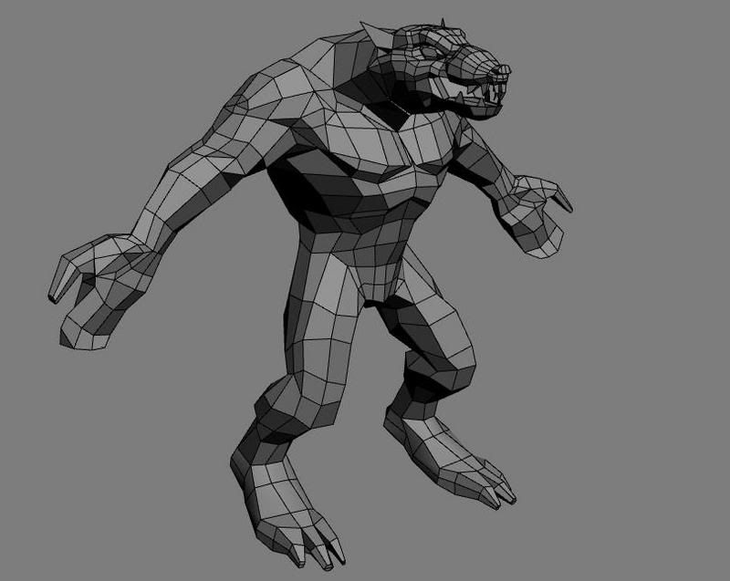
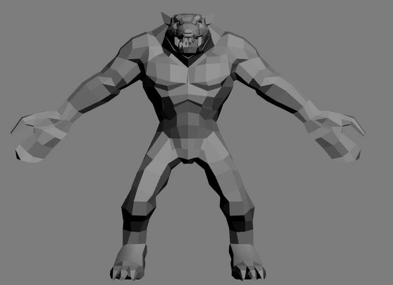
Home 3D Art Showcase & Critiques

Rat Monster

After being inspired by culturedbum's model of a concept from the new warhammer game, i decided i would try and model one of these concepts. Im not sure who the artist is but i got the concept from the warhammeronline site. Im pretty much finished with the modeling but i still need to optimize him. I also plan on adding the weapons and clothing on to him but i wanted to get some crits before i get into that from you guys.

rat1.jpg

rat2.jpg
and here is the original concept..
1006CA04.jpg

Replies

  • Justin Meisse
    Options
    Offline / Send Message
    Justin Meisse polycounter lvl 18
    Model his fingers!
  • Jaco
    Options
    Offline / Send Message
    Jaco polycounter lvl 17
    It's a good start. There's some messy geometry, especially around the forearm area. I'd recommend applying a relax/smooth modifier, and then reshaping according to the concept.
  • ryuju
    Options
    Offline / Send Message
    made some of the edits thanks for the crits, still need to work with the fingers they are still a little clunky, any comments on the shoulders and joints about edge loops would be helpful. Im not too familiar with them and but i want them to deform well.
    rat3.jpg
    rat4.jpg
  • Xenobond
    Options
    Offline / Send Message
    Xenobond polycounter lvl 18
    That looks like a concept from our very own doc_rob. Better make it look good, or he'll melt your face.
  • ryuju
    Options
    Offline / Send Message
    I optimized him, now im on to the loin cloth and his weapon. Any crits on the flow,loops or any extra polys?
    rat5.jpg
    Im gonna try my very hardest xeno, i sure would like to keep my face unmelted if possible.

    Im finished with the model onto the unwrapping phase.
    rat6.jpg
    rat7.jpg
  • ryuju
    Options
    Offline / Send Message
    i started texturing,i still have alot of work to do but i thought i would post and see if any one has any comments.
    rattexture1.jpg
  • Baddcog
    Options
    Offline / Send Message
    Baddcog polycounter lvl 9
    Looks good, I think he needs lots of hair tufts all over, make him look real messy, looks to clean for a rat.

    You could have alpha hair tufts sticking out over his armbands, off his calves, over his claws, ect...

    Doesn't look much like the concept at all though. Not that it needs to.
  • Panupat
    Options
    Offline / Send Message
    Panupat polycounter lvl 15
    Bobo's rat will be a great reference for you.
    http://www.bobotheseal.com/published_art.htm
  • ryuju
    Options
    Offline / Send Message
    yeah i kind of strayed abit from the original concept but i wanted to put my own kind of style on it.(or is it that im just not good enough... haha)Im still going to put the stitches on and the weapon is just hidden. The texture is just pretty basic right now. Ill definetly add those hair tuffs in thanks for the ideas.
  • cholden
    Options
    Offline / Send Message
    cholden polycounter lvl 18
    I've said this plenty of times before: You can't put your own style into something until you're good enough to have a style (probably years from now). Until then, it's just an excuse for sucking. Having your own style would dictate that you're good enough to make it look exactly like the concept, then adding your special touch that makes it even better. Until then, make it look as much like the concept and bobo's rat. This will impress people.
  • ryuju
    Options
    Offline / Send Message
    I agree cholden, thats why i added the hint in the parenthases that im not that good. I'll keep working on the texture and try to get it as close as possible thanks for the tips guys.
  • Rhinokey
    Options
    Offline / Send Message
    Rhinokey polycounter lvl 18
    thats a Skaven Rat Ogre if you wanna look up more reference on them
  • ryuju
    Options
    Offline / Send Message
    ive been really busy but now i have time to finish him up. I want to keep with the main concept so I'm redoing the textures. Ive only painted textures a few times so im pretty new to this.
    rat7-1.jpg
    any tips or crits?
  • jec1183
    Options
    Offline / Send Message
    jec1183 polycounter lvl 18
    For right now you are going to want to show the texture at 100 percent bright so that all you are looking at is the texture. Right now you have it on 0 so all we see is some texture and max lighting. From what I do see it almost looks like you took the sketch and sort of transported it onto your texture. When painting don't get aggravated that it is taking some time to build forms up. Take the time to do it right and the next character will be completed that much faster.
  • Em.
    Options
    Offline / Send Message
    Em. polycounter lvl 17
    That already looks quite a bit better than the previous texture, since you're newer to texturing, I think it's a great idea that you're trying to stick close to the concept.

    It's still a bit muddy right now, then again, you're just getting started. Don't be afraid to play with darker shadows and brighter highlights/placement of shadows and highlights to gain more depth. Also, if you haven't already clicked through the screenshots on warhammeronline.com, they help a lot with capturing the style. Good idea to do a WAR concept with all the guys making the game hanging out here, not too often you get a chance to get feedback from people actually working on the real thing.

    Keep it up, this is a big improvement over the last one. smile.gif
  • ryuju
    Options
    Offline / Send Message
    jec1183: actually this is all hand painted i am just looking off of the original concept. the pic i posted was already at 100% self illum. this new pic i put the self illumination set to pure white and it brightened it some. Hope it helps.

    oglemeanimations: ill try adding some better shadows i think that it looks pretty flat.Thanks for the help. Its difficult trying to make it look not too muddy when the concept has a muddy style but it comes out looking clean. (don't really know how to describe it)

    Here i have the cuts added in.
    rat8.jpg
  • dur23
    Options
    Offline / Send Message
    dur23 polycounter lvl 19
    Don't lie mr. ryuju. Your texture is definitely sourced from the concept.

    edit: It's better to suck ass at making textures and telling us that you sourced the concept, than to rip it and proceed to tell us you didn't.
  • doc rob
    Options
    Offline / Send Message
    doc rob polycounter lvl 19
    a thousand times better than the first texturing job, keep it up smile.gif

    Here's a close up of the head concept, it might help

    RatOgreHead1.jpg
  • ryuju
    Options
    Offline / Send Message
    dur23 : I assure you i did not steal any of doc_rob's original drawings. I tried to paint the texture to look like the concept. I have posted part of my texture to prove it. In the red is the original and you can see where i have painted mine. I think that the difference are very apparent and i think that the original concept shows much more skill than my attempt.
    doc_rob: thanks for the praise it means tons. Ive been taking my time and trying to make it as best i can i would appreciate any more advice and guidance that you can give.
    this new pic i added more shadows and highlights to the right breast. Im going to do the same thing to the other side.thanks alot for the face pic... i was getting a little nervous because the face was a little small and it was difficult to see. This should help tons.
    rattexture2-1.jpg
  • Sean McBride
    Options
    Offline / Send Message
    Sean McBride polycounter lvl 18
    yeah, in your defense i did overlay the concept and warp it around. I couldn't find any straight grabs from the original concept. I originally though the same as Dur actually but spent a little time before throwing claims out. wink.gif

    Your stitching looks frighteningly similar. I did check that too but it also came out as a non-match. So... you've fooled me once or fooled me twice... i hope you only fooled me the first time. smile.gif

    True to the concept. Frighteningly so even.
  • ryuju
    Options
    Offline / Send Message
    i was trying to keep close to the concept but i would never steal anything. This is just a practice model and if i stole i wouldn't make myself any better. thanks for the back up McBride.
  • dur23
    Options
    Offline / Send Message
    dur23 polycounter lvl 19
    Ok, in the newest version there isn't any ripping that i can see. So yes it does look like it's fresh from you.
    BUT, the original "new" texture has a very large chunk on his left pectoral that is directly from the concept. Maybe you forgot to hide that ref layer when you saved it, but it is exact to the concept.

    Carry on.
  • ryuju
    Options
    Offline / Send Message
    oh yeah You are right Dur, Im really sorry about that confusion i had it on another layer that i had unhidden. Thats a really good eye though, got any crits on my work so far? I added more depth to the chest.
    rat9.jpg
  • aesir
    Options
    Offline / Send Message
    aesir polycounter lvl 18
    While you're defining a lot of the little forms right now, you're losing sight of the big forms. THere is pracitcally no seperation between the pectorals and the rest of the body. It all blends into one block of weird fleshiness. It doesnt look like its composed of different bones and muscles anymore. Look more closely at the black and white concepts and see how strongly each of those muscles and forms are defined. You need to do the same thing.
  • ryuju
    Options
    Offline / Send Message
    aesir, you were completely right. I fixed up the forms some what do you think? I hated your comment at first cus i knew i would have to do some massive repainting but i needed it and it made it look much better i think. Also do you think i will need to make the flesh chunks on the arms smaller so they will match his body? right now they dont seem to go together maybe its the colors.
    rat10.jpg
  • SubPablo
    Options
    Offline / Send Message
    SubPablo polycounter lvl 17
    Right now this looks more like gnarly old tree bark and mud chunks than flesh.
    Aesir hit your main problem right on the head, but you're going to have to be much more drastic than that. Make a duplicate flattened layer of this, and just start painting out detail and define the musculature without thinking about any surface detail. Once you have your main forms defined, THEN start thinking about dirtying and ripping him up. Its easy to let yourself get pulled into thinking about surface detail too soon, but don't give in. You'll just end up spending a bunch of time on detail you probably won't be able to use later.

    I'd suggest hiding the color reference and only focusing on the B&W ortho views. Always work from General to specific, and work the whole model at once. That'll help keep you from getting stuck on one particular area, and getting pulled into too much detail too soon.
  • killingpeople
    Options
    Offline / Send Message
    killingpeople polycounter lvl 18
    i personally would have just used the concept art as a beginning for the texture, unless instructed otherwise. it'd save a ton of time. and who doesn't love the stroke of a doc rob?

    the noise is great, it captures the texture in the concept fairly well. you need to better define the forms of the muscles. see the forms in the concept (it has really fun anatomy forms) and exaggerate them.

    lightening from dark-mid values is easiest for me:
    kpicky04.jpg
  • ryuju
    Options
    Offline / Send Message
    Ive finally gotten some time to continue this model, i took a break from the chest.( I tried a few things but it wasn't working). I decided to work some on the face. The eye is just a place holder , its from the original concept . Much of the green cloth is not yet done and i think it needs moved further up his head. I also plan on adding more tuffs of fur sticking up off his face with the alpha mapping.
    rat11.jpg
Sign In or Register to comment.